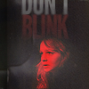
Tutorial: Sally Sparrow (for landofart)
A tutorial for this icon:
Made using PSP XI
But fully translatable, I believe
♪ step 1: prepare a base
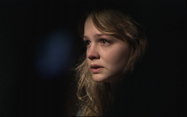
Now I started this icon thinking "I want a Sally Sparrow icon!" And then I thought black-and-white-ish, and I had the idea it would say "Don't blink." I'm a beginner maker, so this isn't exactly advice it's just me, but: I tend to just go through pretty screencaps until I find something I like - I mean, sometimes I do have an idea (with this icon), but more of the time I just want a good picture. So! I went hunting for a screen cap. I found this cap from killcolor (which is a fantastic resource) and was really happy with it.
So first, I resized the cap to 300px width. Just to get a look at it. I knew I wanted Sally closer to the middle than to the side, so I cropped a little off the left side. That gave me this.I needed a square for my icon, so I changed the canvas size (Image>>Canvas Size) to 300x300px, with a #000000 background. There were some lines on the cap, so it didn't match exactly, so I just took the smudge brush and smudged them up. (That wasn't really necessary as I'm going to cover them up in a second. But. I just wanted to ensure it'd be a nice, consistent sort of background.)
I wanted to brighten it up, so I went to curves and pulled it up a little.
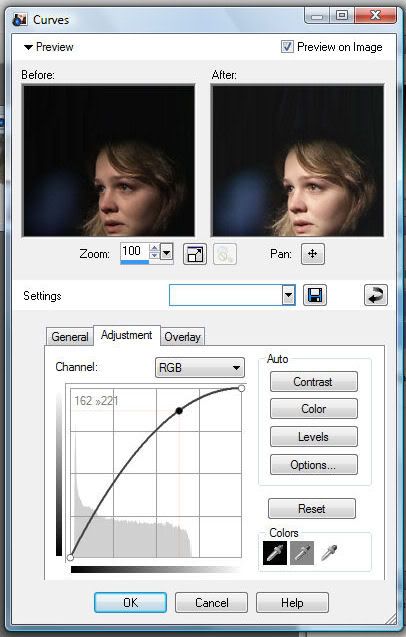
162>>221
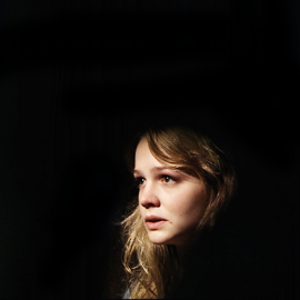
You can see the difference that makes - a lot brighter. Just what I wanted. There are still some grainy looking lines, and that blue light spot. You could probably use that, but I didn't like it, so I made a new raster layer and took a soft brush and painted over it in black. That gave me this:
♪ step 2: coloring
I didn't do anything else to Sally Sparrow because I already knew that I wanted it red. So I made a new fill layer with #f40b00, and set that to Darken at 100% opacity. I had to play around to get a good color. (If you want a lighter red - like #f9665f, for instance, which is the color I used for the word "BLINK" - then use Multiply instead of Darken. You can use Multiply for the color I chose, too, obviously, but it's a little bit darker.)
That will give us this:

Yep, happy with that, so I resized it to 100x100px. Then I copied a merged layer and pasted it on top. I sharpened that with Adjust>>Sharpen>>Sharpen, but that was too sharp, so I just lowered the opacity of that layer.
♪ step 3: textures
Just the red and black gives a lot of contrast, and I wanted a grungy look. So I found this texture in my folder:

(by shoqolad I believe)
I pasted that as a new layer and set it to Screen. I lowered the opacity a little, too - to about 50%.
It was still a little too much, but I didn't like it lowered further, either. I realized, then, that it was just obscuring Sally Sparrow too much, so I made a new Show All mask layer and painted over her face.

>gives us>
♪ step 3: text
I already knew what I wanted the icon to say ("don't blink") so I just had to find a font. I used League Gothic, which is a great font for big words in all caps like this. I wrote DON'T in white, and BLINK in #f9665f. The text was a little too big to fit on the icon, so I tried making it smaller, or moving it down like that. Luckily, you can see the "BLINK" and Sally Sparrow and know exactly what it says - so even though the top part of "DON'T" isn't visible I think it's still readable. Some people don't like text cut off like that, and maybe I could have scooted it up more so that triangle in the "N" doesn't show, but I really like how it turned out, so. It was worth it to have that bit cut off.
I had to adjust it a little bit to get the words lined up like that, and I set the stroke width to 0. I moved the text under the texture layer, so it would have that grungy look, too. Otherwise, it's too strong. I wanted a faded look, so I selected the text (Selections>>From Vector Object) and then added another Show All mask layer.
Then, I got a white to black gradient, and a really soft brush at about 60% opacity or so and painted over the text. The top was fine, but the bottom stood out too much, so I masked that a little more. I also masked away a little more of the text right over her head, too, just sort of following the curve of her head - that's really, really subtle, though, so you might not be able to tell.
♪ step 4: finishing touches
I added two small light blobs on a new layer on top of the icon. This was because I wanted it to be a little more "cloudy," if that makes sense. I took white with a soft brush about 24px or so, at a mid to low opacity and painted two dots - one on the right side of Sally, and one on the left side, just about level with her eyes. Then I used Gaussian Blur with radius: 13. I left the layer at 100% opacity.
On a black background, the blobs wound up looking like this:
One final thing! Sally is really bright red, so I went to Hue/Saturation/Lightness and pulled the Saturation down to -6. It's a really subtle change, but I think it makes the icon look a tad grungier, fading Sally a little more into the background, and better overall. And we're done!
This is... pretty simple, actually; it's actually just showing you how to make icons similar to this one, so I guess it's only helpful if you're going for this look. Ahh well. Um. I haven't uploaded the .psd because I didn't think anybody would want it, but I could if someone was interested.
Made using PSP XI
But fully translatable, I believe
♪ step 1: prepare a base
Now I started this icon thinking "I want a Sally Sparrow icon!" And then I thought black-and-white-ish, and I had the idea it would say "Don't blink." I'm a beginner maker, so this isn't exactly advice it's just me, but: I tend to just go through pretty screencaps until I find something I like - I mean, sometimes I do have an idea (with this icon), but more of the time I just want a good picture. So! I went hunting for a screen cap. I found this cap from killcolor (which is a fantastic resource) and was really happy with it.
So first, I resized the cap to 300px width. Just to get a look at it. I knew I wanted Sally closer to the middle than to the side, so I cropped a little off the left side. That gave me this.I needed a square for my icon, so I changed the canvas size (Image>>Canvas Size) to 300x300px, with a #000000 background. There were some lines on the cap, so it didn't match exactly, so I just took the smudge brush and smudged them up. (That wasn't really necessary as I'm going to cover them up in a second. But. I just wanted to ensure it'd be a nice, consistent sort of background.)
I wanted to brighten it up, so I went to curves and pulled it up a little.
162>>221
You can see the difference that makes - a lot brighter. Just what I wanted. There are still some grainy looking lines, and that blue light spot. You could probably use that, but I didn't like it, so I made a new raster layer and took a soft brush and painted over it in black. That gave me this:
♪ step 2: coloring
I didn't do anything else to Sally Sparrow because I already knew that I wanted it red. So I made a new fill layer with #f40b00, and set that to Darken at 100% opacity. I had to play around to get a good color. (If you want a lighter red - like #f9665f, for instance, which is the color I used for the word "BLINK" - then use Multiply instead of Darken. You can use Multiply for the color I chose, too, obviously, but it's a little bit darker.)
That will give us this:
Yep, happy with that, so I resized it to 100x100px. Then I copied a merged layer and pasted it on top. I sharpened that with Adjust>>Sharpen>>Sharpen, but that was too sharp, so I just lowered the opacity of that layer.
♪ step 3: textures
Just the red and black gives a lot of contrast, and I wanted a grungy look. So I found this texture in my folder:
(by shoqolad I believe)
I pasted that as a new layer and set it to Screen. I lowered the opacity a little, too - to about 50%.
It was still a little too much, but I didn't like it lowered further, either. I realized, then, that it was just obscuring Sally Sparrow too much, so I made a new Show All mask layer and painted over her face.
>gives us>
♪ step 3: text
I already knew what I wanted the icon to say ("don't blink") so I just had to find a font. I used League Gothic, which is a great font for big words in all caps like this. I wrote DON'T in white, and BLINK in #f9665f. The text was a little too big to fit on the icon, so I tried making it smaller, or moving it down like that. Luckily, you can see the "BLINK" and Sally Sparrow and know exactly what it says - so even though the top part of "DON'T" isn't visible I think it's still readable. Some people don't like text cut off like that, and maybe I could have scooted it up more so that triangle in the "N" doesn't show, but I really like how it turned out, so. It was worth it to have that bit cut off.
I had to adjust it a little bit to get the words lined up like that, and I set the stroke width to 0. I moved the text under the texture layer, so it would have that grungy look, too. Otherwise, it's too strong. I wanted a faded look, so I selected the text (Selections>>From Vector Object) and then added another Show All mask layer.
Then, I got a white to black gradient, and a really soft brush at about 60% opacity or so and painted over the text. The top was fine, but the bottom stood out too much, so I masked that a little more. I also masked away a little more of the text right over her head, too, just sort of following the curve of her head - that's really, really subtle, though, so you might not be able to tell.
♪ step 4: finishing touches
I added two small light blobs on a new layer on top of the icon. This was because I wanted it to be a little more "cloudy," if that makes sense. I took white with a soft brush about 24px or so, at a mid to low opacity and painted two dots - one on the right side of Sally, and one on the left side, just about level with her eyes. Then I used Gaussian Blur with radius: 13. I left the layer at 100% opacity.
On a black background, the blobs wound up looking like this:
One final thing! Sally is really bright red, so I went to Hue/Saturation/Lightness and pulled the Saturation down to -6. It's a really subtle change, but I think it makes the icon look a tad grungier, fading Sally a little more into the background, and better overall. And we're done!
This is... pretty simple, actually; it's actually just showing you how to make icons similar to this one, so I guess it's only helpful if you're going for this look. Ahh well. Um. I haven't uploaded the .psd because I didn't think anybody would want it, but I could if someone was interested.