and if i show up ten past six.
yepp. i'm posting another one! and before you ask - no, i'm not totally insane. ok maybe a little =P
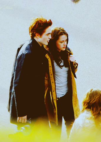
and how to turn that into this:

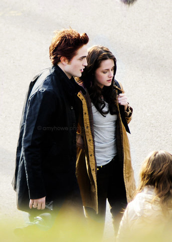
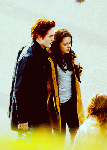
Step 1: Pick an image! I picked this one of e&b:
Step 2: Open a curves layer (layer/new adjustment layer/curves) and apply these settings:
Point 1 - input: 53, output: 67
Point 2 - input: 182, output: 197
Step 3: Open a selective color layer (layer/new adjustment layer/selective color) and apply these settings:
Reds
Cyan: -55
Magenta: 72
Yellow: 100
Yellows
Cyan: -100
Magenta: -67
Yellow: 100
Cyans
Cyan: 100
Whites
Black: -51
Blacks
Black: 11
Set this layer to an opacity of 50!

Step 4: Open a hue/saturation layer (layer/new adjustment layer/hue/saturation) and apply these settings:
Master
Saturation: 30

Step 5: Open a selective color layer (layer/new adjustment layer/selective color) and apply these settings:
Reds
Cyan: -24
Magenta: 6
Yellow: 100
Yellows
Cyan: -12
Yellow: 31
Cyans
Cyan: 100
Neutrals
Cyan: 5
Magenta: -9
Yellow: -13
Step 6: Open a levels layer (layer/new adjustment layer/levels) and apply these settings:
RBG
28 - 1.90 - 225

Step 7: Open a color fill layer (layer/new adjustment layer/color fill), add a dark brown color (1b0303) and set it to exclusion.
Step 9: Open a color fill layer (layer/new adjustment layer/color fill), add a dark brown/yellowish color (1a1704) and set it to exclusion.
Step 10: now the coloring part is finished and we'll move on to actually making the icon! resize the image so it has a width of 100 px , then copy and paste that onto a new 100x100 blank canvas (I DONO WHAT TO CALL IT ROFL!) and adjust it so that the image is located on the lower half.
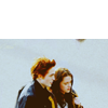
Step 11: what you want to do next is color in the background so that it looks like it's part of the image. it's very very very simple - simply use the eyedropper tool, select the color of the blue in the image and fill in the background with that color (for this specific icon it's c8dae3). Use a fuzzy eraser on the actual image to even it out and make it blend in. I TOLD YOU IT WAS SIMPLE!
Step 12 (optional): merge all layers and duplicate it. Sharpen it and set that layer to 50%.
AND YOU'RE DONE! phew.
keep in mind that you need to adjust the settings depending on the image you're using!
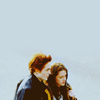
other icons that have been made using this coloring: