Over-sharpened???
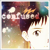
I'm sorta depressed. I've been working on some icons for the past weeks, and they looked alright back home, in my comp. Now, I took them to work (where I have free Internet connection), and they look awfully sharpened in this monitor.
I need your help, fellow LJers, artists and anyone seeing this. Do they look over-sharpened to you? This is a sample, but all others look pretty much the same.




So, what do I do? Are they really over-sharpened? How do I fix them, or my work/home comp?
Edit: I use Photoshop 7.
Edit 2: Crossposted to a ridiculous number of places, 'cause I'm insecure like that.
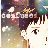
UPDATE: After careful consideration of each and every one of your advices, I've added a gaussian-blurred (4.0) duplicate layer set on soft light to each icon. See the difference? I do, sorta.


I need your help, fellow LJers, artists and anyone seeing this. Do they look over-sharpened to you? This is a sample, but all others look pretty much the same.


So, what do I do? Are they really over-sharpened? How do I fix them, or my work/home comp?
Edit: I use Photoshop 7.
Edit 2: Crossposted to a ridiculous number of places, 'cause I'm insecure like that.
UPDATE: After careful consideration of each and every one of your advices, I've added a gaussian-blurred (4.0) duplicate layer set on soft light to each icon. See the difference? I do, sorta.
