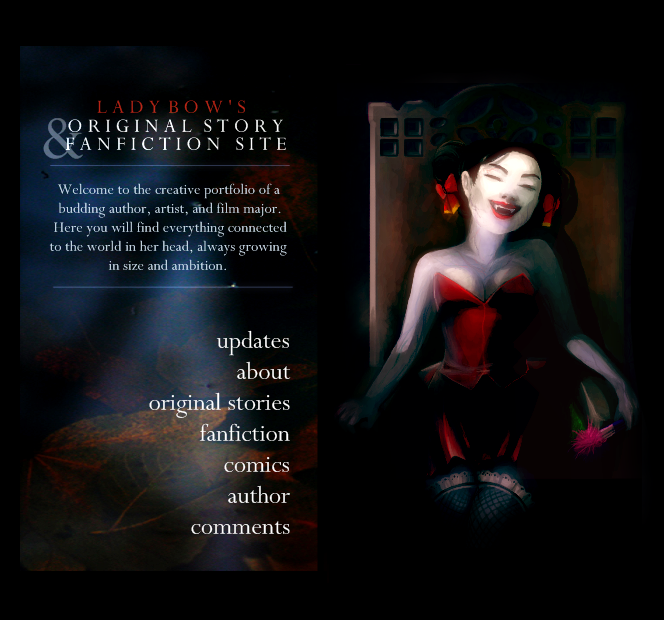
Website Layout (5.0) Ideas

I'm going to make these the colors and main graphic(s) for the next layout, whenever I decide to design it. It'll probably happen really slowly, because I'm still mostly content with the old layout (and I get a bit sentimental about replacing them. ._.)
My goal is actually to do rather the opposite of what I currently have up, though, truth be told. I want the layout graphics to be less of the focus. There will still be a nice backdrop and everything, but I want to make sure that the content is popping.
Content-wise, instead of just going "here you go, all the links to my stories", I wanted to make a clearer picture of what I'm trying to do with all the stories and why I'm in school. I figured that when I transfer to Uni and start pursuing my degrees, this type of approach would be more welcoming to the teachers/classmates/friends to which I might give the site link.
Also! The two story sections will not just be link and summary lists - they'll be like.. uhh, like the little food stands in Downtown Portland X3, where each story has its own short concise display. If they have art and logos, then I will incorporate that into the listing. It'll still have the synopsis, rating, start date; all that stuff, but yeah, it'll just give you a better taste of it.
There is logic behind this, by the way, which is that people operate very visually and I want to take advantage of it. I mean, just the other day, someone read through He's There but told me that they had been overlooking it for a while until they (somehow) found the art on DA and went to the site. And I know she's not that first person to say that. So... even though I like words and I hope my story stands on its own, I can't deny the fact that these other things draw in otherwise disinterested people. :)
Well, now that I've prattled my heart out, what do you think??? :D