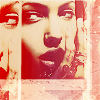
Tutorial #12 - angie_challenge09 [Angelina Jolie]
I bet you always wanted how to make 
This is not the order I did things, but the order of the layouts, going from bottom on to top. Also, um, this tutorial isn't all that good, because you'll find I never remember which brushes I use. That being said...

I took the image offered at angie_challenge [join!], cropped it, duplicated the images two times and placed them the way I wanted. Merged all images together. [Normal, 100%]

-->
I duplicated that merged image, and sharpened. [Screen, 85%]

-->
Gradients, because they are so useful. [Soft Light, 43%]

-->
This is something I have in pretty much every icon I make - desaturated copy of the layer. Duplicate the base, go to Colors --> Adjust --> Hue/Saturation/Lightness, and set it to Hue: 2, Saturation: -100, Lightness: 0 [Soft Light, 100%]

-->
I said already that gradients are useful, right? So here's another one. [Lighten, 100%]

-->
Another copy of the desaturated base, because I wanted it to be less faded. [Soft Light, 100%]

-->
Annnnd another gradient! [Darken, 82%]

-->
I have no idea who made this brush {dark parts}, but it's some kind of 'fabric' brush. [Burn, 51%]

-->
Added borders in #EFD5AF between the images. Made it using the Draw tool with anti-alias on, width 3, set to single line. [Normal, 100%]

-->
Another brush, possibly made by inxsomniax. [Screen, 100%]

This is not the order I did things, but the order of the layouts, going from bottom on to top. Also, um, this tutorial isn't all that good, because you'll find I never remember which brushes I use. That being said...

I took the image offered at angie_challenge [join!], cropped it, duplicated the images two times and placed them the way I wanted. Merged all images together. [Normal, 100%]

-->

I duplicated that merged image, and sharpened. [Screen, 85%]

-->

Gradients, because they are so useful. [Soft Light, 43%]

-->

This is something I have in pretty much every icon I make - desaturated copy of the layer. Duplicate the base, go to Colors --> Adjust --> Hue/Saturation/Lightness, and set it to Hue: 2, Saturation: -100, Lightness: 0 [Soft Light, 100%]

-->

I said already that gradients are useful, right? So here's another one. [Lighten, 100%]

-->

Another copy of the desaturated base, because I wanted it to be less faded. [Soft Light, 100%]

-->

Annnnd another gradient! [Darken, 82%]

-->

I have no idea who made this brush {dark parts}, but it's some kind of 'fabric' brush. [Burn, 51%]

-->

Added borders in #EFD5AF between the images. Made it using the Draw tool with anti-alias on, width 3, set to single line. [Normal, 100%]

-->

Another brush, possibly made by inxsomniax. [Screen, 100%]