A few things
A couple questions:
1. Does anyone find the numbered preview icons useful? I still number the previews in case someone wants to find a certain icon more easily, but I've noticed that no one numbers their preview icons anymore, so maybe it's unnecessary.
2. When using frames (like these picture frames or these polaroids), do you prefer that the inside part be black, white, or transparent? For my future reference.
It's been almost a month since I've last made an icon post, but do know that I have some stuff planned! I've made some icons and have been chipping away at a Pushing Daisies picspam (!). I also made some scans of Victorian calling cards and have set to work making the backgrounds transparent (ugh that's so time-consuming; does anyone have any tips? I use PSP9). Here's a picture of two of the calling cards:
Aren't they pretty?
And last but not least, I'm participating in the best and worst icons meme! If you have time, I'd love to hear your comments. Don't be afraid to be honest with your critique; I'll survive. ;P
best and worst icons meme
1. Does anyone find the numbered preview icons useful? I still number the previews in case someone wants to find a certain icon more easily, but I've noticed that no one numbers their preview icons anymore, so maybe it's unnecessary.
2. When using frames (like these picture frames or these polaroids), do you prefer that the inside part be black, white, or transparent? For my future reference.
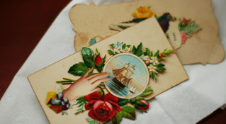
It's been almost a month since I've last made an icon post, but do know that I have some stuff planned! I've made some icons and have been chipping away at a Pushing Daisies picspam (!). I also made some scans of Victorian calling cards and have set to work making the backgrounds transparent (ugh that's so time-consuming; does anyone have any tips? I use PSP9). Here's a picture of two of the calling cards:
Aren't they pretty?
And last but not least, I'm participating in the best and worst icons meme! If you have time, I'd love to hear your comments. Don't be afraid to be honest with your critique; I'll survive. ;P
best and worst icons meme