Beginner Font Tutorial for Land of Art!
BEST FONTS FOR BEGINNING ICON MAKERS
Glossary of terms
Serif: the little feet and flags and types like Times New Roman.
Sans serif: Without serifs, such as Arial or Helvetica
Kerning: The way the letters sit next to each other in the words, and the spaces between each letter. Kerning is the process of adjusting this space when the letters do not lie together correctly.
Leading: Leading is how each line of text sits on top of each other and the adjustments of the space between.
Special characters: Punctuation marks and letters with different accent marks.
When I first began making graphics and wandered off into the wilds of free fonts such as dafont.com, I became a bit...overloaded. How to choose among so many different fonts! This script is so pretty! Look at this Curlz inspired font! So awesome!
Then I quickly discovered when I began making icons, that not only do many of these fonts not have special characters or the ability to kern, but when reduces to 100x100 pixels...they pretty much became impossible to read! I wished I had someone to tell me what "worked" as far as fonts for good icons went, without having to shell about a bunch of money for fonts, or to download expensive fonts illegally.
So in the interests of keeping more beginning icon makers from making the same mistakes, I present: The Best Fonts to Use for Beginning Icon and Graphics Makers!

The sans serif typeface is one of the most important mainstays of typography and design in general. Therefore, every icon and graphics makers should have several good one's at their disposal. They may seem "boring" but when used properly, they are perfect.
Because of the more modern feel of sans serifs they can be used very well on humorous statements, political statements, or fandom icons! Their uses are many and varied!
The most obvious choices here are
Arial and
Verdana (default for Windows PCs) and Helvetica and Futura (default for Mac PCs). Don't limit yourself to either of these pairs though!
In my experience, you can use Arial, Verdana, and Helvetica fairly interchangeably. All are pretty much ubiquitous as far as typefaces go. For a more futuristic look or a condensed typeface, then use Futura. If you do not have Futura, I will be providing an alternative! Please don't use Trebuchet though....I just think it's such an ugly font XD
One good free download that has a bit more character to it than either Arial or Helvetica is Alte Haas Grotesk. It is based on the forefather of Helvetica (which was in turn the forefather of Arial), Akzidenz Grotesk. This variation on the classic has it's own quirks, giving the type an almost unnoticeably distress that harkens to the metal pressed type that it is based on. It also contains most of the special characters, which makes it a gem, imo.
For those who want a font with a vintage or retro feel Aubrey is probably your best bet. It has a fun throwback feel without being overwhelming. It doesn't have all special characters, but it has enough. If you are in a fandom such as Mad Men or Zodiac or just want a funky vintage font, then this one will do the job.
Avant Garde is perhaps one of the more famous/iconic fonts, but it's really expensive! Take it from me, you don't need that font when you can have Caviar Dreams. It comes in four weights, has all special characters and has roughly the same style kerning as Avant Garde (which to be fair, isn't saying much). HOWEVER, like Avant Garde the kerning is very touchy! Some letters just don't sit well next to each other in Avant and Avant inspired fonts.
Gotham is quickly becoming one of the most popular fonts for designers. Which is good as it's absolutely beautiful, but bad, because like most fonts it is expensive as hell. Luckily, most icons which require Gotham or a Gotham-like font, are also only in caps text. A free alternative to Gotham for all your "Keep Calm, etc" icons is Code. It's clean, modern, and also has a Light and Bold family with it! If you need a Light font that is not all caps though I recommend District Thin.
As for a condensed font when Futura isn't working for you? Use Zag. It's more rounded, comes in more weights than Futura, and is more unique all around. For a more digital feel use Stahlbeton. For a less rounded feel use League Gothic.

AND
:
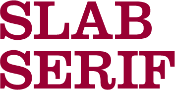
Serifs are the second oldest variety of type (hand written script beating it out of course). The serifs, the little tails and feet on the letters, were originally caused when Greeks and Romans chiseled things into walls. The only way to end the letterform cleanly was with such marks! The slab serif came later; it was originated as an advertising typeface, used for posters and large newsprint headlines.
Normal serif fonts should be used to add an aura of age or classicism. They go very well when you are doing something like literary or lyrical quotes, as well as historical quotes.
The default serif font for both Windows and Mac is Times New Roman, though some Macs now seem to default to Cambria as their serif font (which is silly to me as TNR is much nicer.) No matter how ubiquitous it may seem, Times is a classic, and is especially good for "quote" icons.
My personal favorite free serif font right now is Museo. To be perfectly honest, I recommend downloading all of this Foundry's fonts. They are quite brilliant and beautiful. Museo has a very dynamic feel used in many graphic design centric posters these days. It also has a slab serif version!
Fontin is more delicate than Museo and in a way reminds me of a softer Baskerville (another great default font if you have a Mac! for those who don't have a Mac a free version is available here: http://www.fontshop.com/freefonts/) or Mrs. Eaves. It kerns and leads very well, has a multitude of special characters and it just a genuinely beautiful font, and it's from the same Foundry as Museo. It also has a sans serif version :D
For a more severe Roman look go for Cardo, a German take on on the Modern serif font Bembo :) It's very extensive and even contains medieval characters. Another good font like this is Classicism Antiqua.
I am going to stress this very solemnly right now: Most slab serifs should not be used for icons. Slab serifs are large, bold and meant for display. They are good for banners, spreads and posters, but take them to icon size, and you lose what makes slab serifs so special! The only type of slab serifs I recommend for icon use is the typewriter font, but for your sake and mine avoid using Courier. American Typewriter is marginally better, but hopefully I will give you better options.
And if you use Trajan, God kills a puppy. Just an fyi.
A good one that works better on larger scale graphics is Just Old Fashion. It's fun, modern and very colorful in personality. Be aware of the kerning with this one though! Because the slabs are much thinner than average, they can easily get wedged under rounded letters.
For whatever reason, typewriter fonts are very popular. As I mentioned, Courier, as a font, sucks. It just does. It doesn't kern well, it's difficult to lead, and it's just sort of ugly. There are a wealth of free typewriter style slab serif fonts out there, but how to choose? First off, never get a distressed looking typewriter font, unless you intend to use it exclusively with large graphics. This is true of ALL GRUNGE FONTS. They might look good on icons before you shrink them, but when you do shrink them, they almost always become fuzzy and unreadable.
A good, classic cut typewriter slab serif is Typo Slab Serif. It's definitely in the family of typewriter styles slab serifs and lacks the distressed look which ruins so many otherwise good typewriter faces.
And a classic, yet somewhat digital slab serif, based on another highly successful digital font Eurostile Elite. It's kerns and leads well, and it just looks classy.
Also, if you have a Mac, Rockwell is a good stand-by.
Our final category is...
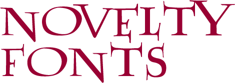
I'm not a huge fan of using novelty fonts, ngl. Some of the ugliest fonts to ever grace a computer are novelty fonts: Comic Sans, Papyrus, Rosewood, Giddyup, Tekton, Curlz, Lucida Handwriting.....Basically, it has to be a damn good font for me to recommend it as a novelty font. And note that pretty much the only use for novelty fonts is for display. If you try to write more than a line or two of text with a novelty font, then you are making a huge mistake and an abomination unto the Lord.
There are multiple types of novelty fonts (including specific novelty fonts inspired by fandoms, such as the pictured Harry Potter font. Lumos, or the broken glass Phantom of the Opera font), but the ones we will cover here are Digital, Retro, Script, and Comic Book/Rounded Type.

Digital fonts are best used for sci-fi inspired graphics and graphics that you want to look especially computer generated. Most digital fonts work well on all scales.
If you want an LED, digital clock feel, then File is probably your best option. Wonderful for display.
Juice is one of the few novelty fonts that can possibly even be used in body copy. Its digital edge is obvious, yet works much more subtly than other novelty types.
Orbitron is a wonderful digital/sci-fi font and my favorite as far as these four go. It sets wonderfully and doesn't take itself to seriously as a font.
And finally MKSD Ultra. It's digital and ultra light, as well as having all special characters.
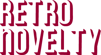
Never use a retro novelty font in body copy. Ever. There are no exceptions to this rule. They look better big but can also be used in icons, if they are a clear edged font.
If you don't want to go through the trouble of lining all your lettering up yourself to make a retro, 3D movie feel, then use Betlog Square Standard but ONLY FOR LARGE DISPLAY.
This one is also only for large display. Lot is inspired by the large chunky concert poster type of the 70s.
Deftone Stylus is a retro script which hearkens to many guitar company logos and for some reason surfing.
Remember the 50s back when cars were awesome and we didn't know how bad they were for the environment? Dymaxion Script is a perfect hearkening to old car logos etched in silver on the hood.
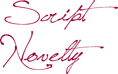
These are undoubtedly my least favorite types. There is only one that I use with any form of regularity and that is Learning Curve. It's an awesome font and the "stitched" font family that they add along with the regular family is really quirky and fun.
If you use script in body copy then you hate yourself and everyone else. It's incredibly hard to translate to icon size as well. I definitely recommend setting script type to Vivid Light on Blend Mode, though, as it makes an absolutely lovely texture. Avoid default script fonts like Monotype Corvisa and Lucida Handwriting.
The best free comic book font I have ever found is Digital Strip from BlamBot. Though this link only leads to the Regular version, it's actually a huge family and it's almost entirely free of charge. It contains all relevant special characters
As for free rounded type Bubble Body is the way to go. It as a lot more character and fun about it than a font like Arial Rounded.
I hope this has been helpful in locating you good free fonts and instructing you how to use different font types in different situations!
Glossary of terms
Serif: the little feet and flags and types like Times New Roman.
Sans serif: Without serifs, such as Arial or Helvetica
Kerning: The way the letters sit next to each other in the words, and the spaces between each letter. Kerning is the process of adjusting this space when the letters do not lie together correctly.
Leading: Leading is how each line of text sits on top of each other and the adjustments of the space between.
Special characters: Punctuation marks and letters with different accent marks.
When I first began making graphics and wandered off into the wilds of free fonts such as dafont.com, I became a bit...overloaded. How to choose among so many different fonts! This script is so pretty! Look at this Curlz inspired font! So awesome!
Then I quickly discovered when I began making icons, that not only do many of these fonts not have special characters or the ability to kern, but when reduces to 100x100 pixels...they pretty much became impossible to read! I wished I had someone to tell me what "worked" as far as fonts for good icons went, without having to shell about a bunch of money for fonts, or to download expensive fonts illegally.
So in the interests of keeping more beginning icon makers from making the same mistakes, I present: The Best Fonts to Use for Beginning Icon and Graphics Makers!

The sans serif typeface is one of the most important mainstays of typography and design in general. Therefore, every icon and graphics makers should have several good one's at their disposal. They may seem "boring" but when used properly, they are perfect.
Because of the more modern feel of sans serifs they can be used very well on humorous statements, political statements, or fandom icons! Their uses are many and varied!
The most obvious choices here are
Arial and
Verdana (default for Windows PCs) and Helvetica and Futura (default for Mac PCs). Don't limit yourself to either of these pairs though!
In my experience, you can use Arial, Verdana, and Helvetica fairly interchangeably. All are pretty much ubiquitous as far as typefaces go. For a more futuristic look or a condensed typeface, then use Futura. If you do not have Futura, I will be providing an alternative! Please don't use Trebuchet though....I just think it's such an ugly font XD
One good free download that has a bit more character to it than either Arial or Helvetica is Alte Haas Grotesk. It is based on the forefather of Helvetica (which was in turn the forefather of Arial), Akzidenz Grotesk. This variation on the classic has it's own quirks, giving the type an almost unnoticeably distress that harkens to the metal pressed type that it is based on. It also contains most of the special characters, which makes it a gem, imo.
For those who want a font with a vintage or retro feel Aubrey is probably your best bet. It has a fun throwback feel without being overwhelming. It doesn't have all special characters, but it has enough. If you are in a fandom such as Mad Men or Zodiac or just want a funky vintage font, then this one will do the job.
Avant Garde is perhaps one of the more famous/iconic fonts, but it's really expensive! Take it from me, you don't need that font when you can have Caviar Dreams. It comes in four weights, has all special characters and has roughly the same style kerning as Avant Garde (which to be fair, isn't saying much). HOWEVER, like Avant Garde the kerning is very touchy! Some letters just don't sit well next to each other in Avant and Avant inspired fonts.
Gotham is quickly becoming one of the most popular fonts for designers. Which is good as it's absolutely beautiful, but bad, because like most fonts it is expensive as hell. Luckily, most icons which require Gotham or a Gotham-like font, are also only in caps text. A free alternative to Gotham for all your "Keep Calm, etc" icons is Code. It's clean, modern, and also has a Light and Bold family with it! If you need a Light font that is not all caps though I recommend District Thin.
As for a condensed font when Futura isn't working for you? Use Zag. It's more rounded, comes in more weights than Futura, and is more unique all around. For a more digital feel use Stahlbeton. For a less rounded feel use League Gothic.

AND

:
Serifs are the second oldest variety of type (hand written script beating it out of course). The serifs, the little tails and feet on the letters, were originally caused when Greeks and Romans chiseled things into walls. The only way to end the letterform cleanly was with such marks! The slab serif came later; it was originated as an advertising typeface, used for posters and large newsprint headlines.
Normal serif fonts should be used to add an aura of age or classicism. They go very well when you are doing something like literary or lyrical quotes, as well as historical quotes.
The default serif font for both Windows and Mac is Times New Roman, though some Macs now seem to default to Cambria as their serif font (which is silly to me as TNR is much nicer.) No matter how ubiquitous it may seem, Times is a classic, and is especially good for "quote" icons.
My personal favorite free serif font right now is Museo. To be perfectly honest, I recommend downloading all of this Foundry's fonts. They are quite brilliant and beautiful. Museo has a very dynamic feel used in many graphic design centric posters these days. It also has a slab serif version!
Fontin is more delicate than Museo and in a way reminds me of a softer Baskerville (another great default font if you have a Mac! for those who don't have a Mac a free version is available here: http://www.fontshop.com/freefonts/) or Mrs. Eaves. It kerns and leads very well, has a multitude of special characters and it just a genuinely beautiful font, and it's from the same Foundry as Museo. It also has a sans serif version :D
For a more severe Roman look go for Cardo, a German take on on the Modern serif font Bembo :) It's very extensive and even contains medieval characters. Another good font like this is Classicism Antiqua.
I am going to stress this very solemnly right now: Most slab serifs should not be used for icons. Slab serifs are large, bold and meant for display. They are good for banners, spreads and posters, but take them to icon size, and you lose what makes slab serifs so special! The only type of slab serifs I recommend for icon use is the typewriter font, but for your sake and mine avoid using Courier. American Typewriter is marginally better, but hopefully I will give you better options.
And if you use Trajan, God kills a puppy. Just an fyi.
A good one that works better on larger scale graphics is Just Old Fashion. It's fun, modern and very colorful in personality. Be aware of the kerning with this one though! Because the slabs are much thinner than average, they can easily get wedged under rounded letters.
For whatever reason, typewriter fonts are very popular. As I mentioned, Courier, as a font, sucks. It just does. It doesn't kern well, it's difficult to lead, and it's just sort of ugly. There are a wealth of free typewriter style slab serif fonts out there, but how to choose? First off, never get a distressed looking typewriter font, unless you intend to use it exclusively with large graphics. This is true of ALL GRUNGE FONTS. They might look good on icons before you shrink them, but when you do shrink them, they almost always become fuzzy and unreadable.
A good, classic cut typewriter slab serif is Typo Slab Serif. It's definitely in the family of typewriter styles slab serifs and lacks the distressed look which ruins so many otherwise good typewriter faces.
And a classic, yet somewhat digital slab serif, based on another highly successful digital font Eurostile Elite. It's kerns and leads well, and it just looks classy.
Also, if you have a Mac, Rockwell is a good stand-by.
Our final category is...

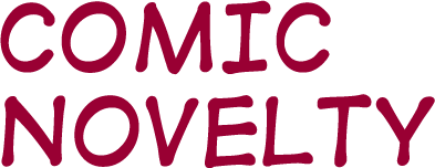
I'm not a huge fan of using novelty fonts, ngl. Some of the ugliest fonts to ever grace a computer are novelty fonts: Comic Sans, Papyrus, Rosewood, Giddyup, Tekton, Curlz, Lucida Handwriting.....Basically, it has to be a damn good font for me to recommend it as a novelty font. And note that pretty much the only use for novelty fonts is for display. If you try to write more than a line or two of text with a novelty font, then you are making a huge mistake and an abomination unto the Lord.
There are multiple types of novelty fonts (including specific novelty fonts inspired by fandoms, such as the pictured Harry Potter font. Lumos, or the broken glass Phantom of the Opera font), but the ones we will cover here are Digital, Retro, Script, and Comic Book/Rounded Type.

Digital fonts are best used for sci-fi inspired graphics and graphics that you want to look especially computer generated. Most digital fonts work well on all scales.
If you want an LED, digital clock feel, then File is probably your best option. Wonderful for display.
Juice is one of the few novelty fonts that can possibly even be used in body copy. Its digital edge is obvious, yet works much more subtly than other novelty types.
Orbitron is a wonderful digital/sci-fi font and my favorite as far as these four go. It sets wonderfully and doesn't take itself to seriously as a font.
And finally MKSD Ultra. It's digital and ultra light, as well as having all special characters.

Never use a retro novelty font in body copy. Ever. There are no exceptions to this rule. They look better big but can also be used in icons, if they are a clear edged font.
If you don't want to go through the trouble of lining all your lettering up yourself to make a retro, 3D movie feel, then use Betlog Square Standard but ONLY FOR LARGE DISPLAY.
This one is also only for large display. Lot is inspired by the large chunky concert poster type of the 70s.
Deftone Stylus is a retro script which hearkens to many guitar company logos and for some reason surfing.
Remember the 50s back when cars were awesome and we didn't know how bad they were for the environment? Dymaxion Script is a perfect hearkening to old car logos etched in silver on the hood.

These are undoubtedly my least favorite types. There is only one that I use with any form of regularity and that is Learning Curve. It's an awesome font and the "stitched" font family that they add along with the regular family is really quirky and fun.
If you use script in body copy then you hate yourself and everyone else. It's incredibly hard to translate to icon size as well. I definitely recommend setting script type to Vivid Light on Blend Mode, though, as it makes an absolutely lovely texture. Avoid default script fonts like Monotype Corvisa and Lucida Handwriting.

The best free comic book font I have ever found is Digital Strip from BlamBot. Though this link only leads to the Regular version, it's actually a huge family and it's almost entirely free of charge. It contains all relevant special characters
As for free rounded type Bubble Body is the way to go. It as a lot more character and fun about it than a font like Arial Rounded.
I hope this has been helpful in locating you good free fonts and instructing you how to use different font types in different situations!