"The gratification comes in the doing, not in the results."
How well does that James Dean quote go with all this graphics making? ;) Making is at least half the fun, but I do enjoy seeing the end results and admiring my handiwork, at least sometimes. Inspired by all the beautiful icon posts I've seen recently, I decided to finally update my journal. About time, too! Always new challenges with new icons to make, and they just seem to accumulate... Well, here are some fruits of my labour.
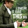
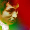
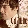
Jane Austen heroes (regency_stills), The Kingdom of Heaven (period_stills)
01.
02.
03.
04.
I was thrilled to get 3rd place for #01. :) Especially with a Henry icon! The cap just begged for that line, but I now wish I'd done a little more with it than just put the text there. And what about the colouring on #02? Poor Henry looks so sickly with that green face... :P
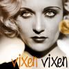
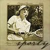
Carole Lombard (classics_stills)
05.
06.
07.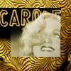
08.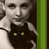
When I saw the beautiful images for this classics_stills challenge I simply had to join the community. I had fun experimenting with different textures and effects. The sporty #05 placed 4th. :)
Regency fashion plates (regency_stills)
09.
10.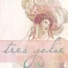
11.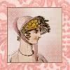
12.
13.
14.
15.
I love fashion plates and have used them for graphics before, so these were a joy to make. #15 was an alternative that I didn't enter as it didn't quite fit the more serious tone of my other entries.
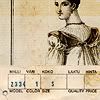
Vintage magazine covers (silver_stills)
16.
17.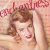
These were quite fun to make. The three-dimensional look on the second one was a last minute decision, but it worked quite well. I even got Mod's Choice for it. :)
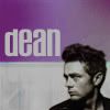
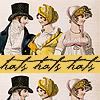
James Dean (silver_stills)
18.
19.
20.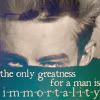
21.
22.
23.
24.
25.
26.
James Dean! *sigh* All photos of him are so good they wouldn't need any revamping at all. Even so, I had to try and add some colour and textures on them. I entered 18, 19 and 20. The others are the best of the rest. :)
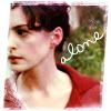
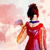
Becoming Jane (regency_stills, period_stills)
27.
28.
29.
30.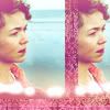
I had several good quotes from the film, but they didn't seem to fit well in such a confined space. I think I'll need to experiment further, or make some siggies instead...
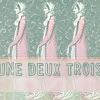
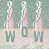
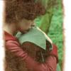
The Wizard of Oz (C19)
31.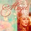
32.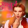
33.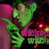
34.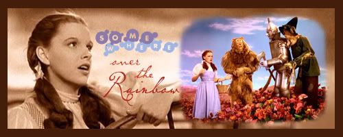
Siggies have been my forte in the C19 challenges so far, but this time I struggled to make one. I'm not too pleased with the end result. The border is a little too prominent, but I like the contrast of the sepia and the colours. I won 1st place for icon #31.
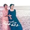
Pride & Prejudice (C19)
35.
36.
37.
38.
Had a little fun with colours, fonts and light textures... I got 3rd place for #35.
Jane Austen heroes (regency_stills), The Kingdom of Heaven (period_stills)
01.
02.
03.
04.
I was thrilled to get 3rd place for #01. :) Especially with a Henry icon! The cap just begged for that line, but I now wish I'd done a little more with it than just put the text there. And what about the colouring on #02? Poor Henry looks so sickly with that green face... :P
Carole Lombard (classics_stills)
05.
06.
07.
08.
When I saw the beautiful images for this classics_stills challenge I simply had to join the community. I had fun experimenting with different textures and effects. The sporty #05 placed 4th. :)
Regency fashion plates (regency_stills)
09.
10.
11.
12.
13.
14.
15.
I love fashion plates and have used them for graphics before, so these were a joy to make. #15 was an alternative that I didn't enter as it didn't quite fit the more serious tone of my other entries.
Vintage magazine covers (silver_stills)
16.
17.
These were quite fun to make. The three-dimensional look on the second one was a last minute decision, but it worked quite well. I even got Mod's Choice for it. :)
James Dean (silver_stills)
18.
19.
20.
21.
22.
23.
24.
25.
26.
James Dean! *sigh* All photos of him are so good they wouldn't need any revamping at all. Even so, I had to try and add some colour and textures on them. I entered 18, 19 and 20. The others are the best of the rest. :)
Becoming Jane (regency_stills, period_stills)
27.
28.
29.
30.
I had several good quotes from the film, but they didn't seem to fit well in such a confined space. I think I'll need to experiment further, or make some siggies instead...
The Wizard of Oz (C19)
31.
32.
33.
34.
Siggies have been my forte in the C19 challenges so far, but this time I struggled to make one. I'm not too pleased with the end result. The border is a little too prominent, but I like the contrast of the sepia and the colours. I won 1st place for icon #31.
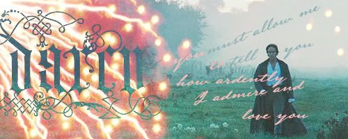
Pride & Prejudice (C19)
35.
36.
37.
38.
Had a little fun with colours, fonts and light textures... I got 3rd place for #35.