2012 Icon Progression
I decided to put together my own icon progression just as a visual to myself on how much I’ve improved. I’m excited to move forward into a new year and having great fun with new techniques. I can’t wait to learn more and get even better!
What I did here was go through each batch of my icons, explain a little bit about where I was in my iconning at that point, and pick out a few of my favorites from each batch. Enjoy!
I started iconning in April of 2012, and when I say I started iconning, I mean I started Photoshopping too. I had never even opened PS before I attempted my first batch of icons, so I was a complete and total noob about everything. I also sucked in the beginning. A lot. But, well, most people do. Live and learn :P
These are from my first batch of icons. I think all I really knew at this point was vibrance, so all I did was crop and make things a little bit more colorful. Go me. Despite that, I actually like these icons, and I even use a couple still.

This next batch was my first ever attempt at an icontest. I entered celebs20in20, and even managed to place! I can see now these icons aren’t great like, at all, but duuuuude, I was so freaking proud of these. I thought I’d automatically be like, the top dawg iconmaker right off the bat. And also, if you couldn’t tell, it was my first time trying to cut a subject out of the background. Just looking at the horrible cutout makes me cringe now :\


I discovered textures here, but unfortunately I didn’t know about blending modes or layer masks, so everything was just kind of plopped on and then opacity was reduced until I could kind of see through the texture. Also, more horrible removing subjects from backgrounds.


And FINALLY, I discovered blending modes. And layer masks. And text. Although I wasn’t very good at any of them. I remember thinking this was a superbly creative icon batch, though, and gosh darn it, why the heck didn’t I win anything?!?!

More stock! This was my last batch of stock icons, and I still love it. I kind of miss doing stock icons now that I think about it. Maybe I’ll try some more :)


This isn’t my best batch of icons by far, but I think my first attempt at inspired20in20 marks a change in my iconning. I started to be more focused on what I was doing. I started using more advanced techniques and being more aware of the quality of my icons. They’re still not great, but this is where I think they started improving.
And then I completely backtracked and made this post. I still hate everything about it to this day. I don’t think I got any votes in this contest, and it took me awhile to regain my confidence after this.
I entered a few weekly icontests and flash challenges, and this was just an icon dump post. Some of them I liked, some were just okay. They were all a ton better than my previous batch though.
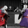
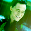
This is still one of my favorite batches of icons. This was THE turning point in my iconmaking, the moment when I really think I went from complete amateur to someone with decent skills. I thought more about what I wanted my icons to look like, I had a picture in my head and could reasonably achieve it. All around, it was kind of a big moment for me. Also, Loki is very fun to icon.
This was another big moment for me, because it was the first time I actually won some serious awards in an icontest. I placed a lot, and it was kind of amazing :)


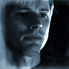
Just another icon dump post from various places. My text and coloring was really starting to improve, and I discovered blue was a really easy color for me to wrok with.


I tried out blocking for the first time. I was really happy at first with the results, but looking back at them now....not so much. I still think this was a good batch though.


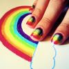
I really went overboard with the vibrancy, but I don’t even care. I had way too much fun making these icons. COLORRRRRS!!!!


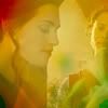
I tried more muted, natural colorings. It’s not really my thing, and I didn’t stick with for long. I really like my colors.


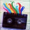
I DISCOVERED GRUNGE. This was where I first started playing with grunge textures, and I haven’t looked back. Dude, grunge is my THING XD


Most of these were actually made before my previous batch, so there was no grunge at all. I was working on my coloring though. I think I’m starting to improve! I also started to play with composition, which is something I hope to improve a lot on in 2013.


I’m not thrilled with my last batch of 2012. Most of them were made in a rush for an icon battle, but I got to experiment more with grunge, and I got a bit more creative in my cropping, so...meh. What can you do? I do like some icons from this batch, so I don’t consider it a total loss :P


Overall, I’m really pleased with where I am in iconning. I’ve gotten into some elite comms, and I hope the trend continues. What I really want to focus on in 2013 is really being more creative with my composition, coloring, and text use. I’m not going to be afraid to do something weird and totally creative and out of the box (which, btw, is why this round of inspired20in20 is seriously the best thing ever).
And that’s a wrap. I hope you liked my progression!
What I did here was go through each batch of my icons, explain a little bit about where I was in my iconning at that point, and pick out a few of my favorites from each batch. Enjoy!
I started iconning in April of 2012, and when I say I started iconning, I mean I started Photoshopping too. I had never even opened PS before I attempted my first batch of icons, so I was a complete and total noob about everything. I also sucked in the beginning. A lot. But, well, most people do. Live and learn :P
These are from my first batch of icons. I think all I really knew at this point was vibrance, so all I did was crop and make things a little bit more colorful. Go me. Despite that, I actually like these icons, and I even use a couple still.
This next batch was my first ever attempt at an icontest. I entered celebs20in20, and even managed to place! I can see now these icons aren’t great like, at all, but duuuuude, I was so freaking proud of these. I thought I’d automatically be like, the top dawg iconmaker right off the bat. And also, if you couldn’t tell, it was my first time trying to cut a subject out of the background. Just looking at the horrible cutout makes me cringe now :\
I discovered textures here, but unfortunately I didn’t know about blending modes or layer masks, so everything was just kind of plopped on and then opacity was reduced until I could kind of see through the texture. Also, more horrible removing subjects from backgrounds.
And FINALLY, I discovered blending modes. And layer masks. And text. Although I wasn’t very good at any of them. I remember thinking this was a superbly creative icon batch, though, and gosh darn it, why the heck didn’t I win anything?!?!
More stock! This was my last batch of stock icons, and I still love it. I kind of miss doing stock icons now that I think about it. Maybe I’ll try some more :)
This isn’t my best batch of icons by far, but I think my first attempt at inspired20in20 marks a change in my iconning. I started to be more focused on what I was doing. I started using more advanced techniques and being more aware of the quality of my icons. They’re still not great, but this is where I think they started improving.
And then I completely backtracked and made this post. I still hate everything about it to this day. I don’t think I got any votes in this contest, and it took me awhile to regain my confidence after this.
I entered a few weekly icontests and flash challenges, and this was just an icon dump post. Some of them I liked, some were just okay. They were all a ton better than my previous batch though.
This is still one of my favorite batches of icons. This was THE turning point in my iconmaking, the moment when I really think I went from complete amateur to someone with decent skills. I thought more about what I wanted my icons to look like, I had a picture in my head and could reasonably achieve it. All around, it was kind of a big moment for me. Also, Loki is very fun to icon.
This was another big moment for me, because it was the first time I actually won some serious awards in an icontest. I placed a lot, and it was kind of amazing :)
Just another icon dump post from various places. My text and coloring was really starting to improve, and I discovered blue was a really easy color for me to wrok with.
I tried out blocking for the first time. I was really happy at first with the results, but looking back at them now....not so much. I still think this was a good batch though.
I really went overboard with the vibrancy, but I don’t even care. I had way too much fun making these icons. COLORRRRRS!!!!
I tried more muted, natural colorings. It’s not really my thing, and I didn’t stick with for long. I really like my colors.
I DISCOVERED GRUNGE. This was where I first started playing with grunge textures, and I haven’t looked back. Dude, grunge is my THING XD
Most of these were actually made before my previous batch, so there was no grunge at all. I was working on my coloring though. I think I’m starting to improve! I also started to play with composition, which is something I hope to improve a lot on in 2013.
I’m not thrilled with my last batch of 2012. Most of them were made in a rush for an icon battle, but I got to experiment more with grunge, and I got a bit more creative in my cropping, so...meh. What can you do? I do like some icons from this batch, so I don’t consider it a total loss :P
Overall, I’m really pleased with where I am in iconning. I’ve gotten into some elite comms, and I hope the trend continues. What I really want to focus on in 2013 is really being more creative with my composition, coloring, and text use. I’m not going to be afraid to do something weird and totally creative and out of the box (which, btw, is why this round of inspired20in20 is seriously the best thing ever).
And that’s a wrap. I hope you liked my progression!