Tutorial 10
Tutorial requested by helenbutterfly. This tutorial is very graphic heavy, contains numerous steps and involves some selective coloring.
I'll show you how to go from:
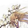
to
Made with Photoshop CS2.

Start off with our base, with credit to clamp_visual. This one is already quite sharpened so I just leave it as is.

The next few steps (including this one) follow the Aged Plum tutorial. Add a new layer and fill it with #6FBE57 and set it to Color Burn, 66%.
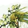

Create a new layer and fill with #03073B and set to Exclusion, 100%. The white patch at the top is really prominent now, but I'll cover that up later.
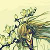

Fill another new layer with #A09E72, and set to Darken, 44%.
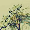

Add a new layer and fill with #FFA9A9, set to Soft Light, 100%.
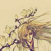

Fill another new layer with #EE9BA9, and set to Soft Light, 100%.
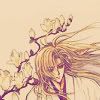
Duplicate your base, bring to the top and set to Soft Light, 100%. I Blur my this layer a bit because at the end, the lineart for Kakyou came out rather strong.
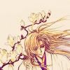
I add a New Adjustment Layer > Color Balance and a New Adjustment Layer > Selective Color. Now it's starting to look better.
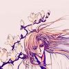
This is where I cover up that obtrusive splotch of random white at the top. I grab a texture by 77words. I desaturate the texture because I'm not going for a particularly strong colour scheme (I decided to make the icon predominantly white as was the theme for clamp_visual), then I set to the layer mode to Multiply, 100%. Now, you can either take the eraser tool and erase what covers Kakyou or add a New Adjustment Layer > Layer Mask > Reveal All, then take a black brush and go over the texture that covers Kakyou, which will essentially erase that part the texture. On your layer palette, the layer mask must be selected; it should look like this.
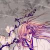
Duplicate the texture twice. Set the first layer (bottom one) to Color Burn and lower the opacity to around 40-60%. Now set the second layer (top one) to Overlay, 100%. I know the effect looks rather strong right now.
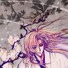
Now it's time to add colour to the icon. I grab two rather dull colour textures (remember I'm going a somewhat white colour scheme, although the icon turned out a little beigey) by 77words.
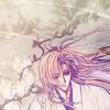
Next, duplicate your base twice and bring both layers to the top. Set both to Soft Light. The first layer, leave at 100% and the second, I lower to around 40% so the icon isn't too bright. Now I add a Gaussian Blur or around 2 to the second layer (lower opacity one) and then I go Image > Adjustments > Hue and Saturation and I lower the Lightness bar.
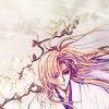
I add another Selective Color Layer to bring out the white a bit more and give the icon a but more contrast.
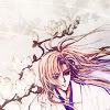
Lastly, add any finishing touches like text or whatever and you're done!

As always, tutorials require experimentation as results will vary depending on your image and the settings you use. Feel free to ask any questions, give feedback or show me your results. :3
I'll show you how to go from:

to

Made with Photoshop CS2.

Start off with our base, with credit to clamp_visual. This one is already quite sharpened so I just leave it as is.

The next few steps (including this one) follow the Aged Plum tutorial. Add a new layer and fill it with #6FBE57 and set it to Color Burn, 66%.


Create a new layer and fill with #03073B and set to Exclusion, 100%. The white patch at the top is really prominent now, but I'll cover that up later.


Fill another new layer with #A09E72, and set to Darken, 44%.


Add a new layer and fill with #FFA9A9, set to Soft Light, 100%.


Fill another new layer with #EE9BA9, and set to Soft Light, 100%.

Duplicate your base, bring to the top and set to Soft Light, 100%. I Blur my this layer a bit because at the end, the lineart for Kakyou came out rather strong.

I add a New Adjustment Layer > Color Balance and a New Adjustment Layer > Selective Color. Now it's starting to look better.


This is where I cover up that obtrusive splotch of random white at the top. I grab a texture by 77words. I desaturate the texture because I'm not going for a particularly strong colour scheme (I decided to make the icon predominantly white as was the theme for clamp_visual), then I set to the layer mode to Multiply, 100%. Now, you can either take the eraser tool and erase what covers Kakyou or add a New Adjustment Layer > Layer Mask > Reveal All, then take a black brush and go over the texture that covers Kakyou, which will essentially erase that part the texture. On your layer palette, the layer mask must be selected; it should look like this.

Duplicate the texture twice. Set the first layer (bottom one) to Color Burn and lower the opacity to around 40-60%. Now set the second layer (top one) to Overlay, 100%. I know the effect looks rather strong right now.


Now it's time to add colour to the icon. I grab two rather dull colour textures (remember I'm going a somewhat white colour scheme, although the icon turned out a little beigey) by 77words.

Next, duplicate your base twice and bring both layers to the top. Set both to Soft Light. The first layer, leave at 100% and the second, I lower to around 40% so the icon isn't too bright. Now I add a Gaussian Blur or around 2 to the second layer (lower opacity one) and then I go Image > Adjustments > Hue and Saturation and I lower the Lightness bar.

I add another Selective Color Layer to bring out the white a bit more and give the icon a but more contrast.

Lastly, add any finishing touches like text or whatever and you're done!

As always, tutorials require experimentation as results will vary depending on your image and the settings you use. Feel free to ask any questions, give feedback or show me your results. :3