Tutorial 09
Tutorial requested by shikon_hime & catastrophiel. This tutorial is very graphic heavy, contains numerous steps and involves some selective coloring.
I'll show you how to go from:
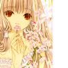
to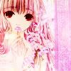
Made with Photoshop CS2.

Start off with our base. Get a crop you'd like, and for this tutorial, I'm going to add one of those side bars.
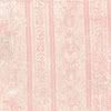
For this icon, I added the side bar texture right away (sometimes I add it later). I grab a texture by tragic_icons and one that will fit my colour scheme. Place it under your base. Then I duplicate the texture, desaturate, then set to Multiply, 59%. This'll prevent the texture from becoming too light later. Then I Flatten the image.
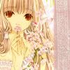

Now I add a new colour layer. I pick a gray colour (#D1D1D1) and set to Multiply, 100%.
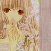

Create a new layer and fill with #04073C and set to Exclusion, 100%
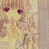

Fill another new layer with #F1CBFC, and set to Color Burn, 53%.
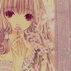

I add another Color Burn layer (#C7E6F7) and leave the opacity at 100%.
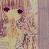

Fill another new layer with #DD93D0 and set to Soft Light, 100%.

Duplicate your base, bring to the top and set to Soft Light, 100%.

I add the usual New Adjustment Layer > Color Balance and a New Adjustment Layer > Selective Color. I darken the overall colours (and enhance the pink colours - my main colours of the icon).
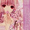
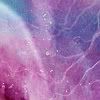
I grab a texture by Lovely Trash and set to Soft Light, 100%.
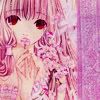

Now it's time for light texture to lighten the icon. The first is by unmasked_icons, the second by silverqe and the last by Lovely Trash. Set all the textures to Screen, 100%, 100%, and 70%, respectively. I moved the first texture over to the right a bit.
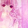
By icon is still looking a bit dark so I duplicate my base twice, bring to the top and set both to Soft Light, 100% The second (top) layer, I added a Gaussian Blur of 1-3 and then desaturated it a bit by going Image > Adjustments > Hue and Saturation and lower the Saturation bar to around -20 or so.
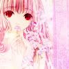
Lastly, I added a New Adjustment Layer > Selective Color in order to enhance the colours of the icon and give it more contrast.

Feel free to post results, give feedback or ask me any questions you may have. It's important to experiment and to not copy my tutorials exactly.
Stupid LJ HTML.
I'll show you how to go from:

to

Made with Photoshop CS2.

Start off with our base. Get a crop you'd like, and for this tutorial, I'm going to add one of those side bars.
For this icon, I added the side bar texture right away (sometimes I add it later). I grab a texture by tragic_icons and one that will fit my colour scheme. Place it under your base. Then I duplicate the texture, desaturate, then set to Multiply, 59%. This'll prevent the texture from becoming too light later. Then I Flatten the image.


Now I add a new colour layer. I pick a gray colour (#D1D1D1) and set to Multiply, 100%.


Create a new layer and fill with #04073C and set to Exclusion, 100%


Fill another new layer with #F1CBFC, and set to Color Burn, 53%.


I add another Color Burn layer (#C7E6F7) and leave the opacity at 100%.


Fill another new layer with #DD93D0 and set to Soft Light, 100%.

Duplicate your base, bring to the top and set to Soft Light, 100%.

I add the usual New Adjustment Layer > Color Balance and a New Adjustment Layer > Selective Color. I darken the overall colours (and enhance the pink colours - my main colours of the icon).


I grab a texture by Lovely Trash and set to Soft Light, 100%.


Now it's time for light texture to lighten the icon. The first is by unmasked_icons, the second by silverqe and the last by Lovely Trash. Set all the textures to Screen, 100%, 100%, and 70%, respectively. I moved the first texture over to the right a bit.

By icon is still looking a bit dark so I duplicate my base twice, bring to the top and set both to Soft Light, 100% The second (top) layer, I added a Gaussian Blur of 1-3 and then desaturated it a bit by going Image > Adjustments > Hue and Saturation and lower the Saturation bar to around -20 or so.

Lastly, I added a New Adjustment Layer > Selective Color in order to enhance the colours of the icon and give it more contrast.

Feel free to post results, give feedback or ask me any questions you may have. It's important to experiment and to not copy my tutorials exactly.
Stupid LJ HTML.