jwynn
in
iconschool
PS Elements- Blends, coloring, and adjustment layers
Hey, all! My first tutorial and it is a long one. Lots of layers, lots of steps, but hopefully it isn't too confusing. If you have any questions, please feel free to ask. I'll do my best to answer them.
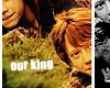
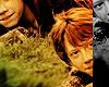
The icon we will be making is this:
A few notes before beginning.
a: For the layers with a solid grey background, the important stuff is the white stuff. The text or the brushes. The grey background is only there to allow the white to be seen.
b: All layers are 100 x 80, or 1.389in x 1.11 in at a 72 resolution. Except one. The first one. But after that it's all 100x80.
c: There are two big steps to the icon: the original blend and coloring step, and then the offset and text step. First up, the original blend and coloring step.
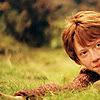
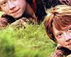
01. I started with these two Ron blanks, cropped from the same image. Sharpen both bases.
and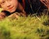
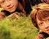
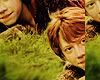
02. Add a new layer to Base 2 (the 100x80 base). Copy and paste Base 1 (the 100x100 base) onto the new layer. Move it into the bottom right corner. Then erase all of the area around Ron. Flatten the image, which should look like this:
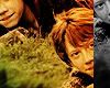
03. Use the AutoLevels feature (Shft + Ctrl + L) on the new blended base. The base should now look like this:
04. Create a new layer. Fill it with #000000, basic black. Set the layer to Color at 100%.
05. Duplicate the AutoLeveled base created in 03. Move the duplicated layer above the color fill from 04. Apply a Gaussian Blur at strength .4 to the duplicated layer, now the top layer, and set it to Screen at 14%.
06. Create a new layer. Fill it with #040020, a dark blue color. Set the layer to Exclusion at 100%.
07. Create a new layer. Fill it with #FBC295, a pale fleshy color. Set the layer to Multiply at 74%.
08. Create a new layer. Fill it with the same pale fleshy color from 07. Set the layer to Soft Light at 86%.
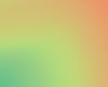
09. Create a new layer. Fill it with the blue/green/purple gradient below. Set the layer to Soft Light at 100%.

10. Create a new layer. Fill it with the melon/green/yellow gradient below. Set the layer to Multiply at 100%.
11. Create a new layer. Fill it with the brown/white gradient below. Set the layer to Soft Light at 22%.

12. Duplicate the brown/white gradient from 11. Set this layer to Multiply at 100%.
13. Now, go all the way back to 03 where we created the AutoLevel base. Duplicate that layer and drag it all the way to the top, over all of those color fills and gradients. Set this layer to Soft Light at 100%. Sharpen this layer.
14. Duplicate the Soft Light layer from 13. Lower the saturation of this layer to 37%.
15. Create a new layer. Fill it with the line brush below. Set the layer to Color Burn at 21%.
16. Flatten all of the layers. The icon should now look like this:

Now we proceed to phase 2.
17. Use the Offset function set at Horizontal=85, Vertical=0 on the flattened base from 16. The icon should now look like this:
18. Create a new layer. Fill it with the melon/white gradient below. Set the layer to Multiply at 100%.

19. Create a new layer. Fill it with the same melon/white gradient from 18. Set this layer to Soft Light at 85%.
20. Duplicate the Offset base created in 17. Drag the duplicate above the two gradients to the very top. Lower the Saturation to -100. Set the blend mode to Overlay at 100%.
21. Create a new adjustment layer. In PS Elements, there is a half-black, half-white circle at the bottom of the layers box that has a small arrow beside it. This arrow pops up into a menu with options like Gradient Map, Levels, Hue/Saturation, Gradient, Color Fill, etc. Select the Gradient Map option. Then select the black/white gradient. The icon should now be completely black and white. Delete the part of the Gradient Map over the left side of the icon. The icon should now look like this:
22. Create a new adjustment layer, a Levels layer this time instead of the Gradient Map from 21. A pop-up box appears with 3 arrows: a black, a grey, and a white arrow. Slide the black arrow over to the right a bit, increasing the darkness of the icon. Then slide the grey arrow over to the left a bit. Click Ok. Delete the same portion of the Levels layer as you did in the Gradient Map layer from 21. This should make the black and white portion of the icon pop a bit like this:
23. Create a new layer. Fill it with the white line brush below (a). Move the line between the colored and black/white portions of the icon. The icon should now look like (b).
a.
b.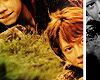
24. Duplicate the white line brush (a) used in 23. Move the duplicate over to the extreme left of the icon.
25. Create a new adjustment layer, a Brightness/Contrast layer this time. Increase the Contrast a bit. Then delete the same portion of the layer as you deleted in 21 and 22. The black/white section of the icon should pop even more with the adjusted contrast.
26. Text! The font is Impact, set to Faux Bold. The size is 11. The text is Our King. Adjust the text by rotating it a bit until it looks like this:

27. And the finishing touch, the crown. Create a new layer. Apply the crown brush below, leaving the blend mode at Normal.

And voila! A way too complicated but very pretty Ron icon.
The icon we will be making is this:
A few notes before beginning.
a: For the layers with a solid grey background, the important stuff is the white stuff. The text or the brushes. The grey background is only there to allow the white to be seen.
b: All layers are 100 x 80, or 1.389in x 1.11 in at a 72 resolution. Except one. The first one. But after that it's all 100x80.
c: There are two big steps to the icon: the original blend and coloring step, and then the offset and text step. First up, the original blend and coloring step.
01. I started with these two Ron blanks, cropped from the same image. Sharpen both bases.
and
02. Add a new layer to Base 2 (the 100x80 base). Copy and paste Base 1 (the 100x100 base) onto the new layer. Move it into the bottom right corner. Then erase all of the area around Ron. Flatten the image, which should look like this:
03. Use the AutoLevels feature (Shft + Ctrl + L) on the new blended base. The base should now look like this:
04. Create a new layer. Fill it with #000000, basic black. Set the layer to Color at 100%.
05. Duplicate the AutoLeveled base created in 03. Move the duplicated layer above the color fill from 04. Apply a Gaussian Blur at strength .4 to the duplicated layer, now the top layer, and set it to Screen at 14%.
06. Create a new layer. Fill it with #040020, a dark blue color. Set the layer to Exclusion at 100%.
07. Create a new layer. Fill it with #FBC295, a pale fleshy color. Set the layer to Multiply at 74%.
08. Create a new layer. Fill it with the same pale fleshy color from 07. Set the layer to Soft Light at 86%.
09. Create a new layer. Fill it with the blue/green/purple gradient below. Set the layer to Soft Light at 100%.
10. Create a new layer. Fill it with the melon/green/yellow gradient below. Set the layer to Multiply at 100%.
11. Create a new layer. Fill it with the brown/white gradient below. Set the layer to Soft Light at 22%.
12. Duplicate the brown/white gradient from 11. Set this layer to Multiply at 100%.
13. Now, go all the way back to 03 where we created the AutoLevel base. Duplicate that layer and drag it all the way to the top, over all of those color fills and gradients. Set this layer to Soft Light at 100%. Sharpen this layer.
14. Duplicate the Soft Light layer from 13. Lower the saturation of this layer to 37%.
15. Create a new layer. Fill it with the line brush below. Set the layer to Color Burn at 21%.
16. Flatten all of the layers. The icon should now look like this:
Now we proceed to phase 2.
17. Use the Offset function set at Horizontal=85, Vertical=0 on the flattened base from 16. The icon should now look like this:
18. Create a new layer. Fill it with the melon/white gradient below. Set the layer to Multiply at 100%.
19. Create a new layer. Fill it with the same melon/white gradient from 18. Set this layer to Soft Light at 85%.
20. Duplicate the Offset base created in 17. Drag the duplicate above the two gradients to the very top. Lower the Saturation to -100. Set the blend mode to Overlay at 100%.
21. Create a new adjustment layer. In PS Elements, there is a half-black, half-white circle at the bottom of the layers box that has a small arrow beside it. This arrow pops up into a menu with options like Gradient Map, Levels, Hue/Saturation, Gradient, Color Fill, etc. Select the Gradient Map option. Then select the black/white gradient. The icon should now be completely black and white. Delete the part of the Gradient Map over the left side of the icon. The icon should now look like this:
22. Create a new adjustment layer, a Levels layer this time instead of the Gradient Map from 21. A pop-up box appears with 3 arrows: a black, a grey, and a white arrow. Slide the black arrow over to the right a bit, increasing the darkness of the icon. Then slide the grey arrow over to the left a bit. Click Ok. Delete the same portion of the Levels layer as you did in the Gradient Map layer from 21. This should make the black and white portion of the icon pop a bit like this:
23. Create a new layer. Fill it with the white line brush below (a). Move the line between the colored and black/white portions of the icon. The icon should now look like (b).
a.
b.
24. Duplicate the white line brush (a) used in 23. Move the duplicate over to the extreme left of the icon.
25. Create a new adjustment layer, a Brightness/Contrast layer this time. Increase the Contrast a bit. Then delete the same portion of the layer as you deleted in 21 and 22. The black/white section of the icon should pop even more with the adjusted contrast.
26. Text! The font is Impact, set to Faux Bold. The size is 11. The text is Our King. Adjust the text by rotating it a bit until it looks like this:
27. And the finishing touch, the crown. Create a new layer. Apply the crown brush below, leaving the blend mode at Normal.
And voila! A way too complicated but very pretty Ron icon.