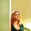
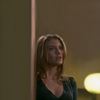
How to make people think you use textures xd
From 
to
You will be surprised, I didn't use any textures
Done on Photoshop CS4. If you snag the graphics/textures, don't forget to credit ;). If you have any questions, Im here! Don't ask for a .PSD, you won't have one. Remember, those settings work on that picture, it doesn't mean they will work on yours.
1. I begun by resizing the picture a lot so that Bella fits in 50% of the icon. Then, I use the smudge tool, size 5, strength 50% to slowly extend the cap. To be more precised, instead of seeing the icon in the 100% size, I put 300% (screenshot here). As I wasn't good enough to do smudge around her I decided to use the background behind her and use it to cut her.
Now your base look like this :
2. Now, it's time to brighten a little the pic without loosing the depth. Do a curve layer.
Output: 150
Input: 89
3. I wanted more blue so I added a selective color layer
Reds: -68%, +26%, +76%, -12%
Yellows: +100%, +17%, -51%, -20%
Whites: +100%, 0, -23%, -10%
Neutrals: +9%, -10%, -6%, +6%
4. To enlighten her very sublty, I opened a selective color layer
Whites: -70%, 0, +6%, 0
5. Now it's time to try to balance the colors a bit so I decided to do a color mixer and to try to give a blue tone (which can after be easily changed in yellow/green)
Red: +112%, -12%, -12%
Blue: 0, -12%, +124%
6. Now, time to concetrate on the colors, one the green specially but without loosing the red and the yellow. Open a color balance layer.
Shadows: -11, 0, +13
Midtones: +22, -6, -19
Highlights: -1, 0, -22
Set the opacity to 26%
7. And now Light!! Open a brightness/contrast layer
Brightness: 104
Contrast: 5
8. She looks really bright right? So we add a color balance layer.
Midtones: +59, -3, -15
As you can see, a color balance layer can correct the lightness in an icon, depending on the color you add.
9. I wanted to add a bit of brightness. I opened a new layer. With a whit brush size 5, I painted a line on the left and one on the bottom and a few spot in the corners. Then, I used the gaussian blur to create a cloud. It looks like this (but your background is transparent, not black).
10. I wanted a bit more of cloud to enlighten the whole icon. So I repeated the operation but painted elswhere. This time, my new layer looks like this. I set the opacity to 31%
11. To not keep the blurry effect but to keep the light, I duplicate my base and set to soft light at the top of the layer list.
12. Then, to add a gold effect, I added this color fill layer and set it to color burn, opacity 45%.
13. To make her shine a little bit more (and our clods too) I added a brightness/contrast layer
Brightness: 16
Contrast: 2
You're done!!

to

You will be surprised, I didn't use any textures
Done on Photoshop CS4. If you snag the graphics/textures, don't forget to credit ;). If you have any questions, Im here! Don't ask for a .PSD, you won't have one. Remember, those settings work on that picture, it doesn't mean they will work on yours.
1. I begun by resizing the picture a lot so that Bella fits in 50% of the icon. Then, I use the smudge tool, size 5, strength 50% to slowly extend the cap. To be more precised, instead of seeing the icon in the 100% size, I put 300% (screenshot here). As I wasn't good enough to do smudge around her I decided to use the background behind her and use it to cut her.
Now your base look like this :

2. Now, it's time to brighten a little the pic without loosing the depth. Do a curve layer.
Output: 150
Input: 89
3. I wanted more blue so I added a selective color layer
Reds: -68%, +26%, +76%, -12%
Yellows: +100%, +17%, -51%, -20%
Whites: +100%, 0, -23%, -10%
Neutrals: +9%, -10%, -6%, +6%
4. To enlighten her very sublty, I opened a selective color layer
Whites: -70%, 0, +6%, 0
5. Now it's time to try to balance the colors a bit so I decided to do a color mixer and to try to give a blue tone (which can after be easily changed in yellow/green)
Red: +112%, -12%, -12%
Blue: 0, -12%, +124%
6. Now, time to concetrate on the colors, one the green specially but without loosing the red and the yellow. Open a color balance layer.
Shadows: -11, 0, +13
Midtones: +22, -6, -19
Highlights: -1, 0, -22
Set the opacity to 26%
7. And now Light!! Open a brightness/contrast layer
Brightness: 104
Contrast: 5
8. She looks really bright right? So we add a color balance layer.
Midtones: +59, -3, -15
As you can see, a color balance layer can correct the lightness in an icon, depending on the color you add.
9. I wanted to add a bit of brightness. I opened a new layer. With a whit brush size 5, I painted a line on the left and one on the bottom and a few spot in the corners. Then, I used the gaussian blur to create a cloud. It looks like this (but your background is transparent, not black).
10. I wanted a bit more of cloud to enlighten the whole icon. So I repeated the operation but painted elswhere. This time, my new layer looks like this. I set the opacity to 31%
11. To not keep the blurry effect but to keep the light, I duplicate my base and set to soft light at the top of the layer list.
12. Then, to add a gold effect, I added this color fill layer and set it to color burn, opacity 45%.
13. To make her shine a little bit more (and our clods too) I added a brightness/contrast layer
Brightness: 16
Contrast: 2
You're done!!