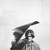
Background, textures and black and white !
From 
to
Done on Photoshop CS4. If you snag the graphics/textures, don't forget to credit ;). If you have any questions, Im here! Don't ask for a .PSD, you won't have one. Remember, those settings work on that picture, it doesn't mean they will work on yours.
The little story story of this icon is that I wanted badly only one color on it so it's quite lond and finally ends by a black one icon because I was pissed off. Though, you'll see, depending on your taste, you can find a n icon you will like during the process.
Textures
by elli
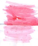
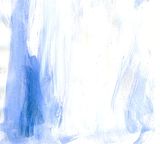
by discolore
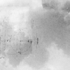

by unknown (if you know who made it, please tell me thanks!)
Layer list part 2
Layer list Part 2
1. Resize your picture and with the smudge tool (strength 50%), extend the sky and the part of the Implala you can see. Desaturate your base.
Your result :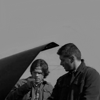
2. Use this texture made by elli. Resize it around 150px. I had something like this after rotating it. Set it to screen with the blue on the boys.
3. Duplicate your base and move it to the top of your layer list. Set it to soft light.
4. I wanted a bit more light so I added this texture. Set it to screen, 50% of opacity.
5. I wanted more contrasts so I duplicate the base. Put it at the top of the layer list and set it to soft light.
Your result so far :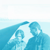
6. I wanted to increase the light. Use a brightness/contrast layer.
Brightness: 65
Contrast: -7
7. Eeek! Not enough contrast!!! Open an exposure layer.
Gamma: 0,43
8. I think the boys are kinda too old for baby blue so I wanted to darken the icon a bit. Duplicate your base, move it at the top of your layer list and set it to soft light.
9. As I still don't like the blue, I duplicate the second texture we have used (this one). Move it at the top of the layer list and set it to color.
10. I am stubborn. I wanted my blue Winchesters. So I duplicate the first texture (tiny version here) we used and set it to color burn.
11. Duplicate the previous layer to increase the blue.
12. Duplicate it again.
13. Okay so it seems like blue doesn't agree to be in that icon so I used this texture by elli, resize it so that it fits the icon size. (my tiny version here) and set it to screen.
14. Duplicate the base and set it at the top of your layer list. Set it to soft light.
15. Use this texture by discolore and set it to color burn in order to darken the icon and increase the contrast.
Your result :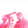
16. As I don't like pink, I decided to do a black and white icon. The thing is that for that, I need huge contrast. So I decided to create an exposure layer.
Gamma : 0,46
17. Create a black and white gradient.
18. It's still a bi too grey for me so I created a new exposure layer.
Gamma : 0,50
19. I wanted to increase the darkness. I opened this texture made by discolore and set it to multiply.
20. It's a bit too dark but the effect of the texture is nice so I open a brightness/contrast layer.
Brightness : 10
Contrast : -2
21. Merge all the layers.
Result so far :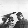
22. Create a new document, iconsized.
23. Put the icon you just finished in the new document. Center Sam.
24. With the smudge tool, size 5, strenght 50%, erase Dean and extend the icon whee it needs to in order to fit the 100*100.
Final result :

to

Done on Photoshop CS4. If you snag the graphics/textures, don't forget to credit ;). If you have any questions, Im here! Don't ask for a .PSD, you won't have one. Remember, those settings work on that picture, it doesn't mean they will work on yours.
The little story story of this icon is that I wanted badly only one color on it so it's quite lond and finally ends by a black one icon because I was pissed off. Though, you'll see, depending on your taste, you can find a n icon you will like during the process.
Textures
by elli


by discolore


by unknown (if you know who made it, please tell me thanks!)

Layer list part 2
Layer list Part 2
1. Resize your picture and with the smudge tool (strength 50%), extend the sky and the part of the Implala you can see. Desaturate your base.
Your result :

2. Use this texture made by elli. Resize it around 150px. I had something like this after rotating it. Set it to screen with the blue on the boys.
3. Duplicate your base and move it to the top of your layer list. Set it to soft light.
4. I wanted a bit more light so I added this texture. Set it to screen, 50% of opacity.
5. I wanted more contrasts so I duplicate the base. Put it at the top of the layer list and set it to soft light.
Your result so far :

6. I wanted to increase the light. Use a brightness/contrast layer.
Brightness: 65
Contrast: -7
7. Eeek! Not enough contrast!!! Open an exposure layer.
Gamma: 0,43
8. I think the boys are kinda too old for baby blue so I wanted to darken the icon a bit. Duplicate your base, move it at the top of your layer list and set it to soft light.
9. As I still don't like the blue, I duplicate the second texture we have used (this one). Move it at the top of the layer list and set it to color.
10. I am stubborn. I wanted my blue Winchesters. So I duplicate the first texture (tiny version here) we used and set it to color burn.
11. Duplicate the previous layer to increase the blue.
12. Duplicate it again.
13. Okay so it seems like blue doesn't agree to be in that icon so I used this texture by elli, resize it so that it fits the icon size. (my tiny version here) and set it to screen.
14. Duplicate the base and set it at the top of your layer list. Set it to soft light.
15. Use this texture by discolore and set it to color burn in order to darken the icon and increase the contrast.
Your result :

16. As I don't like pink, I decided to do a black and white icon. The thing is that for that, I need huge contrast. So I decided to create an exposure layer.
Gamma : 0,46
17. Create a black and white gradient.
18. It's still a bi too grey for me so I created a new exposure layer.
Gamma : 0,50
19. I wanted to increase the darkness. I opened this texture made by discolore and set it to multiply.
20. It's a bit too dark but the effect of the texture is nice so I open a brightness/contrast layer.
Brightness : 10
Contrast : -2
21. Merge all the layers.
Result so far :

22. Create a new document, iconsized.
23. Put the icon you just finished in the new document. Center Sam.
24. With the smudge tool, size 5, strenght 50%, erase Dean and extend the icon whee it needs to in order to fit the 100*100.
Final result :
