A really weird way to do icons.
From 
to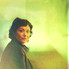
or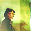
This icon was experimental which means the following tutorial is not in the same way I have worked. It was a long time ago and I don't remember the "real" order and why I have choosen to order layers. THOUGH, you'll see, even the first layers are important for the final look.
If you're a newbie with PS, I will advice you to check other tutorials before this one. It's not really complicated but there's a lot of steps and manipulations.
I have tried to explain as much as I can. If anything is unclear, wrong or if you don't understand my poor English, let me know!
You can use the icon as long as you credit; don't repost as your own, don't do the same icon! Never forget the settings fits this cap but may not fit yours.
Textures:
by navi_glow
Don't remember who made this one if you know let me know thanks!
Layer list
1. Create a selective color layer. I know it's weird as a first step but that's how I did.
Reds: -23%, 0%, +8%, -11%
Whites: 0%, 0%, +15%, +11%
Neutrals: 0%, +3%, 0%, -4%
Set it to soft light.
2. Do a channel mixer
Blue: -18%, +87%, +66%
3. Do a color fill layer #f0e1c2
Set it to soft light.
4. Do a color balance layer.
Shadows: +20, -2, +15
Midtones: -2, -9, -50
5. Open a new layer. Use a paintbrush, separate with a line your icon in 2 then on the right part paint a bit the bottom and the right side. Then use a gaussian blur.
6. Open a new layer. On the left part, paint a line from the bottom left to the middle of the icon. Use just a little gaussian blur.
7. Open a new layer. Paint just a little blurb on the right part and use the gaussian blur.
8. Do an exposure layer.
Offset: -0,0392
Gamma: 0,51
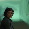
9. Resize your picture a lot. Use the smudge tool to create a background. This gonna be your first base, called A. It will look like this :
10. Put A at the top of your layer list and set it to color burn.
Your icon looks like this: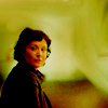
Needs improvement right?
11. Use this texture by navi_glow. Set it to screen.
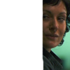
12. I wanted to try to blind her face as a background. So resize again your picture so that you can use a close crop. It will be called Z and it looks like this:
13. Put Z at the top of your layer list. Set it to soft light.
14. Duplicate the previous layer.
Now it looks like this: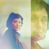
15. Use this texture and set it to multiply.
16. It needs more contrasts and color! Duplicate A and put it at the top of your layer list. Set it to soft light.
17. Duplicate the previous layer. Set the opacity to 62%.
18. Now it needs a little bit more of colors. Open a color balance layer.
Midtones: +38, +20, -33
19. And now brightness!! Add a brightness/contrast layer.
Brightness: 31
Contrast: -5
Result:
If you want a result like this
don't do steps #12, #13 and #14.

to

or

This icon was experimental which means the following tutorial is not in the same way I have worked. It was a long time ago and I don't remember the "real" order and why I have choosen to order layers. THOUGH, you'll see, even the first layers are important for the final look.
If you're a newbie with PS, I will advice you to check other tutorials before this one. It's not really complicated but there's a lot of steps and manipulations.
I have tried to explain as much as I can. If anything is unclear, wrong or if you don't understand my poor English, let me know!
You can use the icon as long as you credit; don't repost as your own, don't do the same icon! Never forget the settings fits this cap but may not fit yours.
Textures:
by navi_glow

Don't remember who made this one if you know let me know thanks!

Layer list
1. Create a selective color layer. I know it's weird as a first step but that's how I did.
Reds: -23%, 0%, +8%, -11%
Whites: 0%, 0%, +15%, +11%
Neutrals: 0%, +3%, 0%, -4%
Set it to soft light.
2. Do a channel mixer
Blue: -18%, +87%, +66%
3. Do a color fill layer #f0e1c2
Set it to soft light.
4. Do a color balance layer.
Shadows: +20, -2, +15
Midtones: -2, -9, -50
5. Open a new layer. Use a paintbrush, separate with a line your icon in 2 then on the right part paint a bit the bottom and the right side. Then use a gaussian blur.
6. Open a new layer. On the left part, paint a line from the bottom left to the middle of the icon. Use just a little gaussian blur.
7. Open a new layer. Paint just a little blurb on the right part and use the gaussian blur.
8. Do an exposure layer.
Offset: -0,0392
Gamma: 0,51
9. Resize your picture a lot. Use the smudge tool to create a background. This gonna be your first base, called A. It will look like this :

10. Put A at the top of your layer list and set it to color burn.
Your icon looks like this:

Needs improvement right?
11. Use this texture by navi_glow. Set it to screen.
12. I wanted to try to blind her face as a background. So resize again your picture so that you can use a close crop. It will be called Z and it looks like this:

13. Put Z at the top of your layer list. Set it to soft light.
14. Duplicate the previous layer.
Now it looks like this:

15. Use this texture and set it to multiply.
16. It needs more contrasts and color! Duplicate A and put it at the top of your layer list. Set it to soft light.
17. Duplicate the previous layer. Set the opacity to 62%.
18. Now it needs a little bit more of colors. Open a color balance layer.
Midtones: +38, +20, -33
19. And now brightness!! Add a brightness/contrast layer.
Brightness: 31
Contrast: -5
Result:

If you want a result like this

don't do steps #12, #13 and #14.