Colouring manga scans tutorial.
It's 5 in the morning, so what do I do? Make a tutorial! That's what! My first post here, by the way, but thanks to everyone who's posted tutorials! This is a really helpful community. <3
Go from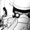
to...read the tutorial to find out. ;) Made with GIMP, but hopefully can be translated to other programs. I'd love to see what you can make! Comments, questions, etc are welcome. ^_^
1. Get to know your base. Fix it up how you want. I, of course, did nothing! >:D
seeeeee?
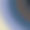
2. Choose the Incandescent gradient and apply it. Ta-da! You now have...a gradient that's covering up your image. OMGWTFBBQ? We don't want that, now do we?
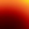
3. So we set it to Screen at 100%. Ah! Much better! Doesn't that look normal? But its lacking still lacking in colour...which means: MORE GRADIENTS! Yay! <3 So choose the Metallic Something gradient and stick it on your image, again setting the layer to screen at 100%. ^_^ Make sure it goes in this order: Metallic something, Incandescent, and then the background layer.
5. Wai! Doesn't our icon look splendiferous? *-* Sorry I don't have a pic of what it should look like now... >.< But now that its colored, we need to add detail! So I'll just choose this swirly fun brush I found and resized (brush by crumblingwalls)...
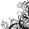
...and stamp it right in the corner in a new layer, making sure its under our gradients.
6. Still not quite right...So let's add...TEXT. I tend to make my text into brushes so that I can use them for later icons, but for now just add your text in two seperate layers. First type "when I saw you" in size 10, Lucida Bright. Than add "c r y i n g" in size 15, still Lucida Bright. Merge these to seperate new layers so that you can arrange them to your liking. Merge the layers together when they're placed in the right place.
7. Now, stamp something small and swirly in the other direction, the brush I used is also by crumblingwalls. Merge this with your text layer. Duplicate this layer twice, setting the original layer to grain merge at 100%. Set the other two layers to Soft light, with one at 100%, the other at 60%
the merged brush and text should look something like this:
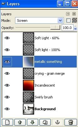
8. Now it may look a little funky, so organize the layers as such (top to bottom):
-Soft light text at 60%
-Soft light text at 100%
-Metallic something at screen 100%
-Grain merge text at 100%
-Incandescend at screen at 100%
-Swirly brush at normal 100%
-Background at 100%...obviously. *gigglesnort*
Here's a cap of the layers, each neatly labeled for you <3
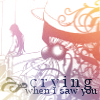
and finally, the finished icon! wheee! *_* It's so beautimous...
x-posted to my personal journal and gimp_users
Go from
to...read the tutorial to find out. ;) Made with GIMP, but hopefully can be translated to other programs. I'd love to see what you can make! Comments, questions, etc are welcome. ^_^
1. Get to know your base. Fix it up how you want. I, of course, did nothing! >:D
seeeeee?
2. Choose the Incandescent gradient and apply it. Ta-da! You now have...a gradient that's covering up your image. OMGWTFBBQ? We don't want that, now do we?
3. So we set it to Screen at 100%. Ah! Much better! Doesn't that look normal? But its lacking still lacking in colour...which means: MORE GRADIENTS! Yay! <3 So choose the Metallic Something gradient and stick it on your image, again setting the layer to screen at 100%. ^_^ Make sure it goes in this order: Metallic something, Incandescent, and then the background layer.
5. Wai! Doesn't our icon look splendiferous? *-* Sorry I don't have a pic of what it should look like now... >.< But now that its colored, we need to add detail! So I'll just choose this swirly fun brush I found and resized (brush by crumblingwalls)...
...and stamp it right in the corner in a new layer, making sure its under our gradients.
6. Still not quite right...So let's add...TEXT. I tend to make my text into brushes so that I can use them for later icons, but for now just add your text in two seperate layers. First type "when I saw you" in size 10, Lucida Bright. Than add "c r y i n g" in size 15, still Lucida Bright. Merge these to seperate new layers so that you can arrange them to your liking. Merge the layers together when they're placed in the right place.
7. Now, stamp something small and swirly in the other direction, the brush I used is also by crumblingwalls. Merge this with your text layer. Duplicate this layer twice, setting the original layer to grain merge at 100%. Set the other two layers to Soft light, with one at 100%, the other at 60%
the merged brush and text should look something like this:
8. Now it may look a little funky, so organize the layers as such (top to bottom):
-Soft light text at 60%
-Soft light text at 100%
-Metallic something at screen 100%
-Grain merge text at 100%
-Incandescend at screen at 100%
-Swirly brush at normal 100%
-Background at 100%...obviously. *gigglesnort*
Here's a cap of the layers, each neatly labeled for you <3
and finally, the finished icon! wheee! *_* It's so beautimous...
x-posted to my personal journal and gimp_users