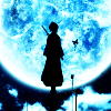
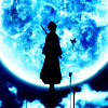
Icon Tutorial #3 (Colouring): Rukia Blue Moon [Beginners; Photoshop/GIMP]
Okay, so these Photoshop and GIMP tutorials are geared more towards newbies, hence the many pretty, colourful pictures. <3
I just tried out GIMP today so that I can sort of translate the Rukia colouring (because I just like it) from Photoshopalese to GIMPlese for my bbs. Yeah, like I'm in the place to call them that. They're old enough to be my grandmothers. XD
===>
Program: Photoshop CS5
Steps: 6
Difficulty: Easy-peasy. 8D
FOR PHOTOSHOP USERS
1. Crop your base.
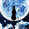
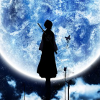
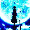
This icon was made for prompt #456: Bright of fandom365days. so of course, you want something bright and not dull and oh-so-boring to fit it, right?
So I took a Rukia wallpaper from Minitokyo, one of the best places to find animanga-related stuff. Scans there are awesome and of high quality, and it's the place that I normally go to aside from the occasional hunt through Mangafox.
2. Selective Colour 1
- Cyans: 100, -13, -71, -18
- Blues: 100, -9, -100, 19
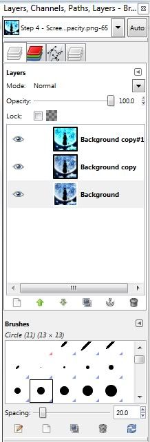
The wallpaper, though beautiful on its own, can be made MUCH MOAR PRETTIEAH through the magic that is Photoshop. No wand-waving and "bimbidy, bombidy, boo" or whatever - the trick? SELECTIVE COLOURING BABEH. Let's see...THREE Selective Colouring layers in this tutorial.. Oh, boy. But hey, it's actually fun to fiddle around with the layer. Keep in mind that it's an adjustment layer, so it can be found through Layer > Adjustment Layer > Selective Colouring (I AIN'T AMERICAN SO IGNORE THE BRIT-SPELLING K.)
So, since the base is mostly blue, ENHANCE THOSE COLOURS. USE 'EM AND ABUSE 'EM. THEY'RE THERE FOR YOU SO WHATCHA WAITIN' FO'?
For those who don't know, a Selective Colour layer has nine colours for you to play with, that are:
- Reds
- Yellows
- Greens
- Cyans
- Blues
- Magentas
- whites
- Neutrals
- Blacks

Each of them, in turn, are branched out into four more colours:
- Cyan
- Magenta
- Yellow
- Black

So, if I say "Cyans: 100, -13, -71, -18", it means Cyan: 100; Magenta: -13; Yellow: -71; Black: -18.
When I first started out, I had problems trying to identify those figures, so I thought of touching on it here. :)
3. Duplicate Selective Colour Layer: Selective Colour 2 - Soft Light 48%
Since the first Selective Colour wasn't quite enough to enhance the contrast, brightness AND the blue colours all at once, you want more of it, yes? Yes. So what now? DUPLICATE IT.
And you'll get this: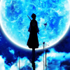
You can stop here if you like since it's already so bright and blinding and blue, but I didn't because I wanted to up the contrast. See the blue pigments under the moon in the background? I want that to be blacker instead of blue (shadows, hello), so instead of setting Selective Colour 2 on Normal mode, I set it to Soft Light.
I get this: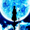
Hnnnnnggghhhhh.
Still kinda eeeeehhhhh for me. Note the areas under the moon that I said I wanted to be blacker. It's gone black like whoa, AS WELL AS RUKIA'S FORM WHY IS IT SO SHARP AT THE EDGES ZOMG *GAAAAASP*
No, we don't want that. Unless, well, you want it, in which case I can't say anything. In everything I discuss, I always bring up the subject of "personal taste" from matters concerning religion, type of alcoholic beverage you like, how you want your steak cooked to what sort of toilet you feel most comfortable shitting on.
In this case, even though the blue is so stunning that it's blinding me, and it's bright enough, I don't like how the black turned out and the sharp edges of Rukia's form.
So I set Selective Colour 2 to Soft Light...wait for it...48%! The product is what you just saw several paragraphs of babbling ago! It's less black, it's got less sharp edges, it's darker...and BOOOOO, less blue.
Now what?
4. Colour fill layer: #000227
Exclusion 100%
Have I ever mentioned of my love for Exclusion layers? One of the best things that ever made its way into iconning. Truth.
I picked a dark blue and set it to exclusion over the icon so that it comes out darker than before, but notice how there are more shades of blue everywhere. In Rukia's black form, in the background - ZOMG BLUEY GOODNESS. Now, that's what I'm talking about.
I use Exclusion layers to darken the image, add more colour, and then pile on top adjustment layers to up the brightness/contrast/colours of everything that I want without causing the image to look too pixelated/sharp like what just happened just now with Selective colour 2 set on Soft Light.
Right? Right.
Because Soft Light enhances shadows and boosts light and made Rukia so damn black and sharp, I lowered the Opacity of the layer. Play around with the Opacity - it can do wonders. But in the case of Exclusion layers, they're normally just set at 100% opacity. Well, at least to me. :|
5. Colour balance
- Shadows: 12, 26, 10
- Midtones: -15, 3, 24
- Highlights: -5, 3, 20
The Exclusion layer sent all matters of contrast and light to hell, so now we whip up another adjustment layer. This time, it's Colour Balance (refer to the above link that gives you the picture of my whole Photoshop program and shows the location of the Selective Colour layer - it's under the same tab).
Colour Balance, like Selective Colour, has some sub-sections as well. The three main ones are:
- Shadows
- Midtones
- Highlights
...OMG, I should just insert a picture.

So, when I say "Midtones: -15, 3, 24," the numbers go according to the bars under their respective sections.
Midtones are just what they are - midtones. The overall "mood" of the icon, so to speak. So in this icon, almost everything is BLUE, so whaddaya wanna do? You enhance the blues, of course! Drag the top bar to the right (increases cyans), drag the middle bar to the right (well...this one doesn't really do anything because there ain't no magenta or green in there, but what the hell) and the bottom bar to the riiiight (ups blue).
Shadows and Hightlights are just what they are as well. This is why Colour Balance can up contrast - it works in almost the same way as Selective Colouring, only that it takes care of the colouring of the ENTIRE icon in general instead of just one particular colour just as what Selective Colour does - hence, selective colour.
So in the end, the blues and cyans are enhanced, the whites and dark blues become slightly brighter. Contrast is boosted. Yayz.
6. Selective Colour 3
- Cyans: 100, 6, -3, -5
- Blues: 100, 11, 10, -13
- Whites: 0, 0, 0, -100
- Blacks: 0, 0, 0, 100
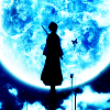
You can actually leave out this step if you like the icon as it is, but me, knowing me, I like my icons with LOTSA LOTSA CONTRAST. This is the last Selective Colour layer, I promise. Hell, we're actually done with the damn icon!
You know the drill, boost Cyans and Blues to up the pretty pretty colours (lower the blacks in Cyans and Blues so that they don't appear too bright; up the whites in Blues because Blues is darker than Cyans; lower the whites in Cyans because Cyans is lighter than Blues). In Whites, up the whites to make sure that the white outline around the moon is totally white and up the blacks in Blacks to get some shadows. HARDCORE BABEH HARDCORE.
ALSO, this is an optional step. I did it anyway. I wanted extra white for the outline of the moon, so I made another Selective Colour layer which only dealt with the Whites. I set it to 0, 0, 0, -100 - ALL THE WAY DOWN LEFT. The icon above is done with this extra step, so I just wanted to throw it out there. Just a minor change - don't think it's actually all that noticeable, so.
And we are done.
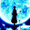
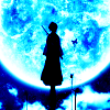
Try comparing the three icons - the two icons from Step 3 (with Soft Light set to Normal mode and the other set to Soft Light 100%) with the final product:
1) Sel. Colour on Normal 100%:
2) Sel. Colour on Soft Light 100%:
3) Final:
Notice how the one on Normal 100% looks more washed out, the one on Soft Light 100% has a bit too much contrast (BUt with bright pretty blues) and the Final one is just somewhere in between.
It's all just personal choice, really. I actually like all three versions - I was just a little too adventurous and experimented a little bit more. Sel. Colour is starting to be my fav adjustment layer. <3
===>
Program: GIMP 2
Steps: 16 (though some can be omitted)
Difficulty: Uber easy. Like, seriously. 8D
The final icon is a bit brighter than the one made with Photoshop. That's basically because GIMP doesn't have Exclusion layers to mute the colours, but it still works all the same, so. x3
FOR GIMP-USERS
So, as always, the first step is to:
1. Crop base.
The cropping that I used for this is the same, only different in that this one is a little "closer" to the moon. I started from scratch using GIMP, but that doesn't make much difference, really. Just a heads-up.
I haven't figured it out yet, but I think that it's impossible to do in GIMP - creating a 100x100 canvas and dragging the picture you want to icon straight into the program just like what I usually do in Photoshop. So it was a rather pain in the ass to open the whole picture itself, cut and crop it down to size.
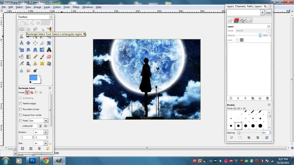
Open the picture that you want and use the rectangle selection tool. Drag it over the picture to make a square/rectangle. It doesn't matter at this point because you'll still be choosing the proper crop to go with.
The selection that you come up with is movable and re-sizable (screenshot), so you don't have to worry if you made the size of the selected area too big/small. You can always modify it.
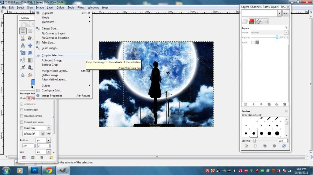
So once you've got the crop that you want, go to Image > Crop selection. Then, if the image is still too big, go to Image > Scale Image to re-size it down to 100x100.
Also, make sure that in the Scale Image Window, the chain binding the Width and the Height is unlinked. This is to make sure that all sizes of the icon are equal in dimension. Say, if you don't unlink them, and if the original size of your image is 450x460, you'll get a 100x105 or something along those lines when you shrink it down.
Now that you've got the crop that you want, 100x100 and all, let's move on! 8D
2. Duplicate the base TWICE.
Set the first duplicated to Screen 59.8% and Soft Light 100%.
Screen it to brighten up the base, soft light to boost the contrast - just like in Photoshop. It's all about the contrast. I reduced the Screened layer because at 100% it became too bright, and added with Soft Light, the brightness and contrast were just blinding. I normally make sure not to make the icon look too bright during earlier stages because I can always abuse the Brightness/Contrast, Levels and Curves tool later on when I'm done and satisfied with everything.
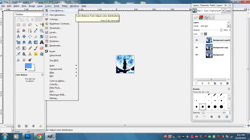
3. Colour Balance - Soft Light 100%
- Shadows: -100, 43, 100
- Midtones: -100, 50, 100
- Highlights: -100, 24, 100
Okay, remember in Photoshop we have adjustment layers and some such crap? Well, GIMP doesn't seem to utilize stuff like that, so it was rather difficult for me to get used to it. The trick is, you need to duplicate your base layer if you want to do stuff like Color Balance, Curves, Channel Mixer and all that jazz. Those tools (note: NOT layers) edit the icon directly, unlike Photoshop which enables the adjustment layers to be set to Soft Light, Screen, whatever just like picture and colour fill layers.
Major pain in the butt, but easy if you get used to it.
So, for Color Balancing, you will first need a picture to color balance, right? So take the Soft Lighted layer that you duplicated in Step 2 (it should be above the Screened layer) and tweak it. To get to Color Balance, go to Colors > Color Balance.
Color Balance in GIMP works just like Color Balance in Photoshop, so I hope you remember the explanations in the Photoshop tut! XD IF NOT, GO READ IT. NAO. SCROLL UP AND READ BEFORE PROCEEDING ANY FURTHER OR I WILL BITE YOUR HEAD OFF. VIRTUALLY.
Color Balance, like mentioned above, can be used to boost contrast, brightness and colours in the overall icon. So, in this case, we want to make blues poop pop, right? So just increase the Cyans and all that - EXACTLY LIKE PHOTOSHOP. 8D
4. Lower the opacity of the screened layer to 34.6%.
Because the icon, after the Color Balance thing, was just too bright for my tastes. Screen ups brightness, right? So it has to go. LIKE WHOA.
Really, it helps to play around with the opacity - again, it works wonders. ;D
5. Merge visible layers. Duplicate the new base.
Since GIMP doesn't have the Stamp Visible ability (CTRL+ALT+E), we're just going to have to merge everythaaaaang. Because, remember, in GIMP, you need a picture to edit with Color Balance/Curves/Levels/whatever, and it just doesn't work when you want to edit the icon AS A WHOLE. It doesn't work like that. GIMP edits the layers one by freaking one.
Unless I'm wrong. >_>
To merge, just hover your mouse over any layer in the layer palette, right-click and scroll waaaay down the list to find "Merge Visible Layers."
--->
Flatten works just as well, so pick whichever you feel like. I normally just go for merge though. "Flatten" somehow reminds me of pancake. Which in turn makes me hungry. Which in turn makes me leave the laptop to go binge. Which in turn makes me fat. And I do not want to be fat.
Vanity aside, your merged layers are now one layer in your layer palette, yes? Alrighty. DUPLICATE IT.
6. Value Invert - Soft Light 100%
This is where it gets...weird. I actually found this by accident. I was reading a tutorial where they set the layer to "Value, 100%", and I was like...WTF is that? So I just fiddled around with the tabs and somehow found Value Invert. Clicked it.
And got this: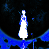
ZOMG WHAT HAPPENED TO MY RUKIA????!!!!!! DDDDDDDDDDDDDDDDDDDDDDDDD:
I then set it to Soft Light 100%.
WHEEEEEEEEEEEEEE RUKIA'S BAAAAAAAAAAAAAACK!!!!!!!!!!! <3333333333333333333
So, moral of the tale of my freaking out, if somethings looks like shit in the beginning, try switching stuff around and observing the effects of what you're doing. Sometimes, sometimes, you'll get something much more than you expect. Brilliant things always strike you square in the face when you least expect it. :>
So, as far as I can tell, Value Invert, when set to Soft Light, can end up with pretty effects. Going to make a note of that. 8D
7. Duplicate the base again - Screen 50.5% under Value Invert layer.
Because Value Invert was being too arrogant for its own good and upped my contrast a little too high, making the shadows blacker than I'd anticipated. Remember what Screen does? Screen uses the whites/light colours in a layer to brighten up the layer directly beneath it, so here we're using that knowledge to brighten the base a little instead of using Brightness/Contrast, Levels or Curves. I usually save those for last for final touch-ups.
8. New Layer: Colour fill, #53a4ff - Soft Light 100%
Photoshop has what they call a Solid Colour Fill which is something like an adjustment layer as well, just that it's only colour and nothing else. GIMP doesn't. GIMP has the notoriety to be very damn...un-straightforward.
To get a solid colour fill in GIMP, make a new layer, take the bucket fill tool, click the coloured rectangle and type in the digits (53a4ff) in the HTML notation. I'm guessing that the # sign in PS is equivalent to "HTML notation" in GIMP. >_>
I'll admit, when I first started using GIMP, I didn't know how to fill in the colour from the bucket. There, I said it.
Anyway, you can choose any sort of blue in order to enhance the blue colours a bit more. I went for a light blue because I wanted to up the lighter shades in the background to make it look like it's shining. The moon shines, so. XD
Sadly, GIMP doesn't have Exclusion, which gives me sad!face. ;A; BUT! That's where Soft Light and Lighten come in! We'll get onto Lighten later on in Step 11.
9. Merge visible.
Because we're going to be going into what PS calls "adjustment layer" - LEVELS, so we need the icon AS WHOLE IN JUST ONE LAYER. ONE. LAYER.
10. Levels
23, 1.03, 248
Levels! My current favourite among the three big brothers: Brightness/Contrast, Curves and Levels. Levels can enhance the blacks/shadows and brightness more efficiently than the other two. Or at least, that's how it feels like to me. Plus, it's easier to handle than Curves. Curves used to make my head hurt, but now I've figure it out. I still don't use it all that much though.
To get to Levels, just go to Colors > Levels. I know the numbers up there can be confusing, so here's a screenshot of what your Levels settings should look like for this particular icon.
Like Curves, the one on the left controls brightness, the one on the right controls shadows, and the middle one is the balancing aspect for the two. I especially recommend using Levels for touch-ups on final products, along with bits of Brightness/Contrast. Curves can be used with slight effects throughout the iconning process - but again, personal. Taste.
11. New Layer - fill with #53a4ff - Lighten only 3.7%

Actually you can stop here without the Lighten and just wrap it up - it looks pretty awesome, already, but me, knowing me as always, I wanted just a weeeee bit more colour.
So I put the colour fill layer to Lighten in order to...lighten the blacks and blues in the icon. They're a bit blinding, don't you think? Just a tad bit. I'm kind of using Lighten to act as Exclusion. If you set Lighten to a complete 100%, you'll get a completely washed out icon covered in nothing but that light blue colour, so play around with the opacity to get what you want. I decreased mine all the way down to 3.7% because I just needed that bit to soften up the colouring.
Lighten at 100%: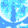
You don't want that, right? RIGHT. No, sarcasm wasn't intended.
The colour set on Lighten can also enhance the colours in the icon. Like Exclusion in Photoshop, it can bring out the colours that you want - just needs a wee bit more work. XD
12. Duplicate colour fill layer - Multiply 12.1%.
A bit too bright for my tastes, so duplicated the Colour Fill layer that I just made in the previous step and set it to Multiply. Remember, Multiply will completely cover your whole icon with the colour if you put it way too high. So that's why I didn't set it all the way up to 100%. I decreased it all the way instead just so it won't make the icon too dark.
Set it too Multiply 100% and get this: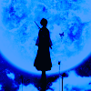
No, thank you. Remember, Multiply will send the bright colours to hell and only allow the blacks some peace.
13. Merge Visible.
At this point, I was actually done with the icon, but see the white outlines of the moon? It's still got a bit of a blueish hue to it, so I wanted to make it more white.
Actually, you don't have to merge visible if you don't want to. Only after this last Colour Fill layer that we're gonna have to do it.
14. New Layer - fill with #ffffff (white) - Overlay 41.1%
I just discovered this awesome layer mode. Well, I don't really use it, just for when I need something a little stronger than Soft Light. In GIMP, white on Soft Light doesn't seem to have any differences with white on Overlay, but I think it does have a difference in PS. I'm not so sure, because yeah, Overlay isn't one of my favourite layer mode.
The white on overlay is for the upping of brightness of the whites. Make sure that it doesn't get TOO BRIGHT, like what happens when you set the Overlay to 100%:
Yeah, no. See that the whites in the moon are overpowering the blues? DO NOT WANT. WE WANT BLUE. So, as always, decrease thy opacity. Does wonders to play with opacity.
15. Merge Visible
Now then we need to merge visible, because next up (and final step, promise) is one of Photoshop's adjustment layer, AKA Colors > Brightness/Contrast in GIMP.
16. Brightness/Contrast
- Brightness: -7
- Contrast: 4
Play with the brightness and contrast bars to get the effect that you want. I turned down the brightness because I wanted the contrast to be more. To be honest, upping the contrast itself can give you a bright icon. Because it's contrast. It gives you shadows and brightness all at once. The brightness bar, when increased too, only makes your icon look washed out with too much light - and the worse part is that it affects the WHOLE icon, not just the white parts.
So play with contrast more. Me, I like to set the contrast first and then set brightness. This is to make sure that the contrast, lighting and shadows don't overpower the icon and make it too sharp. Yep, contrast makes your icon look sharp, like what happens when you abuse Curves too much, so play it subtle.
Here, Rukia's form looks a tad bit too sharp on the right, but ehhhh, I think it'll pass. You can add a couple more Colour Fill layers set to Lighten to add a soft colour scheme to it.
OMG IT'S FINALLY OVER. Hope this has been helpful. Try it out, show me the results. 8D
Questions? :3
Now have fun while I go hunt for food.
Original post here @ shoujo_s Please direct all questions and comments there. No, I don't like the "friend this journal or you won't have access" bull either, so I do not practice it.
I just tried out GIMP today so that I can sort of translate the Rukia colouring (because I just like it) from Photoshopalese to GIMPlese for my bbs. Yeah, like I'm in the place to call them that. They're old enough to be my grandmothers. XD
===>
Program: Photoshop CS5
Steps: 6
Difficulty: Easy-peasy. 8D
FOR PHOTOSHOP USERS
1. Crop your base.
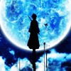
This icon was made for prompt #456: Bright of fandom365days. so of course, you want something bright and not dull and oh-so-boring to fit it, right?
So I took a Rukia wallpaper from Minitokyo, one of the best places to find animanga-related stuff. Scans there are awesome and of high quality, and it's the place that I normally go to aside from the occasional hunt through Mangafox.
2. Selective Colour 1
- Cyans: 100, -13, -71, -18
- Blues: 100, -9, -100, 19
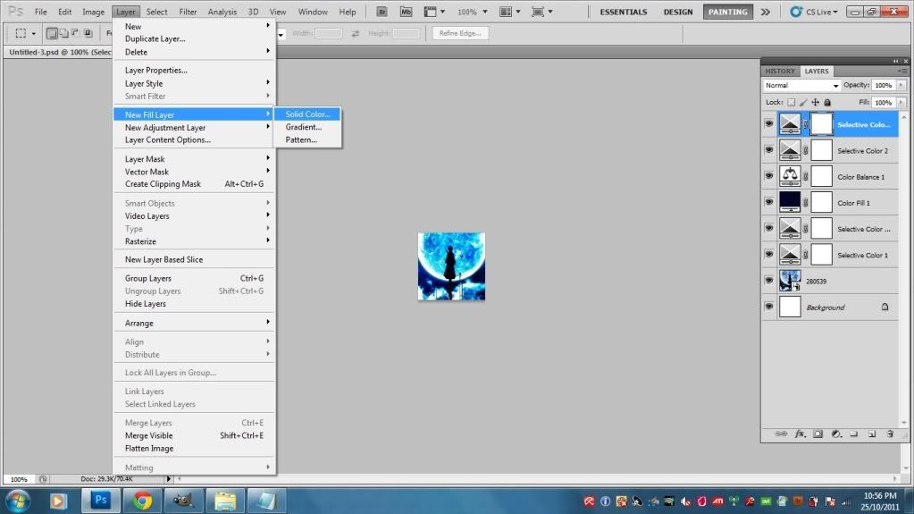
The wallpaper, though beautiful on its own, can be made MUCH MOAR PRETTIEAH through the magic that is Photoshop. No wand-waving and "bimbidy, bombidy, boo" or whatever - the trick? SELECTIVE COLOURING BABEH. Let's see...THREE Selective Colouring layers in this tutorial.. Oh, boy. But hey, it's actually fun to fiddle around with the layer. Keep in mind that it's an adjustment layer, so it can be found through Layer > Adjustment Layer > Selective Colouring (I AIN'T AMERICAN SO IGNORE THE BRIT-SPELLING K.)
So, since the base is mostly blue, ENHANCE THOSE COLOURS. USE 'EM AND ABUSE 'EM. THEY'RE THERE FOR YOU SO WHATCHA WAITIN' FO'?
For those who don't know, a Selective Colour layer has nine colours for you to play with, that are:
- Reds
- Yellows
- Greens
- Cyans
- Blues
- Magentas
- whites
- Neutrals
- Blacks
Each of them, in turn, are branched out into four more colours:
- Cyan
- Magenta
- Yellow
- Black
So, if I say "Cyans: 100, -13, -71, -18", it means Cyan: 100; Magenta: -13; Yellow: -71; Black: -18.
When I first started out, I had problems trying to identify those figures, so I thought of touching on it here. :)
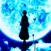
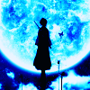
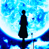
3. Duplicate Selective Colour Layer: Selective Colour 2 - Soft Light 48%
Since the first Selective Colour wasn't quite enough to enhance the contrast, brightness AND the blue colours all at once, you want more of it, yes? Yes. So what now? DUPLICATE IT.
And you'll get this:
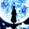
You can stop here if you like since it's already so bright and blinding and blue, but I didn't because I wanted to up the contrast. See the blue pigments under the moon in the background? I want that to be blacker instead of blue (shadows, hello), so instead of setting Selective Colour 2 on Normal mode, I set it to Soft Light.
I get this:
Hnnnnnggghhhhh.
Still kinda eeeeehhhhh for me. Note the areas under the moon that I said I wanted to be blacker. It's gone black like whoa, AS WELL AS RUKIA'S FORM WHY IS IT SO SHARP AT THE EDGES ZOMG *GAAAAASP*
No, we don't want that. Unless, well, you want it, in which case I can't say anything. In everything I discuss, I always bring up the subject of "personal taste" from matters concerning religion, type of alcoholic beverage you like, how you want your steak cooked to what sort of toilet you feel most comfortable shitting on.
In this case, even though the blue is so stunning that it's blinding me, and it's bright enough, I don't like how the black turned out and the sharp edges of Rukia's form.
So I set Selective Colour 2 to Soft Light...wait for it...48%! The product is what you just saw several paragraphs of babbling ago! It's less black, it's got less sharp edges, it's darker...and BOOOOO, less blue.
Now what?
4. Colour fill layer: #000227
Exclusion 100%
Have I ever mentioned of my love for Exclusion layers? One of the best things that ever made its way into iconning. Truth.
I picked a dark blue and set it to exclusion over the icon so that it comes out darker than before, but notice how there are more shades of blue everywhere. In Rukia's black form, in the background - ZOMG BLUEY GOODNESS. Now, that's what I'm talking about.
I use Exclusion layers to darken the image, add more colour, and then pile on top adjustment layers to up the brightness/contrast/colours of everything that I want without causing the image to look too pixelated/sharp like what just happened just now with Selective colour 2 set on Soft Light.
Right? Right.
Because Soft Light enhances shadows and boosts light and made Rukia so damn black and sharp, I lowered the Opacity of the layer. Play around with the Opacity - it can do wonders. But in the case of Exclusion layers, they're normally just set at 100% opacity. Well, at least to me. :|
5. Colour balance
- Shadows: 12, 26, 10
- Midtones: -15, 3, 24
- Highlights: -5, 3, 20
The Exclusion layer sent all matters of contrast and light to hell, so now we whip up another adjustment layer. This time, it's Colour Balance (refer to the above link that gives you the picture of my whole Photoshop program and shows the location of the Selective Colour layer - it's under the same tab).
Colour Balance, like Selective Colour, has some sub-sections as well. The three main ones are:
- Shadows
- Midtones
- Highlights
...OMG, I should just insert a picture.
So, when I say "Midtones: -15, 3, 24," the numbers go according to the bars under their respective sections.
Midtones are just what they are - midtones. The overall "mood" of the icon, so to speak. So in this icon, almost everything is BLUE, so whaddaya wanna do? You enhance the blues, of course! Drag the top bar to the right (increases cyans), drag the middle bar to the right (well...this one doesn't really do anything because there ain't no magenta or green in there, but what the hell) and the bottom bar to the riiiight (ups blue).
Shadows and Hightlights are just what they are as well. This is why Colour Balance can up contrast - it works in almost the same way as Selective Colouring, only that it takes care of the colouring of the ENTIRE icon in general instead of just one particular colour just as what Selective Colour does - hence, selective colour.
So in the end, the blues and cyans are enhanced, the whites and dark blues become slightly brighter. Contrast is boosted. Yayz.
6. Selective Colour 3
- Cyans: 100, 6, -3, -5
- Blues: 100, 11, 10, -13
- Whites: 0, 0, 0, -100
- Blacks: 0, 0, 0, 100
You can actually leave out this step if you like the icon as it is, but me, knowing me, I like my icons with LOTSA LOTSA CONTRAST. This is the last Selective Colour layer, I promise. Hell, we're actually done with the damn icon!
You know the drill, boost Cyans and Blues to up the pretty pretty colours (lower the blacks in Cyans and Blues so that they don't appear too bright; up the whites in Blues because Blues is darker than Cyans; lower the whites in Cyans because Cyans is lighter than Blues). In Whites, up the whites to make sure that the white outline around the moon is totally white and up the blacks in Blacks to get some shadows. HARDCORE BABEH HARDCORE.
ALSO, this is an optional step. I did it anyway. I wanted extra white for the outline of the moon, so I made another Selective Colour layer which only dealt with the Whites. I set it to 0, 0, 0, -100 - ALL THE WAY DOWN LEFT. The icon above is done with this extra step, so I just wanted to throw it out there. Just a minor change - don't think it's actually all that noticeable, so.
And we are done.
Try comparing the three icons - the two icons from Step 3 (with Soft Light set to Normal mode and the other set to Soft Light 100%) with the final product:
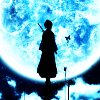
1) Sel. Colour on Normal 100%:
2) Sel. Colour on Soft Light 100%:
3) Final:
Notice how the one on Normal 100% looks more washed out, the one on Soft Light 100% has a bit too much contrast (BUt with bright pretty blues) and the Final one is just somewhere in between.
It's all just personal choice, really. I actually like all three versions - I was just a little too adventurous and experimented a little bit more. Sel. Colour is starting to be my fav adjustment layer. <3
===>
Program: GIMP 2
Steps: 16 (though some can be omitted)
Difficulty: Uber easy. Like, seriously. 8D
The final icon is a bit brighter than the one made with Photoshop. That's basically because GIMP doesn't have Exclusion layers to mute the colours, but it still works all the same, so. x3
FOR GIMP-USERS
So, as always, the first step is to:
1. Crop base.
The cropping that I used for this is the same, only different in that this one is a little "closer" to the moon. I started from scratch using GIMP, but that doesn't make much difference, really. Just a heads-up.
I haven't figured it out yet, but I think that it's impossible to do in GIMP - creating a 100x100 canvas and dragging the picture you want to icon straight into the program just like what I usually do in Photoshop. So it was a rather pain in the ass to open the whole picture itself, cut and crop it down to size.
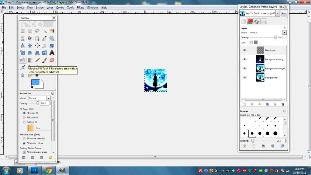
Open the picture that you want and use the rectangle selection tool. Drag it over the picture to make a square/rectangle. It doesn't matter at this point because you'll still be choosing the proper crop to go with.
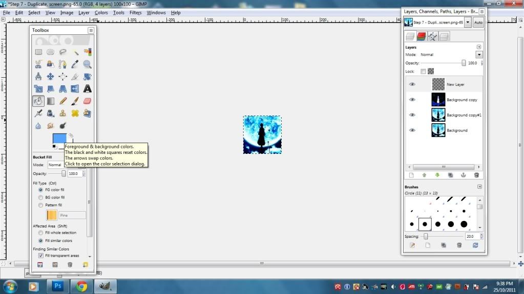
The selection that you come up with is movable and re-sizable (screenshot), so you don't have to worry if you made the size of the selected area too big/small. You can always modify it.
So once you've got the crop that you want, go to Image > Crop selection. Then, if the image is still too big, go to Image > Scale Image to re-size it down to 100x100.
Also, make sure that in the Scale Image Window, the chain binding the Width and the Height is unlinked. This is to make sure that all sizes of the icon are equal in dimension. Say, if you don't unlink them, and if the original size of your image is 450x460, you'll get a 100x105 or something along those lines when you shrink it down.
Now that you've got the crop that you want, 100x100 and all, let's move on! 8D
2. Duplicate the base TWICE.
Set the first duplicated to Screen 59.8% and Soft Light 100%.
Screen it to brighten up the base, soft light to boost the contrast - just like in Photoshop. It's all about the contrast. I reduced the Screened layer because at 100% it became too bright, and added with Soft Light, the brightness and contrast were just blinding. I normally make sure not to make the icon look too bright during earlier stages because I can always abuse the Brightness/Contrast, Levels and Curves tool later on when I'm done and satisfied with everything.
3. Colour Balance - Soft Light 100%
- Shadows: -100, 43, 100
- Midtones: -100, 50, 100
- Highlights: -100, 24, 100
Okay, remember in Photoshop we have adjustment layers and some such crap? Well, GIMP doesn't seem to utilize stuff like that, so it was rather difficult for me to get used to it. The trick is, you need to duplicate your base layer if you want to do stuff like Color Balance, Curves, Channel Mixer and all that jazz. Those tools (note: NOT layers) edit the icon directly, unlike Photoshop which enables the adjustment layers to be set to Soft Light, Screen, whatever just like picture and colour fill layers.
Major pain in the butt, but easy if you get used to it.
So, for Color Balancing, you will first need a picture to color balance, right? So take the Soft Lighted layer that you duplicated in Step 2 (it should be above the Screened layer) and tweak it. To get to Color Balance, go to Colors > Color Balance.
Color Balance in GIMP works just like Color Balance in Photoshop, so I hope you remember the explanations in the Photoshop tut! XD IF NOT, GO READ IT. NAO. SCROLL UP AND READ BEFORE PROCEEDING ANY FURTHER OR I WILL BITE YOUR HEAD OFF. VIRTUALLY.
Color Balance, like mentioned above, can be used to boost contrast, brightness and colours in the overall icon. So, in this case, we want to make blues poop pop, right? So just increase the Cyans and all that - EXACTLY LIKE PHOTOSHOP. 8D
4. Lower the opacity of the screened layer to 34.6%.
Because the icon, after the Color Balance thing, was just too bright for my tastes. Screen ups brightness, right? So it has to go. LIKE WHOA.
Really, it helps to play around with the opacity - again, it works wonders. ;D
5. Merge visible layers. Duplicate the new base.
Since GIMP doesn't have the Stamp Visible ability (CTRL+ALT+E), we're just going to have to merge everythaaaaang. Because, remember, in GIMP, you need a picture to edit with Color Balance/Curves/Levels/whatever, and it just doesn't work when you want to edit the icon AS A WHOLE. It doesn't work like that. GIMP edits the layers one by freaking one.
Unless I'm wrong. >_>
To merge, just hover your mouse over any layer in the layer palette, right-click and scroll waaaay down the list to find "Merge Visible Layers."
--->
Flatten works just as well, so pick whichever you feel like. I normally just go for merge though. "Flatten" somehow reminds me of pancake. Which in turn makes me hungry. Which in turn makes me leave the laptop to go binge. Which in turn makes me fat. And I do not want to be fat.
Vanity aside, your merged layers are now one layer in your layer palette, yes? Alrighty. DUPLICATE IT.
6. Value Invert - Soft Light 100%
This is where it gets...weird. I actually found this by accident. I was reading a tutorial where they set the layer to "Value, 100%", and I was like...WTF is that? So I just fiddled around with the tabs and somehow found Value Invert. Clicked it.
And got this:
ZOMG WHAT HAPPENED TO MY RUKIA????!!!!!! DDDDDDDDDDDDDDDDDDDDDDDDD:
I then set it to Soft Light 100%.
WHEEEEEEEEEEEEEE RUKIA'S BAAAAAAAAAAAAAACK!!!!!!!!!!! <3333333333333333333
So, moral of the tale of my freaking out, if somethings looks like shit in the beginning, try switching stuff around and observing the effects of what you're doing. Sometimes, sometimes, you'll get something much more than you expect. Brilliant things always strike you square in the face when you least expect it. :>
So, as far as I can tell, Value Invert, when set to Soft Light, can end up with pretty effects. Going to make a note of that. 8D
7. Duplicate the base again - Screen 50.5% under Value Invert layer.
Because Value Invert was being too arrogant for its own good and upped my contrast a little too high, making the shadows blacker than I'd anticipated. Remember what Screen does? Screen uses the whites/light colours in a layer to brighten up the layer directly beneath it, so here we're using that knowledge to brighten the base a little instead of using Brightness/Contrast, Levels or Curves. I usually save those for last for final touch-ups.
8. New Layer: Colour fill, #53a4ff - Soft Light 100%
Photoshop has what they call a Solid Colour Fill which is something like an adjustment layer as well, just that it's only colour and nothing else. GIMP doesn't. GIMP has the notoriety to be very damn...un-straightforward.
To get a solid colour fill in GIMP, make a new layer, take the bucket fill tool, click the coloured rectangle and type in the digits (53a4ff) in the HTML notation. I'm guessing that the # sign in PS is equivalent to "HTML notation" in GIMP. >_>
I'll admit, when I first started using GIMP, I didn't know how to fill in the colour from the bucket. There, I said it.
Anyway, you can choose any sort of blue in order to enhance the blue colours a bit more. I went for a light blue because I wanted to up the lighter shades in the background to make it look like it's shining. The moon shines, so. XD
Sadly, GIMP doesn't have Exclusion, which gives me sad!face. ;A; BUT! That's where Soft Light and Lighten come in! We'll get onto Lighten later on in Step 11.
9. Merge visible.
Because we're going to be going into what PS calls "adjustment layer" - LEVELS, so we need the icon AS WHOLE IN JUST ONE LAYER. ONE. LAYER.
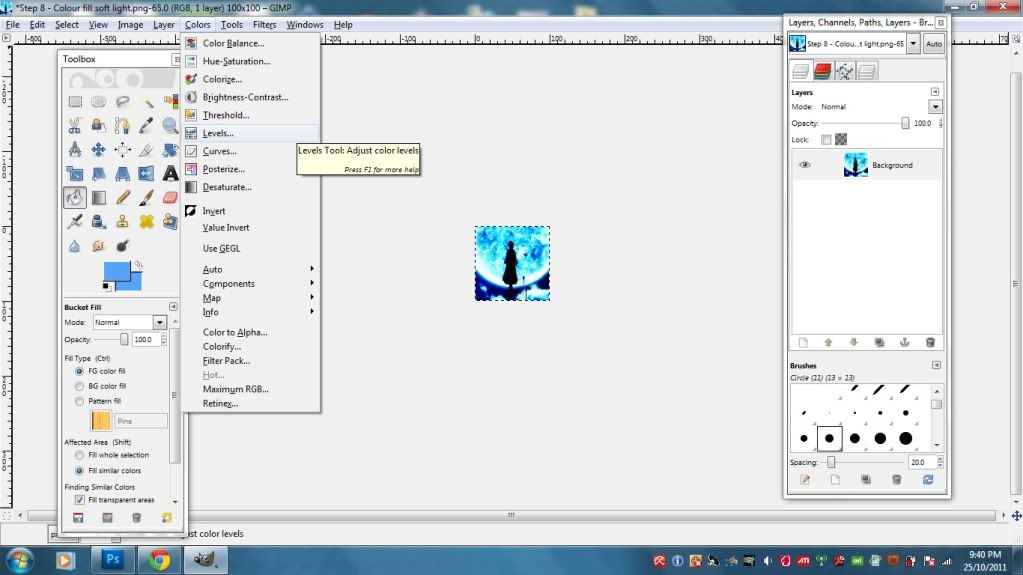
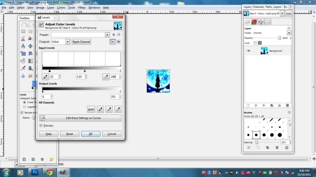
10. Levels
23, 1.03, 248
Levels! My current favourite among the three big brothers: Brightness/Contrast, Curves and Levels. Levels can enhance the blacks/shadows and brightness more efficiently than the other two. Or at least, that's how it feels like to me. Plus, it's easier to handle than Curves. Curves used to make my head hurt, but now I've figure it out. I still don't use it all that much though.
To get to Levels, just go to Colors > Levels. I know the numbers up there can be confusing, so here's a screenshot of what your Levels settings should look like for this particular icon.
Like Curves, the one on the left controls brightness, the one on the right controls shadows, and the middle one is the balancing aspect for the two. I especially recommend using Levels for touch-ups on final products, along with bits of Brightness/Contrast. Curves can be used with slight effects throughout the iconning process - but again, personal. Taste.
11. New Layer - fill with #53a4ff - Lighten only 3.7%
Actually you can stop here without the Lighten and just wrap it up - it looks pretty awesome, already, but me, knowing me as always, I wanted just a weeeee bit more colour.
So I put the colour fill layer to Lighten in order to...lighten the blacks and blues in the icon. They're a bit blinding, don't you think? Just a tad bit. I'm kind of using Lighten to act as Exclusion. If you set Lighten to a complete 100%, you'll get a completely washed out icon covered in nothing but that light blue colour, so play around with the opacity to get what you want. I decreased mine all the way down to 3.7% because I just needed that bit to soften up the colouring.
Lighten at 100%:
You don't want that, right? RIGHT. No, sarcasm wasn't intended.
The colour set on Lighten can also enhance the colours in the icon. Like Exclusion in Photoshop, it can bring out the colours that you want - just needs a wee bit more work. XD
12. Duplicate colour fill layer - Multiply 12.1%.
A bit too bright for my tastes, so duplicated the Colour Fill layer that I just made in the previous step and set it to Multiply. Remember, Multiply will completely cover your whole icon with the colour if you put it way too high. So that's why I didn't set it all the way up to 100%. I decreased it all the way instead just so it won't make the icon too dark.
Set it too Multiply 100% and get this:
No, thank you. Remember, Multiply will send the bright colours to hell and only allow the blacks some peace.
13. Merge Visible.
At this point, I was actually done with the icon, but see the white outlines of the moon? It's still got a bit of a blueish hue to it, so I wanted to make it more white.
Actually, you don't have to merge visible if you don't want to. Only after this last Colour Fill layer that we're gonna have to do it.
14. New Layer - fill with #ffffff (white) - Overlay 41.1%
I just discovered this awesome layer mode. Well, I don't really use it, just for when I need something a little stronger than Soft Light. In GIMP, white on Soft Light doesn't seem to have any differences with white on Overlay, but I think it does have a difference in PS. I'm not so sure, because yeah, Overlay isn't one of my favourite layer mode.
The white on overlay is for the upping of brightness of the whites. Make sure that it doesn't get TOO BRIGHT, like what happens when you set the Overlay to 100%:
Yeah, no. See that the whites in the moon are overpowering the blues? DO NOT WANT. WE WANT BLUE. So, as always, decrease thy opacity. Does wonders to play with opacity.
15. Merge Visible
Now then we need to merge visible, because next up (and final step, promise) is one of Photoshop's adjustment layer, AKA Colors > Brightness/Contrast in GIMP.
16. Brightness/Contrast
- Brightness: -7
- Contrast: 4
Play with the brightness and contrast bars to get the effect that you want. I turned down the brightness because I wanted the contrast to be more. To be honest, upping the contrast itself can give you a bright icon. Because it's contrast. It gives you shadows and brightness all at once. The brightness bar, when increased too, only makes your icon look washed out with too much light - and the worse part is that it affects the WHOLE icon, not just the white parts.
So play with contrast more. Me, I like to set the contrast first and then set brightness. This is to make sure that the contrast, lighting and shadows don't overpower the icon and make it too sharp. Yep, contrast makes your icon look sharp, like what happens when you abuse Curves too much, so play it subtle.
Here, Rukia's form looks a tad bit too sharp on the right, but ehhhh, I think it'll pass. You can add a couple more Colour Fill layers set to Lighten to add a soft colour scheme to it.
OMG IT'S FINALLY OVER. Hope this has been helpful. Try it out, show me the results. 8D
Questions? :3
Now have fun while I go hunt for food.
Original post here @ shoujo_s Please direct all questions and comments there. No, I don't like the "friend this journal or you won't have access" bull either, so I do not practice it.