Icon Tutorial #2 (Colouring/Cropping): Angsty!Juice [Season 4; Sons of Anarchy]
A tutorial for synnerxx even though she didn't request it and doesn't use Photoshop. Just wanted to let her know how special she is. :3
to
Program: Photoshop CS5 (should work on all versions of Photoshop...I think)
Translatable?: Don't think so. Contains Curves and Selective Colouring.
Steps: 9
Difficulty: Newbie!-friendly!! :DDDD
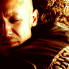
1. Crop your base.
This icon was made for the prompt #989: Mud for iconaday. I took the colour of mud and incorporated it into the icon - brown, dark yellow, copper, bits of dark, dark red. Also, I have a soft spot for this type of colouring, so.
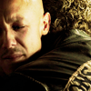
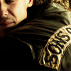
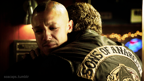
I went to the Sons of Anarchy Tumblr where they post amazing caps and snagged this cap of Juice and Clay because when I first saw it, I knew what sort of crop I wanted.
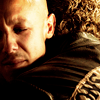
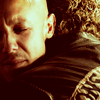
Initially, I wanted to crop it like these:
As you can see, there are many ways to crop your base. It's just a matter of personal taste and an eye for good cropping. I can't really say how exactly to get a good crop, but based off a cropping tutorial I read some time ago, the trick is to play with negative space. Have the head to the side and a load of empty space to the right/left which you can leave empty or add some text. Center and close-crop it so only the mouth and shoulders are visible. Just go wild with cropping, but make sure that the base comes out without the "flattened, pancake look", as I like to call it.
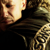
Like this: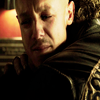
An absolute no-no. We want to retain the original image in its shapes and forms - not so much sizes, 'cause you're just gonna shrink 'em down to 100x100 and 40kb.
To crop, I just open a new 100x100 document and drag the picture from the deskstop into Photoshop. From there, move it around. I find it easier to do this way than setting a 100x100 selection thing and moving it around the picture to find a crop that you like, but it's always up to personal taste.
2. Selective Colour:
Reds: -16, 8, 20, 2
Yellows: -100, 9, 10 -16
Whites: 0, 0, 0, -9
Neutrals: -1, 2, 2, 0
Blacks: 0, 0, 0, 8
Selective colouring is used whenever you want to enhance a particular colour. In this icon, I wanted to boost the reds and yellows, so for the Reds section, I decrease the Cyans (-16) and boosted the other colours [Magenta (+8), Yellow (+20) and Black (+2)].
I also find Selective Colouring to be helpful when you're searching for some contrast in the icon and are not ready to go for Curves, Levels or plain Brightness/Contrast. Truth be told, you don't even need either one of those if you know how to handle the contrast of the icon using Selective Colouring. All you have to do is boost the colours that you want, lower the rest, and increase the Blacks for shadows. It still depends on how you want the colouring on the icon to be though, so again, personal choice.
(As you can see, I didn't use any Curves, Levels or Brightness/Contrast for this icon. Everything was covered by Selective Colouring, hence the two layers of SC. :3)
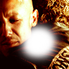
3. Colour fill: #230000, Exclusion 100%
I love Exclusion layers like whoa. I like how they add colour and make the icon darker, and on top of the layer, you can pile light/gradient textures and do a ton of Selective Colouring and Colour Balancing. It's awesome. But it gets nasty sometimes, because NOT ALL colours can be used for Exclusion. Do not use bright colours for exclusion layers - they'll only stuff your icon colouring into the loo and shit on it.
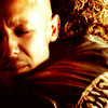
Like this: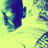
In this one, I used the #e0ff82, a light yellow. Sure, if you want something like that, go for it, but for me, ehhh, I prefer darker colours and more contrast.
Use dark colours for Exclusion layers. For this icon, I used dark red/brown because I wanted the black of clay's jacket to be tinged with red in the end. When I choose a colour for Exclusion, I always check to see whether or not it looks nice when I first set up the Exclusion layer. If it's not, bam, it's gone like clockwork.
Icon-making's basically all about planning. Sure, you can experiment with fonts and colouring and abuse textures - sometimes they come out great, other times, they don't. Experimenting is good - thing is, I just don't like screwing up. XD
4. Selective Colour:
Reds: -8, 1, 9, -4
Yellows: -20, 8, 8, 6
Whites: 0, 0, 0, -10
Neutrals: 2, -1, -1, -1
Blacks: 0, 0, 0, 6

Yep, the contrast had gone to hell because of the Exclusion layer - BUT, we get to have pretty, pretty hints of red. WHEEEE.
But of course, nobody wants a dull icon like that without contrast and much colouring. Bleh.
Remember the little tidbit about Selective Colouring? It's coming into play right nao. To up the constrast AND enhance the colours, repeat the same trick as the last SC layer. Notice how the red and yellow seem to pop out more now? Yeeeeaaaahh.
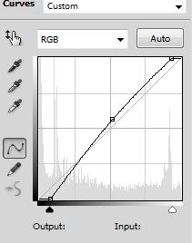
5. Curves: Three dots (screenshot)
2, 20
146, 133
255, 240
During the time I wrote "As you can see, I didn't use any Curves, Levels or Brightness/Contrast for this icon. Everything was covered by Selective Colouring, hence the two layers of SC. :3" in Step 3, I had forgotten that I actually DID use a Curves layer. Fail. >_> SC really does things with contrast (at least, in my case) but sometimes you just have to have a layer specially made to boost brightness and contrast.
Actually, I could have just left the icon like that without the Curves layer, but I decided what the hell and went for it. I like my icons with lots of contrast, even to the point that it may blind some people. I still don't get how Curves and Levels are different, so if anyone has a tip, feel free to share, please. :3
Add in a third dot in the middle of the line so that you can have extra contrast and extra handling on it. The bottom dot deals with shadows while the top dot deals with brightness, so having a middle line is good to control both of them at once. It can prevent your shadows from getting too dark and your brightness from becoming too...bright. Basically, it lets you get a grip on how bright/dark/much contrast of your icon.
6. Optional: text (the original icon had text in it, but I prefer it without, so.)
For this icon, I used Georgia, 11px, Italics. When you use fonts, unless you want the thing to really pop out of your icon, make sure that the colour is about the same as the subject itself so that it would match and not bring about an eyesore. I cancelled out the font in this icon because I found that it didn't really work/match.
To get more fonts, go to Dafonts.com. Best place to look for fonts. I downloaded a couple two days ago and had one hell of an afternoon experimenting with 'em. ;D
7. New Layer: Take a soft brush about 36px, white, and paint some blobs, making it look like a gradient layer.
Set it to Soft Light 100%.

This is basically just to add some light in the middle there to brighten things up a little. Like a gradient. In the case of this icon, it wasn't really necessary. I liked it without the white blobs as well, but decided to just go for it to make it a liiiiiitle bit more interesting. You know, for the splash of red there in the middle.
OR, if you don't want to do that, you can always make a Gradient layer with a white-to-nothing gradient and set it to Radial, like this. It works just as well, only that the gradient is more centered. I didn't want it to be centered, so I just made my own "gradient."
8. Stamp visible: CTRL+ALT+E to, eh, combine all the layers below and place them in one new layer. Set that new layer to Soft Light 24%.
I love this step because it adds contrast and colour to the icon. Stamping takes the finished icon (in this case) and places it on top of all the layers with the layers still being in tact. That way, you can add the colour of the finished icon to the layers below (am I making sense?).
Sometimes, when people want to go for a more "soft, glowing" look, they'll Gaussian Blur the stamped layer and set it to Soft Light. But in this case, I didn't take this step BECAUSE I JUST DIDN'T WANNA AND IT LOOKS FINE WITHOUT IT ANYWAY. Again, personal taste.
9. Texture by...I forgot. Set it to Screen 100%.
I seriously need to organize all my textures and REMEMBER WHO MADE 'EM. Tell me if this is yours - I honestly forgot.
So, set the texture to Screen 100% because you only want the floating beads of light, NOT the black parts. Screen only gives you the parts of the textures with colour while Multiply gives you black.
is what I get when I place the texture to Multiply. Kinda pointless, amiright? Angsty!Juice is gone and replaced with a whole crapload of black. No one wants that.
I love abusing light textures. You can find a LOT of them through the light tag at texturize, another light tag at 100x100textures and the light/vampiresparkle/glow tag at icon_textures.
And there ya have it:
Hope this tutorial was informative enough. Granted, I ain't the best at explaining things and this tutorial was made basically for newbies, so.
Questions? Just ask. And have fun! Icon-making is all about fun, really. Put on some music - heck, make some icons during a commercial break! Remember, practice makes perfect! I used to suuuuuuuuuuuuuuck "the shit off my toilet bowl", as Spoony would say, but I went at icon-making LIKE. A. BOSS and...I think I'm getting pretty okay with it. Not good but just okay.
I'll be making two more icon tutorials based on Rukia from Bleach - one of 'em a simple tut of colouring and another of simple composition and B&W usage. I think I'm going to have to try my hand at GIMP just for my bb. I'm loving the fact that you're into iconing now. <3
Original post here @ shoujo-s. Please direct all comments and questions there.
to
Program: Photoshop CS5 (should work on all versions of Photoshop...I think)
Translatable?: Don't think so. Contains Curves and Selective Colouring.
Steps: 9
Difficulty: Newbie!-friendly!! :DDDD
1. Crop your base.
This icon was made for the prompt #989: Mud for iconaday. I took the colour of mud and incorporated it into the icon - brown, dark yellow, copper, bits of dark, dark red. Also, I have a soft spot for this type of colouring, so.
I went to the Sons of Anarchy Tumblr where they post amazing caps and snagged this cap of Juice and Clay because when I first saw it, I knew what sort of crop I wanted.
Initially, I wanted to crop it like these:
As you can see, there are many ways to crop your base. It's just a matter of personal taste and an eye for good cropping. I can't really say how exactly to get a good crop, but based off a cropping tutorial I read some time ago, the trick is to play with negative space. Have the head to the side and a load of empty space to the right/left which you can leave empty or add some text. Center and close-crop it so only the mouth and shoulders are visible. Just go wild with cropping, but make sure that the base comes out without the "flattened, pancake look", as I like to call it.
Like this:
An absolute no-no. We want to retain the original image in its shapes and forms - not so much sizes, 'cause you're just gonna shrink 'em down to 100x100 and 40kb.
To crop, I just open a new 100x100 document and drag the picture from the deskstop into Photoshop. From there, move it around. I find it easier to do this way than setting a 100x100 selection thing and moving it around the picture to find a crop that you like, but it's always up to personal taste.
2. Selective Colour:
Reds: -16, 8, 20, 2
Yellows: -100, 9, 10 -16
Whites: 0, 0, 0, -9
Neutrals: -1, 2, 2, 0
Blacks: 0, 0, 0, 8
Selective colouring is used whenever you want to enhance a particular colour. In this icon, I wanted to boost the reds and yellows, so for the Reds section, I decrease the Cyans (-16) and boosted the other colours [Magenta (+8), Yellow (+20) and Black (+2)].
I also find Selective Colouring to be helpful when you're searching for some contrast in the icon and are not ready to go for Curves, Levels or plain Brightness/Contrast. Truth be told, you don't even need either one of those if you know how to handle the contrast of the icon using Selective Colouring. All you have to do is boost the colours that you want, lower the rest, and increase the Blacks for shadows. It still depends on how you want the colouring on the icon to be though, so again, personal choice.
(As you can see, I didn't use any Curves, Levels or Brightness/Contrast for this icon. Everything was covered by Selective Colouring, hence the two layers of SC. :3)
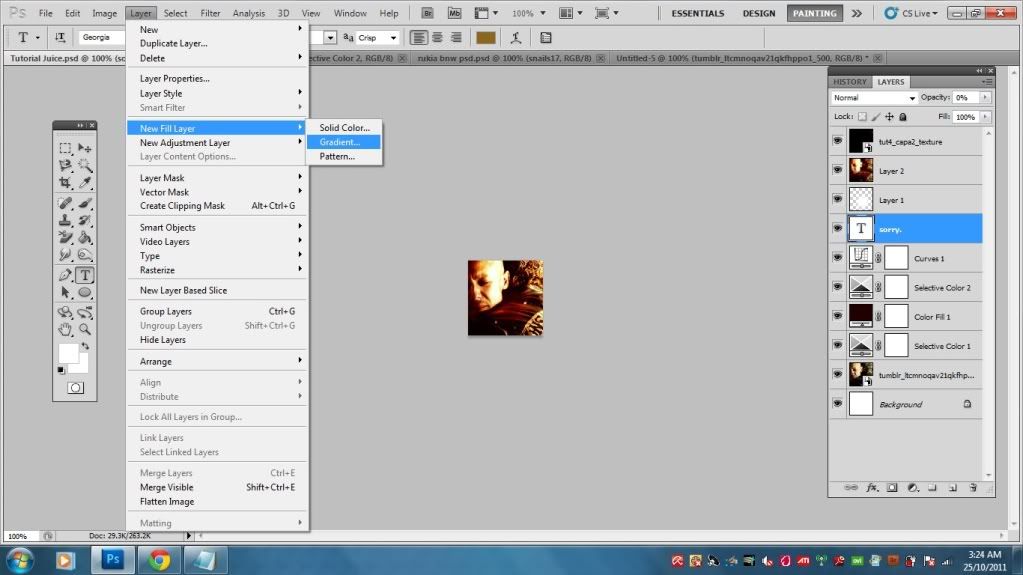
3. Colour fill: #230000, Exclusion 100%
I love Exclusion layers like whoa. I like how they add colour and make the icon darker, and on top of the layer, you can pile light/gradient textures and do a ton of Selective Colouring and Colour Balancing. It's awesome. But it gets nasty sometimes, because NOT ALL colours can be used for Exclusion. Do not use bright colours for exclusion layers - they'll only stuff your icon colouring into the loo and shit on it.
Like this:
In this one, I used the #e0ff82, a light yellow. Sure, if you want something like that, go for it, but for me, ehhh, I prefer darker colours and more contrast.
Use dark colours for Exclusion layers. For this icon, I used dark red/brown because I wanted the black of clay's jacket to be tinged with red in the end. When I choose a colour for Exclusion, I always check to see whether or not it looks nice when I first set up the Exclusion layer. If it's not, bam, it's gone like clockwork.
Icon-making's basically all about planning. Sure, you can experiment with fonts and colouring and abuse textures - sometimes they come out great, other times, they don't. Experimenting is good - thing is, I just don't like screwing up. XD
4. Selective Colour:
Reds: -8, 1, 9, -4
Yellows: -20, 8, 8, 6
Whites: 0, 0, 0, -10
Neutrals: 2, -1, -1, -1
Blacks: 0, 0, 0, 6
Yep, the contrast had gone to hell because of the Exclusion layer - BUT, we get to have pretty, pretty hints of red. WHEEEE.
But of course, nobody wants a dull icon like that without contrast and much colouring. Bleh.
Remember the little tidbit about Selective Colouring? It's coming into play right nao. To up the constrast AND enhance the colours, repeat the same trick as the last SC layer. Notice how the red and yellow seem to pop out more now? Yeeeeaaaahh.
5. Curves: Three dots (screenshot)
2, 20
146, 133
255, 240
During the time I wrote "As you can see, I didn't use any Curves, Levels or Brightness/Contrast for this icon. Everything was covered by Selective Colouring, hence the two layers of SC. :3" in Step 3, I had forgotten that I actually DID use a Curves layer. Fail. >_> SC really does things with contrast (at least, in my case) but sometimes you just have to have a layer specially made to boost brightness and contrast.
Actually, I could have just left the icon like that without the Curves layer, but I decided what the hell and went for it. I like my icons with lots of contrast, even to the point that it may blind some people. I still don't get how Curves and Levels are different, so if anyone has a tip, feel free to share, please. :3
Add in a third dot in the middle of the line so that you can have extra contrast and extra handling on it. The bottom dot deals with shadows while the top dot deals with brightness, so having a middle line is good to control both of them at once. It can prevent your shadows from getting too dark and your brightness from becoming too...bright. Basically, it lets you get a grip on how bright/dark/much contrast of your icon.
6. Optional: text (the original icon had text in it, but I prefer it without, so.)
For this icon, I used Georgia, 11px, Italics. When you use fonts, unless you want the thing to really pop out of your icon, make sure that the colour is about the same as the subject itself so that it would match and not bring about an eyesore. I cancelled out the font in this icon because I found that it didn't really work/match.
To get more fonts, go to Dafonts.com. Best place to look for fonts. I downloaded a couple two days ago and had one hell of an afternoon experimenting with 'em. ;D
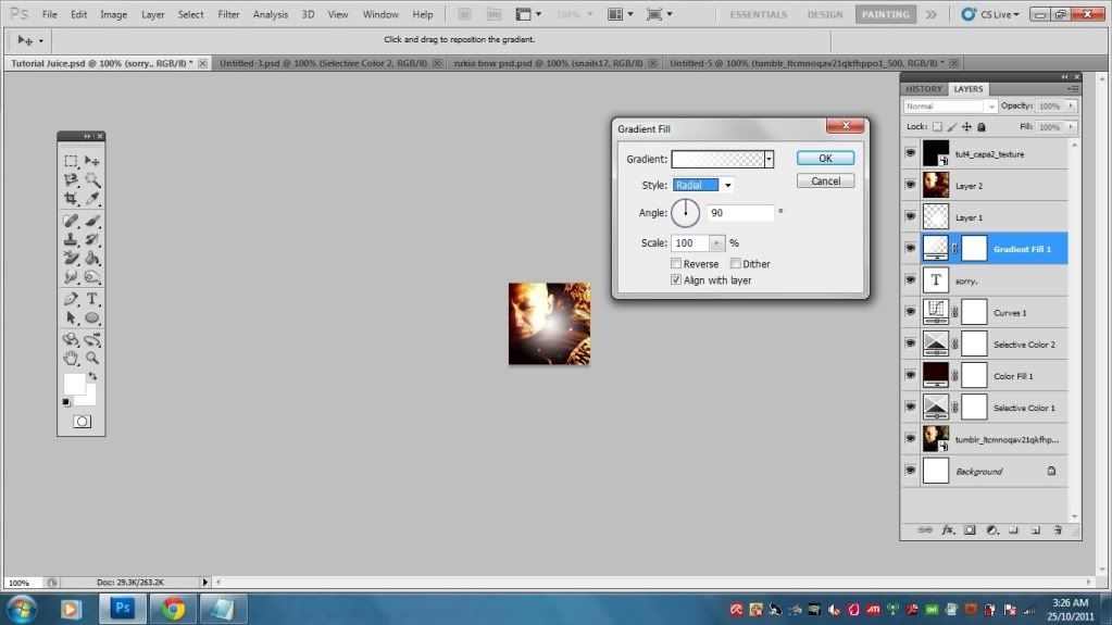
7. New Layer: Take a soft brush about 36px, white, and paint some blobs, making it look like a gradient layer.
Set it to Soft Light 100%.
This is basically just to add some light in the middle there to brighten things up a little. Like a gradient. In the case of this icon, it wasn't really necessary. I liked it without the white blobs as well, but decided to just go for it to make it a liiiiiitle bit more interesting. You know, for the splash of red there in the middle.
OR, if you don't want to do that, you can always make a Gradient layer with a white-to-nothing gradient and set it to Radial, like this. It works just as well, only that the gradient is more centered. I didn't want it to be centered, so I just made my own "gradient."
8. Stamp visible: CTRL+ALT+E to, eh, combine all the layers below and place them in one new layer. Set that new layer to Soft Light 24%.
I love this step because it adds contrast and colour to the icon. Stamping takes the finished icon (in this case) and places it on top of all the layers with the layers still being in tact. That way, you can add the colour of the finished icon to the layers below (am I making sense?).
Sometimes, when people want to go for a more "soft, glowing" look, they'll Gaussian Blur the stamped layer and set it to Soft Light. But in this case, I didn't take this step BECAUSE I JUST DIDN'T WANNA AND IT LOOKS FINE WITHOUT IT ANYWAY. Again, personal taste.
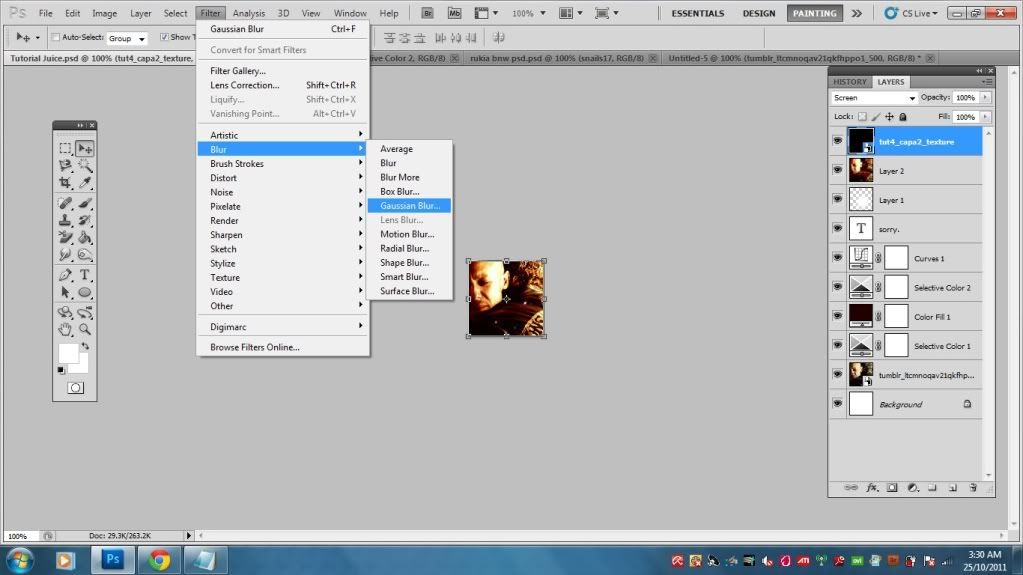
9. Texture by...I forgot. Set it to Screen 100%.
I seriously need to organize all my textures and REMEMBER WHO MADE 'EM. Tell me if this is yours - I honestly forgot.
So, set the texture to Screen 100% because you only want the floating beads of light, NOT the black parts. Screen only gives you the parts of the textures with colour while Multiply gives you black.
is what I get when I place the texture to Multiply. Kinda pointless, amiright? Angsty!Juice is gone and replaced with a whole crapload of black. No one wants that.
I love abusing light textures. You can find a LOT of them through the light tag at texturize, another light tag at 100x100textures and the light/vampiresparkle/glow tag at icon_textures.
And there ya have it:
Hope this tutorial was informative enough. Granted, I ain't the best at explaining things and this tutorial was made basically for newbies, so.
Questions? Just ask. And have fun! Icon-making is all about fun, really. Put on some music - heck, make some icons during a commercial break! Remember, practice makes perfect! I used to suuuuuuuuuuuuuuck "the shit off my toilet bowl", as Spoony would say, but I went at icon-making LIKE. A. BOSS and...I think I'm getting pretty okay with it. Not good but just okay.
I'll be making two more icon tutorials based on Rukia from Bleach - one of 'em a simple tut of colouring and another of simple composition and B&W usage. I think I'm going to have to try my hand at GIMP just for my bb. I'm loving the fact that you're into iconing now. <3
Original post here @ shoujo-s. Please direct all comments and questions there.