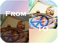
(no subject)
Program: Photoshop 7
Difficulty Level: Intermediate
Translatable: Never having used other programs, I don't know. Contains colour balance, colour fill and hue/saturation.
PSD: No
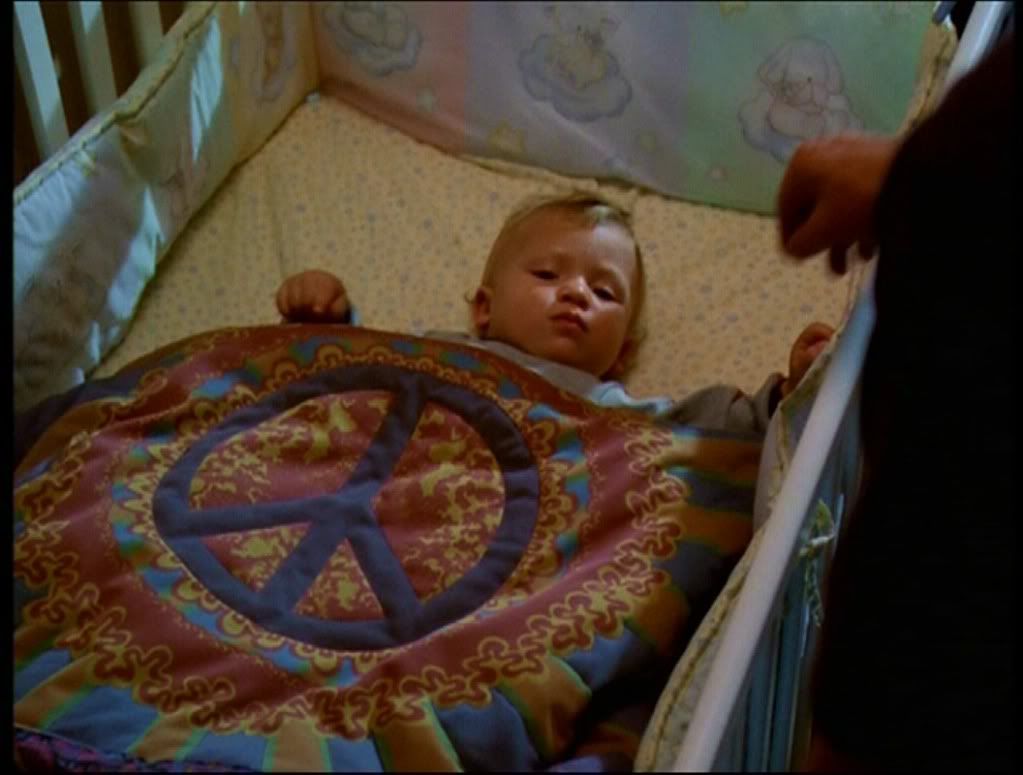
Start off with this cap from Screencap Paradise. Crop and resize it till you're happy with your base.
Step 1: Duplicate the base 4 times. Set the bottom layer to Soft Light 100%. Set all the others to Screen 100%. This lightens the very dark image.
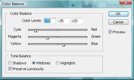
Step 2: Colour Balance: -75, -35, +20. Ensure it is set to MIDTONES. This helps to 'normalise' the image. Make the colours easier to work with.
example
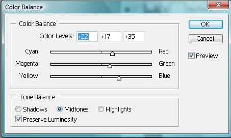
Step 3: Colour Balance: +22, +17, +35. Ensure it is set to MIDTONES. This brings out the pinks and reds.
example
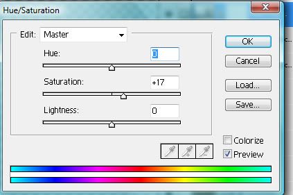
Step 4: Hue/Saturation: Saturation +17. This brightens the colours. It doesn't look great at the moment, but it's needed for the following layers to work.
example
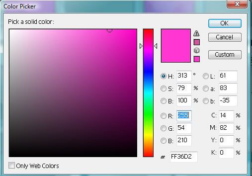
Step 5: Colour Fill: FF36D2 set to Saturation 30%. Now the pink is too harsh, but have faith!
example
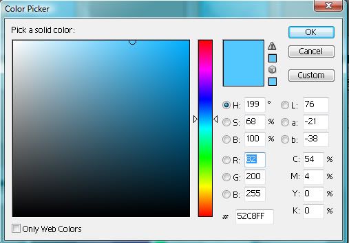
Step 6: Colour Fill: 52C8FF set to Overlay 30%. See, it's starting to look better already! You could stop here is you want. I think it looks good.
example
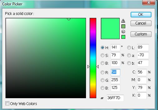
Step 7: Colour Fill: 36FF7D set to Soft Light 30%. Brings out the greens and blues.
example
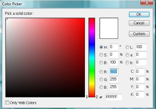
Step 8: Colour Fill: FFFFFF set to Hue 30%. This takes the harshness out of the colours, but now it is too dull.
example
Step 9: Finally, select all (Ctrl A), Edit -> Copy Merged, paste (Ctrl V). Make sure this layer is on top and set to Soft Light 100%. This brings out the colour nicely, but not making it too harsh.
Flatten and finished!

this is what your layer palette should look like.
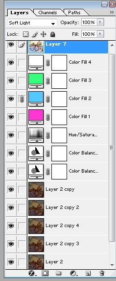
Comments etc? I've got more tutorials here. I'd prefer if you comment on this here as it is easier to keep track of comments there.