2 colourings
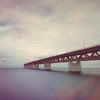
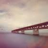
Colouring #03
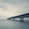
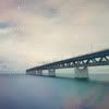
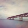
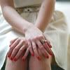
From
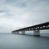
to
Program: Photoshop CS5
Difficulty Level: Easy
Translatable: No (uses Selective Colouring)
PSD: Yes
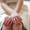
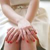
Colouring #04
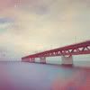
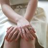
From
to
Program: Photoshop CS5
Difficulty Level: Easy
Translatable: No (uses Selective Colouring)
PSD: Yes
Colouring #03
1. Prepare your base. This type of colouring works better with black&white
images or images with colours that aren't saturated.
2. We're gonna give a slight blueish hue to our image and make it softer.
Add a Color Fill layer, #041328, set to Exclusion, 100%.
3. Add this texture by bambinainnero and set it to Soft Light, 100%. I chose this
texture because it both gives colours and works as a gradient. There are also
some light dots in the left up corner which make it look even better.
4. Add a Color Fill layer, #b93434, set it to Lighten, 40%.
Now the image has more warm and soft colours.
5. Our image looks kinda dull, so we're gonna add some contrast.
Add a Brightness/Contrast layer:
Brightness -12
Contrast 11
6. In this step we make the image warmer so the texture blends in a better way.
Add a Color Balance layer:
Midtones
Cyan Red +8
Magenta Green -19
Yellow Blue -24
7. Last step - making the image more vivid:
Add a Selective Color layer:
Reds -100 47 100 0
Yellows 100 -42 12 14
Greens 100 -71 0 0
Cyans 100 -34 32 12
Neutrals 16 -10 -20 -15
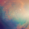
Other examples:
Colouring #04
1. Prepare you base. This type of colouring works better with light
images that have whites and warm colours.
2. We're going to make the colours more vivid and bright.
Add a Selective Color layer:
Reds -100 8 14 0
Yellows 0 0 28 0
Cyans 100 -27 100 100
Neutrals -5 -7 -5 0
You can play with the settings to achieve the best result for your image.
3. Add a Curves Layer
Output 102, Input 81
Now the image is brighter.
4. The images this way looks good, but let's add some blue-grey shades and contrast,
keeping the image bright and the colours - vivid.
Add a Color Fill layer, #1e3f48, set it to Soft Light, 100%.
5. Add a Gradient Map layer:
#3b2710, #cabfbf
Set it to Lighten, 79%.
Now we have image with faded, kinda vintage colouring.
6. Last step - adding that specific blueish hue. Dark colour Exclusion layers add hue and make the colours
softer. While dark blue Exclusion layers add yellowish hue to the light colours and make the shades blueish,
dark brown Exclusion layers add some blueish hue to the light colours and make the shades brownish.
We will use a dark brown Exclusion layer.
Add a Color Fill layer, #290303, set it to Exclusion, 100%.
Other examples:
Both colouring .PSDs can be downloaded here