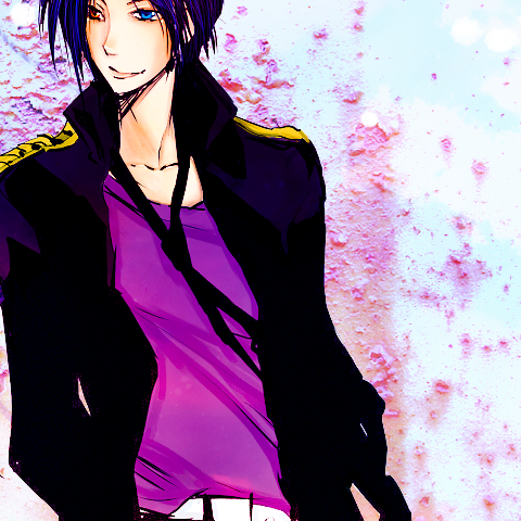
(no subject)
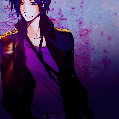
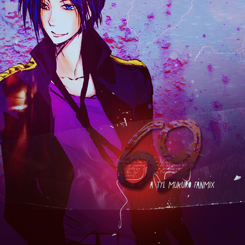
Learn how to make this monstrosity:
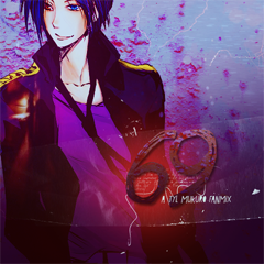
in roughly 19 steps!
I use Photoshop CS5 and I'm not sure that this will be translatable to other programs since it includes Photo Filter, Curves, and Color Balance layers!
Alright, so twilightscribe asked for a tutorial for the cover of my Ten-Year-Later Mukuro fanmix. The art I used in the cover is not mine nor I do I know who's art it is - horrible I know. Image was found via photobucket.
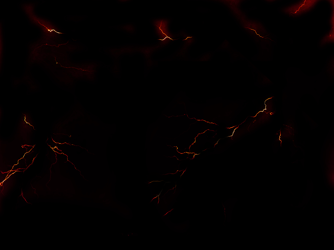
But first, let's start with our background image. I used this from LIGHTS M B, you'd have to join the forum in order to download the texture pack, which sucks, but what can you do?
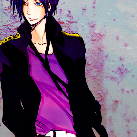
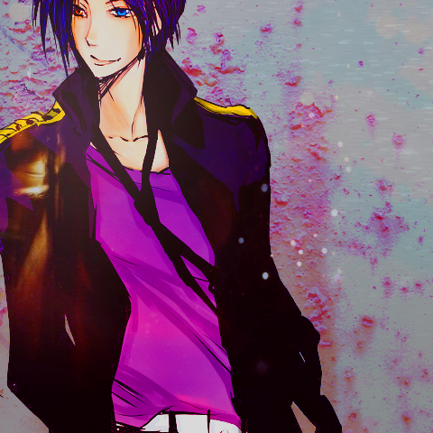
I then took a colored version of the fanart (if you guys do know the artist, please let me know) and placed it on top of the background texture.
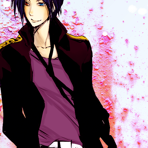
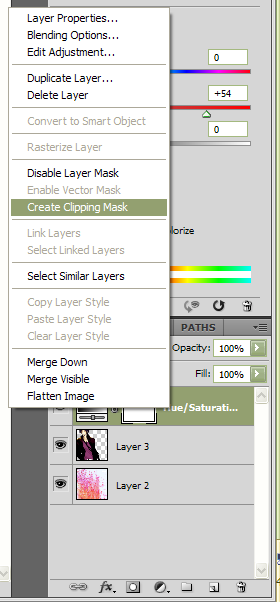
Next we are going to make a new Hue/Saturation layer. Do this by going to Layer>>New Adjustment Layer>>Hue/Saturation. I set the Saturation to +54 - this is because Mukruo was really dull, especially in comparison to the brightly colored background. Now, the new layer has also made the texture-background layer really funny looking, and we mostly just made the H/S layer for Mukuro, so in the Layer box right-click the H/S layer and click CREATE CLIPPING MASK.
Doing this makes sure that the Hue/Saturation only effects the layer directly below it, the Mukuro layer in this case.
Now his colors are brighter and more saturated. He doesn't look so dull against the brightly colored texture background, now, eh?
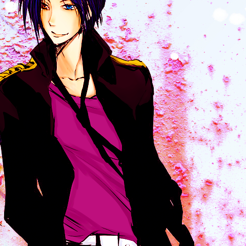
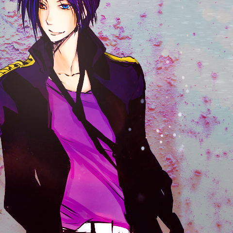
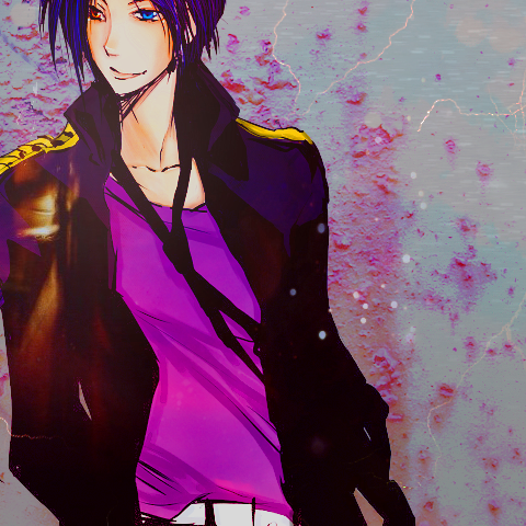
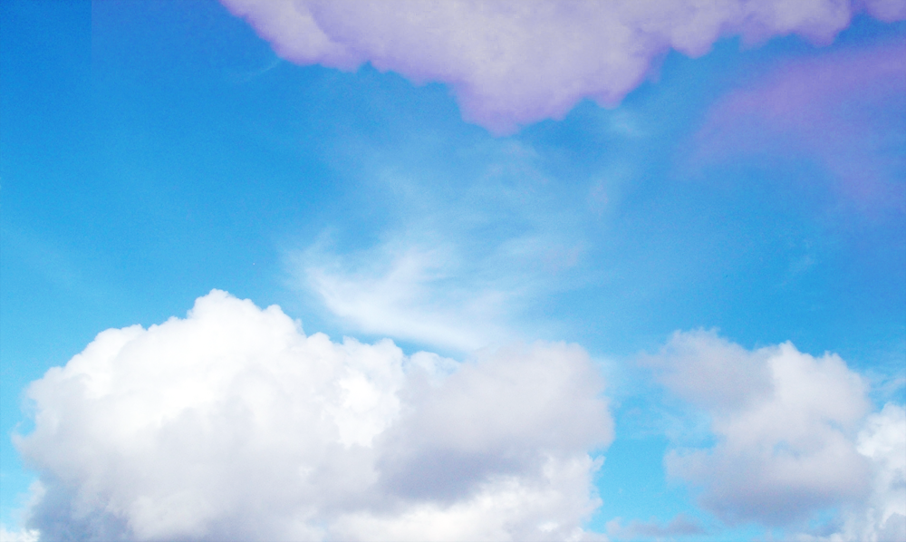
Now I took a really bright blue sky/cloud texture by misarte (found here) and set it to Soft Light at 100%. This really brightens the blue of his hair and his eye.
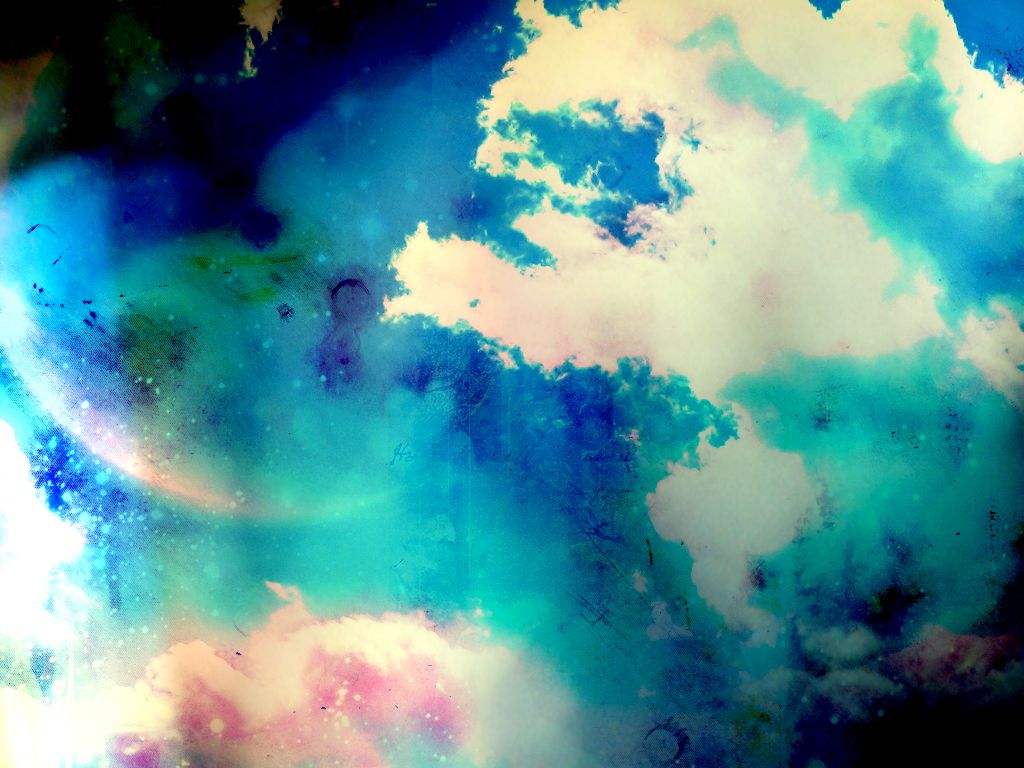
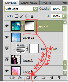
Next I used this texture by erniemay, found here. I set this to Soft Light at 100%. It really makes Mukuro's face dark however so I created a vector mask on the layer and used the Gradient Tool to make it black in the corner and fade to white so it wouldn't make Mukuro's face so dark.
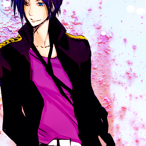
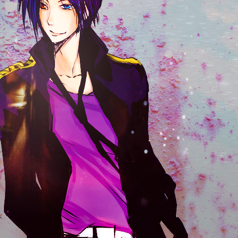
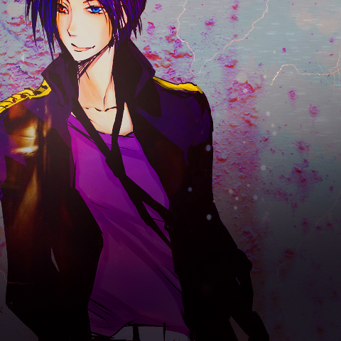
Next I used this texture and set it to Multiply 42% Opacity. (Texture by ??). I like how it's darkened the background, but not Mukuro - so create a vector mask and color out Mukuro (or use the erase tool, whichever you prefer). I mostly just colored out his clothes and skin.
I set the layer to multiply on top of the Mukuro layer instead of just setting it underneath the layer because the effect was different and I preferred it, lol, thought some of you might be wondering why I went through all the trouble of putting that layer on top and then just erasing part of it.
Now take this texture by lemon_snail, found here maybe? - it seems like she (he) deleted all their photos and texture sets D: how lame! - and set it to Screen at 100% - I love this texture set and it is definitely one of my favorites! I would upload the set myself, but I think it would be rude to upload someone else's work.
Now we're going to add another screen layer. This is yet another texture by lemon_snail which is now unattainable. Set it to Screen at 100% - I erased a lot of it and just had the large yellow light showing on Mukuro's side.
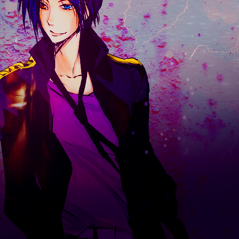
Now make a new Hue/Saturation layer. I used these settings to increase the darkness of the image as well as the vividness of the color.
Saturation: +29
Lightness: -15
Now I used an awesome lightening looking texture by xloliconsx, found here. I'm pretty sure it was that texture (I rotated and resize the texture to fit my image a bit - you can do that right clicking the image - not the layer - and clicking Free Transform, this will allow you to resize your image. If you want to resize your image without messing up its original proportions, hold down the shift key while you are resizing it - it keeps your image with the same proportions instead of skewing it), if it wasn't that texture, it was definitely from that texture back. (I highly recommend this texture pack!)
I erased the texture bit that was on top of Mukuro and just had it so it was around him a bit - you could also do that by creating a vector mask. I normally create a vector mask instead of erasing however just because some people want a copy of my .psd of the image and I want them to be able to see what textures I used. However, I did use the erase on this on instead of the vector mask tool :C.
Now I took a really dark purple (362c3b) and with the Gradient Tool I made a 'sweep' at the bottom. I used dark purple because it's seen as Mukuro's 'ring' color, and I also thought it looked nice. I set this layer to Multiply at 100%. It gives the image a bit of contrast I think.
Now I'm going to make a Color Balance layer (Layer>>New Adjustment Layer>>Color Balance). With this layer, I'm going to be making the purples and blues of the image much, much deeper - it'll turn out really neat, especially since I just applied that dark purple gradient.
Midtones: 0, 0, 0
Shadows: +28, 0, +43
Hightlights: 0, 0, -8
Look at the difference, huh? I still want the image to have more of a blue tone, so I added a Photo Filter layer (Layer>>New Adjustment Layer>>Photo Filter) - I chose Cooling Filter (80). This dulls out the really orange/yellowy parents, especially on the skin.
I now used a grungey looking texture - this one is again from LIGHT MB, like the first texture. It's a bit of a bummer, but you'd have to join the forum in order to download this set as well. I set this texture to Screen at 100%. I wanted to fade it a bit on the left side of the image, so this time I created a vector mask and used the gradient tool - it didn't completely erase the left side of the texture, but it did wash it out a bit.
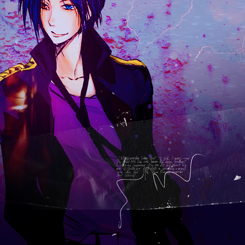
Next I used a large 'fluffy' brush and with the color red, made a 'fluffy dot' and set this layer to screen with a Fill of 79%. I know this kind of thing is overused, but I really liked how it looked, especially since it will sit behind the font I will use for the title of the fanmix.
Now we are going onto the font/text. You can ignore the next few steps if you wish and head to the last couple coloring steps.
The next steps may get a bit wordy, so bear with me - and if you have any questions PLEASE let me know!
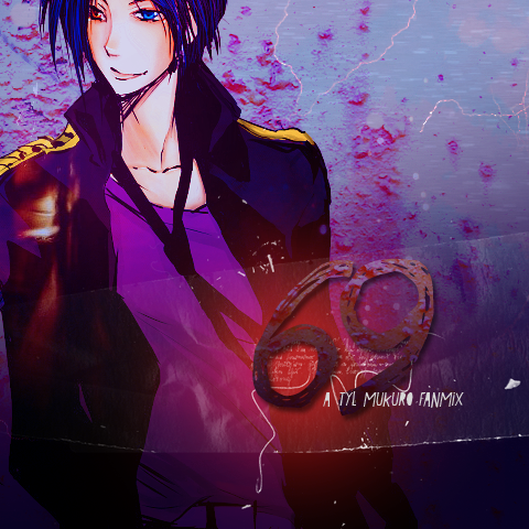
I used the font Love Ya Like A Sister - it's a free font and I think you can get it at dafont.com. I used it in a pale purple color (bbafbf. Now you can double click the layer (in the layer box) or right click and go to Blending Options. Now remember that dark purple color we used earlier for the gradient? Make sure that you have that color as well as the pale purple colors in your color swatch box before you right click.
Now in Blending Options click Gradient and scroll in your gradients until you get the purples and set them to multiply. The font still looks flat, so add a Drop Shadow - this will give more contrast between your text and the background.
Now take your very first background layer and duplicate it. Bring it all the way to the top and make it a clipping mask on top of the text. Set that layer to Multiply at 100%.
Now I used another font in white (Le bain au milieu de la ...) - it's another free font, and typed in the other text underneath my title.
Now we're going to create a new Curves layer (Layer>>New Adjustment Layer>>Curves). We're going to be brightening the image up a bit. This will also brighten up the red blob we made earlier which will add to the contrast between the text and the background.
RGB:
First: Output: 73; Input: 76
Second: Output: 163; Input: 148
This definitely brightens up the image a bit, eh?
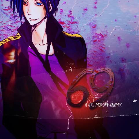
Now for the last step (I also know that this is overused a bit, but sometimes the outcome is just so nice!) I took a dark red color (2c0303) and set that layer to Exclusion with a fill of 67%.
ALL DONE! :D PLEASE DIRECT ALL QUESTIONS AND COMMENTS HERE - it'll be easier for me to track them and will allow me to respond more quickly!
in roughly 19 steps!
I use Photoshop CS5 and I'm not sure that this will be translatable to other programs since it includes Photo Filter, Curves, and Color Balance layers!
Alright, so twilightscribe asked for a tutorial for the cover of my Ten-Year-Later Mukuro fanmix. The art I used in the cover is not mine nor I do I know who's art it is - horrible I know. Image was found via photobucket.
But first, let's start with our background image. I used this from LIGHTS M B, you'd have to join the forum in order to download the texture pack, which sucks, but what can you do?
I then took a colored version of the fanart (if you guys do know the artist, please let me know) and placed it on top of the background texture.
Next we are going to make a new Hue/Saturation layer. Do this by going to Layer>>New Adjustment Layer>>Hue/Saturation. I set the Saturation to +54 - this is because Mukruo was really dull, especially in comparison to the brightly colored background. Now, the new layer has also made the texture-background layer really funny looking, and we mostly just made the H/S layer for Mukuro, so in the Layer box right-click the H/S layer and click CREATE CLIPPING MASK.
Doing this makes sure that the Hue/Saturation only effects the layer directly below it, the Mukuro layer in this case.
Now his colors are brighter and more saturated. He doesn't look so dull against the brightly colored texture background, now, eh?
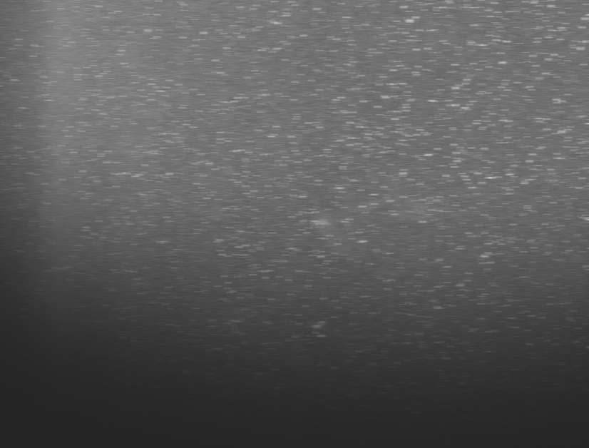
Now I took a really bright blue sky/cloud texture by misarte (found here) and set it to Soft Light at 100%. This really brightens the blue of his hair and his eye.
Next I used this texture by erniemay, found here. I set this to Soft Light at 100%. It really makes Mukuro's face dark however so I created a vector mask on the layer and used the Gradient Tool to make it black in the corner and fade to white so it wouldn't make Mukuro's face so dark.
Next I used this texture and set it to Multiply 42% Opacity. (Texture by ??). I like how it's darkened the background, but not Mukuro - so create a vector mask and color out Mukuro (or use the erase tool, whichever you prefer). I mostly just colored out his clothes and skin.
I set the layer to multiply on top of the Mukuro layer instead of just setting it underneath the layer because the effect was different and I preferred it, lol, thought some of you might be wondering why I went through all the trouble of putting that layer on top and then just erasing part of it.
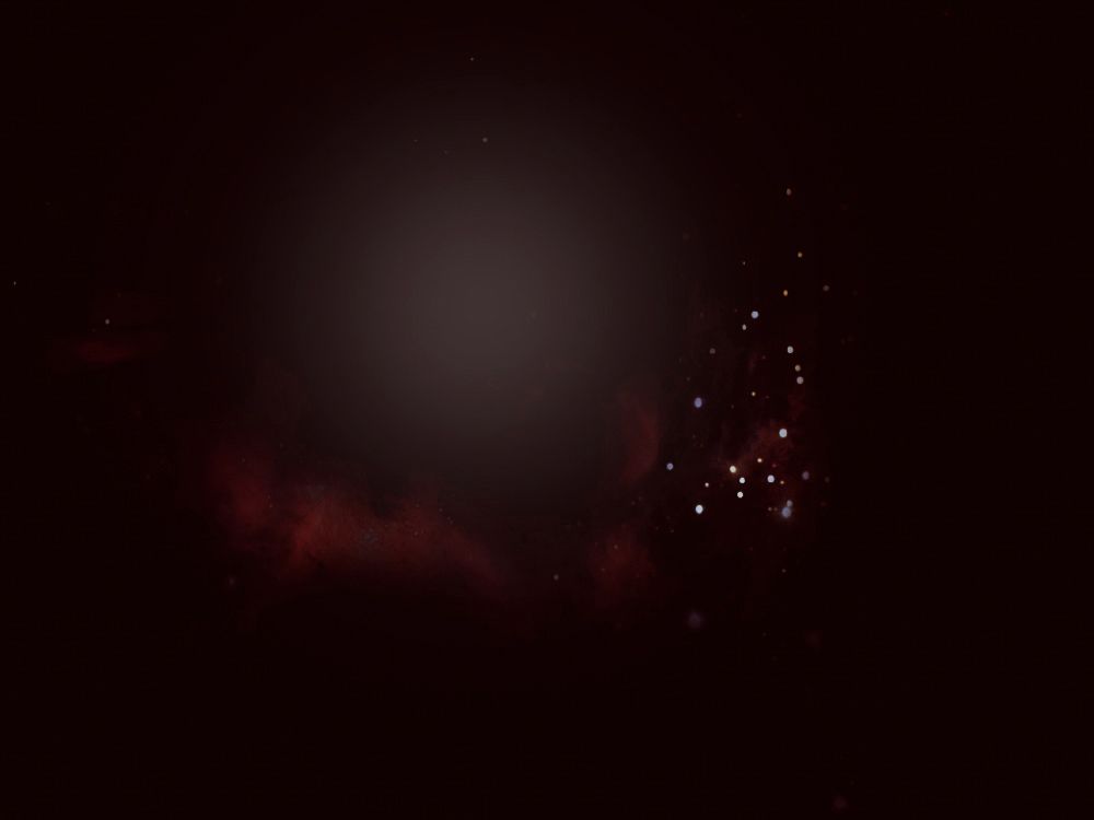
Now take this texture by lemon_snail, found here maybe? - it seems like she (he) deleted all their photos and texture sets D: how lame! - and set it to Screen at 100% - I love this texture set and it is definitely one of my favorites! I would upload the set myself, but I think it would be rude to upload someone else's work.
Now we're going to add another screen layer. This is yet another texture by lemon_snail which is now unattainable. Set it to Screen at 100% - I erased a lot of it and just had the large yellow light showing on Mukuro's side.
Now make a new Hue/Saturation layer. I used these settings to increase the darkness of the image as well as the vividness of the color.
Saturation: +29
Lightness: -15
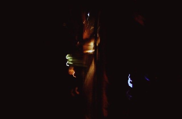
Now I used an awesome lightening looking texture by xloliconsx, found here. I'm pretty sure it was that texture (I rotated and resize the texture to fit my image a bit - you can do that right clicking the image - not the layer - and clicking Free Transform, this will allow you to resize your image. If you want to resize your image without messing up its original proportions, hold down the shift key while you are resizing it - it keeps your image with the same proportions instead of skewing it), if it wasn't that texture, it was definitely from that texture back. (I highly recommend this texture pack!)
I erased the texture bit that was on top of Mukuro and just had it so it was around him a bit - you could also do that by creating a vector mask. I normally create a vector mask instead of erasing however just because some people want a copy of my .psd of the image and I want them to be able to see what textures I used. However, I did use the erase on this on instead of the vector mask tool :C.
Now I took a really dark purple (362c3b) and with the Gradient Tool I made a 'sweep' at the bottom. I used dark purple because it's seen as Mukuro's 'ring' color, and I also thought it looked nice. I set this layer to Multiply at 100%. It gives the image a bit of contrast I think.
Now I'm going to make a Color Balance layer (Layer>>New Adjustment Layer>>Color Balance). With this layer, I'm going to be making the purples and blues of the image much, much deeper - it'll turn out really neat, especially since I just applied that dark purple gradient.
Midtones: 0, 0, 0
Shadows: +28, 0, +43
Hightlights: 0, 0, -8
Look at the difference, huh? I still want the image to have more of a blue tone, so I added a Photo Filter layer (Layer>>New Adjustment Layer>>Photo Filter) - I chose Cooling Filter (80). This dulls out the really orange/yellowy parents, especially on the skin.
I now used a grungey looking texture - this one is again from LIGHT MB, like the first texture. It's a bit of a bummer, but you'd have to join the forum in order to download this set as well. I set this texture to Screen at 100%. I wanted to fade it a bit on the left side of the image, so this time I created a vector mask and used the gradient tool - it didn't completely erase the left side of the texture, but it did wash it out a bit.
Next I used a large 'fluffy' brush and with the color red, made a 'fluffy dot' and set this layer to screen with a Fill of 79%. I know this kind of thing is overused, but I really liked how it looked, especially since it will sit behind the font I will use for the title of the fanmix.
Now we are going onto the font/text. You can ignore the next few steps if you wish and head to the last couple coloring steps.
The next steps may get a bit wordy, so bear with me - and if you have any questions PLEASE let me know!
I used the font Love Ya Like A Sister - it's a free font and I think you can get it at dafont.com. I used it in a pale purple color (bbafbf. Now you can double click the layer (in the layer box) or right click and go to Blending Options. Now remember that dark purple color we used earlier for the gradient? Make sure that you have that color as well as the pale purple colors in your color swatch box before you right click.
Now in Blending Options click Gradient and scroll in your gradients until you get the purples and set them to multiply. The font still looks flat, so add a Drop Shadow - this will give more contrast between your text and the background.
Now take your very first background layer and duplicate it. Bring it all the way to the top and make it a clipping mask on top of the text. Set that layer to Multiply at 100%.
Now I used another font in white (Le bain au milieu de la ...) - it's another free font, and typed in the other text underneath my title.
Now we're going to create a new Curves layer (Layer>>New Adjustment Layer>>Curves). We're going to be brightening the image up a bit. This will also brighten up the red blob we made earlier which will add to the contrast between the text and the background.
RGB:
First: Output: 73; Input: 76
Second: Output: 163; Input: 148
This definitely brightens up the image a bit, eh?
Now for the last step (I also know that this is overused a bit, but sometimes the outcome is just so nice!) I took a dark red color (2c0303) and set that layer to Exclusion with a fill of 67%.
ALL DONE! :D PLEASE DIRECT ALL QUESTIONS AND COMMENTS HERE - it'll be easier for me to track them and will allow me to respond more quickly!