How to make smooth, good-quality animated icons
This is pretty much my first tutorial, sort of. Definitely my first animated icon tutorial. I decided to make an easy-to-follow tut because I can't count the amount of times I'd searched around for tutorials on how to make animated images when I wanted to learn how, only to discover nothing made any sense or I got lost along the way because the instructions were so confusing. SO. Hopefully, this tutorial will be useful and helpful to others who are in the same boat as I was - want to learn how to make smooth, good-quality animated icons and want easy-to-understand instructions on how to do so. :-)
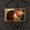
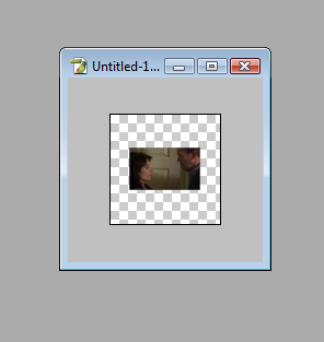
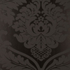
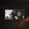
Today, we'll be making this icon:
Programmes: VirtualDub (for screencapping), Adobe Photoshop CS - CS2 and Adobe ImageReady.
Involves: How to screencap, how to import frames and images, how to crop, colour adjustment layers, tweening, how to optimise animated icons to fit 40K, how to set timing for icons.
Translatable: Probably not. :-(
Steps: For screencapping: 4 steps. For making the icon: 15 steps.
Difficulty: Actually really easy once you know how to do it. But I will go with Medium - Hard.
WARNING: THIS IS VERY IMAGE-HEAVY.
SCREENCAPPING.
If you don't have VirtualDub, you can download it here. VirtualDub isn't the screencapping programme you *have* to use - if you have a screencapping programme already, then just use that. I choose to use VDub because it's very easy to use.
In order to have smooth animated images, you will need to screencap your footage every three frames. This is how many frames I screencap, anyway, and it works really well for me. (If you're not going to use VDub, then set your programme to capture every three frames and save those frames to their own folder, then skip the rest of the VDub part of the tutorial.)
Step one:
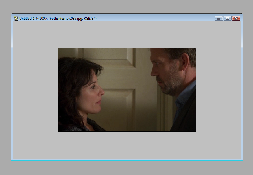
Open VirtualDub. Open your file.
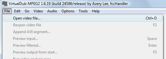
For today's tutorial, I will be using the kiss sequence in the House episode, Under My Skin (5x23). Now, when you open your file, you may get a pop-up message like this:
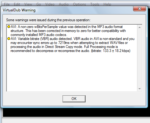
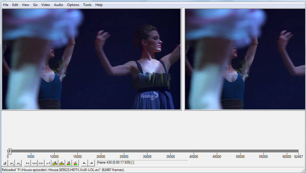
Don't panic! Ignore it. Just click 'OK'. Then your footage should open in two windows, like this:
Step two:
You will need to scroll through the footage to find the point you want. When I am capping to make a number of animated icons, I use the scroll ball on my mouse to go through the footage slowly. But in this case, I know exactly where I want to go, so I have moved the frame cursor to the spot I want. When you have found the spot you want to start capping from, click on the mark-in button:
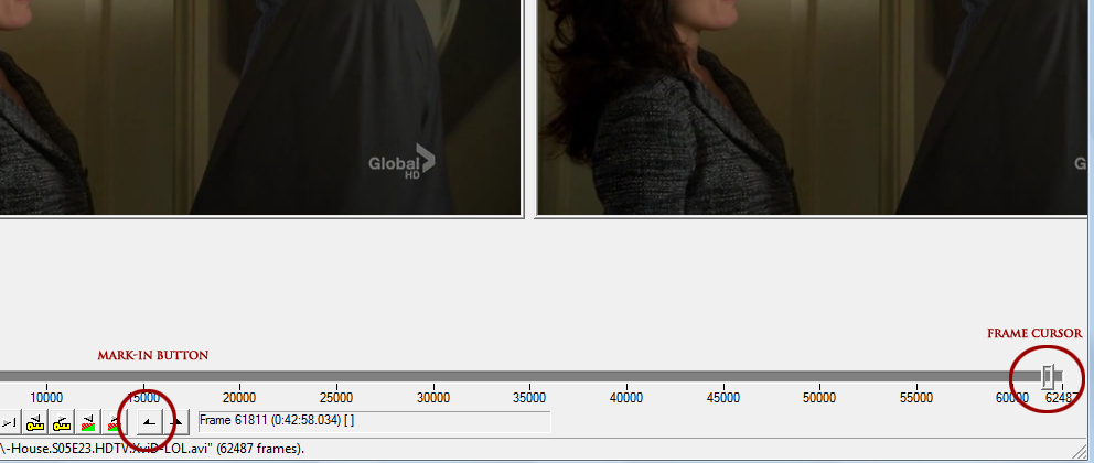
Then I move the frame cursor to the spot I want to stop capping and click the mark-out button:
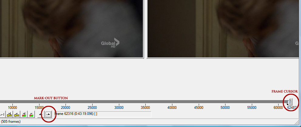
As you can see, the segment to be capped is marked in pale blue on the timeline. That is what you will be capping.
Step three:
Now you will need to select the number of frames to cap, the file name, file name suffix and the folder in which to save the caps to.
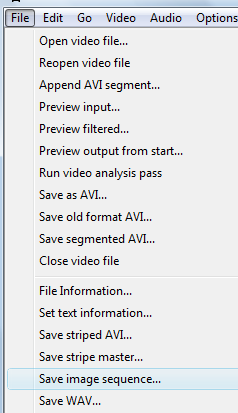
First, create a folder on your computer for the screencaps to be saved into before you do anything. Then go up to File. Now, this next step may vary according to the version of VDub you have. That's not a problem - in older versions, you will probably need to go to File > Export > Image sequence. In my version (VirtualDub-MPEG 1.6.19 build 24568/release by Avery Lee), you will need to go to File > Save image sequence.
A pop-up wlll then appear:
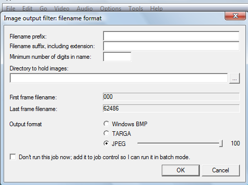
In filename prefix, type in the name you choose for your files. (I chose 'bothsidesnow' as my file prefix.)
In filename suffix, including extension, type in .jpg
In minimum number of digits in name, type in 3
Then you will need to select the folder in which to save your caps. I created the folder name 'BSN' (acronym for 'Both Sides Now'), thus I selected this folder. Click on the browse folder button next to the directory to hold images bar and a pop-up will appear for you to select the folder you created earlier:
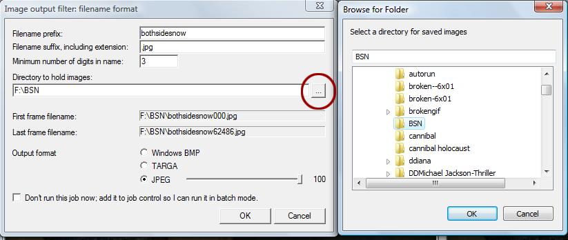
Keep your output format on JPEG at 100%. Then hit OK.
VirtualDub should now start capping your footage every three frames. A pop-up like this shoulder appear the moment you hit 'ok':

This is the progress of the capping; it will show you how many caps it has taken out of the complete number of caps, how big the file will be, and how much time is estimated for VDub to cap everything. Once VDub has finished capping, this pop-up will automatically disappear. You can close VDub now, as we no longer need it.
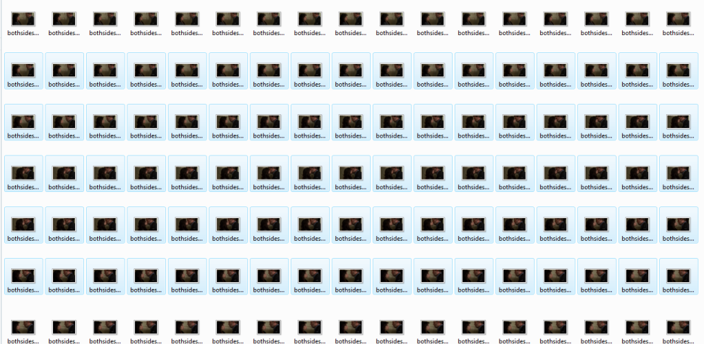
Now if you go to the folder you'd made earlier and selected to have the images saved in, all the caps should be there. Bravo! We're about a quarter way there now!
Step four (optional):
Okay, now depending on the pixel dimension of the gif (we'll talk about that a bit later), you can have up to 50 frames in a gif. If you noticed in the pop-up I had when VDub was capping my footage choice (see the last image), you will notice I had 492 images to be saved to the file. WAAAAY too many. If you tried to import all of those into ImageReady, you'd be waiting forever and your programme could likely crash. SO, if you've found that you've capped way too many images, don't worry! Go to the folder you've saved your images in. Create a folder within that folder. Now have a browse through them and choose a particular segment of image sequences, like what I've done here:
Move selected caps to the folder you just created and viola! You have a much more manageable amount of screencaps to work with. Repeat the above couple of steps if you plan on making more icons from the caps you've made, if you have a large number of them.
RIGHT. So, we've dealt with screencapping. Now we can finally move onto the fun part!
IMPORTING, IMAGEREADY AND PREPARING/COLOURING YOUR ICON.
This really is the fun part. There are SO many things you can do with animated icons. Try not to be daunted - it looks complicated because there are a fair number of steps but it really isn't complicated at all. Hopefully, my explanation of what to do will be easy to understand.
Step one:
The very first thing you need to do is open up ImageReady. You can open up Photoshop, too, if you like, though we won't be needing that just yet. Bear in mind that I am using an older version of PS and ImageReady, so where applications are on mine may not be the same as yours. Knowing your ImageReady and PS programmes would be handy in this case, but if you're not too familiar with either of them, don't worry. Just do some browsing around and you'll find everything I'm talking about.
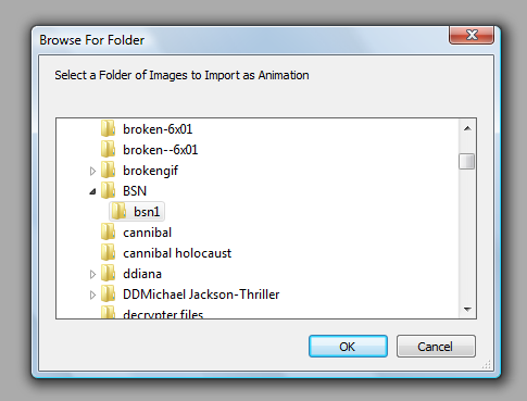
Now, go up to File once you've got ImageReady open and go down to Import. A side-box will pop out, like this:
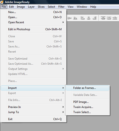
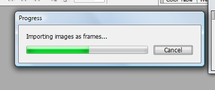
Click on 'folder as frames'. Another pop-up box will appear, a list of all your folders. We're going to be importing our screencap folder, so browse for this and when you find it, select it. Click 'OK'. A progress bar will then appear, which will tell you ImageReady is importing your folder.
Now you should have something like this:
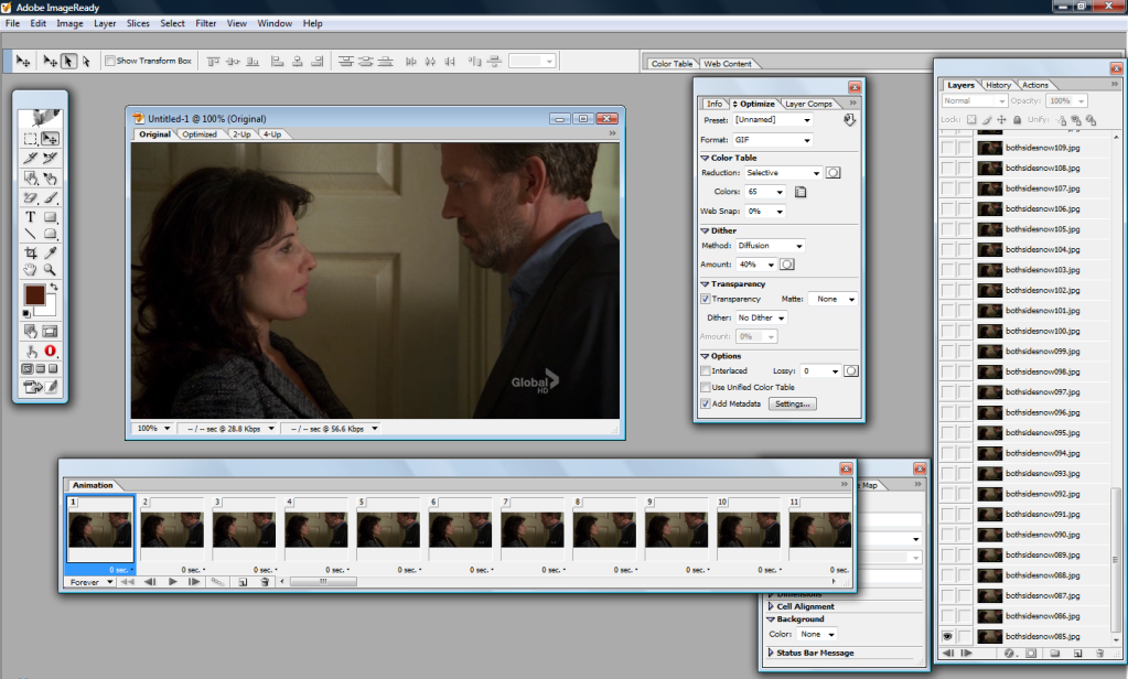
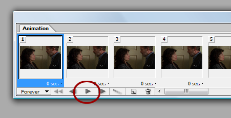
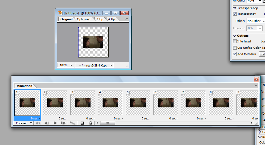
The large box with your image in it is the first frame of your image files. Underneath that is an oblong box labelled 'Animation'. This is all your image files in frames. If you press play on the Animation box (circled in red in the image below), you will be able to watch all your frames as an animation.
Play it a few times to make sure everything is okay. It should play smoothly.
Step two:
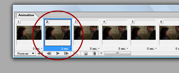
Now, what we need to do is import these frames into Photoshop. So, go to the beginning of the animations in the Amination box and select the second frame by clicking on it. Not the first - the second.
Now scroll to the end of the animation. Press the shift button and keep it held down while clicking on the very last frame. This will select all of the frames except for the first one.
These frames need to be deleted from the animation box. (Don't worry, we'll have them all back in the animation box a little later.) Making sure all of the frames, except for the first one, are still highlighted, go down to the bin icon at the bottom of the animation box and click it. This will delete the selected frames, so you will be left with only the first frame.
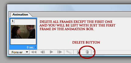
DO NOT delete anything in the layers box. The frames have been deleted from the Animation box but not from the layers. If you delete the layers, you will lose them and and you'll have to start all over again. :-(
Step three:
NOW. Go up to File and select edit in photoshop. A progress bar will pop up, like this:
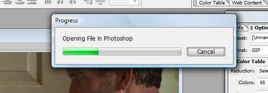
Depending on how many frames you have and how fast/slow your computer is, this progress can take a couple of minutes. Usually for me, it zips right across to Photoshop within a few seconds. But larger amounts of images take longer to import.
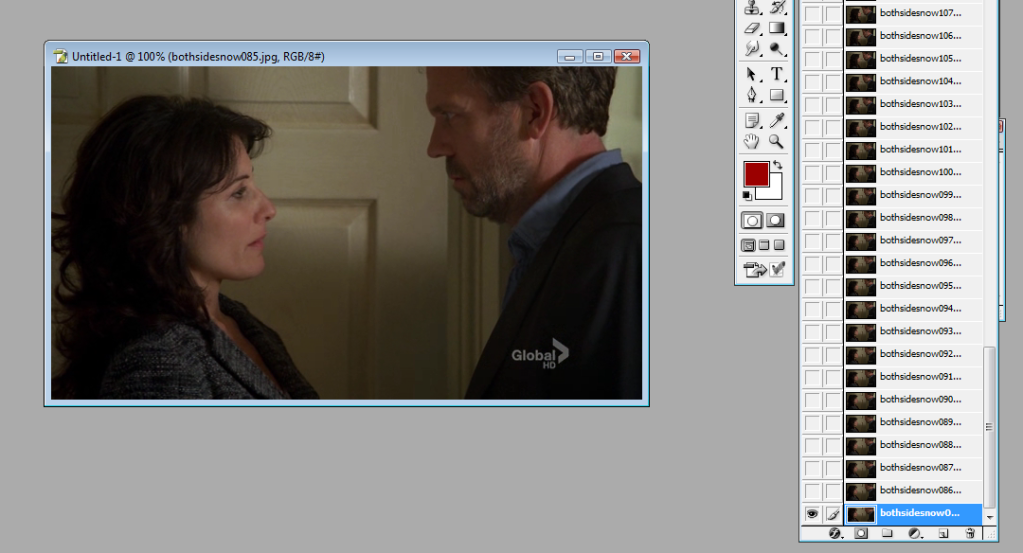
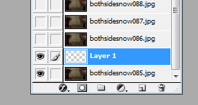
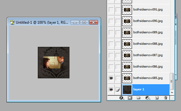
Okay. Now switch over to Photoshop. You should see something like this - your first frame in a large image and all your layers in the layer box, all of them deselected except for the very first layer:
Step four:
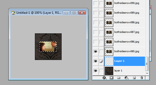
The very first thing you need to do is crop, if you wish to crop at all. I don't want the 'Global' watermark in my icon and I also want to focus a lot more on House and Cuddy's faces. So, I take the Selection tool and I select which area of the image I want to crop. I then go up to Image in the tool bar and go down to crop and select it. This crops every single frame in my icon automatically.
Before cropping:

After cropping:
Step five:
Next, we need to resize. This is where things can be a bit tricky. A .gif is an image that uses an RGB (a colour model that has the primary colours red, blue and green combined in various forms to create a vast array of different secondary colours) palette of up to 256 colours. The higher the file size, the more colours it uses. The lower the file size, the less colours it will use. Livejournal allows gif icons of no more than 40K, which is pretty damn small. Thus, you need to get your icon down to 40K without losing too much quality or colour. The bigger your image, the bigger the file size is going to be. The smaller the image, the smaller the file size, which means the more colours you get to keep in the image.
Confused? Lol, I hope not. But the point in my blabbering is: in order for me to have a good quality animated icon that retains a good number of colours, I need to make the image fairly small. So, go up to Image in the tool bar and select 'image size. I decided to go with 65 x 39 px. This is what I end up with:
Step six:
Now we need to create the canvas around the image so that it has a background. Go to your layer box and, with the only visible layer highlighted, select a new layer. Move that layer down to the bottom so it is now your very first layer.

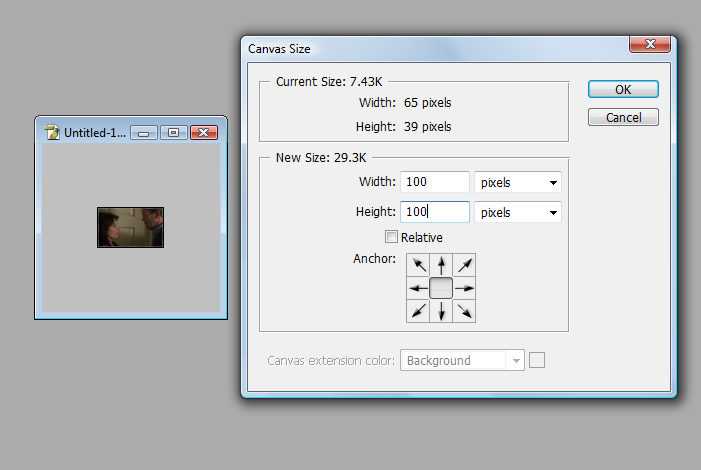
The canvas needs to be enlarged so we can actually see it and use it. Go up to 'Image' in the tool bar and select canvas size. In the numerical boxes, type in 100 in both of them. Hit 'OK'. The canvas will then appear as 100x100 sized with the image of House and Cuddy still at 65x39px in the middle of the empty canvas.
You're about halfway there now! I know this is a lot of steps but trust me, once you've gotten the hang of this, you'll be making animated icons in ten minutes.
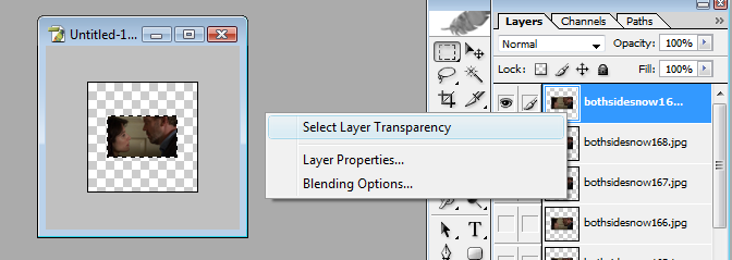
Step six:
Now we need to colour and brighten the images so they actually look nice instead of dull and lifeless. Go to your layer box and scroll to the very top layer. Right-click on it (this will make the layer appear visible but that's okay) and click on select layer transparency. This will create a "marching ants" selection border around the image House and Cuddy are in. What this does is prepares the image to have a new layer to be created with a layer mask, which will enable all the images to be brightened and coloured without affecting the rest of the canvas. Er, does that make sense?
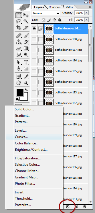
With the image of House and Cuddy still outlined, go down to the create adjustment layer button at the bottom of your layer box (the little black and white circle button that looks a bit like a yin yang sign) and click on it. A pop-up box will appear; go up to curves and click that. A new curves adjustment layer will appear in the form of a layer mask at the top of all the images.
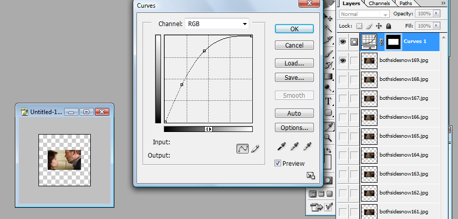
I adjusted the curves RGB channel to Input: 49; Output: 119. This brightened House and Cuddy significantly and makes it a lot clearer. I repeated step six again, except with selective colouring this time, to make the colours in the image stand out more. And to give the colours one final little punch, I repeated step six again except with hue & saturation to bring out a bit more contrast. So, now the top of my layer box and my image looks like this:
See how much clearer and better my image is? This same colouring will automatically apply to all the layers, so I don't need to repeat any of step six anymore.
Step seven:
Now we need to deal with the background and with text and other things to make the icon look pretty. Hide the very top image layer you made visible while you were adding colour adjustments in your layer box (don't hide the colour adjustments themselves, though) amd go back down to the very bottom of your layers and select the empty layer we created earlier. What you choose to put in your background is entirely up to you, but I chose to go with this background:
by worship_elle
I pasted it in the empty layer and got this result:
Step eight (optional):
I want to make a small border around the image, to make it sound out against the background more. So, just like in step six, I right-click on the bottom most image and select layer transparency. Then I click new layer and move that beneath the first image layer but above the layer with the background in it. Just in case that sounds confusing, here is a screenshot:
To create the border, go up to to edit in the tool bar and select stroke. A pop-up box will appear like this:

Select the 'outside' radio button and choose what pixel width you want your border to be. I chose 2px and used #7C704B as the colour for my border. Hit OK and deselect the selection border around your image. It looks nice if the border is a nice contrast to the background colour but compliments to the image, too. This is what I got:
See how it makes the image stand out against the background a little more? This step is entirely optional, of course, but I thought I would include it just in case people were interested in knowing how to create borders around the gif image in their icon. :-)
Step nine:
NOW. I swear we'll be almost done soon. I know this seems like an awful lot but I wanted to explain each step thoroughly so that everything makes sense. But now, we have to do something with the background behind the image. The adjustment layers will affect that part of the background. The best type of background to choose is one that is either the same as the background itself, or a colour that compliments the background. Scroll to the very top of your layers. Right-click on the top-most image (NOT the adjustment layers) and select layer transparency. Go back down to the create adjustment layer button at the bottom of your layer box (again, the b&w one that looks a bit like a yin yang symbol) and select solid colour. Move that layer to the very top of your layers, above the other adjustment layers.
Select the colour you want for the background fill. I chose #9E9064, a lighter colour than the border but still compliments the background. I copied this layer and dragged the copy all the way back down so that is between the border layer and the first image in the layers, as well. This is so I can make a smooth and clean fadeout later when I take everything back over into ImageReady.
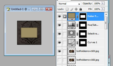
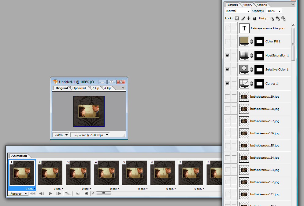
Now I want to add text. With the text tool select, click on the icon and put in whatever text you wish to use. I chose the text, "I always wanna kiss you" (something House says to Cuddy just before they kiss in this scene, SQUEE!), and I set the font to Trajan at size 8px, with the colour #766125.
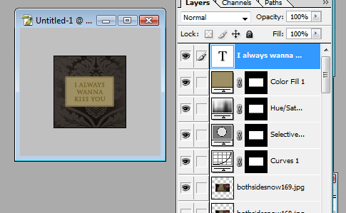
See how the very top image layer is visible. Click on that to make it invisible. Leave all the other layers exactly as they are. So, you should have: your text layer, colour adjustment layers, border layer, background layers and the very first frame of the icon visible. The rest should be selected to invisible.
Yes? Everything good to go? OKAY, AT LAST. We can return our icon back to ImageReady! Go to File > Edit in ImageReady and everything should import back to IR successfully.
OPTIMISING, TIMING AND SAVING YOUR ICON.
PHEW. WE ARE ALMOST THERE.
Step ten:
Now, when your layers return to ImageReady, you should see something like this:
You should see only one frame in the Animation box. That's good if you do. That means everything imported properly. On the top right corner of your Animation box, there is a little tab. Click on this and a box of options will appear. Select make frames from layers and every single layer in your layer box will appear in the Animation box.
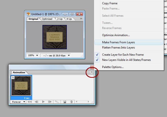
Step eleven:
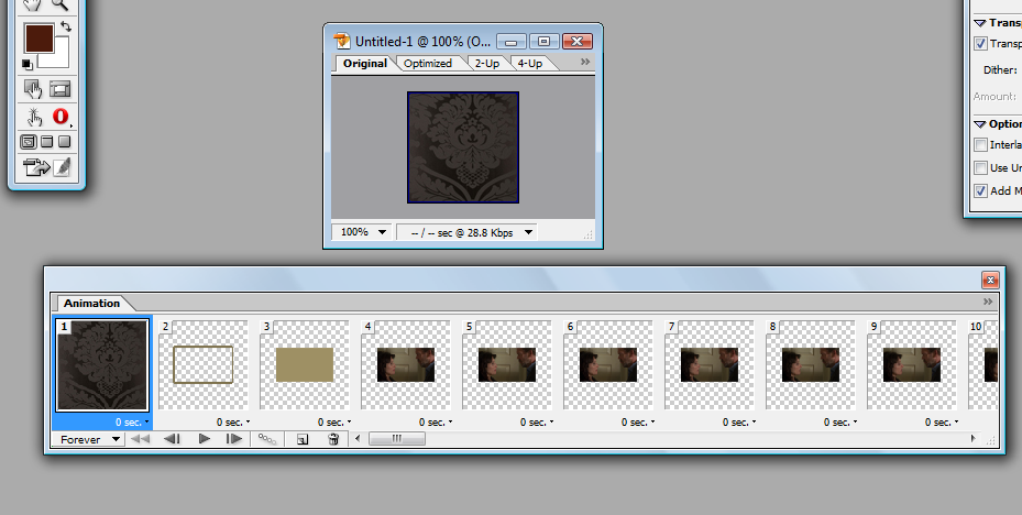
What we need to do now is delete every frame in the Animation box that isn't House and Cuddy. Press the ctrl button and hold it down, and select with your mouse the background frame, layer frame, colour adjustment frame, every single frame that doesn't have House and Cuddy in it. Once all of those are selected, hit delete and you should be looking at something like this:
FROM THIS:
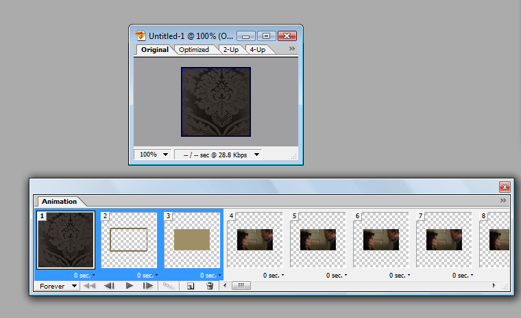
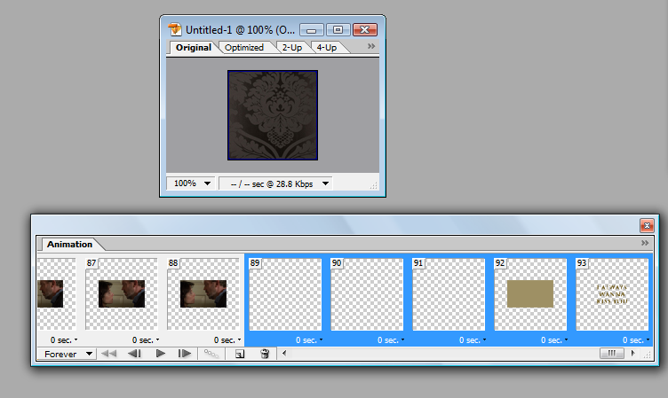
TO THIS:
Now go to your layer box and make every layer that does not have House and Cuddy in it except for the very two top layers visible, so you should end up with something like this:
Step twelve:
WE ARE ALMOST THERE. DON'T GIVE UP YET! We need to adjust the timing of each frame. This is a step you must do, otherwise your animated icon will end up very slow. Beneath each frame in the Animation box is a little tab that has 0 sec on it. Adjusting each frame individually is a real pain, so click on the very first frame, scroll to the end of the Animation timeline and hold down the shift button. While holding that down, click on the very last frame in the timeline. This will highlight every frame in the box. Now click on a tab that has 0 sec on it and a box of options will pop up.
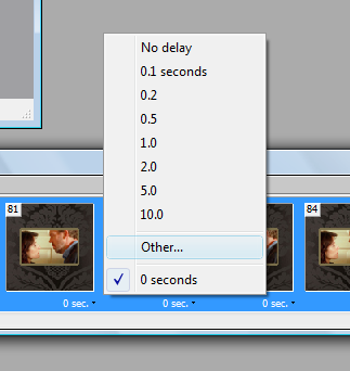
Click on Other... and a box will appear that will be titled Set Frame Delay. Set delay for all frames to: enter 0.06. The reason for this is because 0.06 is a good time in which the animation runs at normal speed. Any greater number than this will start to make the animation go slower. And any value less than 0.06 seconds will make it go faster and look like something out of The Benny Hill Show. This of course depends on how fast you want it to run. If you want your animation to go slower, then enter a value closer to 0.08 - it will run slower but still smoothly. Any greater value than that, however, will make the animation run staccato rather than smoothly.
Hit 'OK'. All the frames will automatically change to 0.06 second delay. Make sure your icon is set to loop forever (bottom left-hand corner - there is a drop-down box that has 'one', 'forever' and 'other' to choose from. Make sure 'forever' is chosen, or it will not loop properly) and now you can preview your icon! Hit 'play' in the Animation box and watch your icon a few times to make sure it runs smoothly.
My icon currently has 85 frames, which is waaay too many. This means I need to delete some frames to bring the number down, as too many frames will make the file size of the icon much too big for LJ. After watching my icon loop a few times, I worked out which bits I no longer wanted. I decided for now to get rid of the first 25 frames. I did this by selecting the very first frame, holding the shift button down and selecting the 25 frame. This highlights all 25 frames I wish to get rid of. I then click the trash can button on the bottom of the Animation box and delete those frames. So, now I am left with 62 frames. Still too many, but I will worry about that in a moment.
Step thirteen:
We now need to add in the text layer and the colour layers we'd edited in photoshop earlier. Go to the very end of your timeline. Select the very last frame and then go down to the icon at the bottom of the Animation frame that looks like a piece of paper. Click that and the frame you selected will be duplicated.
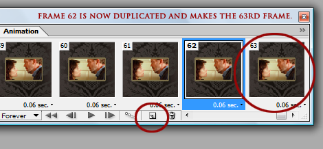
Click on the duplicated frame. Now go to your layer box and scroll right up to the top. The duplicated frame should be the very last House and Cuddy layer. Make that layer invisible and in its place select the colour layer at the top to be visible. Here is a screenshot to show you what I mean:
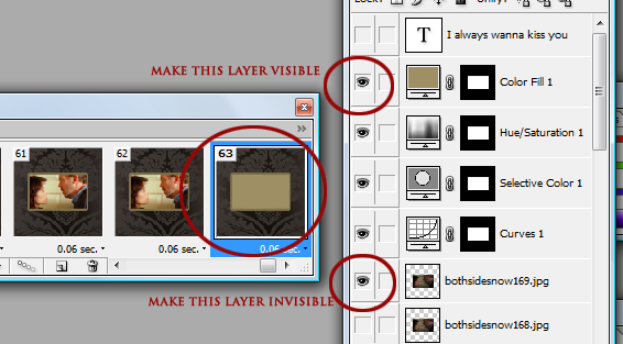
Step fourteen:
The next step is to fade the last couple of frames into the background colour. This step is called tweening. (This step is optional if you don't wish to fade anything. If you prefer your icon to go straight from the image to the text, skip this part.)
With the very last frame selected (the one that now has no image of House and Cuddy in it and has a solid background), find the button on the bottom of the Animation box that has three tiny circles on it. Click this and a box will pop up, asking you to enter the number of frames to add. Type in 2 and then hit OK.
The result should look something like this:
We need to do one more frame delay adjustment, this time only on the very last frame, the one without House and Cuddy, and with the solid colour. Click on the drop down box beneath the last frame that should have 0.06 sec on it and select 2.0 (or 2 seconds). The text in the little box beneath that frame should now read 2 sec.
And now, we're going to make the text layer visible on that very last frame. Keeping that last frame selected, go up to the top of your layers and change the text layer to visible.
Step fifteen:
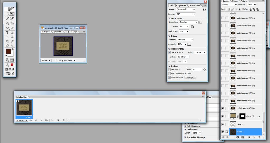
SO CLOSE TO THE END NOW. What we have to do now is to get the icon at 40K or below without losing too much quality. How to find out what size your icon is, go to the canvas where your icon is and at the top, you will see a few tabs: original, optimised, 2-Up and 4-Up. Select the optimise tab. At the bottom of that screen, image information will appear: the percentage size of the canvas (should be 100%), and two long, thin boxes. The most important thing to take note of is the file size.
This is where this box is going to come in very, very handy:
See the settings I have it on? Set yours to the exact same: 0% web snap, 40% dither, transparency selected, no matte, again no dither and add metadata selected. These settings I have allow me to include up to 50 frames in a gif, as they free up more space that I can use for my icon size. I won't be getting 50 frames out of this particular gif but I have done with others. 'Dithering' is where you'll find your file size will go up; the higher the dithering, the higher the file size. Dithering is a feature that spreads colours out more, especially on graphics that are already low in colour. You ever seen .gifs that seem particularly "spotty" or grainy? That's dithering. And while it's a good feature where your colours are limited, it eats up your file space like whoa. I choose to go with 40% or less because that's a good range of dithering that spreads my colours evenly and doesn't take up too much file space. Anything between 0% - 40% is a good range. So, don't feel you *have* to stick to 40% dithering. Decrease to 20% or even 0% if your file size is on the large size.
On the top right corner in the box I just showed you, there is a little tab. Click on this and a box of options will appear. Select Optimise to file size... and another box will pop up. In this box, you should see a heading Desired file size and a small box next to that. In that box, type 40 and hit OK.
My image is currently at 73.53K - much too big for LJ. So, I put in the value of 40K to optimise the icon to that file size. This is result I get:
So, I've got it down to 39.31K. But look at how horrendous the icon looks. Turns out that with 65 frames, I'll only get 17 colours in the icon, hence why it looks so grainy, washed out and basically really bloody awful. This means I need to delete more frames. The best way to do it, if you're not sure how many frames to delete, is to delete slowly. Meaning, only delete a couple of frames at a time so you can see how it looks as you decrease the number of frames. Each time you delete, hit the 'optimise to file size option. I did exactly this a number of times and turned the dithering down to 0% until I finally get down to this:
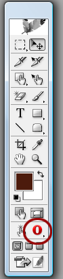
MUCH better quality. So, I now have 33 frames and my icon is down to 36.16K. Which means I can optimise it again to get an even better quality. Thus, I optimise and viola! My icon is now at 39.1K and has 83 colours. Perfect. All I have to do now is save and then I am done! The best thing to do first, however, is to preview it in your web browser. On your tool palette, you should see a little symbol that represents your browser. My browser is Opera, but you can select the default browser to be Explorer (whyyyy anyone would still be using that, though, I have no clue) or Firefox. Click this button and your icon will appear in your browser so you can view how it behaves.
Does it look good? Does it run smoothly? Are you happy with it? AWESOME. Now you can save your icon! Go to File > Save optimised as and save your icon wherever you wish to save it.
And now you're DONE. WHOOO!
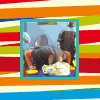
This is my final result:
Other results I got with the same process:
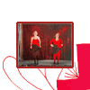
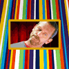
(These are free to take - just credit my art comm, bold_as_brass.)
I hope this tutorial was easy to understand and easy to follow. And please, if you end up making any animated icons using my tut, post them in the comments so I can see! I'd love to see what results people get. :-)
Today, we'll be making this icon:
Programmes: VirtualDub (for screencapping), Adobe Photoshop CS - CS2 and Adobe ImageReady.
Involves: How to screencap, how to import frames and images, how to crop, colour adjustment layers, tweening, how to optimise animated icons to fit 40K, how to set timing for icons.
Translatable: Probably not. :-(
Steps: For screencapping: 4 steps. For making the icon: 15 steps.
Difficulty: Actually really easy once you know how to do it. But I will go with Medium - Hard.
WARNING: THIS IS VERY IMAGE-HEAVY.
SCREENCAPPING.
If you don't have VirtualDub, you can download it here. VirtualDub isn't the screencapping programme you *have* to use - if you have a screencapping programme already, then just use that. I choose to use VDub because it's very easy to use.
In order to have smooth animated images, you will need to screencap your footage every three frames. This is how many frames I screencap, anyway, and it works really well for me. (If you're not going to use VDub, then set your programme to capture every three frames and save those frames to their own folder, then skip the rest of the VDub part of the tutorial.)
Step one:
Open VirtualDub. Open your file.
For today's tutorial, I will be using the kiss sequence in the House episode, Under My Skin (5x23). Now, when you open your file, you may get a pop-up message like this:
Don't panic! Ignore it. Just click 'OK'. Then your footage should open in two windows, like this:
Step two:
You will need to scroll through the footage to find the point you want. When I am capping to make a number of animated icons, I use the scroll ball on my mouse to go through the footage slowly. But in this case, I know exactly where I want to go, so I have moved the frame cursor to the spot I want. When you have found the spot you want to start capping from, click on the mark-in button:
Then I move the frame cursor to the spot I want to stop capping and click the mark-out button:
As you can see, the segment to be capped is marked in pale blue on the timeline. That is what you will be capping.
Step three:
Now you will need to select the number of frames to cap, the file name, file name suffix and the folder in which to save the caps to.
First, create a folder on your computer for the screencaps to be saved into before you do anything. Then go up to File. Now, this next step may vary according to the version of VDub you have. That's not a problem - in older versions, you will probably need to go to File > Export > Image sequence. In my version (VirtualDub-MPEG 1.6.19 build 24568/release by Avery Lee), you will need to go to File > Save image sequence.
A pop-up wlll then appear:
In filename prefix, type in the name you choose for your files. (I chose 'bothsidesnow' as my file prefix.)
In filename suffix, including extension, type in .jpg
In minimum number of digits in name, type in 3
Then you will need to select the folder in which to save your caps. I created the folder name 'BSN' (acronym for 'Both Sides Now'), thus I selected this folder. Click on the browse folder button next to the directory to hold images bar and a pop-up will appear for you to select the folder you created earlier:
Keep your output format on JPEG at 100%. Then hit OK.
VirtualDub should now start capping your footage every three frames. A pop-up like this shoulder appear the moment you hit 'ok':
This is the progress of the capping; it will show you how many caps it has taken out of the complete number of caps, how big the file will be, and how much time is estimated for VDub to cap everything. Once VDub has finished capping, this pop-up will automatically disappear. You can close VDub now, as we no longer need it.
Now if you go to the folder you'd made earlier and selected to have the images saved in, all the caps should be there. Bravo! We're about a quarter way there now!
Step four (optional):
Okay, now depending on the pixel dimension of the gif (we'll talk about that a bit later), you can have up to 50 frames in a gif. If you noticed in the pop-up I had when VDub was capping my footage choice (see the last image), you will notice I had 492 images to be saved to the file. WAAAAY too many. If you tried to import all of those into ImageReady, you'd be waiting forever and your programme could likely crash. SO, if you've found that you've capped way too many images, don't worry! Go to the folder you've saved your images in. Create a folder within that folder. Now have a browse through them and choose a particular segment of image sequences, like what I've done here:
Move selected caps to the folder you just created and viola! You have a much more manageable amount of screencaps to work with. Repeat the above couple of steps if you plan on making more icons from the caps you've made, if you have a large number of them.
RIGHT. So, we've dealt with screencapping. Now we can finally move onto the fun part!
IMPORTING, IMAGEREADY AND PREPARING/COLOURING YOUR ICON.
This really is the fun part. There are SO many things you can do with animated icons. Try not to be daunted - it looks complicated because there are a fair number of steps but it really isn't complicated at all. Hopefully, my explanation of what to do will be easy to understand.
Step one:
The very first thing you need to do is open up ImageReady. You can open up Photoshop, too, if you like, though we won't be needing that just yet. Bear in mind that I am using an older version of PS and ImageReady, so where applications are on mine may not be the same as yours. Knowing your ImageReady and PS programmes would be handy in this case, but if you're not too familiar with either of them, don't worry. Just do some browsing around and you'll find everything I'm talking about.
Now, go up to File once you've got ImageReady open and go down to Import. A side-box will pop out, like this:
Click on 'folder as frames'. Another pop-up box will appear, a list of all your folders. We're going to be importing our screencap folder, so browse for this and when you find it, select it. Click 'OK'. A progress bar will then appear, which will tell you ImageReady is importing your folder.
Now you should have something like this:
The large box with your image in it is the first frame of your image files. Underneath that is an oblong box labelled 'Animation'. This is all your image files in frames. If you press play on the Animation box (circled in red in the image below), you will be able to watch all your frames as an animation.
Play it a few times to make sure everything is okay. It should play smoothly.
Step two:
Now, what we need to do is import these frames into Photoshop. So, go to the beginning of the animations in the Amination box and select the second frame by clicking on it. Not the first - the second.
Now scroll to the end of the animation. Press the shift button and keep it held down while clicking on the very last frame. This will select all of the frames except for the first one.
These frames need to be deleted from the animation box. (Don't worry, we'll have them all back in the animation box a little later.) Making sure all of the frames, except for the first one, are still highlighted, go down to the bin icon at the bottom of the animation box and click it. This will delete the selected frames, so you will be left with only the first frame.
DO NOT delete anything in the layers box. The frames have been deleted from the Animation box but not from the layers. If you delete the layers, you will lose them and and you'll have to start all over again. :-(
Step three:
NOW. Go up to File and select edit in photoshop. A progress bar will pop up, like this:
Depending on how many frames you have and how fast/slow your computer is, this progress can take a couple of minutes. Usually for me, it zips right across to Photoshop within a few seconds. But larger amounts of images take longer to import.
Okay. Now switch over to Photoshop. You should see something like this - your first frame in a large image and all your layers in the layer box, all of them deselected except for the very first layer:
Step four:
The very first thing you need to do is crop, if you wish to crop at all. I don't want the 'Global' watermark in my icon and I also want to focus a lot more on House and Cuddy's faces. So, I take the Selection tool and I select which area of the image I want to crop. I then go up to Image in the tool bar and go down to crop and select it. This crops every single frame in my icon automatically.
Before cropping:
After cropping:
Step five:
Next, we need to resize. This is where things can be a bit tricky. A .gif is an image that uses an RGB (a colour model that has the primary colours red, blue and green combined in various forms to create a vast array of different secondary colours) palette of up to 256 colours. The higher the file size, the more colours it uses. The lower the file size, the less colours it will use. Livejournal allows gif icons of no more than 40K, which is pretty damn small. Thus, you need to get your icon down to 40K without losing too much quality or colour. The bigger your image, the bigger the file size is going to be. The smaller the image, the smaller the file size, which means the more colours you get to keep in the image.
Confused? Lol, I hope not. But the point in my blabbering is: in order for me to have a good quality animated icon that retains a good number of colours, I need to make the image fairly small. So, go up to Image in the tool bar and select 'image size. I decided to go with 65 x 39 px. This is what I end up with:
Step six:
Now we need to create the canvas around the image so that it has a background. Go to your layer box and, with the only visible layer highlighted, select a new layer. Move that layer down to the bottom so it is now your very first layer.
The canvas needs to be enlarged so we can actually see it and use it. Go up to 'Image' in the tool bar and select canvas size. In the numerical boxes, type in 100 in both of them. Hit 'OK'. The canvas will then appear as 100x100 sized with the image of House and Cuddy still at 65x39px in the middle of the empty canvas.
You're about halfway there now! I know this is a lot of steps but trust me, once you've gotten the hang of this, you'll be making animated icons in ten minutes.
Step six:
Now we need to colour and brighten the images so they actually look nice instead of dull and lifeless. Go to your layer box and scroll to the very top layer. Right-click on it (this will make the layer appear visible but that's okay) and click on select layer transparency. This will create a "marching ants" selection border around the image House and Cuddy are in. What this does is prepares the image to have a new layer to be created with a layer mask, which will enable all the images to be brightened and coloured without affecting the rest of the canvas. Er, does that make sense?
With the image of House and Cuddy still outlined, go down to the create adjustment layer button at the bottom of your layer box (the little black and white circle button that looks a bit like a yin yang sign) and click on it. A pop-up box will appear; go up to curves and click that. A new curves adjustment layer will appear in the form of a layer mask at the top of all the images.
I adjusted the curves RGB channel to Input: 49; Output: 119. This brightened House and Cuddy significantly and makes it a lot clearer. I repeated step six again, except with selective colouring this time, to make the colours in the image stand out more. And to give the colours one final little punch, I repeated step six again except with hue & saturation to bring out a bit more contrast. So, now the top of my layer box and my image looks like this:
See how much clearer and better my image is? This same colouring will automatically apply to all the layers, so I don't need to repeat any of step six anymore.
Step seven:
Now we need to deal with the background and with text and other things to make the icon look pretty. Hide the very top image layer you made visible while you were adding colour adjustments in your layer box (don't hide the colour adjustments themselves, though) amd go back down to the very bottom of your layers and select the empty layer we created earlier. What you choose to put in your background is entirely up to you, but I chose to go with this background:
by worship_elle
I pasted it in the empty layer and got this result:
Step eight (optional):
I want to make a small border around the image, to make it sound out against the background more. So, just like in step six, I right-click on the bottom most image and select layer transparency. Then I click new layer and move that beneath the first image layer but above the layer with the background in it. Just in case that sounds confusing, here is a screenshot:
To create the border, go up to to edit in the tool bar and select stroke. A pop-up box will appear like this:
Select the 'outside' radio button and choose what pixel width you want your border to be. I chose 2px and used #7C704B as the colour for my border. Hit OK and deselect the selection border around your image. It looks nice if the border is a nice contrast to the background colour but compliments to the image, too. This is what I got:
See how it makes the image stand out against the background a little more? This step is entirely optional, of course, but I thought I would include it just in case people were interested in knowing how to create borders around the gif image in their icon. :-)
Step nine:
NOW. I swear we'll be almost done soon. I know this seems like an awful lot but I wanted to explain each step thoroughly so that everything makes sense. But now, we have to do something with the background behind the image. The adjustment layers will affect that part of the background. The best type of background to choose is one that is either the same as the background itself, or a colour that compliments the background. Scroll to the very top of your layers. Right-click on the top-most image (NOT the adjustment layers) and select layer transparency. Go back down to the create adjustment layer button at the bottom of your layer box (again, the b&w one that looks a bit like a yin yang symbol) and select solid colour. Move that layer to the very top of your layers, above the other adjustment layers.
Select the colour you want for the background fill. I chose #9E9064, a lighter colour than the border but still compliments the background. I copied this layer and dragged the copy all the way back down so that is between the border layer and the first image in the layers, as well. This is so I can make a smooth and clean fadeout later when I take everything back over into ImageReady.
Now I want to add text. With the text tool select, click on the icon and put in whatever text you wish to use. I chose the text, "I always wanna kiss you" (something House says to Cuddy just before they kiss in this scene, SQUEE!), and I set the font to Trajan at size 8px, with the colour #766125.
See how the very top image layer is visible. Click on that to make it invisible. Leave all the other layers exactly as they are. So, you should have: your text layer, colour adjustment layers, border layer, background layers and the very first frame of the icon visible. The rest should be selected to invisible.
Yes? Everything good to go? OKAY, AT LAST. We can return our icon back to ImageReady! Go to File > Edit in ImageReady and everything should import back to IR successfully.
OPTIMISING, TIMING AND SAVING YOUR ICON.
PHEW. WE ARE ALMOST THERE.
Step ten:
Now, when your layers return to ImageReady, you should see something like this:
You should see only one frame in the Animation box. That's good if you do. That means everything imported properly. On the top right corner of your Animation box, there is a little tab. Click on this and a box of options will appear. Select make frames from layers and every single layer in your layer box will appear in the Animation box.
Step eleven:
What we need to do now is delete every frame in the Animation box that isn't House and Cuddy. Press the ctrl button and hold it down, and select with your mouse the background frame, layer frame, colour adjustment frame, every single frame that doesn't have House and Cuddy in it. Once all of those are selected, hit delete and you should be looking at something like this:
FROM THIS:
TO THIS:
Now go to your layer box and make every layer that does not have House and Cuddy in it except for the very two top layers visible, so you should end up with something like this:
Step twelve:
WE ARE ALMOST THERE. DON'T GIVE UP YET! We need to adjust the timing of each frame. This is a step you must do, otherwise your animated icon will end up very slow. Beneath each frame in the Animation box is a little tab that has 0 sec on it. Adjusting each frame individually is a real pain, so click on the very first frame, scroll to the end of the Animation timeline and hold down the shift button. While holding that down, click on the very last frame in the timeline. This will highlight every frame in the box. Now click on a tab that has 0 sec on it and a box of options will pop up.
Click on Other... and a box will appear that will be titled Set Frame Delay. Set delay for all frames to: enter 0.06. The reason for this is because 0.06 is a good time in which the animation runs at normal speed. Any greater number than this will start to make the animation go slower. And any value less than 0.06 seconds will make it go faster and look like something out of The Benny Hill Show. This of course depends on how fast you want it to run. If you want your animation to go slower, then enter a value closer to 0.08 - it will run slower but still smoothly. Any greater value than that, however, will make the animation run staccato rather than smoothly.
Hit 'OK'. All the frames will automatically change to 0.06 second delay. Make sure your icon is set to loop forever (bottom left-hand corner - there is a drop-down box that has 'one', 'forever' and 'other' to choose from. Make sure 'forever' is chosen, or it will not loop properly) and now you can preview your icon! Hit 'play' in the Animation box and watch your icon a few times to make sure it runs smoothly.
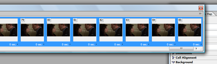
My icon currently has 85 frames, which is waaay too many. This means I need to delete some frames to bring the number down, as too many frames will make the file size of the icon much too big for LJ. After watching my icon loop a few times, I worked out which bits I no longer wanted. I decided for now to get rid of the first 25 frames. I did this by selecting the very first frame, holding the shift button down and selecting the 25 frame. This highlights all 25 frames I wish to get rid of. I then click the trash can button on the bottom of the Animation box and delete those frames. So, now I am left with 62 frames. Still too many, but I will worry about that in a moment.
Step thirteen:
We now need to add in the text layer and the colour layers we'd edited in photoshop earlier. Go to the very end of your timeline. Select the very last frame and then go down to the icon at the bottom of the Animation frame that looks like a piece of paper. Click that and the frame you selected will be duplicated.
Click on the duplicated frame. Now go to your layer box and scroll right up to the top. The duplicated frame should be the very last House and Cuddy layer. Make that layer invisible and in its place select the colour layer at the top to be visible. Here is a screenshot to show you what I mean:
Step fourteen:
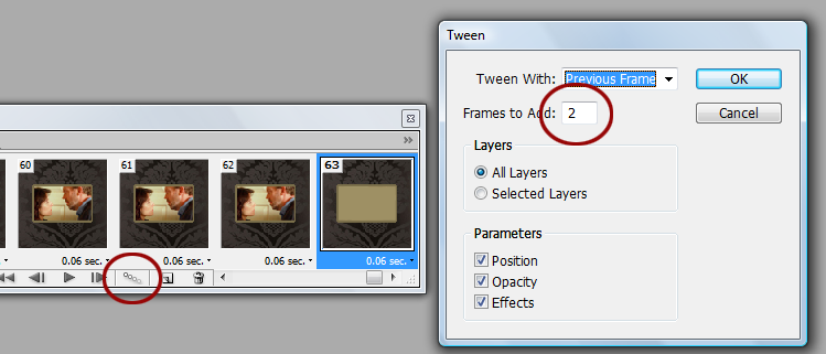
The next step is to fade the last couple of frames into the background colour. This step is called tweening. (This step is optional if you don't wish to fade anything. If you prefer your icon to go straight from the image to the text, skip this part.)
With the very last frame selected (the one that now has no image of House and Cuddy in it and has a solid background), find the button on the bottom of the Animation box that has three tiny circles on it. Click this and a box will pop up, asking you to enter the number of frames to add. Type in 2 and then hit OK.
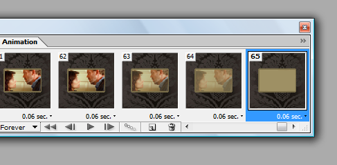
The result should look something like this:
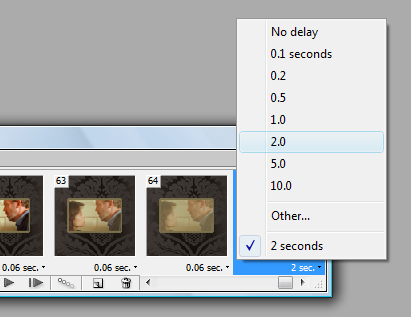
We need to do one more frame delay adjustment, this time only on the very last frame, the one without House and Cuddy, and with the solid colour. Click on the drop down box beneath the last frame that should have 0.06 sec on it and select 2.0 (or 2 seconds). The text in the little box beneath that frame should now read 2 sec.
And now, we're going to make the text layer visible on that very last frame. Keeping that last frame selected, go up to the top of your layers and change the text layer to visible.
Step fifteen:
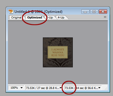
SO CLOSE TO THE END NOW. What we have to do now is to get the icon at 40K or below without losing too much quality. How to find out what size your icon is, go to the canvas where your icon is and at the top, you will see a few tabs: original, optimised, 2-Up and 4-Up. Select the optimise tab. At the bottom of that screen, image information will appear: the percentage size of the canvas (should be 100%), and two long, thin boxes. The most important thing to take note of is the file size.
This is where this box is going to come in very, very handy:
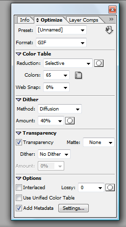
See the settings I have it on? Set yours to the exact same: 0% web snap, 40% dither, transparency selected, no matte, again no dither and add metadata selected. These settings I have allow me to include up to 50 frames in a gif, as they free up more space that I can use for my icon size. I won't be getting 50 frames out of this particular gif but I have done with others. 'Dithering' is where you'll find your file size will go up; the higher the dithering, the higher the file size. Dithering is a feature that spreads colours out more, especially on graphics that are already low in colour. You ever seen .gifs that seem particularly "spotty" or grainy? That's dithering. And while it's a good feature where your colours are limited, it eats up your file space like whoa. I choose to go with 40% or less because that's a good range of dithering that spreads my colours evenly and doesn't take up too much file space. Anything between 0% - 40% is a good range. So, don't feel you *have* to stick to 40% dithering. Decrease to 20% or even 0% if your file size is on the large size.
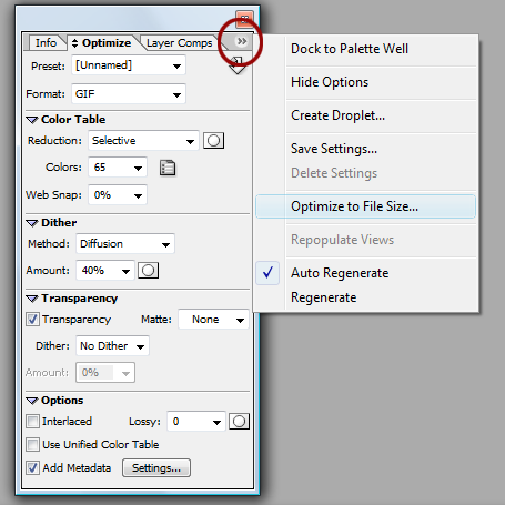
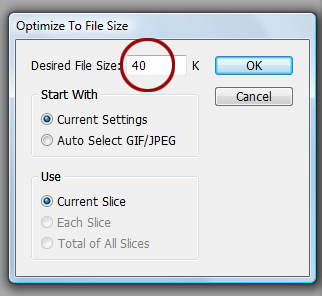
On the top right corner in the box I just showed you, there is a little tab. Click on this and a box of options will appear. Select Optimise to file size... and another box will pop up. In this box, you should see a heading Desired file size and a small box next to that. In that box, type 40 and hit OK.
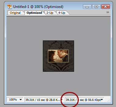
My image is currently at 73.53K - much too big for LJ. So, I put in the value of 40K to optimise the icon to that file size. This is result I get:
So, I've got it down to 39.31K. But look at how horrendous the icon looks. Turns out that with 65 frames, I'll only get 17 colours in the icon, hence why it looks so grainy, washed out and basically really bloody awful. This means I need to delete more frames. The best way to do it, if you're not sure how many frames to delete, is to delete slowly. Meaning, only delete a couple of frames at a time so you can see how it looks as you decrease the number of frames. Each time you delete, hit the 'optimise to file size option. I did exactly this a number of times and turned the dithering down to 0% until I finally get down to this:
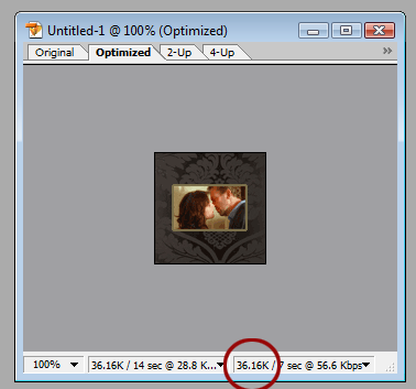
MUCH better quality. So, I now have 33 frames and my icon is down to 36.16K. Which means I can optimise it again to get an even better quality. Thus, I optimise and viola! My icon is now at 39.1K and has 83 colours. Perfect. All I have to do now is save and then I am done! The best thing to do first, however, is to preview it in your web browser. On your tool palette, you should see a little symbol that represents your browser. My browser is Opera, but you can select the default browser to be Explorer (whyyyy anyone would still be using that, though, I have no clue) or Firefox. Click this button and your icon will appear in your browser so you can view how it behaves.
Does it look good? Does it run smoothly? Are you happy with it? AWESOME. Now you can save your icon! Go to File > Save optimised as and save your icon wherever you wish to save it.
And now you're DONE. WHOOO!
This is my final result:
Other results I got with the same process:
(These are free to take - just credit my art comm, bold_as_brass.)
I hope this tutorial was easy to understand and easy to follow. And please, if you end up making any animated icons using my tut, post them in the comments so I can see! I'd love to see what results people get. :-)