Tutorial #1, first ever, Removing Overpowering Green
First tutorial ever, XDD.
Pretty simple, 5 steps. Using PS CS3, includes a selective color layer, so it's not translatable. Sorry! :{
All it is really showing is how to take an image with waaaay too much green and cyan into a nicely colored icon.
From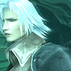
to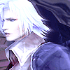
Featuring a Final Fantasy VII: Crisis Core screencap from Silent Tweak.
Steps 4 & 5 are from this tutorial by
athenstorm .
Well I started with this image,
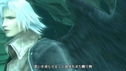
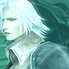
And then cropped & resized it into

1. First thing I did was sharpen it once, this may vary with your image. Then I duplicated my base and set it to Screen 60%. Your image may be darker or light than this one, so feel free to play with the opacity or duplicate the screen layer.
2. Next, I added a Color Balance {Layer - New Adjustment Layer - Color Balance} layer with these values:
Midtones: +12,-14, +1
Shadows: +19, -27, -9
Highlights: +19, -15, +17

3. Ahhhh, much better already ^_^. Next, I added a Hue/Saturation {Layer - New Adjustment Layer - Hue/Saturation}layer, and set the Master Saturation to 30. Your can set yours to whatever suits your image.
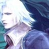
4. Next I added a Selective Color {Layer - New Adjustment Layer - Selective Color} layer (as I mentioned at the beginning of the tutorial). You may not see the difference it makes right away, but it gets definitely gets rid of the turquoise-ish wall on the bottom left of the icon. Input the folowing values:
Reds: -100, 0, 0, +100
Yellows: 0, 0, -100, 0
Cyans: -100, +100, 0, +100
Blacks: 0, 0, 0, +30

5. Finally, I added another Hue/Saturation {Layer - New Adjustment Layer - Hue/Saturation} layer, (this step also mentioned at the beginning) with the following values:
Master: 0, +20, 0
Reds: 0, +20, 0
Yellows: 0, -60, 0

Viola! Much prettier isn't it? ^_^ I'd love to see your results. Comment with them :DD
I'm new to making tutorials, so suggestions and constructive critisizm are appreciated!
Like what you see? Add me :)
Pretty simple, 5 steps. Using PS CS3, includes a selective color layer, so it's not translatable. Sorry! :{
All it is really showing is how to take an image with waaaay too much green and cyan into a nicely colored icon.
From

to

Featuring a Final Fantasy VII: Crisis Core screencap from Silent Tweak.
Steps 4 & 5 are from this tutorial by
athenstorm .
Well I started with this image,

And then cropped & resized it into

1. First thing I did was sharpen it once, this may vary with your image. Then I duplicated my base and set it to Screen 60%. Your image may be darker or light than this one, so feel free to play with the opacity or duplicate the screen layer.

2. Next, I added a Color Balance {Layer - New Adjustment Layer - Color Balance} layer with these values:
Midtones: +12,-14, +1
Shadows: +19, -27, -9
Highlights: +19, -15, +17

3. Ahhhh, much better already ^_^. Next, I added a Hue/Saturation {Layer - New Adjustment Layer - Hue/Saturation}layer, and set the Master Saturation to 30. Your can set yours to whatever suits your image.

4. Next I added a Selective Color {Layer - New Adjustment Layer - Selective Color} layer (as I mentioned at the beginning of the tutorial). You may not see the difference it makes right away, but it gets definitely gets rid of the turquoise-ish wall on the bottom left of the icon. Input the folowing values:
Reds: -100, 0, 0, +100
Yellows: 0, 0, -100, 0
Cyans: -100, +100, 0, +100
Blacks: 0, 0, 0, +30

5. Finally, I added another Hue/Saturation {Layer - New Adjustment Layer - Hue/Saturation} layer, (this step also mentioned at the beginning) with the following values:
Master: 0, +20, 0
Reds: 0, +20, 0
Yellows: 0, -60, 0

Viola! Much prettier isn't it? ^_^ I'd love to see your results. Comment with them :DD
I'm new to making tutorials, so suggestions and constructive critisizm are appreciated!
Like what you see? Add me :)