54. A Close Cropping Guide for applepips16

Requested by applepips16 ages ago(sorry for the delay :3) at Ask The Maker 4.0
So, cropping. Cropping was the first thing I ever got right about making icons. And when I started out, I had Photoshop Elements, so really, the only thing I could DO was crop, so I got lots of practice. And the one thing I can say about cropping is that it does take practice. It takes getting it right once and getting it wrong fifteen times. But you learn what works and what doesn't, especially if you can find some good tutorials. I'm gonna try to explain and elaborate on my close crops, but I found this cool tutorial by nyza for cropping in general just the other day, and I completely recommend it to everyone. She's got actual science-y sounding explainations for cropping and why things happen the way they do. For a lot of us cropping is very spur-of-the-moment and the balance and focus comes together naturally, but it's nice to see it laid out like that.
Anyways. Moving on to my favorite kind of cropping. The close-up. Most makers will tell you that it's just luck and it's really hard to explain, which is totally is, and I sat down and examined my icons to try and figure out what all my close crops have in common and what I think really works, and here it is. I think it's pretty common to most icons, but it really is the basis I work off when I make my close crops.
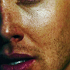
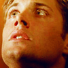
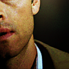
The things she mentions in that tutorial are great, but. For extreme and close cropping you sometimes have to take everything you think you know about cropping and throw it all to the wind. For example these icons:


all have what probably is considered too much just bare skin and not enough interesting details. Everything interesting and eye-catching floats around the edges. But when I do close crops, that's what I go for ninety percent of the time. I try to use HD/HQ caps as much as I can, and even then sometimes I break the cardinal rule of making icons(never re-size more than 100%) because it can sometimes be hidden behind coloring and sharpening and when I resize.
The first thing I go for when working with close cropping is what I always learned in my traditional art classes; the rule of thirds. Your focal doesn't have to be right in the middle. In fact, it shouldn't be. Very rarely do close crops have a centered focus. It should follow the rule of thirds. Your focus should always be drawn to the four points of the guide. Look at these icons;

The way these are put together means that your eye is always drawn first of all to one of those points. You can see my sloppy lines and arrows, but in the first one, your eye is drawn to the upper left corner because a) that's where the content is, and b) that's where the character is looking. The whole focus of the cap works with the crop. That's the ideal close crop. Make the focus of the crop AND the focus of the cap head in the same direction. Your eyes are innately drawn to the eyes of the subject, so if you include them, your eyes will follow the path of the character's gaze in the icon. And if you can make that match up with the focus, then you've got your magic. You'll notice the same thing is happening in the second icon; Katniss is looking at something behind us over our right shoulder, and her whole head is oriented towards our right, so you know you want the focus of the icons to follow. The reason you'll notice that most of my icons focus on the top half of the grid is because it makes the icon look better. It just gives it a sense of balance. If you focus on the bottom half you run the risk of it looking too bottom-heavy, which is just something I don't like.

The other two are a little more complicated; in the first one, your eye is drawn to what you can see of Dean's face, which is the left side of the icon. Because you don't see his eye, focus drops to his nose and mouth, where there's some color and variation. Your eye follows off to the left of the icon and away. This is a case of the cap's natural focus not being where the character is looking, but the variant features in the cap, in this case, his nose/mouth. Light and shadow. In the second one, it's kinda flipped; your eye is first drawn to Dean's eye and face, and then you follow his gaze out of the icon. I purposefully muted the background as much as possible so your eye would be drawn to the right before following Dean's gaze. If I remade it today, I'd probably change the background out entirely to something lighter and more colorful to fill up the icon.
But you get the idea; use the rule of thirds in conjunction with the focus of the cap/where the subject is looking/facing, and put it all together to find some interesting crops. The last thing is caps. I usually go with caps that have something interesting going on with the face. Tilted heads, different expressions, emotional resonance, etc. though extreme close crops CAN give something special to a cap that looks like it's just someone staring off into space. Just don't be afraid to resize! Start with your cap at 100% and try to find crops you like, then go down to 95%, and try to find more, and keep going. Find crops that you really love and then go for them!
So, that's a little bit of an idea of the mechanics of why it works. I've been making icons for about four years, which I guess is pretty common, but the one thing I've worked on perfecting the whole time is crops, because while colorings and compositions may change, a good crop and simple coloring will never go out of style. So I've gotten used to doing this with crops every time. But it just takes practice and experimenting. But now I'm gonna give a bit of an idea how to compose an icon from the start with cropping, using the ideas I tend to stick to.
Check out this cap; Dean looks a little derpy, since he is in the middle of talking to Cas, but the plus side of it is that you can crop it in a few different ways to take advantage of the movement going on.

Look at these different crops you can get from it;


The first two are so-so; you might be able to do something with them but because you can see his eyes it means you get to see him staring at you, and it makes him look a little dead-eyed, which is not the kind of creativity you want in a close crop. But the last two...they've got something special. And that's pretty much due to Dean's mouth and lips and their perfection. They kind of are the focus of the cap, if you look at it. The lips and how his mouth is a little open and he's got a little dimple on one side...you can see it's something interesting, it draws your eye looking at the cap. So it makes sense that the crop should include it. Looking at all of them, I'm really liking the last one. Which isn't surprising; if I'm going for a close crop, I like to get as close as I can without ruining the quality of the icon. And to see if this crop will work, I do my base prep, which is a curves layer set to screen, another curves put to auto and set on soft light(for this icon it's got the fill lowered to 69%) and lastly a vibrance layer cranked up to 100 and set to color. Since the last two are my favorites, I went ahead and prep'd both to see what works.

>


>

At this point the colors aren't important, because you can always change those. It's more about seeing the light and shadows and how the icon just looks, uniformity-wise. And looking at them side-by-side, I'm loving the last one. Give it some dynamic shadows and light and play with the coloring to make it look a little less pinkish, and it could look really amazing. So I go for it! I try to make sure I'm not afraid to try things. I go back all the time to my base if something doesn't work. Since I use the history panel a lot, I like to make a screenshot of the base so I can go back to it at any point if I don't like what I have or I want to make a comparison. Anyway, a little more coloring and work on the second one gives us this;

>

>

And it's well on its way to something interesting, I think.
You can see quite a few other crops that fit the focus + rule of thirds technique using other caps. They're not finished, obviously, just crops and base prep, but it gives you an idea of what you can get with crops. Center crops do work if you managed to find the subject looking down or up and you can get a good lips/chin/neck crop.

>


>


>

(this one was rotated -10 degrees to fit everything, though it's not often that I rotate the cap)

>


>


>


>

(for this one I would make the background a solid bright color for some contrast if I were to continue with it)
You get the idea. And lastly; when in doubt, lose the eyes. Unless your subject has magically sparkly eyes and they're really well lit(unfortunately Jensen Ackles has amazing eyes that 90% of the time are impossibly lit on SPN), a good lips/chin/neck crop is hard to go wrong with. If you're iconing a girl, sometimes just getting the lashes adds something to it(like the Snow icon). Go extreme. Try new things. Make five different crops for each cap, and find which is your favorite. And most importantly, don't freak out about whether it's a good one that everyone else might like. If it's bad, then it's bad. But if it turns out to be good, then you've just stumbled onto something interesting and new. Also, sometimes, when making icons with weird crops, you start to zone out and it's hard to tell if it's even good anymore after coloring. If you get there, just save it and move onto something else, and go back to it later.
So that's my cropping guide. Apologies for rambling and maybe not making much sense. It's hard to explain yourself once you get down to it. If you have any questions please let me know and I'll do my best to answer them.
...and yes, I'm betting most of these examples will become full-fledged icons at some point.
- Be sure to check out my thread ask the maker 4.0!
- Don't hotlink. Don't edit. Don't repost.
- Watch?