atm | cropping guide
absolutelybatty asked for a cropping guide and this is my first time doing any of the sorts, so I hope it’s clear and easy to read and etc, and I’ll probably ramble a lot, cause that’s what I do, and I’ll bore you all with my unnecessary talk. Anyway, I hope this is, at least, somehow useful.
I'm going to focus this on ~how i crop, ~what I crop, ~”what in the what” i crop. Basically, I'm going to ramble in three different sections pretending I actually know what I'm saying (I might on the first two, I surely don't on the last one~).

ONE. PLAY AROUND.
So, let’s start by saying that I feel cropping is one of the most intuitive parts of the icon process for me. Most of it, it’s trial and error, and what I basically do is: move around the cap until it works. Yes, I know, very insightful.
But the thing is, I never ever ever use the cropping tool. I paste the cap (prep or un-prep, depends) on a 100x100 canvas, fix the transform controls to make sure I don’t screw the aspect radio and move it up and down at pleasure until something works, and only then apply the size transformation.
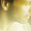
So basically, I go from this to this, or this, or this. And to be honest, most time IDK where I'm going to end up... if I like it, it stays.
TWO. PICK THE RIGHT CAP.
So now that we’ve got covered how I ~do the cropping, let’s take a look at what I’m looking for when I crop. I’m 100% certain that a good cap choice is half, or more, work done when it comes to cropping. So, when I select caps I usually kinda of know where I’m going with them and what sort of cropping I might find there.
Let’s see an example:

>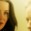
You could say I almost cheated on this, but basically, the crop was calling on it. I wanted a Kahlan/Cara icon, and Cara was almost already on a workable crop. But, see where I’m going with this?
Let’s try another example:

>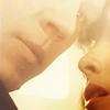
The thing with this cap is that, although the subjects are further and the crop choice is less obvious, there are many things that drew me to it: the different angles in their faces are dynamic, he is looking towards us instead of her, there’s an alright amount of space between them (so that for both of them to be on the icon they don’t need to be super small)
I just took the same picture and tried to re-crop it, I immediately ended up with this, which is basically the same crop we see up there. And although you could argue I could have gone on a less close crop, like this, you would still be working on the same things I just mentioned up there.
So, let’s see a few examples of what I would consider good caps. Sometiems caps can be misleading though, and what i often think OMG CROP ends in like HOW THE HELL DO I MAKE THIS WORK, so don't be discouraged with that~. Anyway, I have checked that these lived to the expectations I had of them! :D, and I have already used a few of them actually..
[16 caps~]


THREE. FOCUS AND BALANCE.
So now we have our caps, or we know we are looking for something specific on a cap, but what are we looking for when we crop? For me, eventually, it's all about focus and balance.
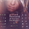
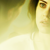
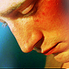
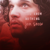
FOCUS. What I find important on an icons is ~what am I looking at & ~what do I wanna show. You crop what you need to see; what you want to see on the icon. You can go for emotion, hair, eyes, facial expressions, tension (like the King’s icon above), other body parts, even, sometimes, negative space like this or this.
So, let’s see a few examples of things I tend to focus on:
|
|
|
|
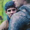
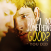
1. Primary character (Arthur) is not the focus, secondary (Merlin) is, therefore this works more like a centered icon with some added crop. Caps where the subject of the icon is obscured by the subject in the front are very interesting imo and propose a lot of tension (we focus on Merlin, Merlin focus on Arthur, so to say).
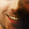
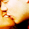
2.¡Emotions! I’ll admit I’m not one for EXTREME close crops because I find them extremely complicated (see what we are not looking for next~) but the point is, it’s all about the smile~ So be sure you have a captivating emotions and that it actually SHOWS on the cap, because, in my experience, sometimes, when you lose the eyes, or the eyebrows or idk, something on the face of the subject, you can’t see anymore what was there on the beginning.
3. Distance. Reverse!#1 (primary subject IS the focus). Two subjects tension. Spaces in between.
4. Hair. Yes, believe it or not, I was focusing on hair here. Hair and negative space in a way. The tendrils suggest the whole hair body, and the negative space draws your attention away from it and to the borders (or so I think, hope, whateveeeeeer).
5.Hair. Hair and hands actually. And I don’t think there’s much to say to this, hair and hands are perfectly (or sorta perfectly) centered in the icon
What we shouldn’t be looking for:
I believe this needs a special section because it gives me lots of headaches (I’ve been working on a cap for a battle that didn’t seem to want to be cropped in any way at all, I had quite a few of this issues - wish I could use that one as an example!). I’ve been rambling lots about what to look for, what to focus on, what I usually decide I want to show in an icon and etc, truth is… most times is WHAT IT ISNT WRONG. Most I know it’s what I’m trying to avoid. So let’s have a small list of things I tend to be careful with:

|
|
|
|
extreme amount of skin | half eyes | no chin/too much forehead | weird nose cuts & monochrome side/back shots | weird face cuts in general (nose in this case)
These are just some examples I could think of, there are of course other things that won’t work and I can’t think of at the top of my head right now. But basically, I would say, avoid everything that looks like “a bit of” or missing “a bit of”, however, this is not necessarily exclusive and there’s nothing better than try and fail or try and succeed, maybe.
BALANCE Let’s move on, before you all fall asleep, if you haven’t by now. In the end, focus and balance aren’t separate elements as they work very entwined together, but for the hopes of explaining myself better I separated explanations.
Balance = an even distribution of weight. Sometimes, balance can also come from unbalance elements. The thing is, I find there needs to be some sort of equality on what I’m working on. So, let’s go back on some of the icons I already used as examples and see if I can explain myself better.

|
|
|
|
1.Rhythm, tension, symmetry (same crop on both subjects), both faces cover both sides and leave most of up and down borders empty.
2.Dynamics (diagonals ftw), balance subjects/empty space
3.HALFS. AND diagonal. Obscuring (half again).
4.Diagonal (colour axial symmetry) and balance subject/empty space as well as perspective feel (size of subjects)
5.CENTER CENTER CENTER IT ALL. Half borders full, half borders empty.
Don’t fool yourselves, I don’t actually go and think that I think this the very second I’m cropping cause I definitely do not. As I said when I began, I feel there’s a lot of this that it’s precisely intuitive, and what's important is getting you eye used to it. Most of the stuff I mentioned there, just happens by default in the end, except, maybe, diagonals cause i love fucking diagonals, but I think that in any case, intuitive or not, these are elements that play a lot of importance when cropping in the final result.
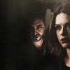
There are things we do know, some because we might have been told, and some because of experience, and like me right now, when we actually inspect these things, we notice them. Per example, I wanna bring the lots icon back because we could say there some sort of misbalance on it, since Kahlan occupies way more space than Cara.
However, our eyes tend to look for the right first (right and down actually… hey, that’s where you find MOST book numbers, and were you go looking for them every time, per example~). So just for a little test, and to demonstrate how I think this affects the composition, and therefore balance on the icon, I flipped it:
>
Besides the fact that most times flipped caps look kinda weird, I, myself, find that Cara gets lost on the icon immediately.If you look at it, what you see is Kahlan’s predominant face & hair and you HAVE to look for Cara.
Noticing these stuff helps a lot when I’m unsure whether something is working or not (not always) but I still believe it’s something I mostly use when LOOKING at icons rather than when making them. So when looking at icons it’s nice to see what are its proportions, what is the focus, is there any tension, what’s the balance empty/full, where is everything more weighted right or left, up or down?
It’s all about making an eye for it, and even though you might not even be looking for it, it’s there; and it’s in the end, imho, what helps saying THAT’S IT, THAT’S THE CROP I WANT.
END where i stop talking basically, or not
Anyway, god, I’m good at pretending I know shit about what I’m talking about, I don’t I swear, as I said: it’s all trying and trying and trying again. And also, watch and see what it works for others (I follow the “nothing is new, everything was already created, we just reinterpret it” philosophy). To end this, and since GAWD I TALKED SO MUCH. I’m just going to select a few types of crops I do, some more frequent, some less, some very little (that I had to dig ugh-icons to put in here, sorry about that!)
THE SAFE CROP. you can’t go wrong with this one.
|
|
ONE EYE OUT. one or two subjects, as you can tell, fave is with two characters. Characters are fully recognizable, but there’s still some sort of mystery left. also, nose tends to be fully in the icon~ i have issues with cut noses, ok? ISSSUUUUUEEES
|
|
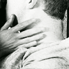
FOCUS ON CHARACTER ON BACK aka, crop me as you want, just center him/her.
|
|
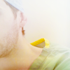
HALF SIDE FACE w/eyes.
|
|
I CAN GO AWAY WITH EVERYTHING BECAUSE BLOCKING remember the don’ts we were talking about before, scratch them. Things that wouldn’t work on a one 100x100 image, can actually do so when composed with other elements~
|
|
EYES IN or basically, close centered crops~
|
|
NON FACE FOCUS
|
|
BY OTHERS uncategorized~ just awesome crops all around :D


biliki castiels daleksaresexy imaginary_lives john_scorpy


letsey_x letsey_x blackmamba_esq neversleeps ofthesea


ofthesea room-6277 appleindecay regis fluides


phaust_ sarisafari talipuu jam_min navras-rheya
And that's it~~ You get cookies if you got this far (chocolate & dulce de leche, for you~).
Anyway, if you've got any questions, please, ask!
ask the maker thread~
I'm going to focus this on ~how i crop, ~what I crop, ~”what in the what” i crop. Basically, I'm going to ramble in three different sections pretending I actually know what I'm saying (I might on the first two, I surely don't on the last one~).
ONE. PLAY AROUND.
So, let’s start by saying that I feel cropping is one of the most intuitive parts of the icon process for me. Most of it, it’s trial and error, and what I basically do is: move around the cap until it works. Yes, I know, very insightful.
But the thing is, I never ever ever use the cropping tool. I paste the cap (prep or un-prep, depends) on a 100x100 canvas, fix the transform controls to make sure I don’t screw the aspect radio and move it up and down at pleasure until something works, and only then apply the size transformation.
So basically, I go from this to this, or this, or this. And to be honest, most time IDK where I'm going to end up... if I like it, it stays.
TWO. PICK THE RIGHT CAP.
So now that we’ve got covered how I ~do the cropping, let’s take a look at what I’m looking for when I crop. I’m 100% certain that a good cap choice is half, or more, work done when it comes to cropping. So, when I select caps I usually kinda of know where I’m going with them and what sort of cropping I might find there.
Let’s see an example:
>
You could say I almost cheated on this, but basically, the crop was calling on it. I wanted a Kahlan/Cara icon, and Cara was almost already on a workable crop. But, see where I’m going with this?
Let’s try another example:
>
The thing with this cap is that, although the subjects are further and the crop choice is less obvious, there are many things that drew me to it: the different angles in their faces are dynamic, he is looking towards us instead of her, there’s an alright amount of space between them (so that for both of them to be on the icon they don’t need to be super small)
I just took the same picture and tried to re-crop it, I immediately ended up with this, which is basically the same crop we see up there. And although you could argue I could have gone on a less close crop, like this, you would still be working on the same things I just mentioned up there.
So, let’s see a few examples of what I would consider good caps. Sometiems caps can be misleading though, and what i often think OMG CROP ends in like HOW THE HELL DO I MAKE THIS WORK, so don't be discouraged with that~. Anyway, I have checked that these lived to the expectations I had of them! :D, and I have already used a few of them actually..
[16 caps~]
THREE. FOCUS AND BALANCE.
So now we have our caps, or we know we are looking for something specific on a cap, but what are we looking for when we crop? For me, eventually, it's all about focus and balance.
FOCUS. What I find important on an icons is ~what am I looking at & ~what do I wanna show. You crop what you need to see; what you want to see on the icon. You can go for emotion, hair, eyes, facial expressions, tension (like the King’s icon above), other body parts, even, sometimes, negative space like this or this.
So, let’s see a few examples of things I tend to focus on:
|
|
|
|
1. Primary character (Arthur) is not the focus, secondary (Merlin) is, therefore this works more like a centered icon with some added crop. Caps where the subject of the icon is obscured by the subject in the front are very interesting imo and propose a lot of tension (we focus on Merlin, Merlin focus on Arthur, so to say).
2.¡Emotions! I’ll admit I’m not one for EXTREME close crops because I find them extremely complicated (see what we are not looking for next~) but the point is, it’s all about the smile~ So be sure you have a captivating emotions and that it actually SHOWS on the cap, because, in my experience, sometimes, when you lose the eyes, or the eyebrows or idk, something on the face of the subject, you can’t see anymore what was there on the beginning.
3. Distance. Reverse!#1 (primary subject IS the focus). Two subjects tension. Spaces in between.
4. Hair. Yes, believe it or not, I was focusing on hair here. Hair and negative space in a way. The tendrils suggest the whole hair body, and the negative space draws your attention away from it and to the borders (or so I think, hope, whateveeeeeer).
5.Hair. Hair and hands actually. And I don’t think there’s much to say to this, hair and hands are perfectly (or sorta perfectly) centered in the icon
What we shouldn’t be looking for:
I believe this needs a special section because it gives me lots of headaches (I’ve been working on a cap for a battle that didn’t seem to want to be cropped in any way at all, I had quite a few of this issues - wish I could use that one as an example!). I’ve been rambling lots about what to look for, what to focus on, what I usually decide I want to show in an icon and etc, truth is… most times is WHAT IT ISNT WRONG. Most I know it’s what I’m trying to avoid. So let’s have a small list of things I tend to be careful with:
|
|
|
|
extreme amount of skin | half eyes | no chin/too much forehead | weird nose cuts & monochrome side/back shots | weird face cuts in general (nose in this case)
These are just some examples I could think of, there are of course other things that won’t work and I can’t think of at the top of my head right now. But basically, I would say, avoid everything that looks like “a bit of” or missing “a bit of”, however, this is not necessarily exclusive and there’s nothing better than try and fail or try and succeed, maybe.
BALANCE Let’s move on, before you all fall asleep, if you haven’t by now. In the end, focus and balance aren’t separate elements as they work very entwined together, but for the hopes of explaining myself better I separated explanations.
Balance = an even distribution of weight. Sometimes, balance can also come from unbalance elements. The thing is, I find there needs to be some sort of equality on what I’m working on. So, let’s go back on some of the icons I already used as examples and see if I can explain myself better.
|
|
|
|
1.Rhythm, tension, symmetry (same crop on both subjects), both faces cover both sides and leave most of up and down borders empty.
2.Dynamics (diagonals ftw), balance subjects/empty space
3.HALFS. AND diagonal. Obscuring (half again).
4.Diagonal (colour axial symmetry) and balance subject/empty space as well as perspective feel (size of subjects)
5.CENTER CENTER CENTER IT ALL. Half borders full, half borders empty.
Don’t fool yourselves, I don’t actually go and think that I think this the very second I’m cropping cause I definitely do not. As I said when I began, I feel there’s a lot of this that it’s precisely intuitive, and what's important is getting you eye used to it. Most of the stuff I mentioned there, just happens by default in the end, except, maybe, diagonals cause i love fucking diagonals, but I think that in any case, intuitive or not, these are elements that play a lot of importance when cropping in the final result.
There are things we do know, some because we might have been told, and some because of experience, and like me right now, when we actually inspect these things, we notice them. Per example, I wanna bring the lots icon back because we could say there some sort of misbalance on it, since Kahlan occupies way more space than Cara.
However, our eyes tend to look for the right first (right and down actually… hey, that’s where you find MOST book numbers, and were you go looking for them every time, per example~). So just for a little test, and to demonstrate how I think this affects the composition, and therefore balance on the icon, I flipped it:
>
Besides the fact that most times flipped caps look kinda weird, I, myself, find that Cara gets lost on the icon immediately.If you look at it, what you see is Kahlan’s predominant face & hair and you HAVE to look for Cara.
Noticing these stuff helps a lot when I’m unsure whether something is working or not (not always) but I still believe it’s something I mostly use when LOOKING at icons rather than when making them. So when looking at icons it’s nice to see what are its proportions, what is the focus, is there any tension, what’s the balance empty/full, where is everything more weighted right or left, up or down?
It’s all about making an eye for it, and even though you might not even be looking for it, it’s there; and it’s in the end, imho, what helps saying THAT’S IT, THAT’S THE CROP I WANT.
END where i stop talking basically, or not
Anyway, god, I’m good at pretending I know shit about what I’m talking about, I don’t I swear, as I said: it’s all trying and trying and trying again. And also, watch and see what it works for others (I follow the “nothing is new, everything was already created, we just reinterpret it” philosophy). To end this, and since GAWD I TALKED SO MUCH. I’m just going to select a few types of crops I do, some more frequent, some less, some very little (that I had to dig ugh-icons to put in here, sorry about that!)
THE SAFE CROP. you can’t go wrong with this one.
|
|
ONE EYE OUT. one or two subjects, as you can tell, fave is with two characters. Characters are fully recognizable, but there’s still some sort of mystery left. also, nose tends to be fully in the icon~ i have issues with cut noses, ok? ISSSUUUUUEEES
|
|
FOCUS ON CHARACTER ON BACK aka, crop me as you want, just center him/her.
|
|
HALF SIDE FACE w/eyes.
|
|
I CAN GO AWAY WITH EVERYTHING BECAUSE BLOCKING remember the don’ts we were talking about before, scratch them. Things that wouldn’t work on a one 100x100 image, can actually do so when composed with other elements~
|
|
EYES IN or basically, close centered crops~
|
|
NON FACE FOCUS
|
|
BY OTHERS uncategorized~ just awesome crops all around :D
biliki castiels daleksaresexy imaginary_lives john_scorpy
letsey_x letsey_x blackmamba_esq neversleeps ofthesea
ofthesea room-6277 appleindecay regis fluides
phaust_ sarisafari talipuu jam_min navras-rheya
And that's it~~ You get cookies if you got this far (chocolate & dulce de leche, for you~).
Anyway, if you've got any questions, please, ask!
ask the maker thread~