Header Tutorial - Raven
Okay! Today we're making a random header.
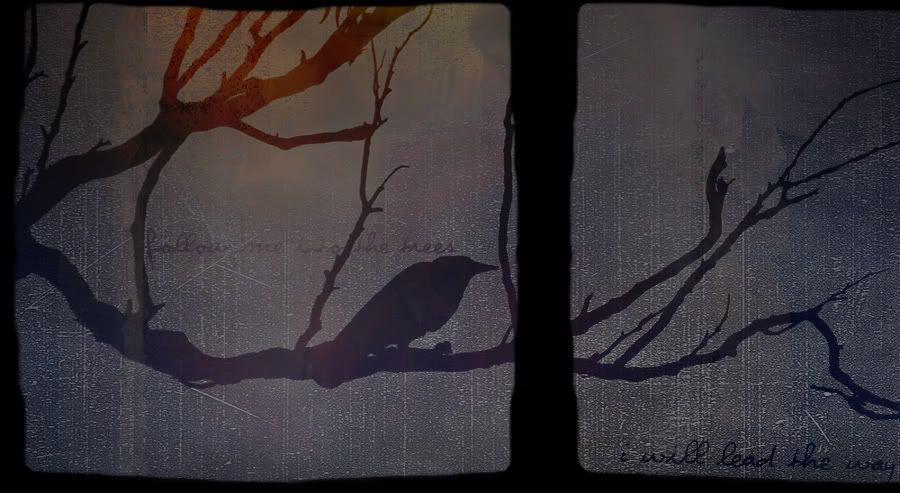
Happens to be this one.
I started with This Image from Stock.Xchng. Fun fact--I found it while searching the word 'evil'.
Really, you should probably pick your own image, since they're all different! But anyways, that's what I was working with. I resized the image so it was 900px across, then cut it down some more, so there wasn't so much blank space at the bottom.
Image>Adjustments>Desaturate!
Above that, I made that terribly-common-yet-nice Exclusion layer set to 100%, color #050424.
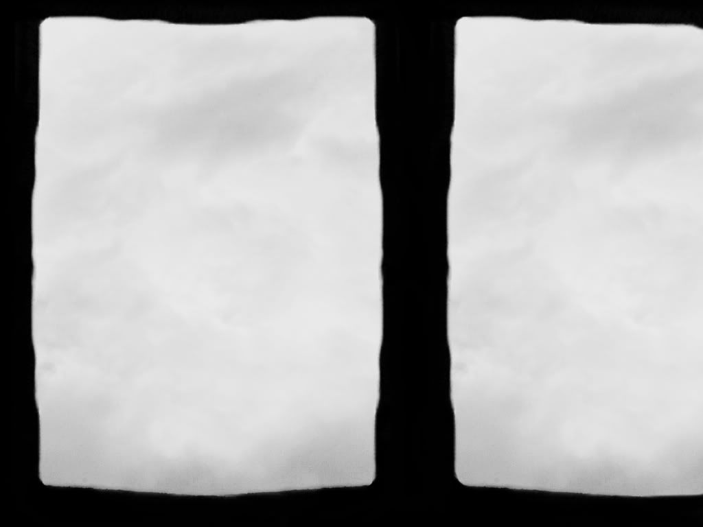
Above that, I used This Texture by someone I don't actually remember, if anyone does know, please let me know so I can credit! I set it to soft light, to give the image a grainy, old look.
Above that layer, I pasted on and used Free Transform to pull the corners out so it covered the entire image. I used This Texture by Textura, I believe(If this needs correcting, let me know!). Then I set the layer to Exclusion.
Now duplicate your background image, and pull it up top above everything else. I set mine to Overlay'. Now, I didn't actually want to lose out on the more subtle coloring over the shadows of the trees and bird, but I liked that red/oranges up in the lefthand side there. So I took that layer, and added a Vector Mask to it. Then, using my gradients tool, I chose black to transparent, and did a simple bottom to top gradient on the vector mask on that layer. That left me with what I wanted with the random reds there, but gave me back some of the lighter colors too down lower.
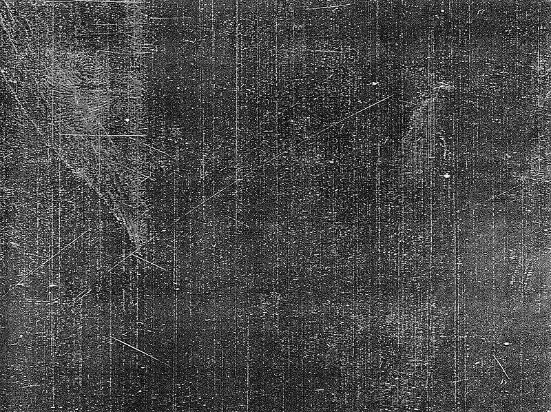
Next! I grabbed This Texture (another one I don't know where I got, please let me know if you know!!) I messed around with it quite a bit to get it where I wanted it, feel free to free-transform it so it works for whatever image you are using. Set it to Multiply.
I added three text layers right above the background layer. Using black for the color, violation for the font, and lyrics from Still by the Foo Fighters, I used one that said 'i will lead the way'. That was at 30pt--slightly bigger than the other words. I also used Edit>Rotate to tilt it just a little, so the worlds followed the downward angle the Multiply Layer texture had going on.
The other two were 'follow me into the trees', written at 24 pt. I did the first, placed it, then because it was beneath the color textures, it was just a little too light to read properly, so I simply duplicated it.
And that is pretty much it, folks. Add any more decorations that you see fit with, I was going for something fairly simple in feel, so didn't want too many things on it. I hope that was coherent!
Happens to be this one.
I started with This Image from Stock.Xchng. Fun fact--I found it while searching the word 'evil'.
Really, you should probably pick your own image, since they're all different! But anyways, that's what I was working with. I resized the image so it was 900px across, then cut it down some more, so there wasn't so much blank space at the bottom.
Image>Adjustments>Desaturate!
Above that, I made that terribly-common-yet-nice Exclusion layer set to 100%, color #050424.
Above that, I used This Texture by someone I don't actually remember, if anyone does know, please let me know so I can credit! I set it to soft light, to give the image a grainy, old look.
Above that layer, I pasted on and used Free Transform to pull the corners out so it covered the entire image. I used This Texture by Textura, I believe(If this needs correcting, let me know!). Then I set the layer to Exclusion.
Now duplicate your background image, and pull it up top above everything else. I set mine to Overlay'. Now, I didn't actually want to lose out on the more subtle coloring over the shadows of the trees and bird, but I liked that red/oranges up in the lefthand side there. So I took that layer, and added a Vector Mask to it. Then, using my gradients tool, I chose black to transparent, and did a simple bottom to top gradient on the vector mask on that layer. That left me with what I wanted with the random reds there, but gave me back some of the lighter colors too down lower.
Next! I grabbed This Texture (another one I don't know where I got, please let me know if you know!!) I messed around with it quite a bit to get it where I wanted it, feel free to free-transform it so it works for whatever image you are using. Set it to Multiply.
I added three text layers right above the background layer. Using black for the color, violation for the font, and lyrics from Still by the Foo Fighters, I used one that said 'i will lead the way'. That was at 30pt--slightly bigger than the other words. I also used Edit>Rotate to tilt it just a little, so the worlds followed the downward angle the Multiply Layer texture had going on.
The other two were 'follow me into the trees', written at 24 pt. I did the first, placed it, then because it was beneath the color textures, it was just a little too light to read properly, so I simply duplicated it.
And that is pretty much it, folks. Add any more decorations that you see fit with, I was going for something fairly simple in feel, so didn't want too many things on it. I hope that was coherent!