A colorful tutorial
I made a tutorial under Photoshop. It has a lot of layers, really, but it's not very complicated. It explains how to blind people through colorful icons :D
In fact, I always make icons with bright colors, because I use the same techniques :
colorful textures and brushes set on overlay.
The guinea pig is Athrun Zala from Gundam Seed who will be iconized that way :
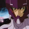
>>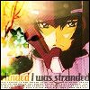
It won something at seed_chorus, best color.
From this image (credit goes to aestalitz) to this :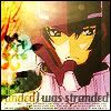
Making the base : 3 steps
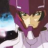
> I crop the image, duplicate it sharpen and set on screen 100 %.

>>
> I flatten the image. Only one layer left. I want it brighter. I duplicate it, set it on screen 83 %.
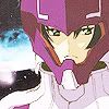
> Too bright, too much sharpened. We're gonna blur it a bit. I duplicate the base (the first layer), go to filter > noise > median set on 5 and set the layer on overlay 100 %.
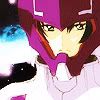
Now, with 3 layers, I'm satisfied with my base.
Adding colors and textures
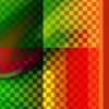
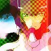
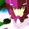
> I want more colors, like green, red or yellow, so I add a texture by bombayicons above the first layer. Mode normal 100 %. I erase the part on Athrun. I use the eraser, but you can use masks if you prefer.
>>
>>
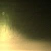
> The icon is bit plain, so I add light textures to make it more interesting. I add a texture by pessimistchick, still above the first layer, just above the previous texture.
I rotate it, at 180°, because I want the light to come from the bottom. I set it on soft light 100 %.
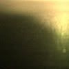
>>
>>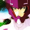
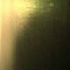
> But now, it's too dark on the left side. So I take the same light texture, but I rotate it on 90° CW, because I want it on the left. I set it on overlay 100 %.

>>
>>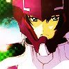
> Too plain and the brushes I want to add won't be very visible. So I used teletha's trick about bright pink and yellow layers set on pin light.
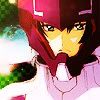
I make a new layer and fill it with pink #ff44a2, set on pin light 13 %, above the second base layer.

>>
I make a new layer and fill it with yellow #ffef09, set on pin light 4 %, above the third base layer.

>>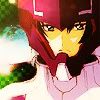
I know you don't see much difference between the 2 layers, but these color layers are very important ; they will make the brushes I'll add later more visible and more colorful.
You can flatten the image if you want.
Brushes
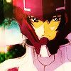
> Now I add brushes. Most of the time, well, always, I set my brushes on overlay or soft light 100 %, because it creates some nice shadows and you can see textures. Generally, I use brushes by gender or arisubox.
I used this brush by arisubox, set on overlay, duplicate twice.
>>
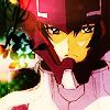
> The left side looks empty. I add a floral brush by colorfilter, I rotate, move it, set it on overlay 100 % and duplicate it 6 times. The 6th brush layer was on overlay 50 %, but it depends on the brightness of your icon.
>>
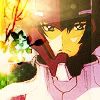
> It's very dark ! I use once again my light texture, rotated at 90° CCW and put it under all the brush layers, just above the third base layer.

>>
Text and border
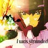
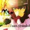
> I add text on mode normal 100 %, duplicate it, set the duplicate on overlay, duplicate the copy layer (until I find it's visible enough) and move it on the left The text layers remain under the last light texture.
>>
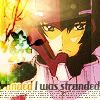
> A tiny text brush, opacity between 80 and 100 %. I add diagonal lines brushes because I love them and a 1px black border.
>>
The end. Tell me if you don't understand it. Maybe I'll post it on a community, I don't know. It looks complicated but isn't really.
In fact, I always make icons with bright colors, because I use the same techniques :
colorful textures and brushes set on overlay.
The guinea pig is Athrun Zala from Gundam Seed who will be iconized that way :

>>

It won something at seed_chorus, best color.
From this image (credit goes to aestalitz) to this :

Making the base : 3 steps
> I crop the image, duplicate it sharpen and set on screen 100 %.

>>

> I flatten the image. Only one layer left. I want it brighter. I duplicate it, set it on screen 83 %.

> Too bright, too much sharpened. We're gonna blur it a bit. I duplicate the base (the first layer), go to filter > noise > median set on 5 and set the layer on overlay 100 %.

Now, with 3 layers, I'm satisfied with my base.
Adding colors and textures
> I want more colors, like green, red or yellow, so I add a texture by bombayicons above the first layer. Mode normal 100 %. I erase the part on Athrun. I use the eraser, but you can use masks if you prefer.

>>

>>

> The icon is bit plain, so I add light textures to make it more interesting. I add a texture by pessimistchick, still above the first layer, just above the previous texture.
I rotate it, at 180°, because I want the light to come from the bottom. I set it on soft light 100 %.

>>

>>

> But now, it's too dark on the left side. So I take the same light texture, but I rotate it on 90° CW, because I want it on the left. I set it on overlay 100 %.

>>

>>

> Too plain and the brushes I want to add won't be very visible. So I used teletha's trick about bright pink and yellow layers set on pin light.
I make a new layer and fill it with pink #ff44a2, set on pin light 13 %, above the second base layer.

>>

I make a new layer and fill it with yellow #ffef09, set on pin light 4 %, above the third base layer.

>>

I know you don't see much difference between the 2 layers, but these color layers are very important ; they will make the brushes I'll add later more visible and more colorful.
You can flatten the image if you want.
Brushes
> Now I add brushes. Most of the time, well, always, I set my brushes on overlay or soft light 100 %, because it creates some nice shadows and you can see textures. Generally, I use brushes by gender or arisubox.
I used this brush by arisubox, set on overlay, duplicate twice.

>>

> The left side looks empty. I add a floral brush by colorfilter, I rotate, move it, set it on overlay 100 % and duplicate it 6 times. The 6th brush layer was on overlay 50 %, but it depends on the brightness of your icon.

>>

> It's very dark ! I use once again my light texture, rotated at 90° CCW and put it under all the brush layers, just above the third base layer.

>>

Text and border
> I add text on mode normal 100 %, duplicate it, set the duplicate on overlay, duplicate the copy layer (until I find it's visible enough) and move it on the left The text layers remain under the last light texture.

>>

> A tiny text brush, opacity between 80 and 100 %. I add diagonal lines brushes because I love them and a 1px black border.

>>

The end. Tell me if you don't understand it. Maybe I'll post it on a community, I don't know. It looks complicated but isn't really.