Tutorials #2 & #3!!
I've made 2 tutorials... I can see jaws dropping to the floor already!
hope you guys like them! ^_^
From this:
to this:
and from this:
to this: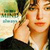
For those who find it hard to believe (just kidding!) you can see for yourselves
There's a reason why I have done only one tut about a million years ago; #1- I'm not the most creative or experienced person using PS7, #2- I never considered I had anything interesting (& decent enough) to share with you guys but in the past weeks, by random chance while playing around with Selective Color, I came up with some colorings that I think are pretty decent. To be honest I was trying to get that 'natural-orangy' skin color that I've seen on Lola's icons at loleiasbits & the_testimony's icons @ colorset, of course I didn't get the same results or anything remotely close but...what the heck!, it didn't turn out butt ugly so, let's get it on!
Tutorial #2: Peter "Kabum!" Petrelli.
1- Start with your base: Crop, resize, etc. Mine was an icon base by wearmedown_x posted @ dont_be_so_base.
I softened the look of his skin by using the Blur tool & did Auto-Contrast (Image>Adjustments>Auto-Contrast):

2- Duplicate the base & set it to Screen 35% (the opacity will depend on how light or dark your base is)
3- Duplicate the base again, drag it to the top & set it to Soft Light 35%
4- Selective Color Adjustment layer:
REDS [-25, 0, +15, 0] YELLOWS [-25, +15, 0, 0] CYANS [+100, 0, 0, -20] NEUTRALS [0, +10, +20, 0]
5- Duplicate the Selective Color layer from step 4 twice.
6- Another Selective Color Adj, layer:
NEUTRALS [0, 0, 0, -10]
7- yes you guessed it! Selective Color Adj, layer!:
REDS [-19, 0, +36, 0] YELLOWS [-20, +35, 0, 0] CYANS [+100, 0, 0, +10] NEUTRALS [0, +10, +30, 0] (on the NEUTRALS you can also try -30 or -25 instead of 0 for the Black)
8- last time I will ask you for a Selective Color Adjustment layer:
REDS [0, 0, +60, 0] YELLOWS [0, +25, 0, 0] NEUTRALS [0, +10, +30, 0]
9- I added text in "Dream Orphans" bold 18pt in white, and that's it for this icon!
Result:
Tutorial #3: Lizzie Bennet "in my mind always".
1- Start with your pic, crop & resize, do your thing, you know. I also did Auto-Contrast on this one:

2- Duplicate the base & set it to Screen 100%.
3- Selective Color Adjustment layer:
REDS [-25, 0, +15, 0] YELLOWS [-25, +15, 0, 0] CYANS [+100, 0, 0, -20] NEUTRALS [0, +10, +20, 0] (like in the previous tut)
4- Duplicate the Selective Color layer from step 3 (I think I duplicated it once but if when you're done your icon looks too washed out then duplicate this layer one more time)
5- Selective Color Adjustment layer:
NEUTRALS [0, 0, 0, -30]
6- Selective Color Adjustment layer:
REDS [0, +10, +25, 0] YELLOWS [0, +10, +35, -20] GREENS [+100, 0, 0, +100] CYANS [+100, 0, -100, +100] NEUTRALS [+100, +5, +25, -20]
7- Paste a texture by discolore,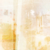
it's in soft oranges, rotate it once to the right and set it to Multiply 100%. I took the Blur tool (using a soft round brush at 35% strength) to smoothen the texture over Lizzie's face.
8- For the last touch I added text in Optima bold, 9pt & 12pt, 50% tracking using #4AAFB0 and set the text layer to Linear Burn. Done!
Result:
Take into account that the result will always depend on the picture you use. I chose a base and a pic that also has yellows, cyans, greens to bring them out too.
Also try changing opacities of the base duplicates, add more duplicates if necessary, set the Selective Color layers to different blending modes (like Soft Light or Screen) or remove one of the S.Color layers. The options are limitless (if that's a word!) so use this as a guideline more than a step by step icon making. Play around with the settings in the S. Color layers, change them to your liking!
I hope this is useful for somebody out there. I'd love to read your comments and why not see your results!. I'm open to suggestions too.
hope you guys like them! ^_^
From this:

to this:

and from this:

to this:

For those who find it hard to believe (just kidding!) you can see for yourselves
There's a reason why I have done only one tut about a million years ago; #1- I'm not the most creative or experienced person using PS7, #2- I never considered I had anything interesting (& decent enough) to share with you guys but in the past weeks, by random chance while playing around with Selective Color, I came up with some colorings that I think are pretty decent. To be honest I was trying to get that 'natural-orangy' skin color that I've seen on Lola's icons at loleiasbits & the_testimony's icons @ colorset, of course I didn't get the same results or anything remotely close but...what the heck!, it didn't turn out butt ugly so, let's get it on!
Tutorial #2: Peter "Kabum!" Petrelli.
1- Start with your base: Crop, resize, etc. Mine was an icon base by wearmedown_x posted @ dont_be_so_base.
I softened the look of his skin by using the Blur tool & did Auto-Contrast (Image>Adjustments>Auto-Contrast):

2- Duplicate the base & set it to Screen 35% (the opacity will depend on how light or dark your base is)
3- Duplicate the base again, drag it to the top & set it to Soft Light 35%
4- Selective Color Adjustment layer:
REDS [-25, 0, +15, 0] YELLOWS [-25, +15, 0, 0] CYANS [+100, 0, 0, -20] NEUTRALS [0, +10, +20, 0]
5- Duplicate the Selective Color layer from step 4 twice.
6- Another Selective Color Adj, layer:
NEUTRALS [0, 0, 0, -10]
7- yes you guessed it! Selective Color Adj, layer!:
REDS [-19, 0, +36, 0] YELLOWS [-20, +35, 0, 0] CYANS [+100, 0, 0, +10] NEUTRALS [0, +10, +30, 0] (on the NEUTRALS you can also try -30 or -25 instead of 0 for the Black)
8- last time I will ask you for a Selective Color Adjustment layer:
REDS [0, 0, +60, 0] YELLOWS [0, +25, 0, 0] NEUTRALS [0, +10, +30, 0]
9- I added text in "Dream Orphans" bold 18pt in white, and that's it for this icon!
Result:

Tutorial #3: Lizzie Bennet "in my mind always".
1- Start with your pic, crop & resize, do your thing, you know. I also did Auto-Contrast on this one:

2- Duplicate the base & set it to Screen 100%.
3- Selective Color Adjustment layer:
REDS [-25, 0, +15, 0] YELLOWS [-25, +15, 0, 0] CYANS [+100, 0, 0, -20] NEUTRALS [0, +10, +20, 0] (like in the previous tut)
4- Duplicate the Selective Color layer from step 3 (I think I duplicated it once but if when you're done your icon looks too washed out then duplicate this layer one more time)
5- Selective Color Adjustment layer:
NEUTRALS [0, 0, 0, -30]
6- Selective Color Adjustment layer:
REDS [0, +10, +25, 0] YELLOWS [0, +10, +35, -20] GREENS [+100, 0, 0, +100] CYANS [+100, 0, -100, +100] NEUTRALS [+100, +5, +25, -20]
7- Paste a texture by discolore,

it's in soft oranges, rotate it once to the right and set it to Multiply 100%. I took the Blur tool (using a soft round brush at 35% strength) to smoothen the texture over Lizzie's face.
8- For the last touch I added text in Optima bold, 9pt & 12pt, 50% tracking using #4AAFB0 and set the text layer to Linear Burn. Done!
Result:

Take into account that the result will always depend on the picture you use. I chose a base and a pic that also has yellows, cyans, greens to bring them out too.
Also try changing opacities of the base duplicates, add more duplicates if necessary, set the Selective Color layers to different blending modes (like Soft Light or Screen) or remove one of the S.Color layers. The options are limitless (if that's a word!) so use this as a guideline more than a step by step icon making. Play around with the settings in the S. Color layers, change them to your liking!
I hope this is useful for somebody out there. I'd love to read your comments and why not see your results!. I'm open to suggestions too.