26. Ask the Maker Tute 1
Ask the Maker, tute #1 (Requested by fangss)
I've got an exam on Monday so it might take me a while to work on the rest of the tutorials :)
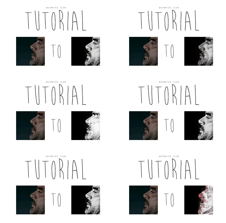
This icon was made for au_rooms and is meant to be Jeffery Dean Morgan playing the role of Torque. In the games Torque is able to turn into 'the beast', a physical manifestation of his anger and rage. I worked with the idea of a person changing and the flickering lights that are common in games of the horror genre to decide on this effect.
Step 1
Crop the screencap to a close-crop. I choose this cap because I felt the close-up allowed for a greater sense of emotion in the character.

Step 2
Turn the icon black and white, I did this by applying a black/white gradient map. Then add curves to brighten the image. I used the following points: (5,0), (87, 175) and (255, 255), however this will greatly depend on the base image. Next merge all layers if required.

Step 3
In this step we will work on getting the salmon-y coloured overlay. First duplicate the layer and brighten the hell out of it, making sure to use the 'burn tool' on the background to retain the black colouring. Next add a fill layer of #d17075, or whatever colour you choose, set this to screen. Merge the new layers made in this step (do not merge with the background layer) so you have 2 layers in total. Next move the top layer over slightly to the left and set it to multiply

to
to
Step 4
Duplicate the second layer, and desaturate it

Then turn off the top 2 layers so we can work on the next 'glitched layer' by clicking on the little eye button in the layers list
Step 5
Open up this texture (I don't know who made this so if you did let me know so I can credit!), invert the colours and increase the contrast so the skull outline is white and the background is black. Then size and position the skull so that it aligns with the character's own head. I cheated and used Topaz clean on a very low setting here because the texture looked a bit low quality
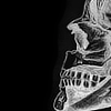
Then turn this layer off by clicking on the little eye button in the layers list.
Step 6
Duplicate the background layer, set it to screen and move it over to the left slightly

Then turn this layer off by clicking on the little eye button in the layers list.
Step 7- Create a new layer, fill it with black then turn off this layer. You won't need to sharpen any layers because due to the way gif files save they become slightly pixelated upon saving, you can blur them if you like but I usually don't bother.
Your layers list should look like this:

From this point on I will be referring to the layers as they are labelled in the above image
Step 8- Animating the icon (using CS6)
We will be using the timeline at the bottom of the CS6 window. If you do not have the timeline visible go to window in the toolbar and select timeline. This is the most time-heavy step of the process if you are making the icon from scratch as it takes a while to get the timings perfect and the timings in the window and in the save screen vary which make it even more troublesome.
Frame 1: set the background to 1 sec duration
Frame 2: set the background and layer 2 to 0 sec
Frame 3: set background and layer 3 to 0.1 sec
Frame 4: set background, layer 2 and layer 5 to 0.1 sec
Frame 5: set the background and layer 2 to 0.05 sec
Frame 6: set background and layer 5 to 0.05 sec
Frame 7: repeat frame 5, set it to 0.05 sec duration
Frame 8: repeat frame 1, set it to 0.2 sec duration
Frame 9: repeat frame 3, set to 0.05 sec
Frame 10: repeat frame 6
Frame 11: repeat frame 1 set to 0.5
Frame 12: use layer 6 set to 0.05
Frame 13: set background layer, layer 2 and layer 4 to 0.05
If you push play you'll notice the animation is a bit sluggish, once you save the gif file it'll speed up. Your timeline should look like this, however:

Step 9- saving gif files
Go to file on the toolbar and select save for web. LJ specifications for gif icons is that it needs to be less than 40kb (If anyone is interested I can do another tutorial on the ways to lower gif file size without losing too much quality). If you push the play button in this window you'll notice the animation now runs like it does in the final product, ie. faster and looks more like the flickering of lighting.
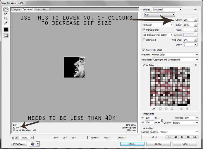
I had to lower the number of colours down to 64 to get the gif under 40kb , because the pallet is so limited in the icons to begin with (meaning it is all black and white besides the one colour layer) little quality was lost.
Finally save the icon and this is your final product:

As always, if you have any questions feel free to ask! :D
I've got an exam on Monday so it might take me a while to work on the rest of the tutorials :)

This icon was made for au_rooms and is meant to be Jeffery Dean Morgan playing the role of Torque. In the games Torque is able to turn into 'the beast', a physical manifestation of his anger and rage. I worked with the idea of a person changing and the flickering lights that are common in games of the horror genre to decide on this effect.
Step 1
Crop the screencap to a close-crop. I choose this cap because I felt the close-up allowed for a greater sense of emotion in the character.

Step 2
Turn the icon black and white, I did this by applying a black/white gradient map. Then add curves to brighten the image. I used the following points: (5,0), (87, 175) and (255, 255), however this will greatly depend on the base image. Next merge all layers if required.

Step 3
In this step we will work on getting the salmon-y coloured overlay. First duplicate the layer and brighten the hell out of it, making sure to use the 'burn tool' on the background to retain the black colouring. Next add a fill layer of #d17075, or whatever colour you choose, set this to screen. Merge the new layers made in this step (do not merge with the background layer) so you have 2 layers in total. Next move the top layer over slightly to the left and set it to multiply

to

to

Step 4
Duplicate the second layer, and desaturate it

Then turn off the top 2 layers so we can work on the next 'glitched layer' by clicking on the little eye button in the layers list
Step 5
Open up this texture (I don't know who made this so if you did let me know so I can credit!), invert the colours and increase the contrast so the skull outline is white and the background is black. Then size and position the skull so that it aligns with the character's own head. I cheated and used Topaz clean on a very low setting here because the texture looked a bit low quality

Then turn this layer off by clicking on the little eye button in the layers list.
Step 6
Duplicate the background layer, set it to screen and move it over to the left slightly

Then turn this layer off by clicking on the little eye button in the layers list.
Step 7- Create a new layer, fill it with black then turn off this layer. You won't need to sharpen any layers because due to the way gif files save they become slightly pixelated upon saving, you can blur them if you like but I usually don't bother.
Your layers list should look like this:

From this point on I will be referring to the layers as they are labelled in the above image
Step 8- Animating the icon (using CS6)
We will be using the timeline at the bottom of the CS6 window. If you do not have the timeline visible go to window in the toolbar and select timeline. This is the most time-heavy step of the process if you are making the icon from scratch as it takes a while to get the timings perfect and the timings in the window and in the save screen vary which make it even more troublesome.
Frame 1: set the background to 1 sec duration
Frame 2: set the background and layer 2 to 0 sec
Frame 3: set background and layer 3 to 0.1 sec
Frame 4: set background, layer 2 and layer 5 to 0.1 sec
Frame 5: set the background and layer 2 to 0.05 sec
Frame 6: set background and layer 5 to 0.05 sec
Frame 7: repeat frame 5, set it to 0.05 sec duration
Frame 8: repeat frame 1, set it to 0.2 sec duration
Frame 9: repeat frame 3, set to 0.05 sec
Frame 10: repeat frame 6
Frame 11: repeat frame 1 set to 0.5
Frame 12: use layer 6 set to 0.05
Frame 13: set background layer, layer 2 and layer 4 to 0.05
If you push play you'll notice the animation is a bit sluggish, once you save the gif file it'll speed up. Your timeline should look like this, however:

Step 9- saving gif files
Go to file on the toolbar and select save for web. LJ specifications for gif icons is that it needs to be less than 40kb (If anyone is interested I can do another tutorial on the ways to lower gif file size without losing too much quality). If you push the play button in this window you'll notice the animation now runs like it does in the final product, ie. faster and looks more like the flickering of lighting.

I had to lower the number of colours down to 64 to get the gif under 40kb , because the pallet is so limited in the icons to begin with (meaning it is all black and white besides the one colour layer) little quality was lost.
Finally save the icon and this is your final product:

As always, if you have any questions feel free to ask! :D