Garnet Meets Forehead Wrinkles
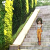
Going from...

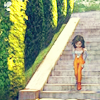
to
Using: Photoshop CS3
I use selective coloring, so it's not really directly translateable. I don't think it's too hard, probably doesn't take more than 15 minutes (although if you're me and you play with a single bar in selective coloring for about 20 minutes, it'll take significantly longer).
A little image-intensive, but it shouldn't freeze you up.
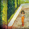
I.
Start off with your usual base preparations. For the coloring I did, it's nice to have a variety of colors and a slightly brighter image. A little more contrast is good too :D. My finished base looked like this.
II.
The next step was inspired by an awesome tutorial by so_vayne. I changed it to fit to my own coloring requirements, but the method/fill layers were inspired by that tutorial.
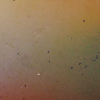
The first layer I added was a dark blue (#010037) fill layer, which I set to Exclusion and lowered the opacity to 50%. I like the yellow it added, because it gave the image less of a cold feeling. Next, I made a light blue (#def7ff) fill layer and set it to Color Burn, at 70% opacity. Finally, I put in a light pink (#ffd5d5) fill layer set on soft light at 60% opacity. You get something like this:

III.
It's a little light and dull, so next I added my favorite kind of layer, Selective Coloring. ;D My approach with selective coloring is slide the bars around until I get something suitable. I usually play with all the colors, to get everything perfect.
Reds: -100, -18, +25, +51
Yellows: -56, -15, +26, +52
Greens: +100, -34, +100, +38
Whites: -22, -25, -33, +24
Neutrals: +5, +1, 0, +7
Set the layer to Color! I like the effect it gives! :D
IV.
At this point, I added my first texture, this (I honestly do not know who this texture is by, I've had it for so long; if anyone has any ideas, that would be great). I set it to Overlay at 100% opacity for some pretty coloring :D
V.
Next, I duplicated the original base and dragged it to the top, then set it to Luminosity @ 20%. It gives it nice contrast and slightly more vibrant colors. I do it mostly because I want to.
VI.
Now comes a whole bunch of textures. The first I added is this one by sanami276, set to Darken. I erased around Garnet because I didn't want her to be really dark. The next texture was this one by tihana, set to Lighten @ 20% opacity. Next, this texture by tihana set to Multiply @ 14%. I'm all about the subtle effects with my textures. Then, this texture by duskflare. I love this set I downloaded because it's full of such pretty twinkle textures ;D. Finally, this texture by toybirds. I flipped it and deleted everything but the border I wanted.
VII.
Last step, I added some tiny text and a large "G" with the font Bickham Script Pro, and placed that layer under the Lighten texture layer. All done!
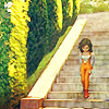
to
Using: Photoshop CS3
I use selective coloring, so it's not really directly translateable. I don't think it's too hard, probably doesn't take more than 15 minutes (although if you're me and you play with a single bar in selective coloring for about 20 minutes, it'll take significantly longer).
A little image-intensive, but it shouldn't freeze you up.
I.
Start off with your usual base preparations. For the coloring I did, it's nice to have a variety of colors and a slightly brighter image. A little more contrast is good too :D. My finished base looked like this.
II.
The next step was inspired by an awesome tutorial by so_vayne. I changed it to fit to my own coloring requirements, but the method/fill layers were inspired by that tutorial.
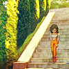
The first layer I added was a dark blue (#010037) fill layer, which I set to Exclusion and lowered the opacity to 50%. I like the yellow it added, because it gave the image less of a cold feeling. Next, I made a light blue (#def7ff) fill layer and set it to Color Burn, at 70% opacity. Finally, I put in a light pink (#ffd5d5) fill layer set on soft light at 60% opacity. You get something like this:
III.
It's a little light and dull, so next I added my favorite kind of layer, Selective Coloring. ;D My approach with selective coloring is slide the bars around until I get something suitable. I usually play with all the colors, to get everything perfect.
Reds: -100, -18, +25, +51
Yellows: -56, -15, +26, +52
Greens: +100, -34, +100, +38
Whites: -22, -25, -33, +24
Neutrals: +5, +1, 0, +7
Set the layer to Color! I like the effect it gives! :D
IV.
At this point, I added my first texture, this (I honestly do not know who this texture is by, I've had it for so long; if anyone has any ideas, that would be great). I set it to Overlay at 100% opacity for some pretty coloring :D
V.
Next, I duplicated the original base and dragged it to the top, then set it to Luminosity @ 20%. It gives it nice contrast and slightly more vibrant colors. I do it mostly because I want to.
VI.
Now comes a whole bunch of textures. The first I added is this one by sanami276, set to Darken. I erased around Garnet because I didn't want her to be really dark. The next texture was this one by tihana, set to Lighten @ 20% opacity. Next, this texture by tihana set to Multiply @ 14%. I'm all about the subtle effects with my textures. Then, this texture by duskflare. I love this set I downloaded because it's full of such pretty twinkle textures ;D. Finally, this texture by toybirds. I flipped it and deleted everything but the border I wanted.
VII.
Last step, I added some tiny text and a large "G" with the font Bickham Script Pro, and placed that layer under the Lighten texture layer. All done!