inquisitory ✭ 37; it's all we've got now
Right on the heels of the contest results comes another tutorial xD Hope you all enjoyed that diversion from the usual, it was fun!
Request by aurturius ♥
Go from
to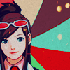
in Photoshop. Uses Selective Color and Color Balance, so not translatable.
One thing that was really handy about this base image was the transparency of the background, so I didn't have to cut Ema out to add this texture by loveicon in the back :] Good stuff! So here's my base with that in mind.

orz, the texture's so radiant and Ema hardly stands out against it! D: Let's fix that with a super-daring Hard Light, 100% duplicate of the base (ONLY the character, not the background too).

Okay, now they match more, but the colours are kinda boring so LET'S FIX IT~~~ Take a Hue/Saturation... adjustment layer with Saturation on 50 and watch your image go crazy! xD

Fun stuff, yeah? xD But as always I have to advise that your image may not be capable of such high saturation, so do what's comfortable for you. And since I'm a huge sucker for Selective Coloring... adjustment layers such as the one in step 3 of this tutorial by ckdesigns, let's go ahead and do that :')

Oh god that's horrifyingly bright ;____; Not pleasantly either, more like a "get the heck away from me" kinda bright, I think xD Unfortunately I don't remember and can't find where I got the following Selective Coloring... adjustment layer settings, so uh, if you know where they came from please do tell xD Unless I just have a bad memory and it was me who moved random sliders to get this, lolol.
Reds: 100, 100, 100, -41
Yellows: 50, -37, 54, 47
Cyans: 100, 100, 100, -83
Whites: 63, 48, -79, 44
Neutrals: -7, -14, -8, 18
Blacks: -15, -4, -23, 14
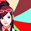
augh augh not that different after all ;; I think it's time for a Color Balance... adjustment layer, don't you? 8) With the following numeros lawl:
Midtones: -33, 0, +37

Finally getting somewhere decent dsajfhlas. At this point I realized the icon was seriously lacking in texture, so my favourite grainy texture ever by dusty_memories (more here) on Multiply, 100% will do nicely, yeah? I think I desaturated the texture part of the way so it didn't get too orangey as that texture tends to do sometimes, so you can play with that in the Hue/Saturation/Lightness... menu (Image > Adjustments > Hue/Saturation...).
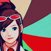
Okay, now have a different texture by dusty_memories (from the same set), also on Multiply, 100% for extra grainy goodness! xD
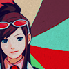
And to finish, I flipped this texture by rlf_icons (rest here) on Lighten, 100%, with some bits erased by a soft brush! That's it, yay 8)

Other examples:
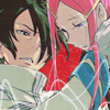
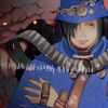
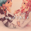
as well as every single Apollo Justice icon on this batch lolol.
I encourage you to go play around and show me your finished icons! DOOO IIIIIIT, I wanna see what you guys come up with~
If you like what you see, why not friend ewidentnie for future updates?
Request by aurturius ♥
Go from

to

in Photoshop. Uses Selective Color and Color Balance, so not translatable.
One thing that was really handy about this base image was the transparency of the background, so I didn't have to cut Ema out to add this texture by loveicon in the back :] Good stuff! So here's my base with that in mind.

orz, the texture's so radiant and Ema hardly stands out against it! D: Let's fix that with a super-daring Hard Light, 100% duplicate of the base (ONLY the character, not the background too).

Okay, now they match more, but the colours are kinda boring so LET'S FIX IT~~~ Take a Hue/Saturation... adjustment layer with Saturation on 50 and watch your image go crazy! xD

Fun stuff, yeah? xD But as always I have to advise that your image may not be capable of such high saturation, so do what's comfortable for you. And since I'm a huge sucker for Selective Coloring... adjustment layers such as the one in step 3 of this tutorial by ckdesigns, let's go ahead and do that :')

Oh god that's horrifyingly bright ;____; Not pleasantly either, more like a "get the heck away from me" kinda bright, I think xD Unfortunately I don't remember and can't find where I got the following Selective Coloring... adjustment layer settings, so uh, if you know where they came from please do tell xD Unless I just have a bad memory and it was me who moved random sliders to get this, lolol.
Reds: 100, 100, 100, -41
Yellows: 50, -37, 54, 47
Cyans: 100, 100, 100, -83
Whites: 63, 48, -79, 44
Neutrals: -7, -14, -8, 18
Blacks: -15, -4, -23, 14

augh augh not that different after all ;; I think it's time for a Color Balance... adjustment layer, don't you? 8) With the following numeros lawl:
Midtones: -33, 0, +37

Finally getting somewhere decent dsajfhlas. At this point I realized the icon was seriously lacking in texture, so my favourite grainy texture ever by dusty_memories (more here) on Multiply, 100% will do nicely, yeah? I think I desaturated the texture part of the way so it didn't get too orangey as that texture tends to do sometimes, so you can play with that in the Hue/Saturation/Lightness... menu (Image > Adjustments > Hue/Saturation...).

Okay, now have a different texture by dusty_memories (from the same set), also on Multiply, 100% for extra grainy goodness! xD

And to finish, I flipped this texture by rlf_icons (rest here) on Lighten, 100%, with some bits erased by a soft brush! That's it, yay 8)

Other examples:


as well as every single Apollo Justice icon on this batch lolol.
I encourage you to go play around and show me your finished icons! DOOO IIIIIIT, I wanna see what you guys come up with~
If you like what you see, why not friend ewidentnie for future updates?