(no subject)
Go from 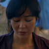
to
Program: PSP X2
Level: Easy
Translatable: Yes
Join evita_icons for more tutorials
1) First off, as I reitorate in all of my tutorials it's essential that you start out with a HQ cap/base. I capped this myself from the LostCaps gallery. Even in Lost where they are always on a sunny beach the caps have a tendency to be a bit dark. I duplicated the base two times and set to screen for both layers. This really brightens the icon up. Don't worry if it looks a little washed out. The end product isnt as light as this. If you think your base is too light then you may only need one layer of screen or you may need to adjust the opacity of thetop layer a little bit.

to
2)Next, it's time to sharpen your base. You can either do it the traditional sharpen tool way but for this icon since Im not looking for too crisp an image I went the High Pass Sharpen way. Set the radius on 60 and set to soft light. This will deepen the image's contrast a bit and soften the entire base up.

3)Third, I adjusted the contrast a little. You can do this with the contrast and brightness tool, but I chose to use a cheat and used Auto-Contrast option. It's quick and easy. Less of a hassle.

4)Now it's time to start brightening the colors up. I did this with the Channel Mixer tool insted of fill layers and whatnot. The settings will have to be adjusted to fit your particular base's color palatte. I used the following settings:
Reds: 116,-3,0
Greens: -15,116,17
Blues: -46, 92,64

5) Next it's time to apply the texture. I wanted a bright color that still blended into the background so it looked natural. The texture was purple to begin with but I created a new layer and filled it with a color of the tarp behind her then set to color. This created this:
Then I pasted our texture onto Sun. I wanted to erase the part of the texture that was on her face so I lowered the opacity of the texture so I could see where I was erasing. I had the eraser tool on a medium opacity and lowered the Hardness to around 20% so the color kind of faded into Sun.

to
Remember, you'll have to find a color that works with your base.
6) Next I added a bit of a smoky texture to add a bit of texture. I wanted the grunginess of the blue to carry over onto her face but no to colorize it. Black and white textures work wonders here This step may be omitted if it looks out of place.
to
7) Now, I want the colors of Sun's face and clothes to pop a little more so I adjusted the saturation to 20. This again will have to be adjusted to your bases needs. Be careful, this may cause skin tons (especially ruddy skintones) to turn very red.

8) Lastly, I wanted to adjust the blacks and whites of the icon. I noticed her hair was a little blue so to darken it to black again I set Levels at 1, 154, 255. If you have lots of white in your icon you'll have to go the other way.


to

Program: PSP X2
Level: Easy
Translatable: Yes
Join evita_icons for more tutorials
1) First off, as I reitorate in all of my tutorials it's essential that you start out with a HQ cap/base. I capped this myself from the LostCaps gallery. Even in Lost where they are always on a sunny beach the caps have a tendency to be a bit dark. I duplicated the base two times and set to screen for both layers. This really brightens the icon up. Don't worry if it looks a little washed out. The end product isnt as light as this. If you think your base is too light then you may only need one layer of screen or you may need to adjust the opacity of thetop layer a little bit.

to

2)Next, it's time to sharpen your base. You can either do it the traditional sharpen tool way but for this icon since Im not looking for too crisp an image I went the High Pass Sharpen way. Set the radius on 60 and set to soft light. This will deepen the image's contrast a bit and soften the entire base up.

3)Third, I adjusted the contrast a little. You can do this with the contrast and brightness tool, but I chose to use a cheat and used Auto-Contrast option. It's quick and easy. Less of a hassle.

4)Now it's time to start brightening the colors up. I did this with the Channel Mixer tool insted of fill layers and whatnot. The settings will have to be adjusted to fit your particular base's color palatte. I used the following settings:
Reds: 116,-3,0
Greens: -15,116,17
Blues: -46, 92,64

5) Next it's time to apply the texture. I wanted a bright color that still blended into the background so it looked natural. The texture was purple to begin with but I created a new layer and filled it with a color of the tarp behind her then set to color. This created this:

Then I pasted our texture onto Sun. I wanted to erase the part of the texture that was on her face so I lowered the opacity of the texture so I could see where I was erasing. I had the eraser tool on a medium opacity and lowered the Hardness to around 20% so the color kind of faded into Sun.

to

Remember, you'll have to find a color that works with your base.
6) Next I added a bit of a smoky texture to add a bit of texture. I wanted the grunginess of the blue to carry over onto her face but no to colorize it. Black and white textures work wonders here This step may be omitted if it looks out of place.

to

7) Now, I want the colors of Sun's face and clothes to pop a little more so I adjusted the saturation to 20. This again will have to be adjusted to your bases needs. Be careful, this may cause skin tons (especially ruddy skintones) to turn very red.

8) Lastly, I wanted to adjust the blacks and whites of the icon. I noticed her hair was a little blue so to darken it to black again I set Levels at 1, 154, 255. If you have lots of white in your icon you'll have to go the other way.
