(no subject)
Go from 
to
Program: PSP X2
Level: Easy - Mediumish
Translatable: Yes
Works best with: Images with dark colored backgrounds.
Please visit/join evita_icons for more tutorials and graphics
1) Just as I start any tutorial I should remind you that graphics work best with good quality images. The more HQ the better. It will save you from a major headache later. I cropped this base from an image I found on gettyimages.com. Much of the cropping is based off of where the watermarks fall on these images. Usually close ups found on this site have a watermark right across the face and it's just a pain to deal with so I usually opt for a 3/4th body panel of the actor or actress Im iconing. The watermark then (hopefully) falls around the torso and you can easily crop around it.

As stated above, this tutorials works MUCH better with images with darker backgrounds. Primeres are great, photographers usually always wear black so the person getting their photo taken pops out.
2) First thing we must do is get this base workable. Emma looks a little pale and washed out. By duplicating the base layer and setting it to soft light automatically more color pops into her face and already the people behind her are starting to disappear. If you base is exceptionally dark you may have to do both or only a screen layer insted. Screen will lighten up the face.

3) Since this image was resized it's a little blurry. (tip RESIZE ONLY ONCE! Your image will loose quality every time it is resized so for best results go from full size to 100x100 or whatever size graphic you are making) It's not too bad and since Im going for a little foggy look I sharpen only once :)

4) Next, I want to do a fix quick on the flatness of her face. By adjusting contrast. Making the whites a little whiter and the blacks a little blacker. You can go in an adjust settings by hand if you want but I found that auto-contrast works just fine :) This is just a basic icon so a cheat is always welcome!

For those interested the only contrast I adjusted was the RGB and auto set it at about 215, 225
5) Now it's time to start making the background even darker and help the shading around her face. You can do this by solid layers of black or dark gray but I chose this texture (maker unknown) and set it on soft light.

to
6)And to start adding the fogginess (as I call it) I discovered the use of the Difference setting! It replaces much of the gray bits and makes them blacker. I use another texture (same maker but still unknown) and set it on Difference on 20%

to
Notice how the black is starting to look a bit more matted?
7)Now it is time to adjust the coloring of the image! There are many ways to adust coloring, color fill layers, hue/saturation adjustments, selective coloring (not available in PSP) but my favorite since it is translatable across the board is the Channel Mixer. Bare in mind that settings for every image should be different. Adjust to what fits your image. I wanted to basically make the image a bit more saturated and put more blues and reds into it. Here are my settings.
RED: 107,-6
GREEN: -15, 114, 10
BLUE:-49,125,37

8)Next I want to darken the image up some since I see that it's starting to get a little too light. And easy way is a black layer on soft light but I used levels here set on 0, 146, 255

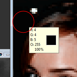
9) Now it's time to get rid of the bits of white and other colors behind Emma. I do this by first copy-merging and pasting on as a new layer. This way you can work with the icon as a whole now insted of layer by layer. I zoom in on the layer until it's about 400 - 500% size. This way I can work with the individual pixals more. I use the color dropper and find a dark area on the icon (I circled in red were I selected my color) As you can see it's not quite solid black. Black would be too harsh against Emma's skin and it's much easier to blend in a slightly gray color. I set my paint brush on a opacity around 60 and softness around 10 and carefully paint brush away the bits of white and lighter gray. With the low opacity it's safe to get close to her skin and face because the edges won't be harsh and even if a wisp of gray/black gets on her skin and hair it will be a such a low opacity it will blend and actually give a nice polished effect.

You can also use a smudge brush if you don't have much to color out :)
10)Now for the final touch and the secret of this icon is a layer of gray! Yes, it is that simple :D It gives a nice matted look but stil allows the contrast and the vibrancy of Emma's face to shine through. I set the gray on Lighten at about 13-15%

to
Examples!


to

Program: PSP X2
Level: Easy - Mediumish
Translatable: Yes
Works best with: Images with dark colored backgrounds.
Please visit/join evita_icons for more tutorials and graphics
1) Just as I start any tutorial I should remind you that graphics work best with good quality images. The more HQ the better. It will save you from a major headache later. I cropped this base from an image I found on gettyimages.com. Much of the cropping is based off of where the watermarks fall on these images. Usually close ups found on this site have a watermark right across the face and it's just a pain to deal with so I usually opt for a 3/4th body panel of the actor or actress Im iconing. The watermark then (hopefully) falls around the torso and you can easily crop around it.

As stated above, this tutorials works MUCH better with images with darker backgrounds. Primeres are great, photographers usually always wear black so the person getting their photo taken pops out.
2) First thing we must do is get this base workable. Emma looks a little pale and washed out. By duplicating the base layer and setting it to soft light automatically more color pops into her face and already the people behind her are starting to disappear. If you base is exceptionally dark you may have to do both or only a screen layer insted. Screen will lighten up the face.

3) Since this image was resized it's a little blurry. (tip RESIZE ONLY ONCE! Your image will loose quality every time it is resized so for best results go from full size to 100x100 or whatever size graphic you are making) It's not too bad and since Im going for a little foggy look I sharpen only once :)

4) Next, I want to do a fix quick on the flatness of her face. By adjusting contrast. Making the whites a little whiter and the blacks a little blacker. You can go in an adjust settings by hand if you want but I found that auto-contrast works just fine :) This is just a basic icon so a cheat is always welcome!

For those interested the only contrast I adjusted was the RGB and auto set it at about 215, 225
5) Now it's time to start making the background even darker and help the shading around her face. You can do this by solid layers of black or dark gray but I chose this texture (maker unknown) and set it on soft light.

to

6)And to start adding the fogginess (as I call it) I discovered the use of the Difference setting! It replaces much of the gray bits and makes them blacker. I use another texture (same maker but still unknown) and set it on Difference on 20%

to

Notice how the black is starting to look a bit more matted?
7)Now it is time to adjust the coloring of the image! There are many ways to adust coloring, color fill layers, hue/saturation adjustments, selective coloring (not available in PSP) but my favorite since it is translatable across the board is the Channel Mixer. Bare in mind that settings for every image should be different. Adjust to what fits your image. I wanted to basically make the image a bit more saturated and put more blues and reds into it. Here are my settings.
RED: 107,-6
GREEN: -15, 114, 10
BLUE:-49,125,37

8)Next I want to darken the image up some since I see that it's starting to get a little too light. And easy way is a black layer on soft light but I used levels here set on 0, 146, 255

9) Now it's time to get rid of the bits of white and other colors behind Emma. I do this by first copy-merging and pasting on as a new layer. This way you can work with the icon as a whole now insted of layer by layer. I zoom in on the layer until it's about 400 - 500% size. This way I can work with the individual pixals more. I use the color dropper and find a dark area on the icon (I circled in red were I selected my color) As you can see it's not quite solid black. Black would be too harsh against Emma's skin and it's much easier to blend in a slightly gray color. I set my paint brush on a opacity around 60 and softness around 10 and carefully paint brush away the bits of white and lighter gray. With the low opacity it's safe to get close to her skin and face because the edges won't be harsh and even if a wisp of gray/black gets on her skin and hair it will be a such a low opacity it will blend and actually give a nice polished effect.


You can also use a smudge brush if you don't have much to color out :)
10)Now for the final touch and the secret of this icon is a layer of gray! Yes, it is that simple :D It gives a nice matted look but stil allows the contrast and the vibrancy of Emma's face to shine through. I set the gray on Lighten at about 13-15%

to

Examples!
