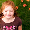
Base Prep tutorial
A while ago someone requested a base prep tutorial. Sorry it took me forever and a day but here is what I basically do for my base prepping. I used a 200x200 image but the tutorial is the same for 100x100. I just chose a bigger image so you could see the actual differences :)
From this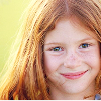
1) Start out with your unpreped base. Make sure that it is of good quality to begin with. I get most of my stock images off of GettyImages Usually they are workable.

2)I always duplicate my base for any icon and leave it untouched. It's nice to go back and see what base you started with and ended up with when done with an icon. I sharpen the top layer once.
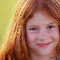
See? Already it's more workable :)
3) Then I duplicate the sharpened layer and set to screen at about 50% for this particular icon. It varies for base to base. Adjust accordingly. If the opacity is too high the icon will look unnatural and too contrasted which is a major pitfall of new icon makers.
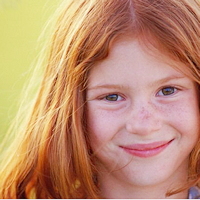
4) I then adjust the contrast and brightness of the icon. Just with this your base will pop and not look so flat. I adjusted Brightness to 10 and Contrast to 5. Remember, too much contrast will make an unnatural looking base. Don't go overboard. For some bases I actually have to lower the contrast.

5)Then it's time to adjust a little bit of color. I generally liked the colorization of this base but I think it was a little on the red side. I went into Curves and did these adjustments
RGB (grayscale) : 184 > 195 (made it a little darker)
Red: 147>144 (took some red out)
Green: Left untouched
Blue: 199>186 (Raised it a moderate amount)

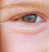
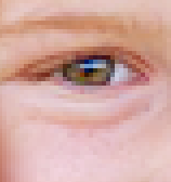
6)At this point I copy-merge my entire project and paste on as a new layer. For bases like this focusing mostly on a face I zoom in and sharpen the eyes a little extra so they have a bit of sparkle. Do not over do the sharpening :)
--
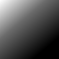
7) After that I then apply a gradient to polish the colorization a bit. It basically helps the colors blend a little bit. Not very noticeable but it definitely helps :) I set a standard black and white gradient from the pallete and set to Screen at 20% (note, soft light in place of screen works too.)
--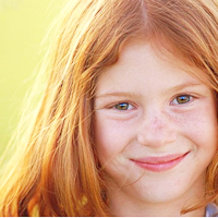
8)At this point I am basically done but for this particular base I see that it is still too green and red for me so I go into color balance and adjust the shadows: -33,0,15. This will add more blue into the base and balance the colors a bit more

And I am done! Sorry if I rambled a bit :) Like I said, this can be applied to most any image you have and works the same for 100x100 bases.
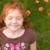
Example
--

From this

1) Start out with your unpreped base. Make sure that it is of good quality to begin with. I get most of my stock images off of GettyImages Usually they are workable.

2)I always duplicate my base for any icon and leave it untouched. It's nice to go back and see what base you started with and ended up with when done with an icon. I sharpen the top layer once.

See? Already it's more workable :)
3) Then I duplicate the sharpened layer and set to screen at about 50% for this particular icon. It varies for base to base. Adjust accordingly. If the opacity is too high the icon will look unnatural and too contrasted which is a major pitfall of new icon makers.

4) I then adjust the contrast and brightness of the icon. Just with this your base will pop and not look so flat. I adjusted Brightness to 10 and Contrast to 5. Remember, too much contrast will make an unnatural looking base. Don't go overboard. For some bases I actually have to lower the contrast.

5)Then it's time to adjust a little bit of color. I generally liked the colorization of this base but I think it was a little on the red side. I went into Curves and did these adjustments
RGB (grayscale) : 184 > 195 (made it a little darker)
Red: 147>144 (took some red out)
Green: Left untouched
Blue: 199>186 (Raised it a moderate amount)

6)At this point I copy-merge my entire project and paste on as a new layer. For bases like this focusing mostly on a face I zoom in and sharpen the eyes a little extra so they have a bit of sparkle. Do not over do the sharpening :)

--

7) After that I then apply a gradient to polish the colorization a bit. It basically helps the colors blend a little bit. Not very noticeable but it definitely helps :) I set a standard black and white gradient from the pallete and set to Screen at 20% (note, soft light in place of screen works too.)

--

8)At this point I am basically done but for this particular base I see that it is still too green and red for me so I go into color balance and adjust the shadows: -33,0,15. This will add more blue into the base and balance the colors a bit more

And I am done! Sorry if I rambled a bit :) Like I said, this can be applied to most any image you have and works the same for 100x100 bases.
Example

--
