Icon Tutorial #2: Slash - On My Own
This is the second tutorial I promised recycleanimals. I'm sorry about the small delay in getting this done, but I've had other icon-related deadlines to meet! But slowly and surely I'm making my through my to-do list.
The usual guidelines apply:
:: DO NOT COPY this tutorial exactly. It's here to HELP and GUIDE you, that is all. I do not want to see carbon copies out there.
:: Experiment, experiment, experiment. Some of the techniques here don't work for all images, you will have to bend rules, and work new ideas into them.
:: Do not hotlink the images, or claim this tute as your own.
:: Please, if you find this tutorial helpful to you, comment and let me know. I'll adore you for it :)
On My Own
I will show you how to make this icon:
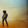
Again, this is quite straight forward, but if you do have any questions, feel free to ask and I'll help you all I can. I use PSP7, but it is easily transferrable to other programmes.
This tutorial is best suited for light 'airy' caps/pictures. Anything too dark will just muddy up too much.
I started off with this cap from the November Rain video.
This is my base:
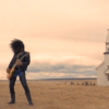
I then followed the same steps I use for every single icon I make. It is all detailed in the first three steps in my other tutorial.
Duplicate > screen:
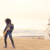
Duplicate > soft light:
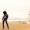
I then adjust the opacity of these layers, ending up with a palette reading like this:
Base
Screen > 85%
Soft light > 85%
And a base that currently looks like this:
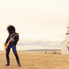
Go to layers > merge > merge (visible). Right click on your merged image and click copy. UNDO the merge, and paste your copy as a new layer. This way you still have your new colour-tweaked image to work with, aswell as the original layers available in case you need them.
Duplicate your 'new' base > sharpen. Sometimes you might need a second sharpened layer with a low opacity added if once isn't enough. But in this case one layer was just fine:
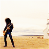
I duplicated this layer and went to effects > enhance photo > and tweaked both the saturation and contrast levels. I wanted a bit more depth to the colour, and as I knew I would be using a texture I wanted Slash to stand out well.
I have recently discovered some gorgeous textures by rhinestone_life, which are so versatile. I just love them! I grabbed this one:
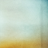
And set it to soft light:
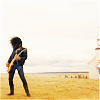
Nice, but still very washed out. I duplicated it and set it to multiply > 85%:
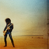
That's better. Very moody and atmospheric.
Now for the text. New layer > text tool. Using the dropper I found a mid-range brown colour and typed in my text. I think I used either Georgia or 18th Century:
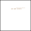
I left the layer Normal > 100%, resulting in this:

I used this same technique for a few of my other Slash icons. Such as these:
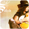
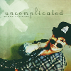
The usual guidelines apply:
:: DO NOT COPY this tutorial exactly. It's here to HELP and GUIDE you, that is all. I do not want to see carbon copies out there.
:: Experiment, experiment, experiment. Some of the techniques here don't work for all images, you will have to bend rules, and work new ideas into them.
:: Do not hotlink the images, or claim this tute as your own.
:: Please, if you find this tutorial helpful to you, comment and let me know. I'll adore you for it :)
On My Own
I will show you how to make this icon:
Again, this is quite straight forward, but if you do have any questions, feel free to ask and I'll help you all I can. I use PSP7, but it is easily transferrable to other programmes.
This tutorial is best suited for light 'airy' caps/pictures. Anything too dark will just muddy up too much.
I started off with this cap from the November Rain video.
This is my base:
I then followed the same steps I use for every single icon I make. It is all detailed in the first three steps in my other tutorial.
Duplicate > screen:
Duplicate > soft light:
I then adjust the opacity of these layers, ending up with a palette reading like this:
Base
Screen > 85%
Soft light > 85%
And a base that currently looks like this:
Go to layers > merge > merge (visible). Right click on your merged image and click copy. UNDO the merge, and paste your copy as a new layer. This way you still have your new colour-tweaked image to work with, aswell as the original layers available in case you need them.
Duplicate your 'new' base > sharpen. Sometimes you might need a second sharpened layer with a low opacity added if once isn't enough. But in this case one layer was just fine:
I duplicated this layer and went to effects > enhance photo > and tweaked both the saturation and contrast levels. I wanted a bit more depth to the colour, and as I knew I would be using a texture I wanted Slash to stand out well.
I have recently discovered some gorgeous textures by rhinestone_life, which are so versatile. I just love them! I grabbed this one:
And set it to soft light:
Nice, but still very washed out. I duplicated it and set it to multiply > 85%:
That's better. Very moody and atmospheric.
Now for the text. New layer > text tool. Using the dropper I found a mid-range brown colour and typed in my text. I think I used either Georgia or 18th Century:
I left the layer Normal > 100%, resulting in this:
I used this same technique for a few of my other Slash icons. Such as these: