Some inititial ideas on concept and critique.
By no means exhaustive, or definitive, this is something I was
told by abecat and, less formally, kamenkyote, both of whom
I respect a great deal on such matters.
Go over this checklist, in order of importance:
1. Concept
2. Composition
3. Contrast
4. Color
5. Technique
If you can't say you've considered and worked out one of these points, then don't go on to the next one.
I know you might really want to jump to #5 and start cranking on that hot sexy method for rendering fur that you've figured out, or stylizing hair/fingers/tits/clothing/anatomy in that way you saw in the last issue/episode of ________. And I know how strong the urge is to scattershoot apply the newest lens flare filters, or.. or whatever, but seriously:
If you don't have the first four things on the list solidly sorted, then it'll be obvious that you don't, and all the slick technique in the world won't change or mask it.
And I don't mean you have to gnaw all day on it, just... y'know, come up with different options for each one, think about it, pick the best one and move on to the next thing.
A good thumbnail sketch can nail three of them right off the bat, for instance.
I list them in order of importance, but the sequence of the list isn't nearly as important as the content: it is basically a means of ensuring that what you're doing is as fully considered as possible. Not that you can't decide to just "do what you feel" or let things happen organically, but even that is a decision. Owning your image as fully as possible will help you help it do what you want more effectively.
[NOTE: The above is the bottom line for this post.]
Firstly, what's the point? Is there any idea to it at all? What is the idea? Is it a clear idea? Is it interesting? What are you're trying to get across, and if so are you actually, effectively doing it. And "concept" might mean something as obvious as a Hallmark greeting card. Or the visual equivalent of a loopy drunken free-for-all. Has it been said before? How did that work? How didn't that work?
There isn't any wrong answer, but that you have an answer. That you are thinking and actively engaged with the process of what you're doing. Even if the other points on the list are managed brilliantly, without a concept that is even a little compelling, or slightly legible, then it's just a technical exercise. And while there's nothing wrong with that, there's nothing right about it, either :P
I know that I've made work that had no point other than to scratch some self-serving fascination with technique or because I'm figuring out how to render fur or chrome, etc. But by the same token, I wouldn't necessarily consider those images my best work.
Sometimes, such fascination with technique -is- the concept: for example, Mondrian's grid paintings, or the wave of intense photorealism in certain paintings from the 70's.
However, even in those cases, there is still a concept: it is the demonstrated commitment to Technique.
I mean, if you're using a technique or a visual gimmick, why? If it is for its own sake - if you are using Photoshop filters or fake lens flares, then by God, put 1000% of your heart and soul into making those lens flares work and carry the image. If you're going to dabble in pixel art, then Dabble with a capital D! If the juicy splatter is your thing, get the juiciest splatteriest thingiest thing you can muster. Mean what you make; own it and mean it.
-lavender-mist.jpg)


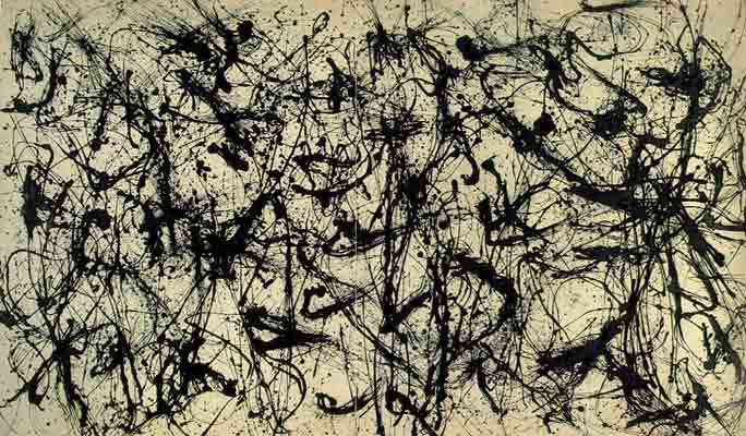
Incidentally, the last image is only questionably "attributed" to Jackson Pollock. There is controversy around it, but it's apparent to my eye that a different mind (or at least mental state) was at work for that image than the others. Granted, they are all splattered and "messy", but that last image feels much more conspicuously organized than the others (I totally recognize that his paintings are organized, but with more nuance and subtlety). I think the last painting is a wonderful image, I just don't believe Pollock made it.
How would you describe the differences and similarities of these paintings? Even though they rely on apparent chaos, none of them feel like accidents or aimless doodles, there is still rhythm and evidence of creative intention.

^^^^^^^And more/less relatedly: Work by Chris Jordan, who makes images from large-scale digital compositing of small ordinary things. His way of markmaking is very organized and meticulous and intentional. In a way, it has the same overwhelming buzz in the eye as a Pollock painting (check out the "actual size" details and how the images look on a wall next to people, for scale). But his stuff isn't built on a technique of messy liquid "vector" hyperchaos, it's built on granular "pixilated" units, on hyperorganization; and he is not at all trying to grunt his emotions onto the surface, he is communicating deliberate overt political statements. How is it similar and different from Pollock's work. Do the overt statements matter?
Jordan and Pollock use techniques that overwhelm the viewer with visual information. However, Jordan deliberately connects this optic buzz to statistics that have political relevance. He is trying to communicate a specific message. On the other hand, Pollock comes across as brute, primal, lyrical and aggressively disconnected from meaning - even though that itself can be seen as a communicated message. Neither one is better or worse than the other; they are both similar and different in approach and effect.
These artists are making work that feels like every square inch of the piece is deliberate and considered and part of the whole.
Also, Guernica
told by abecat and, less formally, kamenkyote, both of whom
I respect a great deal on such matters.
Go over this checklist, in order of importance:
1. Concept
2. Composition
3. Contrast
4. Color
5. Technique
If you can't say you've considered and worked out one of these points, then don't go on to the next one.
I know you might really want to jump to #5 and start cranking on that hot sexy method for rendering fur that you've figured out, or stylizing hair/fingers/tits/clothing/anatomy in that way you saw in the last issue/episode of ________. And I know how strong the urge is to scattershoot apply the newest lens flare filters, or.. or whatever, but seriously:
If you don't have the first four things on the list solidly sorted, then it'll be obvious that you don't, and all the slick technique in the world won't change or mask it.
And I don't mean you have to gnaw all day on it, just... y'know, come up with different options for each one, think about it, pick the best one and move on to the next thing.
A good thumbnail sketch can nail three of them right off the bat, for instance.
I list them in order of importance, but the sequence of the list isn't nearly as important as the content: it is basically a means of ensuring that what you're doing is as fully considered as possible. Not that you can't decide to just "do what you feel" or let things happen organically, but even that is a decision. Owning your image as fully as possible will help you help it do what you want more effectively.
[NOTE: The above is the bottom line for this post.]
Firstly, what's the point? Is there any idea to it at all? What is the idea? Is it a clear idea? Is it interesting? What are you're trying to get across, and if so are you actually, effectively doing it. And "concept" might mean something as obvious as a Hallmark greeting card. Or the visual equivalent of a loopy drunken free-for-all. Has it been said before? How did that work? How didn't that work?
There isn't any wrong answer, but that you have an answer. That you are thinking and actively engaged with the process of what you're doing. Even if the other points on the list are managed brilliantly, without a concept that is even a little compelling, or slightly legible, then it's just a technical exercise. And while there's nothing wrong with that, there's nothing right about it, either :P
I know that I've made work that had no point other than to scratch some self-serving fascination with technique or because I'm figuring out how to render fur or chrome, etc. But by the same token, I wouldn't necessarily consider those images my best work.
Sometimes, such fascination with technique -is- the concept: for example, Mondrian's grid paintings, or the wave of intense photorealism in certain paintings from the 70's.
However, even in those cases, there is still a concept: it is the demonstrated commitment to Technique.
I mean, if you're using a technique or a visual gimmick, why? If it is for its own sake - if you are using Photoshop filters or fake lens flares, then by God, put 1000% of your heart and soul into making those lens flares work and carry the image. If you're going to dabble in pixel art, then Dabble with a capital D! If the juicy splatter is your thing, get the juiciest splatteriest thingiest thing you can muster. Mean what you make; own it and mean it.
-lavender-mist.jpg)


Incidentally, the last image is only questionably "attributed" to Jackson Pollock. There is controversy around it, but it's apparent to my eye that a different mind (or at least mental state) was at work for that image than the others. Granted, they are all splattered and "messy", but that last image feels much more conspicuously organized than the others (I totally recognize that his paintings are organized, but with more nuance and subtlety). I think the last painting is a wonderful image, I just don't believe Pollock made it.
How would you describe the differences and similarities of these paintings? Even though they rely on apparent chaos, none of them feel like accidents or aimless doodles, there is still rhythm and evidence of creative intention.
^^^^^^^And more/less relatedly: Work by Chris Jordan, who makes images from large-scale digital compositing of small ordinary things. His way of markmaking is very organized and meticulous and intentional. In a way, it has the same overwhelming buzz in the eye as a Pollock painting (check out the "actual size" details and how the images look on a wall next to people, for scale). But his stuff isn't built on a technique of messy liquid "vector" hyperchaos, it's built on granular "pixilated" units, on hyperorganization; and he is not at all trying to grunt his emotions onto the surface, he is communicating deliberate overt political statements. How is it similar and different from Pollock's work. Do the overt statements matter?
Jordan and Pollock use techniques that overwhelm the viewer with visual information. However, Jordan deliberately connects this optic buzz to statistics that have political relevance. He is trying to communicate a specific message. On the other hand, Pollock comes across as brute, primal, lyrical and aggressively disconnected from meaning - even though that itself can be seen as a communicated message. Neither one is better or worse than the other; they are both similar and different in approach and effect.
These artists are making work that feels like every square inch of the piece is deliberate and considered and part of the whole.
Also, Guernica