Tutorial #2
How to go from 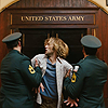
to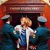
Other icons made using this tut:
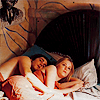
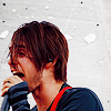

Not translatable. Sorry bbs :(
1. You know how to start. Get a picture you want and crop it. Sharpen it now if you want to.
2. Now duplicate your base, and set it to Screen. What you set the screen opacity to all depends on your icon. But do know that some pictures dont have high or good quality so sometimes screening might make the picture look worse. Too some that are new to graphic making, remember that screening is just used to make your picture seem brighter.
3. Now add a curves layer (Image >> Adjustements >> Curves).
RGB: 115/133
Red: 123/132
Green: 164/150
Blue: 160/145
4. Now create a Hue/Saturation Layer (Image >> Adjustments >> Hue/Saturation). For this kind of coloring, I use +15 at the most for saturation.
5. Time for Selective Coloring.
Reds: -19, +10, +30, 0
Yellows: -26, +21, +66, +14
Neutrals: +37, +6, -8, +7
Blacks: 0, 0, 0, +11
6. Time for more selective coloring.
Reds: -11, 0, +14, 0
Yellows: -16, 0, -17, 0
Blues: +35, 0, -48 (optional)
Magentas: +100, 0, -27
Neutrals: +12, 0, -15, 0
7. Now use this texture by damnicons (or any other light grainy texture you like) and set it to Multiply 100%.
8. Now create a Brightness/Contrast later (Image >> Adjustments >> Brightness/Contrast) and put in +8 for contrast.
Then add some brushes, text, textures, whatever to make your icon look pretty.
Remember that everything depends on the picture you're using, so change the settings the the way you want too to get the right coloring :)
like what you see? then join enchantedsecret! :D

to

Other icons made using this tut:


Not translatable. Sorry bbs :(
1. You know how to start. Get a picture you want and crop it. Sharpen it now if you want to.
2. Now duplicate your base, and set it to Screen. What you set the screen opacity to all depends on your icon. But do know that some pictures dont have high or good quality so sometimes screening might make the picture look worse. Too some that are new to graphic making, remember that screening is just used to make your picture seem brighter.
3. Now add a curves layer (Image >> Adjustements >> Curves).
RGB: 115/133
Red: 123/132
Green: 164/150
Blue: 160/145
4. Now create a Hue/Saturation Layer (Image >> Adjustments >> Hue/Saturation). For this kind of coloring, I use +15 at the most for saturation.
5. Time for Selective Coloring.
Reds: -19, +10, +30, 0
Yellows: -26, +21, +66, +14
Neutrals: +37, +6, -8, +7
Blacks: 0, 0, 0, +11
6. Time for more selective coloring.
Reds: -11, 0, +14, 0
Yellows: -16, 0, -17, 0
Blues: +35, 0, -48 (optional)
Magentas: +100, 0, -27
Neutrals: +12, 0, -15, 0
7. Now use this texture by damnicons (or any other light grainy texture you like) and set it to Multiply 100%.
8. Now create a Brightness/Contrast later (Image >> Adjustments >> Brightness/Contrast) and put in +8 for contrast.
Then add some brushes, text, textures, whatever to make your icon look pretty.
Remember that everything depends on the picture you're using, so change the settings the the way you want too to get the right coloring :)
like what you see? then join enchantedsecret! :D