lims results
rockmusiclims (Round 2, Challenge 1)
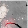
#17; -13 +0 = -13 points eliminated
Comments:
#17: The scuzzy washout of color takes away this crop's only real asset, which is the contrast of the dark night sky with the figure and the lights. If the swath of erased brush fell across those lights and supported them, or the figure for that matter, it would be a much more effective design choice. As it is, the brief respite from scuzz only highlights how detrimental it is to the icon.
#17- The texture is way too overpowering; it takes away the color of the original image and it's hard to see what the subject is. Also, the arc near the bottom of the icon seems really random; it's hard to tell what kind of effect you are trying to achieve.
#17 - the texture washes out the picture and doesn't make the icon look good at all
17 :: The icon is way to faded out. I can't tell what you were trying to achieve but the white texture barely faded out makes you lose focus of the subject.
17: The texture makes the image look completely washed out, and the darker area draws attention away from the real focus. The light texture also draws away from the focus because there are so many lights.
#17 - The picture is too covered by the top layer, not blended. The cropping is weird and the light texture? at the bottom doesn't look right.
#17 - The icon is very faded out, and white. The use of texture doesn't fit with the subject, and the crop isn't very unique.
17: texture used is not effective, it makes the icon far too dull and plain. Thre could have been much more color and a better crop.
17 - Texture used over the image kills it. It looks way too faded out. Duplicating the image layer and putting it on softlight or overlay might have made it look better but right now that texture is overpowering. The icon seems to be going in the right direction though; the light texture is nice.
17 - i love the crop but sadly the texture didn't exactly work out. ugh, it kills me because i'm sure it would have been lovely if the scratchy texture would have been screened or multiplied. :\
#17 - Way too much use of textures, and the execution was badly done. The border idea would be a good one, but just slapping a texture on the icon and setting to screen washes the guy out. There isn't even any text to add interest to the icon, or tie the effects together.
#17 > original texture-use, but the way it was used it covers up the image, also it gives the icon a grey-faded colouring because of the opacity; this icon could use more excitement and detail.
#17 - Whatever texture is being used over the original image is overpowering it to such a degree that the end result is hard to look at. Everything is so faded that there is no sense of what the icon is trying to convey, there is no focus. As a result the icon fades into the background and completely lacks any "look at me" or "wow" factor.
ohgreat_battle (Term 1, Battle 1)
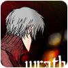
#01: -5 +0 = -5 eliminated
Comments:
1, The cut-off face, cut-off text and filler light texture make this icon seem really incomplete. The three elements just don't mesh well.
2, Rather dull, it would help if we could see the character's face or have some kind of angry emotion expressed in the icon to match the word. As it is it's hard to be sure who the character is supposed to be, and how the image even represents wrath at all. The light texture doesn't really do anything for the icon, either.
3, Crop is uninspired, and the color is rather flat. Interesting typography, with the letters cut off like that, but it really doesn't work well in this icon, especially because of the rounded corners... mostly because of the font choice. Try a bolder, rounder font that will mimic the roundness of the corners as well as look less strange cut off like that.
4, The darkness portrayed in this icon is good, however that makes the light texture used seem out of place. The placement of text could be better and more subtle instead of hanging on the edge of the icon and standing out a bit much from the subject.
5, The text is cut off so much, it makes it slightly hard to read. The placement of the text also leaves a huge amount of negative space, and the icon looks unbalanced.
dogsawards (Technical Critical Challenge 1-1)
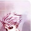
#01: -0 +2 = +2 best in round
Comments:
(+) Nice colors, especially given the technical restrictions. And it's a daring crop.
(+) I thought the crop was brave! Also, I love that it's slightly off-center. The coloring is also another strong point of the icon.
(-) There might be too much negative/blank space, but good job!
(-) I'm not a big fan of the rounded corner, it seems a little out of place...
dogsawards (Technical Critical Challenge 1-2)
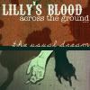
default win
ohgreat_battle (Term 1~Comeback Challenge)

#01: -2 +0 = -2 eliminated
Comments:
1, Overuse of gradients. There's also no depth to this image... try using shading.
2, the caption doesn't suit the image, the gradient and surrounding colors clash unattractively.
rockmusiclims (Round 2, Challenge 6~Comeback Challenge)
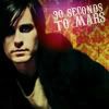
#04; +7 = 7 points re-entered
Comments:
#04
#04 - While it's kind of a generic (but nice!) crop and doesn't look like anything was really done to it aside from the crop, the text and the red circle, it's a nice looking icon.
#004 - lol, i think i just like this picture! i like the closeup of jared, he's so pretty, and that light thing.
#04 - the contrast of bright accents and the muted tones around jared and gorgeous; really makes this one stand out. it's bright without being tacky in that sense. the placement and sizing of the font are also excellent; the slant is complementary to the slope of his shoulders which makes it all harmonic and uh. yeah. :D it's a really nice icon.
#04 - Nice soft yet clear treatment of the photo. Good cropping. Nice colours.
#04
#04 - The crop, the simplicity of the text, the subtle softening and colours all make this icon look fantastic without going overboard.
rockmusiclims (Round 2, Challenge 7)
#02; -4 +3 = -1 points
Comments:
NEGATIVE;
#02 - image is a bit blurry; light textures are dull and wash the bottom of the icon out; text is nice, however it is really small and illegible.
#02 - The text is large enough that it seems out of place for being illegible. The blured hand and arm are creating visually confusing shapes that seem blocky instead of organic.
#02 - I is a very basic and mininmal icon. The light texture across the bottom doesn't seem to do much other than fill out the negative space, while the text is so small that it's hard to read.
#02 - The image is overly blurry, and through cropped well, the embellishments and the text all give a blurry+pixelated feel to the entire icon. The rounded corners don't work particularly well here, either.
POSITIVE;
#02 - Interesting use of colouring and text. Despite the image being blurred, the subject can still be seen and the soft but bright colours work well together.
#02 - Nice cropping, nice text adding and a unique border.
#02 - The original image was a bit blurred, but the color and the layout use that to make an effective icon. The text is a bit hard to read, though.
rockmusiclims (Round 2, Challenge 8)

#02; -5 +1 = -4 points eliminated
Comments:
Negative;
#02 - The image is oversharpened, greatly reducing contrast, and the icon as a whole could be brighter, as a lot of contrast is lost with the grayness.
#02 - The icon feels dark and washed out. There is nothing to make the icon stand out, no point your eye immediately goes to. The notebook texture looks nice, it should just be overall lighter.
#02 - The colouring on the icon is too dark. This icon could do with some more contrast, like changing the colour in the text. The man in this icon is oversharpened.
#02 - the colour scheme, of the icon is dull, dark and murky-looking; the notebook texture ( although nicely positioned ) doesn't work well with the darker tones of the icon [ particularly with sky parts ] , as you cannot see all the detailing of both the texture and the image itself. lightening up the tone in the sky area or altering the texture [adding contrast to enhance the detail], could be helpful in balancing out the icon's dark and light values ( i hope this is making sense lol ); typography is nice and creative in the sense that it runs off the icon (♥), however it is rather bland looking.
#02 - The poor image quality of the icon is deplorable, considering the high resolution images that were given. The pixelation and grainy quality of the image looks terrible. The image is also far too dark; brightening a little would have helped, as would have increasing the contrast.
Positive;
#02 - This is very simple and clean, but still very interesting with the cropping and layout. It also feels appropriate to the band. I almost chose another icon becaue I feel like this might be just a touch too dark, but otherwise I was impressed.
rockmusiclims (Round 3, Challenge 1)
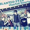
#04; -10 +0 = -10 points eliminated
Comments:
#04 - the coloring is very unflattering, it's too pinkish; the image is oversharpened; the set-up isn't the best.
#04 - The texture simply clashes with the image. The coloring of the image is not flattering. While the idea of slanting it is neat, it doesn't work too well in favor of this icon.
#04 - The angle is distracting and the texture doesn't look like it belongs.
#04 - The colouring gives it a washed out look and distorts the features of the people within the icon. The text looks a little odd and clumsy in relation to the rest.
#04 - Awkward crop and bad typography. The washed out coloring is actually nice, but it needs to be enhanced by a more contrasting border or background, not something similarly washed out. As it is, it stands out as oddly colored... and it doesn't looks purposely done.
#04 - Far too pale, with uncomplimentary & ugly textures. Having the text slanted is quirky, but messy and trying desperately to squeeze it in on the top of the icon looks cramped for space.
#04 - The coloring is too blue, and the font is wiggly which is confusing. The color is too bright, and over saturated.
#04 - bad use of exclusion layers and definitely does not work with the colors of the original image. With that, the icon is very washed out and not clear. It's too sharp and the colors don't match at all.
#04 - The colouring is too washed out; for such a vibrant original image, it seems a shame to colour it in this way. There is too much cyan, and the bottom portion of the icon seems unnecessary.
04 - The text is at a slightly different angle to the picture, and the texture at the bottom is distracting.
ff_lims (Round 15, Phase 1)
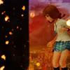
#09; -2, +0 = -2 points
Comments:
[-] For me it is a strange choice of the source image. Thick black line on the left side of the userpic could be easily used for the text, without it it looks empty.
ff_lims (Round 15, Phase 2)
#04; -7, +0 = -7 points eliminated
Comments:
[-] The texture is really overpowering over the rest of the cast, especially with the mini-light flares, and it works to wash them out better than emphasize anything. The image as a whole looks over-sharpened, including the texture and the text.
[-] The image is really blurry and I cannot read the text at all.
[-] This icon just feels a bit unpolished (oversharpened, dull) compared to the others.
[-] The cropping is great & the text placements pretty nice as well, it's just that the icon is a bit pixilated esp. around the characters.
[-] I like the idea behind the icon but the image is blurry and the FF12 cast wasn't very cleanly masked or cut out of their background. That font makes the caption hard to read too.
#17; -13 +0 = -13 points eliminated
Comments:
#17: The scuzzy washout of color takes away this crop's only real asset, which is the contrast of the dark night sky with the figure and the lights. If the swath of erased brush fell across those lights and supported them, or the figure for that matter, it would be a much more effective design choice. As it is, the brief respite from scuzz only highlights how detrimental it is to the icon.
#17- The texture is way too overpowering; it takes away the color of the original image and it's hard to see what the subject is. Also, the arc near the bottom of the icon seems really random; it's hard to tell what kind of effect you are trying to achieve.
#17 - the texture washes out the picture and doesn't make the icon look good at all
17 :: The icon is way to faded out. I can't tell what you were trying to achieve but the white texture barely faded out makes you lose focus of the subject.
17: The texture makes the image look completely washed out, and the darker area draws attention away from the real focus. The light texture also draws away from the focus because there are so many lights.
#17 - The picture is too covered by the top layer, not blended. The cropping is weird and the light texture? at the bottom doesn't look right.
#17 - The icon is very faded out, and white. The use of texture doesn't fit with the subject, and the crop isn't very unique.
17: texture used is not effective, it makes the icon far too dull and plain. Thre could have been much more color and a better crop.
17 - Texture used over the image kills it. It looks way too faded out. Duplicating the image layer and putting it on softlight or overlay might have made it look better but right now that texture is overpowering. The icon seems to be going in the right direction though; the light texture is nice.
17 - i love the crop but sadly the texture didn't exactly work out. ugh, it kills me because i'm sure it would have been lovely if the scratchy texture would have been screened or multiplied. :\
#17 - Way too much use of textures, and the execution was badly done. The border idea would be a good one, but just slapping a texture on the icon and setting to screen washes the guy out. There isn't even any text to add interest to the icon, or tie the effects together.
#17 > original texture-use, but the way it was used it covers up the image, also it gives the icon a grey-faded colouring because of the opacity; this icon could use more excitement and detail.
#17 - Whatever texture is being used over the original image is overpowering it to such a degree that the end result is hard to look at. Everything is so faded that there is no sense of what the icon is trying to convey, there is no focus. As a result the icon fades into the background and completely lacks any "look at me" or "wow" factor.
ohgreat_battle (Term 1, Battle 1)
#01: -5 +0 = -5 eliminated
Comments:
1, The cut-off face, cut-off text and filler light texture make this icon seem really incomplete. The three elements just don't mesh well.
2, Rather dull, it would help if we could see the character's face or have some kind of angry emotion expressed in the icon to match the word. As it is it's hard to be sure who the character is supposed to be, and how the image even represents wrath at all. The light texture doesn't really do anything for the icon, either.
3, Crop is uninspired, and the color is rather flat. Interesting typography, with the letters cut off like that, but it really doesn't work well in this icon, especially because of the rounded corners... mostly because of the font choice. Try a bolder, rounder font that will mimic the roundness of the corners as well as look less strange cut off like that.
4, The darkness portrayed in this icon is good, however that makes the light texture used seem out of place. The placement of text could be better and more subtle instead of hanging on the edge of the icon and standing out a bit much from the subject.
5, The text is cut off so much, it makes it slightly hard to read. The placement of the text also leaves a huge amount of negative space, and the icon looks unbalanced.
dogsawards (Technical Critical Challenge 1-1)
#01: -0 +2 = +2 best in round
Comments:
(+) Nice colors, especially given the technical restrictions. And it's a daring crop.
(+) I thought the crop was brave! Also, I love that it's slightly off-center. The coloring is also another strong point of the icon.
(-) There might be too much negative/blank space, but good job!
(-) I'm not a big fan of the rounded corner, it seems a little out of place...
dogsawards (Technical Critical Challenge 1-2)
default win
ohgreat_battle (Term 1~Comeback Challenge)
#01: -2 +0 = -2 eliminated
Comments:
1, Overuse of gradients. There's also no depth to this image... try using shading.
2, the caption doesn't suit the image, the gradient and surrounding colors clash unattractively.
rockmusiclims (Round 2, Challenge 6~Comeback Challenge)
#04; +7 = 7 points re-entered
Comments:
#04
#04 - While it's kind of a generic (but nice!) crop and doesn't look like anything was really done to it aside from the crop, the text and the red circle, it's a nice looking icon.
#004 - lol, i think i just like this picture! i like the closeup of jared, he's so pretty, and that light thing.
#04 - the contrast of bright accents and the muted tones around jared and gorgeous; really makes this one stand out. it's bright without being tacky in that sense. the placement and sizing of the font are also excellent; the slant is complementary to the slope of his shoulders which makes it all harmonic and uh. yeah. :D it's a really nice icon.
#04 - Nice soft yet clear treatment of the photo. Good cropping. Nice colours.
#04
#04 - The crop, the simplicity of the text, the subtle softening and colours all make this icon look fantastic without going overboard.
rockmusiclims (Round 2, Challenge 7)
#02; -4 +3 = -1 points
Comments:
NEGATIVE;
#02 - image is a bit blurry; light textures are dull and wash the bottom of the icon out; text is nice, however it is really small and illegible.
#02 - The text is large enough that it seems out of place for being illegible. The blured hand and arm are creating visually confusing shapes that seem blocky instead of organic.
#02 - I is a very basic and mininmal icon. The light texture across the bottom doesn't seem to do much other than fill out the negative space, while the text is so small that it's hard to read.
#02 - The image is overly blurry, and through cropped well, the embellishments and the text all give a blurry+pixelated feel to the entire icon. The rounded corners don't work particularly well here, either.
POSITIVE;
#02 - Interesting use of colouring and text. Despite the image being blurred, the subject can still be seen and the soft but bright colours work well together.
#02 - Nice cropping, nice text adding and a unique border.
#02 - The original image was a bit blurred, but the color and the layout use that to make an effective icon. The text is a bit hard to read, though.
rockmusiclims (Round 2, Challenge 8)
#02; -5 +1 = -4 points eliminated
Comments:
Negative;
#02 - The image is oversharpened, greatly reducing contrast, and the icon as a whole could be brighter, as a lot of contrast is lost with the grayness.
#02 - The icon feels dark and washed out. There is nothing to make the icon stand out, no point your eye immediately goes to. The notebook texture looks nice, it should just be overall lighter.
#02 - The colouring on the icon is too dark. This icon could do with some more contrast, like changing the colour in the text. The man in this icon is oversharpened.
#02 - the colour scheme, of the icon is dull, dark and murky-looking; the notebook texture ( although nicely positioned ) doesn't work well with the darker tones of the icon [ particularly with sky parts ] , as you cannot see all the detailing of both the texture and the image itself. lightening up the tone in the sky area or altering the texture [adding contrast to enhance the detail], could be helpful in balancing out the icon's dark and light values ( i hope this is making sense lol ); typography is nice and creative in the sense that it runs off the icon (♥), however it is rather bland looking.
#02 - The poor image quality of the icon is deplorable, considering the high resolution images that were given. The pixelation and grainy quality of the image looks terrible. The image is also far too dark; brightening a little would have helped, as would have increasing the contrast.
Positive;
#02 - This is very simple and clean, but still very interesting with the cropping and layout. It also feels appropriate to the band. I almost chose another icon becaue I feel like this might be just a touch too dark, but otherwise I was impressed.
rockmusiclims (Round 3, Challenge 1)
#04; -10 +0 = -10 points eliminated
Comments:
#04 - the coloring is very unflattering, it's too pinkish; the image is oversharpened; the set-up isn't the best.
#04 - The texture simply clashes with the image. The coloring of the image is not flattering. While the idea of slanting it is neat, it doesn't work too well in favor of this icon.
#04 - The angle is distracting and the texture doesn't look like it belongs.
#04 - The colouring gives it a washed out look and distorts the features of the people within the icon. The text looks a little odd and clumsy in relation to the rest.
#04 - Awkward crop and bad typography. The washed out coloring is actually nice, but it needs to be enhanced by a more contrasting border or background, not something similarly washed out. As it is, it stands out as oddly colored... and it doesn't looks purposely done.
#04 - Far too pale, with uncomplimentary & ugly textures. Having the text slanted is quirky, but messy and trying desperately to squeeze it in on the top of the icon looks cramped for space.
#04 - The coloring is too blue, and the font is wiggly which is confusing. The color is too bright, and over saturated.
#04 - bad use of exclusion layers and definitely does not work with the colors of the original image. With that, the icon is very washed out and not clear. It's too sharp and the colors don't match at all.
#04 - The colouring is too washed out; for such a vibrant original image, it seems a shame to colour it in this way. There is too much cyan, and the bottom portion of the icon seems unnecessary.
04 - The text is at a slightly different angle to the picture, and the texture at the bottom is distracting.
ff_lims (Round 15, Phase 1)
#09; -2, +0 = -2 points
Comments:
[-] For me it is a strange choice of the source image. Thick black line on the left side of the userpic could be easily used for the text, without it it looks empty.
ff_lims (Round 15, Phase 2)
#04; -7, +0 = -7 points eliminated
Comments:
[-] The texture is really overpowering over the rest of the cast, especially with the mini-light flares, and it works to wash them out better than emphasize anything. The image as a whole looks over-sharpened, including the texture and the text.
[-] The image is really blurry and I cannot read the text at all.
[-] This icon just feels a bit unpolished (oversharpened, dull) compared to the others.
[-] The cropping is great & the text placements pretty nice as well, it's just that the icon is a bit pixilated esp. around the characters.
[-] I like the idea behind the icon but the image is blurry and the FF12 cast wasn't very cleanly masked or cut out of their background. That font makes the caption hard to read too.