tutorial 002.
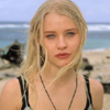
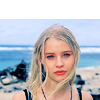
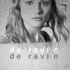
Subject- Emilie DeRavin
Difficulty- Medium
Program- Photoshop CS2
Translatable- N/A (selective coloring.)
Another of my favorite LOST gals.
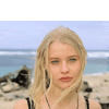
Going from...
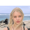
TO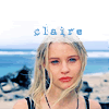
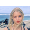
OR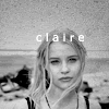
This tutorial will NOT work for every icon. It is meant to be used as a guide, and to help you come up with techniques of your own as a result of fiddling with colors and layers. Please do not replicate the example exactly for posting purposes, but feel free to practice with this base.
001.
Before you flatten your base, resize/crop and move it down until you have a blank space of canvas above it.
002.
Duplicate your base and set it to screen at 25%.
Sharpen if needed.
003.
Create a new layer and fill it with (#848CA7).
Set it to softlight at 100%.
004.
Create a new selective coloring layer.
Input the following.
Reds
-100
+30
+100
-40
Yellows
+100
+20
+25
0
Neutrals
+40
+15
-10
0
005.
Create another selective coloring layer.
Input the following.
Reds
-100
+100
+100
-50
Yellows
+100
+10
+50
0
Neutrals
+20
0
-20
0
006.
Duplicate the base and drag it to the top.
Set it to softlight at 100%.
Sharpen again if needed.
007.
Find a good texture that you want to use.
I chose one by
ewanism
Rotate it so that your blank canvas is covered by the white area of the texture.
Set it to screen.
This just gives it a little bit of a focal point instead of a dull white space.
I then used 1942 Report in 12pt near the edge of the texture.
Thats it for the first example.
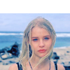
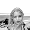
I am a huge obsessive fan of black and white icons.
So to transform our colorful Emilie icon into a pretty black and white icon, we do the following.
001.
Take the original base and desaturate it.
Adjust the brightness/contrast.
I used the settings around brightness +25, contrast +25.
002.
Choose a grunge-ish texture.
This one again by
ewanism is perfect.

Set it to multiply at 100%.
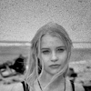
003.
It lost a little of the contrast after adding the texture, so create a new brightness/contrast adjustment layer.
Play with the settings until it looks nice and clear.
Finally, add text if desired.
I used verdana 10pt.
Thats it!
I hope you find it useful.
If its particulary helpful to anyone, I'd love to see what you come up with.
Others made using this technique.
(Minor tweaking involved).
001

002
Difficulty- Medium
Program- Photoshop CS2
Translatable- N/A (selective coloring.)
Another of my favorite LOST gals.
Going from...
TO
OR
This tutorial will NOT work for every icon. It is meant to be used as a guide, and to help you come up with techniques of your own as a result of fiddling with colors and layers. Please do not replicate the example exactly for posting purposes, but feel free to practice with this base.
001.
Before you flatten your base, resize/crop and move it down until you have a blank space of canvas above it.
002.
Duplicate your base and set it to screen at 25%.
Sharpen if needed.
003.
Create a new layer and fill it with (#848CA7).
Set it to softlight at 100%.
004.
Create a new selective coloring layer.
Input the following.
Reds
-100
+30
+100
-40
Yellows
+100
+20
+25
0
Neutrals
+40
+15
-10
0
005.
Create another selective coloring layer.
Input the following.
Reds
-100
+100
+100
-50
Yellows
+100
+10
+50
0
Neutrals
+20
0
-20
0
006.
Duplicate the base and drag it to the top.
Set it to softlight at 100%.
Sharpen again if needed.
007.
Find a good texture that you want to use.
I chose one by
ewanism
Rotate it so that your blank canvas is covered by the white area of the texture.
Set it to screen.
This just gives it a little bit of a focal point instead of a dull white space.
I then used 1942 Report in 12pt near the edge of the texture.
Thats it for the first example.
I am a huge obsessive fan of black and white icons.
So to transform our colorful Emilie icon into a pretty black and white icon, we do the following.
001.
Take the original base and desaturate it.
Adjust the brightness/contrast.
I used the settings around brightness +25, contrast +25.
002.
Choose a grunge-ish texture.
This one again by
ewanism is perfect.
Set it to multiply at 100%.
003.
It lost a little of the contrast after adding the texture, so create a new brightness/contrast adjustment layer.
Play with the settings until it looks nice and clear.
Finally, add text if desired.
I used verdana 10pt.
Thats it!
I hope you find it useful.
If its particulary helpful to anyone, I'd love to see what you come up with.
Others made using this technique.
(Minor tweaking involved).
001
002