Tutorial 001.
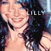
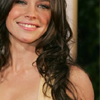
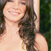
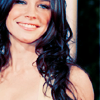
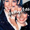
Subject- Evangeline Lilly
Difficulty- Medium
Program- Photoshop CS2
Translatable- No
this to

Short rant before I go on.
Evi so should have won her Golden Globe, she really did deserve it.
Honestly, I'm boycotting all award shows this year. The ones who deserve it never get it.
Now....
This tutorial will NOT work for every icon. It is meant to be used as a guide, and to help you come up with techniques of your own as a result of fiddling with colors and layers. Please do not replicate the example exactly for posting purposes, but feel free to practice with this base.
001.
Duplicate your base and set it to screen at 100%.
(will vary depending on your base.)
Sharpen if needed, although for this base it was already pretty clear.
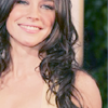
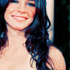
002.
Create a new layer and fill it with a light orangy color (#ECB988).
Set it to multiply at 40%.
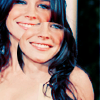
003.
Create another new layer and fill it with a purpleish color (#9E9CC0).
Set it to softlight at 100%.
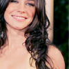
004.
Create another new layer and fill it with a bright blue color (#517FAA).
Set it to softlight at 60%.
005.
Create yet another new layer and fill it with a greyish color (#DEDEDE).
Set it to colorburn at 100%.
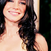
006.
Go to select >> select all.
Go to edit >> copy merged >> paste.
(Although similar, it is not the same effect as just duplicating the base.)
You should now have a new layer on top.
Set it to softlight at 100%.
007.
Create a new selective coloring layer.
Input the following.
Reds
-100
0
+100
0
Yellows
+100
0
-100
0
Neutrals
+70
0
-30
0
008.
Create another selective coloring layer.
Input the following.
Reds
-100
+100
+100
-40
Yellows
+100
0
+20
0
Neutrals
+35
0
-5
0
009.
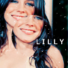
You can now flatten your image, or if you think you want to go back and tweak layers, do so before flattening.
Using the elliptical marquee tool, select a part of your base that you'd like to use.
I selected an area of Evi's face, obviously.
Go to layer >> new >> layer via copy.
Resize your selection slightly and position it wherever desired.
010.
The final touches are very simple.
I used this texture by the brilliant
loveicons

(cropped and rotated.)
Set it to screen at 100%.
As for text, I used Verdana 10pt by the duplicate layer to acheive the final icon.
If its helpful, I'd love to see what you come up with.
Other Icons Made with this Technique
(Minor tweaking involved)
Feel free to snag them now, just remember to credit
crackchemistry
001
002