Feeling productive
And here's yet another tut...I'm feeling quite proud. At least doing this helped me ignore things and put my bitchyness aside. >D
Go from this:
to this: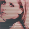
Programs used: PS7. Should be easy to translate into other programs.
We have our base:
First off, make sure that your icon has a border. I have a 1px border in #888888. Since it's black and white, I want to add some sephia toning. Make sure the Image Mode is in RGB.
Create a new layer - flood fill with with #816859. Blend mode - Soft Light, 100%. Duplicate the Soft Light layer, reduce the opacity to 20%. Flatten image.
You should get this:
Because of the Soft Light layers, the blacks are predominant. So, go to Image > Adjustments > Variations. Move the little arrow towards fine like so:
. Lighten twice.
Very subtle difference:
Now, duplicate the base. Blend mode set to Screen, 100%. Go to Filter > Blur > Gaussian Blur, with the radius at 3.
Should look like this:
Duplicate the base layer again, drag it on top of the Screen layer, set to Soft Light, 100%.
And you get this:
Create a new layer - flood fill with #704D59. Blend mode - Color, 100%.
Looks like:
Another new layer - flood fill with #9A7762. Set the blend mode to Multiply, 20%.
And you get:
Another new layer - use this horizontal line brush:
made by...I actually have no clue who it's by...I have all my resources on my user info, sometimes they mesh - in #9A7762. Reduce opacity to 20%.
We get this:
Yet another new layer, moving on to gradients. Take this gradient:
made by yours truly, blend mode to Overlay, 50%.
Result being:
Last new layer before brushes and text - another gradient, this one made by crumblingwalls:
. Change the blend mode to Difference, 40%.
Image before text and brushes:
On a new layer, we use this brush by teh_indy, I believe:
in #FFFFFF. Blend mode to Soft Light, 100%, duplicate once.

And now the text. On a new text layer, I used "she's got wicked style", again taking a tibit from a song...which was "What You Waiting For?" by Gwen Stefani. Good song, btw. So, the font we'll be using is Georgia, 5pt, anti alias at sharp, color is #FFFFFF. One space between each letter, two between spaces. Like the brush layer, blend mode on Soft Light, 100%. Duplicate once.
And this is the final icon:
I hope this was helpful...and I hope it wasn't too confusing. I tried to explain everything. :)
Go from this:
to this:
Programs used: PS7. Should be easy to translate into other programs.
We have our base:
First off, make sure that your icon has a border. I have a 1px border in #888888. Since it's black and white, I want to add some sephia toning. Make sure the Image Mode is in RGB.
Create a new layer - flood fill with with #816859. Blend mode - Soft Light, 100%. Duplicate the Soft Light layer, reduce the opacity to 20%. Flatten image.
You should get this:
Because of the Soft Light layers, the blacks are predominant. So, go to Image > Adjustments > Variations. Move the little arrow towards fine like so:
. Lighten twice.
Very subtle difference:
Now, duplicate the base. Blend mode set to Screen, 100%. Go to Filter > Blur > Gaussian Blur, with the radius at 3.
Should look like this:
Duplicate the base layer again, drag it on top of the Screen layer, set to Soft Light, 100%.
And you get this:
Create a new layer - flood fill with #704D59. Blend mode - Color, 100%.
Looks like:
Another new layer - flood fill with #9A7762. Set the blend mode to Multiply, 20%.
And you get:
Another new layer - use this horizontal line brush:
made by...I actually have no clue who it's by...I have all my resources on my user info, sometimes they mesh - in #9A7762. Reduce opacity to 20%.
We get this:
Yet another new layer, moving on to gradients. Take this gradient:
made by yours truly, blend mode to Overlay, 50%.
Result being:
Last new layer before brushes and text - another gradient, this one made by crumblingwalls:
. Change the blend mode to Difference, 40%.
Image before text and brushes:
On a new layer, we use this brush by teh_indy, I believe:
in #FFFFFF. Blend mode to Soft Light, 100%, duplicate once.
And now the text. On a new text layer, I used "she's got wicked style", again taking a tibit from a song...which was "What You Waiting For?" by Gwen Stefani. Good song, btw. So, the font we'll be using is Georgia, 5pt, anti alias at sharp, color is #FFFFFF. One space between each letter, two between spaces. Like the brush layer, blend mode on Soft Light, 100%. Duplicate once.
And this is the final icon:
I hope this was helpful...and I hope it wasn't too confusing. I tried to explain everything. :)