Weekend Update: By the Cover
It has been forever since I've posted one of these, and it's largely due in part to being CRAZY BUSY. This means that I'm lucky to get one review out per week, let alone multiple reviews and a book-related discussion on the weekend. I'm trying to get back in the saddle, as there ARE things I'd like to discuss, but I would ask for your patience regarding this column. It may not be weekly, but I'll get it up when I can. :)
I can't remember how or when this caught my eye, but when it did, I couldn't get over at the similarities between the two books. Mind you, I've read the one and not the other, so any similarities I see are superficial and may not exist in the actual text.
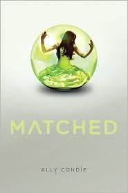
The first cover I'm sure many of my readers recognize. It's Ally Condie's Matched, which has not only been reviewed here at Calico Reaction, but I've also spent some kind comparing and contrasting it to Lois Lowry's The Giver (for those of you dying to read that post, you may find it here).
However, for the sake of my post, I'd like to share with you Matched's summary:
Cassia has always trusted the Society to make the right choices for her: what to read, what to watch, what to believe. So when Xander's face appears on-screen at her Matching ceremony, Cassia knows with complete certainty that he is her ideal mate . . . until she sees Ky Markham's face flash for an instant before the screen fades to black.
The Society tells her it's a glitch, a rare malfunction, and that she should focus on the happy life she's destined to lead with Xander. But Cassia can't stop thinking about Ky, and as they slowly fall in love, Cassia begins to doubt the Society's infallibility and is faced with an impossible choice: between Xander and Ky, between the only life she's known and a path that no one else has dared to follow.
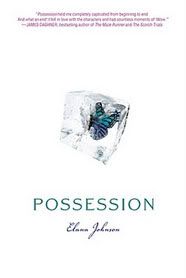
Now, I don't know where I was when I first saw the cover art for Elana Johnson's YA debut Possession, but two things struck me. The first was how similar the summary sounded to Matched, which you can read here:
Vi knows the Rule: Girls don’t walk with boys, and they never even think about kissing them. But no one makes Vi want to break the Rules more than Zenn ... and since the Thinkers have chosen him as Vi’s future match, how much trouble can one kiss cause? The Thinkers may have brainwashed the rest of the population, but Vi is determined to think for herself.
But the Thinkers are unusually persuasive, and they’re set on convincing Vi to become one of them . . . starting by brainwashing Zenn. Vi can’t leave Zenn in the Thinkers’ hands, but she’s wary of joining the rebellion, especially since that means teaming up with Jag. Jag is egotistical, charismatic, and dangerous: everything Zenn’s not. Vi can’t quite trust Jag and can’t quite resist him, but she also can’t give up on Zenn.
This is a game of control or be controlled. And Vi has no choice but to play.
And then I looked at the cover art. My first thought was, "Oh, that's pretty," and my second thought was, "Wait... butterfly trapped in ice ... girl trapped in bubble ... both set against light, neutral backdrops ..." And then I shuddered.
I want to make a few things clear here:
1) I do not think that Johnson took Condie's book and made it her own. Furthermore, unless these two authors are friends and/or part of the same critique circle, I do not think Johnson was even inspired by Condie's idea. Frankly, given that these books are being published six months apart, roughly, there just isn't enough time. No, in terms of similarities of plot, this is just a common idea. Not new, not groundbreaking, just frankly common. So if you happen to be writing a YA book about a dystopian society where people are matched for marriage instead of being allowed to fall in love, you better get a new idea, because this one's been done to death, and the two books mentioned in this post aren't the first or the last books to chase that rabbit.
2) These books have two different publishers. However, without going into a bookstore and looking at the books themselves, I can't tell if you whether or not the books have the same artist or designer.
But here's what I DO think, and we've seen this over and over when the Twilight books became popular: publishers start mimicking the covers to attract Twilight readers to THEIR books. You know the look: black background, pretty white font, some kind of symbolic image in red and/or white and/or both on the cover. Well, I think that same trend is happening here: someone in charge of Possession probably adored the cover/campaign for Matched and probably made a point of emulating it. Imitating it. That's my guess. Maybe the six months between books still isn't enough time to even think that one publisher is copying another in terms of design and look, but it's worth considering. Whether or not Possession itself has a completely different story than Matched is beside the point too, because the wording of the blurbs are intended to remind me of the book that came before.
And it worked. Only it had the opposite effect than the one the publisher had in mind: despite the oh-so-pretty cover, I have no interest in Johnson's book, simply because it looks too similar to something I've already read. Oh, I might change my mind, if I read reviews that praise it as something so fantastic and ground-breaking that I can't resist it. Or unless I get a free copy, and in that case, I'll be happy to compare and contrast.
But the point of this post isn't to shill for free books. I get that publishers are going to latch on to a trend and beat it into the ground. That being said, I think there's a danger is making something look TOO much like something else. I think covers, especially, are something to be careful with: you don't want to give the readers the idea they've already read your book when they haven't.
How do you feel about the similarities? Do you feel it even matters? Is this too close to comfort, or just another case of similarities, like the trendy urban fantasy covers with butt-shots, leather, and tattoos? Should publishers be a little more careful to make their covers unique, without alienating their target audience? Or am I making a mountain out of a molehill? I'll be the first to admit I might, but given that BOTH the cover art concepts AND the summaries are similar makes me wonder. :)
I can't remember how or when this caught my eye, but when it did, I couldn't get over at the similarities between the two books. Mind you, I've read the one and not the other, so any similarities I see are superficial and may not exist in the actual text.
The first cover I'm sure many of my readers recognize. It's Ally Condie's Matched, which has not only been reviewed here at Calico Reaction, but I've also spent some kind comparing and contrasting it to Lois Lowry's The Giver (for those of you dying to read that post, you may find it here).
However, for the sake of my post, I'd like to share with you Matched's summary:
Cassia has always trusted the Society to make the right choices for her: what to read, what to watch, what to believe. So when Xander's face appears on-screen at her Matching ceremony, Cassia knows with complete certainty that he is her ideal mate . . . until she sees Ky Markham's face flash for an instant before the screen fades to black.
The Society tells her it's a glitch, a rare malfunction, and that she should focus on the happy life she's destined to lead with Xander. But Cassia can't stop thinking about Ky, and as they slowly fall in love, Cassia begins to doubt the Society's infallibility and is faced with an impossible choice: between Xander and Ky, between the only life she's known and a path that no one else has dared to follow.
Now, I don't know where I was when I first saw the cover art for Elana Johnson's YA debut Possession, but two things struck me. The first was how similar the summary sounded to Matched, which you can read here:
Vi knows the Rule: Girls don’t walk with boys, and they never even think about kissing them. But no one makes Vi want to break the Rules more than Zenn ... and since the Thinkers have chosen him as Vi’s future match, how much trouble can one kiss cause? The Thinkers may have brainwashed the rest of the population, but Vi is determined to think for herself.
But the Thinkers are unusually persuasive, and they’re set on convincing Vi to become one of them . . . starting by brainwashing Zenn. Vi can’t leave Zenn in the Thinkers’ hands, but she’s wary of joining the rebellion, especially since that means teaming up with Jag. Jag is egotistical, charismatic, and dangerous: everything Zenn’s not. Vi can’t quite trust Jag and can’t quite resist him, but she also can’t give up on Zenn.
This is a game of control or be controlled. And Vi has no choice but to play.
And then I looked at the cover art. My first thought was, "Oh, that's pretty," and my second thought was, "Wait... butterfly trapped in ice ... girl trapped in bubble ... both set against light, neutral backdrops ..." And then I shuddered.
I want to make a few things clear here:
1) I do not think that Johnson took Condie's book and made it her own. Furthermore, unless these two authors are friends and/or part of the same critique circle, I do not think Johnson was even inspired by Condie's idea. Frankly, given that these books are being published six months apart, roughly, there just isn't enough time. No, in terms of similarities of plot, this is just a common idea. Not new, not groundbreaking, just frankly common. So if you happen to be writing a YA book about a dystopian society where people are matched for marriage instead of being allowed to fall in love, you better get a new idea, because this one's been done to death, and the two books mentioned in this post aren't the first or the last books to chase that rabbit.
2) These books have two different publishers. However, without going into a bookstore and looking at the books themselves, I can't tell if you whether or not the books have the same artist or designer.
But here's what I DO think, and we've seen this over and over when the Twilight books became popular: publishers start mimicking the covers to attract Twilight readers to THEIR books. You know the look: black background, pretty white font, some kind of symbolic image in red and/or white and/or both on the cover. Well, I think that same trend is happening here: someone in charge of Possession probably adored the cover/campaign for Matched and probably made a point of emulating it. Imitating it. That's my guess. Maybe the six months between books still isn't enough time to even think that one publisher is copying another in terms of design and look, but it's worth considering. Whether or not Possession itself has a completely different story than Matched is beside the point too, because the wording of the blurbs are intended to remind me of the book that came before.
And it worked. Only it had the opposite effect than the one the publisher had in mind: despite the oh-so-pretty cover, I have no interest in Johnson's book, simply because it looks too similar to something I've already read. Oh, I might change my mind, if I read reviews that praise it as something so fantastic and ground-breaking that I can't resist it. Or unless I get a free copy, and in that case, I'll be happy to compare and contrast.
But the point of this post isn't to shill for free books. I get that publishers are going to latch on to a trend and beat it into the ground. That being said, I think there's a danger is making something look TOO much like something else. I think covers, especially, are something to be careful with: you don't want to give the readers the idea they've already read your book when they haven't.
How do you feel about the similarities? Do you feel it even matters? Is this too close to comfort, or just another case of similarities, like the trendy urban fantasy covers with butt-shots, leather, and tattoos? Should publishers be a little more careful to make their covers unique, without alienating their target audience? Or am I making a mountain out of a molehill? I'll be the first to admit I might, but given that BOTH the cover art concepts AND the summaries are similar makes me wonder. :)