Revenge of the tutorial
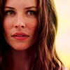
Making this icon (joyyyy)
Written for weatheredlaw and zooclawakp (finally)
Since the last tutorial addressed textures/masking (even if the icon created is crap imho, principles are still there :p), I figured I'd do coloring for this one. I use to be quite fond of just messing with random settings, saving psds and making batches that way (and honestly, you don't learn much that way), however I've moved on to a different, more individual approach to cap coloring/iconing and actually tried to, you know, understand how to do it.
As a basic iconing rule, picking high resolution images/caps is obviously ideal. Why? Because we'll get less pixelization/image distortion when we resize our images and maintain more detail than if we were working with a small image. In this particular image, I'll be using curves, color balance, selective coloring, exposure and saturation adjustment layers.
So let's start with our cap. These are reduced in size for tutorial purposes, but you can download the original of this cap here. See? Nice and big.
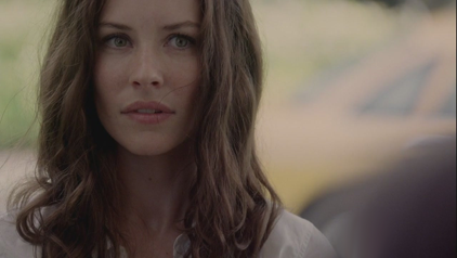
So what I really wanted to do in this image is brighten/add contrast and (try) and bring out the yellows because I really loved the way the light was reflecting off her hair. There are several ways to go about lightening an image. Instead of using screen layers I like using curves because I find I can get more precise control that way. Now, if your graphic program doesn't have curves, duplicating your layer and screening it and adding a soft light layer works too.
Go to the bottom of your layers palette, hit new adjustment layer and go to curves. I sort of regret using this for a tutorial because my curves are all over the place but I'll give it a go anyway. Now, to be honest, I'm not 100% super awesome at using curves, a lot of it is experimentation. Do I really understand it? Not really. I could probably stand to research more a bit, but understanding the funky graph in the middle (the histogram) helps slightly. I don't have complete knowledge to lecture about it in this tutorial, but a good one already written can be found here.
First, let's start working with the shadows. Click on the little dot on the graph in the bottom left corner. Input these numbers.
output: 0
input: 6
Now click on the other dot at the top right of the graph and input these numbers.
output: 255
input: 192
Next we're going to add more points on this line to increase contrast and create-gasp-a curve. I've probably added one too many but I have a tendency to do that. Just click anywhere on the line and put in these numbers.
1st point
output: 12
input: 26
2nd point
output: 61
input: 63
3rd point
output: 93
input: 79
Your graph should look similar to this
Now here's what our cap looks like after all that bizness.
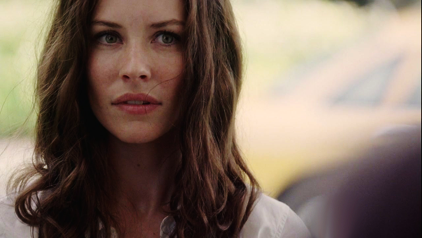
As you can see, we've got a fair amount of contrast from the curves and the yellows are starting to pop out too. It still looks a bit washed out though. So next we're going to add in a bit of saturation.
Create a saturation layer, give it a setting of about +12, we should get something that looks like this.
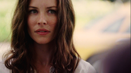
Now the color is really starting to come out. I still thought the image could use just a smidge more lightening and I wanted to do a bit of color adjustment to even out the skin tone. So I'm going to use selective coloring. You could use color balance, just like you can contrast/brighten with levels too but like curves, I find selective coloring to give more precise tuning. A better explanation of selective coloring can be found here. So create a selective coloring adjustment layer and put in these numbers.
Reds
magenta: +14
yellow: +4
black: -12
As you can see, we're increasing the magentas in the red tones and balancing a bit with some yellow. We're also adding white which really helps to even/lighten skin tones.
Yellows
cyan: +10
magenta: -8
yellow: +17
black: -13
Neutrals
cyan: -7
magenta: -6
yellow: -6
black: -9
And our image should look like this
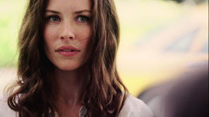
The skin tone is softened a bit and we've got a nice hue to her face. Now we add a bit of saturation back in again. Instead of adding it to the entire image, we're only going to add saturation to the reds and yellows. Create a hue/saturation layer with these numbers.
Reds: +10
Yellows: +14
Your image should look like this
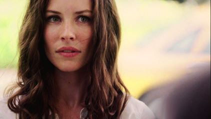
Subtle, but it's there. Next I wanted to focus on those yellows. I wanted to really just do a quick and dirty increase to make them stand out so I created another curves layer. At the top instead of working in RGB we're going to work in the green channel. Once more I've got my points all over the place but here are the input numbers.
We're not adjusting either the top or bottom points, just adding to the line. Once more just click a spot on it and input these numbers.
First point
output: 40
input: 32
Second point
output: 120
input: 98
Third point
output: 165
input: 140
Fourth point
output: 238
input: 233
Curves should look like this
Now yes the entire image has a green/yellow tint to it, however, layer masks can also be used for color adjustment layers! Make sure black is selected on your color palette and click on the white square next to the adjustment layer image on the layers panel. Fill this in with black and it should remove the tint. Now take your brush, select white as your color and paint in this box. I painted around the highlights in her hair as well as her eyes. Essentially we're 'masking' so only the yellow tint will show through on these areas. What you should have should look similar to this.
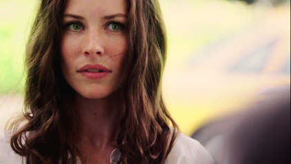
Next is a levels layer to brighten up the reds. In the red channel your numbers should be 10, 1.14 and 255 to give us this
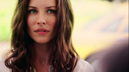
Again, subtle but it's there. You could just stop right here and call it a day but I opted to add in a bit more red to the shadows so I added a fill layer with this color da2799, set it to Pin light at 7%
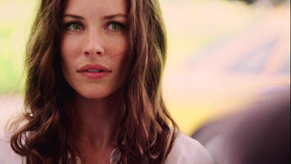
Now we're going to add an exposure layer to do a quick and dirty contrast/lighten.
Exposure: +0.12
Offset: -0.0020
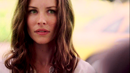
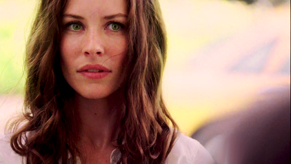
Add in one more saturation level of +8 and we get our final image. Subtle is the running theme, or it's just being anal maybe.
Here are the two icons I made from this cap. Generally I will create a separate 100x100 document, copy the cap and paste, then resize (hold down the shift key to keep your image proportions so you don't get elongated, funky faces and whatnot). Next I sharpen using photoshop's High Pass filter, adjusting input and opacity as needed.

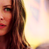
And fin. If you have further questions I'll do my best to answer them but I hope at least some of this was helpful :)