Look ma, a tutorial
Requested by weatheredlaw
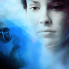
Disclaimer: There's like a million and one ways to make icons. I think I suck at explaining and there's really better tutorials at icon_tutorial but this is my process. And by process I mean screwing around with fills, adjustment layers and textures. 90% of my icons are accidents, trufax. Anyhoot, on we go. I use Photoshop CS3, so things should be relatively the same in earlier versions.
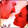
We'll be going to this

from
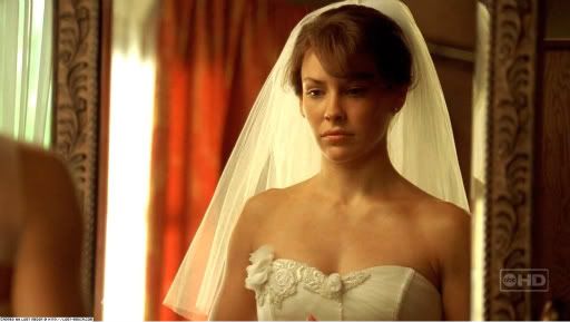
bad wig
and
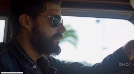
bad beard (of awesome)♥
I hardly ever have a solid idea on what I want to do with an icon. I normally just scour my caps folder (these two are from lost-media)for something that jumps out at me, or I'll browse through my saved icons folder for inspiration.
So grab your cap. Start out with a 100x100 pixel document. Copy the first cap, past it into your created document. Resize. Some people like to do all their coloring on the cap before hand, sharpen and all that jazz before pasting/resizing. Again, there's a billion and one ways to do one thing, use whatever method works best for you.
I forgot to sharpen in this icon (bad me) but normally I use the high pass filter instead of the sharpen filter just because it's more subtle and less likely to make shit all pixely and gross. How do you use high pass you ask? Simple. Just duplicate your image, go to your filter menu, hit high pass, mess around until you get something nice then set your image to either overlay or soft light and adjust opacity as needed.
Okay, so we've got our cap resized. Position it someplace nice.
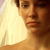
Now we could just convert this to B&W from here, but adding some color adjustments beforehand makes it a tad nicer looking, so we're going to do that first.
Coloring
I'm not going in to detail on how I color because I don't know what the hell I'm doing well enough to tell anyone. I screw with sliders and adjustment layers. Really, that's it. Coloring is something I continuously struggle with.
Instead I'm going to offer up some examples and link to tutorials because I'm lazy.
=Great tutorials=
Tutorial 1-x_insurrextion
Tutorial 2-prettybutt
Tutorial 3- intodelirium


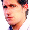
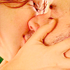
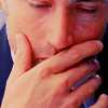
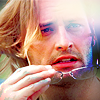
sadie_carter two_five lulinha_k
prettybutt aliasledger losty_ville
Not only do a lot of these icons have amazing, crops that grab your attention or are interesting (look at the emotion the middle icon in the last row conveys) but they all have bright, vibrant colors. I love, love, love bright coloring. Neither of these is particularly strong in one hue (like an orange or blue) but the colors still pop while not being overly distracting.
Look at this. Ew. The pink is overpowering and kind of nasty. It's bright, but not in a good way.
Now back to our icon. Before I slap in any adjustment layers I like to brighten the image by duplicating it and setting the layer to screen. Depending on how dark your cap is, you can do this several times, adjusting the opacity. As a finishing touch I like to duplicate one last time and set the last one on soft light, adjusting opacity as needed. Usually after this step is when I add in the high pass filter.
In this case I duplicated the layer once, screen at 64%
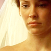
We're adding a curves level first. I'm not giving out numbers here, just showing what the image looks like along this process.
OVERLAY around 73%
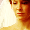
BRIGHTNESS/CONTRAST normal 100%
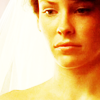
SELECTIVE COLORING color 100%

Now to get the B&W affect, we'll add a threshold adjustment layer. Now make sure this layer sits above your image layers and comes before your color adjustment layers. Move the slider so there's a fair amount of contrast and set your adjustment layer to color.
Now we have this
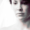
If we had gone strictly to the B&W without the color adjustment, the result would have been this:
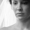
See, we got a bit of contrast with the color adjustments as opposed to leaving them out.
Now the first part is finished. On to Dr. Beardface
Copy your cap, slap it into your open document, resize and place. In this instance I rotated the image.
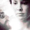
Now how do you get rid of the rest of the cap around Jack to get Kate to show? You could erase. But that's bad. Never erase when you can use layer masks. Just don't. Iz bad.

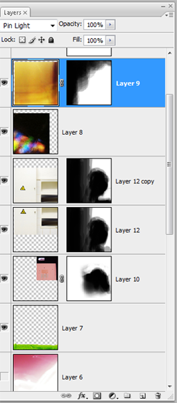
Click on the icon to the left of your adjustment layers one that says 'add vector mask'. A white box should pop up right beside the thumbnail of your current layer. Black will erase parts of your image, white does the opposite. This is the meat and potatoes of how I add textures as well.
Now go to your paintbrush tool, pick something nice. I use one of my illustration brushes downloaded from Deviantart.

I have the opacity and flow down pretty low, usually around 20-40% depending so it's easier to blend. I also use a graphics tablet which helps a lot in controlling the pressure of the brush. Now paint as needed and voila.
Screen it once to get

TEXTURE
Now we add the texture. It's at this point I pretty much rummage through my sea of (very unorganized) textures folder until I find something that slaps me in the face. In this case, I came across this nice blue one from dabbischdes
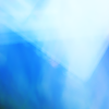
Copy, pasta. Make sure this layer sits at the top of your layers pallet above the color corrections, set it to multiply. Although you could drag it around to see how they change the colors of the texture, I've done this sometimes too. Don't be afraid to play with the color of your texture or even rotate it/crop it. Experiment!

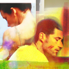
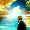
Here are some examples of past icons and the various textures I've used on them. A lot of these textures are also set to different blend modes, so again, experiment.

=More Great Tutorials=
Tutorial 1-iconseeyou
Tutorial 2-xeyra
Tutorial 3-shoqolad
I hope this was at least somewhat helpful. I'll be updating this post as time rolls on, possibly with more in depth explanation as soon as I get decent at this shit.

Disclaimer: There's like a million and one ways to make icons. I think I suck at explaining and there's really better tutorials at icon_tutorial but this is my process. And by process I mean screwing around with fills, adjustment layers and textures. 90% of my icons are accidents, trufax. Anyhoot, on we go. I use Photoshop CS3, so things should be relatively the same in earlier versions.
We'll be going to this

from

bad wig
and

bad beard (of awesome)♥
I hardly ever have a solid idea on what I want to do with an icon. I normally just scour my caps folder (these two are from lost-media)for something that jumps out at me, or I'll browse through my saved icons folder for inspiration.
So grab your cap. Start out with a 100x100 pixel document. Copy the first cap, past it into your created document. Resize. Some people like to do all their coloring on the cap before hand, sharpen and all that jazz before pasting/resizing. Again, there's a billion and one ways to do one thing, use whatever method works best for you.
I forgot to sharpen in this icon (bad me) but normally I use the high pass filter instead of the sharpen filter just because it's more subtle and less likely to make shit all pixely and gross. How do you use high pass you ask? Simple. Just duplicate your image, go to your filter menu, hit high pass, mess around until you get something nice then set your image to either overlay or soft light and adjust opacity as needed.
Okay, so we've got our cap resized. Position it someplace nice.

Now we could just convert this to B&W from here, but adding some color adjustments beforehand makes it a tad nicer looking, so we're going to do that first.
Coloring
I'm not going in to detail on how I color because I don't know what the hell I'm doing well enough to tell anyone. I screw with sliders and adjustment layers. Really, that's it. Coloring is something I continuously struggle with.
Instead I'm going to offer up some examples and link to tutorials because I'm lazy.
=Great tutorials=
Tutorial 1-x_insurrextion
Tutorial 2-prettybutt
Tutorial 3- intodelirium


sadie_carter two_five lulinha_k
prettybutt aliasledger losty_ville
Not only do a lot of these icons have amazing, crops that grab your attention or are interesting (look at the emotion the middle icon in the last row conveys) but they all have bright, vibrant colors. I love, love, love bright coloring. Neither of these is particularly strong in one hue (like an orange or blue) but the colors still pop while not being overly distracting.

Look at this. Ew. The pink is overpowering and kind of nasty. It's bright, but not in a good way.
Now back to our icon. Before I slap in any adjustment layers I like to brighten the image by duplicating it and setting the layer to screen. Depending on how dark your cap is, you can do this several times, adjusting the opacity. As a finishing touch I like to duplicate one last time and set the last one on soft light, adjusting opacity as needed. Usually after this step is when I add in the high pass filter.
In this case I duplicated the layer once, screen at 64%

We're adding a curves level first. I'm not giving out numbers here, just showing what the image looks like along this process.
OVERLAY around 73%

BRIGHTNESS/CONTRAST normal 100%

SELECTIVE COLORING color 100%

Now to get the B&W affect, we'll add a threshold adjustment layer. Now make sure this layer sits above your image layers and comes before your color adjustment layers. Move the slider so there's a fair amount of contrast and set your adjustment layer to color.
Now we have this

If we had gone strictly to the B&W without the color adjustment, the result would have been this:

See, we got a bit of contrast with the color adjustments as opposed to leaving them out.
Now the first part is finished. On to Dr. Beardface
Copy your cap, slap it into your open document, resize and place. In this instance I rotated the image.

Now how do you get rid of the rest of the cap around Jack to get Kate to show? You could erase. But that's bad. Never erase when you can use layer masks. Just don't. Iz bad.

Click on the icon to the left of your adjustment layers one that says 'add vector mask'. A white box should pop up right beside the thumbnail of your current layer. Black will erase parts of your image, white does the opposite. This is the meat and potatoes of how I add textures as well.
Now go to your paintbrush tool, pick something nice. I use one of my illustration brushes downloaded from Deviantart.

I have the opacity and flow down pretty low, usually around 20-40% depending so it's easier to blend. I also use a graphics tablet which helps a lot in controlling the pressure of the brush. Now paint as needed and voila.
Screen it once to get

TEXTURE
Now we add the texture. It's at this point I pretty much rummage through my sea of (very unorganized) textures folder until I find something that slaps me in the face. In this case, I came across this nice blue one from dabbischdes

Copy, pasta. Make sure this layer sits at the top of your layers pallet above the color corrections, set it to multiply. Although you could drag it around to see how they change the colors of the texture, I've done this sometimes too. Don't be afraid to play with the color of your texture or even rotate it/crop it. Experiment!

Here are some examples of past icons and the various textures I've used on them. A lot of these textures are also set to different blend modes, so again, experiment.


=More Great Tutorials=
Tutorial 1-iconseeyou
Tutorial 2-xeyra
Tutorial 3-shoqolad
I hope this was at least somewhat helpful. I'll be updating this post as time rolls on, possibly with more in depth explanation as soon as I get decent at this shit.