now I've got this all out of my system I'm off for a week-long field trip with my photography class!
1. I finally getting around to watching ANTM cycle 2 last week. I'm so sad I didn't do it earlier because it's brilliant. I'm in love April and her journey to become romantic because she reminds me a lot of myself (because I'm a sexy Asian model obviously ;)) in the sense that I'm very analytical about art. Also I find her determination is admirable.
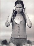
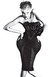
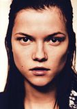
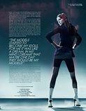
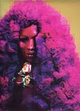
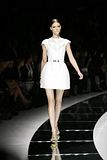
2. Answer the questions with pictures of the person/character you were tagged with. Leave a comment and I will give you a name.
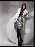
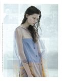
flatlined associated me with Jessica Stam (which btw was the incorrect answer of who you associate me with. Natalia Vodianova is correct, for future reference ;))
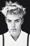
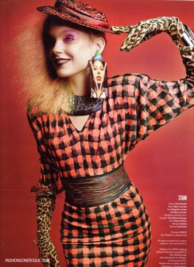
01. Choose a picture of the funniest face on your person.
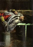
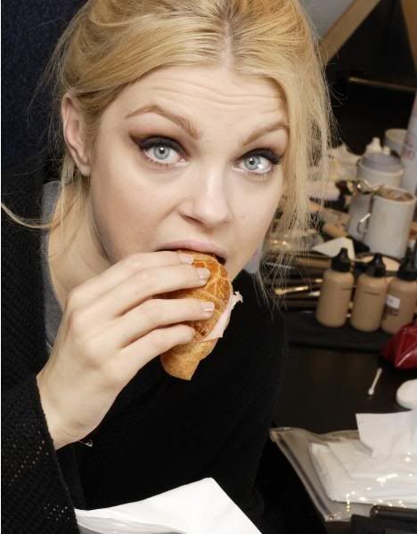
02. Choose a picture of your person eating.
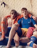
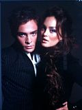
03. Choose a picture of your person with a member of the opposite sex.

04. Choose a picture where you would have sex with this person
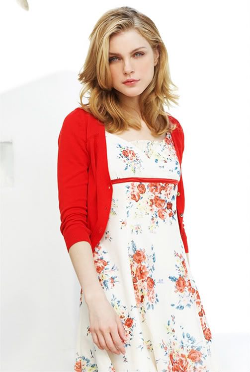
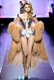
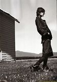
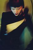
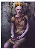
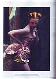
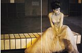
05. Choose a picture of your favorite outfit on this person. -
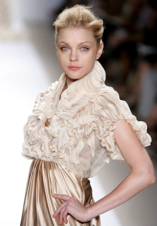
06. Choose a picture of your person smiling.
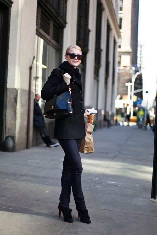
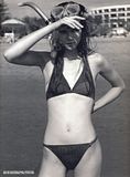
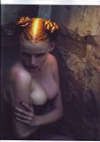
07. Choose a picture of your person half-naked.
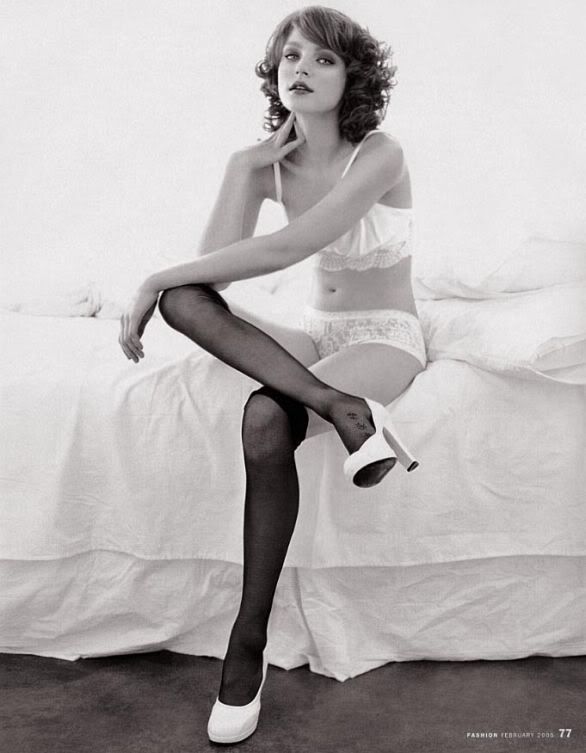
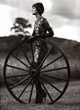
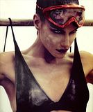
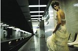
08. Choose a picture of your person doing an outdoor activity.
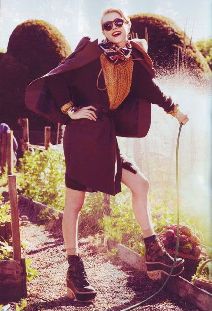
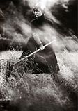
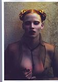
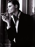
09. Choose your favorite picture of this person.
3.
a)
The colouring I use often reduces image quality and usually it's not visible in icons because I blend and then resize from 300x300 when I'm done, but it's visible here :/ Overall I like it but it's too splotchy to look at for an extended period of time.
b)


The fifth version is my favourite, it's my current wallpaper. The idea behind it was to show the many faces of Natalia because she's looks so different in each photo, but all of her faces are beyond perfect. I can't say I'm completely happy with the way I've composed and blended the pictures, the right hand side is getting a bit crowded and messy and the top half is empty. I really love the vertical lines because I feel like they add a distinct mood to the piece (and distract from some of the low quality pictures :P).
4.
a)
this is the ideal Burn Notice icon for me. The cap is full of so much drama and intent, and my colouring is spot on. It's saturated, but not too saturated, it's got a variety of colours but it all meshes and I'm not worried at all that at some places skin is green, in fact I kind of love that.
b)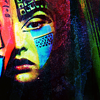
um, it's alright. I'm not in love with it, but it could definitely be worse. I like the reds on the left.
c)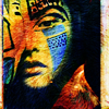
I really like the textures in this, but I think the colours need a bit more tweaking. The textures are too extreme (they're blowing out the beauty of the original photo), there's too much yellow in the reds and the blues are too saturated and bright. However I feel I've made a good base for a great icon. I'm crazy about the offset rectangular shape.
d)
about 5 seconds worth of effort was put into this and it shows :P
e)
eek, brb going blind. I like the bars at the top and bottom, though.
f)
I'm currently in love with this. It's so sexy and unexpected. The way I've used the textures is so far out of my regular routine, I love the V shape I made, it feels like an old painting. Do you remember the ones that were just silhouettes?
And a special shout out to lice because without his photo of a river (now running through Cesar's chest) this wouldn't be possible :P
5.


2. Answer the questions with pictures of the person/character you were tagged with. Leave a comment and I will give you a name.
flatlined associated me with Jessica Stam (which btw was the incorrect answer of who you associate me with. Natalia Vodianova is correct, for future reference ;))
01. Choose a picture of the funniest face on your person.

02. Choose a picture of your person eating.

03. Choose a picture of your person with a member of the opposite sex.

04. Choose a picture where you would have sex with this person

05. Choose a picture of your favorite outfit on this person. -

06. Choose a picture of your person smiling.

07. Choose a picture of your person half-naked.

08. Choose a picture of your person doing an outdoor activity.

09. Choose your favorite picture of this person.

3.
a)

The colouring I use often reduces image quality and usually it's not visible in icons because I blend and then resize from 300x300 when I'm done, but it's visible here :/ Overall I like it but it's too splotchy to look at for an extended period of time.
b)


The fifth version is my favourite, it's my current wallpaper. The idea behind it was to show the many faces of Natalia because she's looks so different in each photo, but all of her faces are beyond perfect. I can't say I'm completely happy with the way I've composed and blended the pictures, the right hand side is getting a bit crowded and messy and the top half is empty. I really love the vertical lines because I feel like they add a distinct mood to the piece (and distract from some of the low quality pictures :P).
4.
a)

this is the ideal Burn Notice icon for me. The cap is full of so much drama and intent, and my colouring is spot on. It's saturated, but not too saturated, it's got a variety of colours but it all meshes and I'm not worried at all that at some places skin is green, in fact I kind of love that.
b)

um, it's alright. I'm not in love with it, but it could definitely be worse. I like the reds on the left.
c)

I really like the textures in this, but I think the colours need a bit more tweaking. The textures are too extreme (they're blowing out the beauty of the original photo), there's too much yellow in the reds and the blues are too saturated and bright. However I feel I've made a good base for a great icon. I'm crazy about the offset rectangular shape.
d)

about 5 seconds worth of effort was put into this and it shows :P
e)

eek, brb going blind. I like the bars at the top and bottom, though.
f)

I'm currently in love with this. It's so sexy and unexpected. The way I've used the textures is so far out of my regular routine, I love the V shape I made, it feels like an old painting. Do you remember the ones that were just silhouettes?
And a special shout out to lice because without his photo of a river (now running through Cesar's chest) this wouldn't be possible :P
5.
