(no subject)
1. Torchwood week: well, that happened.
2.
a)
I tried to make this as if it was a screencap of a 3rd world, instead of an animated still. That's why it looks so freaky.
b)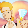
My Attempt To Make A Monkey Island Icon - take #2: fail. Too bright bright, not enough contrast.
c)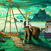
My Attempt To Make A Monkey Island Icon - take #3: fail. Too dark, not invested enough in the original image.
d)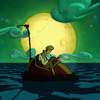
My Attempt To Make A Monkey Island Icon - take #4: win! It's simple, but not too boring and the original cap is beautiful.
e)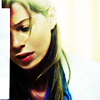
I don't know why I don't like this. It's got strong contrast which usually attracts me, it's got a nice cap, the colours are good. Maybe it just seems a bit too formulaic :/
f)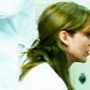
I like that it's an obscure cap, I like that her hair is green, I was trying to take my advice from the previous post, but again it's all just too formulaic for me. It lacks that little extra kick of passion :/
g)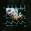
I was trying to juxtapose the blips on the heartmonitor with a very... uh... "intimate" moment and capture the two most prominent elements of Grey's Anatomy (sex and surgery). I think I just tried to squeeze too many pictures and elements in too small of a space
h)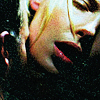
I dropped the overly dramatic subplot and just tried to make grain look sexy. It's not particularly grainy, but it is particularly sexy. I like that the texture use, the colouring and the fact that the cyan highlights are scaring me off like they usually do.
i)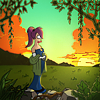
I'm completely crazy about this. It took me three days to make (for theskilltester) and I drew it entirely from scratch, isn't that awesome! I mean... well, not entirely. I pretty much just traced Futurama caps using the pen tool to get an outline and then coloured that in, which sounds like something a toddler would do, tracing and colouring-in, but it took AGES and therefore gives me a reason to boast :P
It saddens me that nobody really likes it until they find out how much effort I put into it :(
j)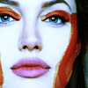
It's kind of freaky and I haven't decided if I love or hate the freakyness :P
3.

My Thread
I came up with the idea for it, designed the header and then got bashed because somebody didn't like my concrit. Interesting meme :P
4. I've done a little more investigating and come up with a few more icon tips:
- If you're aiming for a bold high-contrast look make sure that the process of saturation doesn't distort the depth of the image. Sometimes the colours will group together on approximately the same tone and that makes the colours look "uncontrolled" ;)
this and this are the two best examples of that I could find. The saturation is through the roof but because the depth of the image remains in tact, it looks professional.
- Another common thread I noticed amongst high-saturation images was that often they'll have really strong warm colours juxtaposed with really strong cold colours. See here the colours are completely blown out, but it's still kind of awesome because of the way the colour temperatures are interacting. The same applies to this
- Use differently coloured light splodges (other than the usual obvious light tan/orange/yellow/white). Experiment with pink and green and cyan. All of the best people do it; tihana, schmiss. Learn from the best.
- I just thought I'd explain the reasoning behind my tip last post about following a theskilltester challenge whenever you're going to make something. Using it as a guideline will mean that you will have something to strive towards technically. You may have a concept figured out *cough g cough* but having something specific and technical to aim for adds a very comforting structure around making graphics. It gives you something to fight for and against.
5. Okay, I just have to say I am not proud of the majority of these, but it seems like the teachers aren't desperate to see us do something adventurous these days, they just to be shown that we know the basics. I've taken pictures I am proud of recently, but just to keep things in order in my life I'm going to keep them saved up until I've finished with the course or until I submit them for an assignment.


2.
a)

I tried to make this as if it was a screencap of a 3rd world, instead of an animated still. That's why it looks so freaky.
b)

My Attempt To Make A Monkey Island Icon - take #2: fail. Too bright bright, not enough contrast.
c)

My Attempt To Make A Monkey Island Icon - take #3: fail. Too dark, not invested enough in the original image.
d)

My Attempt To Make A Monkey Island Icon - take #4: win! It's simple, but not too boring and the original cap is beautiful.
e)

I don't know why I don't like this. It's got strong contrast which usually attracts me, it's got a nice cap, the colours are good. Maybe it just seems a bit too formulaic :/
f)

I like that it's an obscure cap, I like that her hair is green, I was trying to take my advice from the previous post, but again it's all just too formulaic for me. It lacks that little extra kick of passion :/
g)

I was trying to juxtapose the blips on the heartmonitor with a very... uh... "intimate" moment and capture the two most prominent elements of Grey's Anatomy (sex and surgery). I think I just tried to squeeze too many pictures and elements in too small of a space
h)

I dropped the overly dramatic subplot and just tried to make grain look sexy. It's not particularly grainy, but it is particularly sexy. I like that the texture use, the colouring and the fact that the cyan highlights are scaring me off like they usually do.
i)

I'm completely crazy about this. It took me three days to make (for theskilltester) and I drew it entirely from scratch, isn't that awesome! I mean... well, not entirely. I pretty much just traced Futurama caps using the pen tool to get an outline and then coloured that in, which sounds like something a toddler would do, tracing and colouring-in, but it took AGES and therefore gives me a reason to boast :P
It saddens me that nobody really likes it until they find out how much effort I put into it :(
j)

It's kind of freaky and I haven't decided if I love or hate the freakyness :P
3.

My Thread
I came up with the idea for it, designed the header and then got bashed because somebody didn't like my concrit. Interesting meme :P
4. I've done a little more investigating and come up with a few more icon tips:
- If you're aiming for a bold high-contrast look make sure that the process of saturation doesn't distort the depth of the image. Sometimes the colours will group together on approximately the same tone and that makes the colours look "uncontrolled" ;)
this and this are the two best examples of that I could find. The saturation is through the roof but because the depth of the image remains in tact, it looks professional.
- Another common thread I noticed amongst high-saturation images was that often they'll have really strong warm colours juxtaposed with really strong cold colours. See here the colours are completely blown out, but it's still kind of awesome because of the way the colour temperatures are interacting. The same applies to this
- Use differently coloured light splodges (other than the usual obvious light tan/orange/yellow/white). Experiment with pink and green and cyan. All of the best people do it; tihana, schmiss. Learn from the best.
- I just thought I'd explain the reasoning behind my tip last post about following a theskilltester challenge whenever you're going to make something. Using it as a guideline will mean that you will have something to strive towards technically. You may have a concept figured out *cough g cough* but having something specific and technical to aim for adds a very comforting structure around making graphics. It gives you something to fight for and against.
5. Okay, I just have to say I am not proud of the majority of these, but it seems like the teachers aren't desperate to see us do something adventurous these days, they just to be shown that we know the basics. I've taken pictures I am proud of recently, but just to keep things in order in my life I'm going to keep them saved up until I've finished with the course or until I submit them for an assignment.


