(no subject)

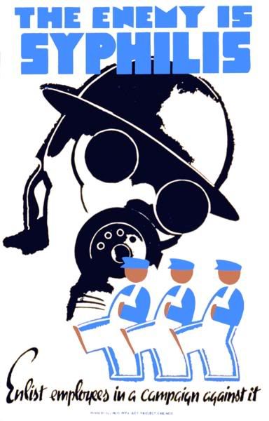
There is something so stylish and glamorous about 1930's and 1940's posters that even something like syphilis ends up with and aura of, well, style.

A personal favourite this, with the employers doing a sweet little dance to scare of the syphilis monster. Not surprisingly it is a public health poster, and originated from the WPA Art Project for use in Chicago between 1936 and 1940.

Above is the result of Cleveland Division of Health trying to promote milk. Made by WPA Federal Art Project in Ohio in 1940.

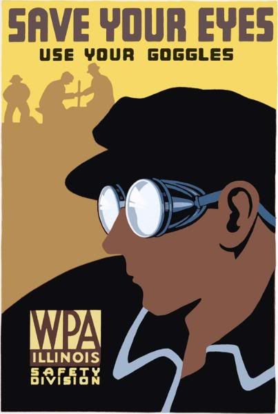
This WPA Federal Art Project poster for the Illinois Safety Division promotes safety and proper eye protection, and was created in either 1936 or 1937. I love the use of colours in this one, and how the colours are repeated in the logo to the left.

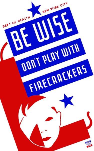
This was created in either 1936 or 1937 by the New York City Works Progress Administration Federal Art Project by artist Vera Bock, for the City Department of Health. My problem is that it is so stylish that I actually want to use firecrackers.
All from the site Vintagraph