Tutorials #010 to #013
A little warning : it's not because the settings works well with this icon that it will with yours.You can use the icon as long as you credit; If you snag the textures, don't forget to credit their creators!
If you got questions, don't hesitate!! I know everything is not explained but I like when people just see by themselves what are the effects of the different tools. But don't hesitate to ask questions if you want to know something. Don't ask for a .PSD, you won't have one.
All done on Photoshop CS4.
Tutorial #010
From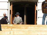
to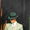
Textures:
by nodazzle

by fullonswayzeed

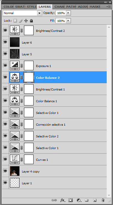
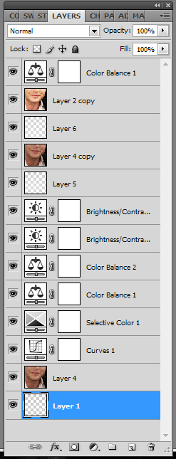
The entire layer list is here
1. Resize your picture (mine is 367px width and 275px height)and place it in your base (size 100*100px)til you don't see the camera and the people in front of Bale. (it's a behind the scene picture, which is why you saw them)
2. Do a curve Layer, opacity to 27%
Output: 150
Input: 89
3. Do a selective color layer that you put to soft light, 100% of opacity.
Reds: -23%, 0%, +8%, -11%
Whites: 0%, 0%, +15%, +11%
Neutrals: 0%, +3%, 0%, -4%
4. Do another selective color layer. Opacity at 29%
Reds: -20%, 0%, +2%, -1%
Yellows: 0%, 0%, -3%, +3%
Whites: +11%, 0%, +9%, +24%
Neutrals: 0%, +2%, +8%, 0%
Blakcs: 0%, 0%, 0%, +100%
5. Do again a selective color layer (sorry I know it's boring)Opacity to 41%
Reds: -68%, +26%, +76%, -12%
Yellows: +100%, +17%, -51%, -20%
Whites: +100%, 0%, -23%, -10%
Neutrals: +9%, -10%, -6%, +6%
6. Guess what? Create a selective color layer (it's the last one I swear)
Whites: -70%, 0%, +6%, 0%
7. Create a color balance layer, opacity to 25%
Shadows: -11, 0, +13
Midtones: +22, -6, -19
Highlights: -1, 0, -22
8. Create a brightness/contrast layer
Brightness: +9
Contrast: -39
9. Create a new color balance layer
Midtones: -71, -8, -27
10. Create an Exposure layer (in new adjustment layer)
Gamma: 0,58
11. Use this texture made by fullonswayzeed. Set it to screen, opacity at 20%.
12. Use this texture made by nodazzle. Set it to screen.
13. And now, the final touch. Create a brightness/contrast layer.
Brightness: +19
Contrast: -38
And you're done!
Tutorial #011
From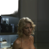
to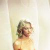
Textures used:
by lemonpunch
by ohfreckle
The entire layer list is here
1. Duplicate your base and set it to screen, opacity at 38%
2. Do a curve layer.
Input: 89
Output: 150
3. Do a selective color layer and set it to soft light.
Reds: -23%, 0%, +8%, -11%
Whites: 0%, 0%, +15%, +11%
Neutrals: 0%, +3%, 0%, - 4%
4. Do another selective color layer
Reds: -68%, +26%, +76%, -12%
Yellows: +100%, +17%, -51%, -20%
Whites: +100%, 0%, -23%, -10%
Neutrals: +9%, -10%, -6%, +6%
5. Another selective color layer
Whites: -70%, 0%, +6%, 0%
6. Do a color balance layer:
Shadows: -11, 0, +13
Midtones: +22, -6, -19
Highlights: -1, 0, -22
7. Do a brightness/contrast layer
Brightness: +9
Contrast: -39
8. Do another brightness/contrast layer.
Brightness: + 65
Contrast: +11
9. Use this texture by lemonpunch. Erase all the part that are above Caprica Six. To do that easily, set the texture to overlay for example or in a way you can see Caprica. Then increase the view of the icon to 400% and use an eraser size 3. When you have finished to erase all the part above Caprica, set the texture to normal.
10. Use this texture by ohfreckle. Set it to soft light, opacity at 19%.
11. Use again this texture by lemonpunch (not the one you have erased, a non altered one). Set it to screen, opacity at 24%
12. Create a new layer. With a white brush size 4, paint a kind of frame around Caprica and do a line from the top of her head following her face and then go to the border of the icon. Then, use the gaussian blur a bit. You'll have something that will look like this (but you have a transparent background, not a black one)
13. Do a color balance layer
Midtones: +5, -12, -13
14. Do a brightness/contrast layer.
Brightness: 4
Contrast: 46
And you're done!!
Tutorial #012
From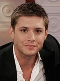
to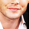
The entire layer list is here
1. Resize and crop the picture using the image size tool and positioning your picture on a 100px*100px base. We will call Rox.
2. Do a curve layer and set the opacity to 32%
Output : 150
Input : 89
3. Do a selective color layer
Reds: -23%, 0%, +8%, -11%
Whites: 0%, 0%, +15%, +11%
Neutrals: 0%, +3%, 0%, -4%
4. Do a color balance layer
Shadows: -11, 0, +13
Midtones: +22, -6, -19
Highlights: -1, 0, -22
5. Do another color balance layer
Midtones: -30, 0, +7
6. Do a brightness/contrast layer
Brightness: 9
Contrast: -39
7. Do another brightness/contrast layer
Brightness: 19
Contrast: -29
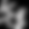
8. Creat a new layer. Using a brush, size 5 in white, paint a line in the middle of his throat, follow the shape of his face. Then use the gaussian blur to obtain a layer like this (though yours has a transparent background)
9. Duplicate your base (layer 4 in the layer list). Put it at the top of the layers and set it to soft light.
10. Create a new 100px*100px base (not a new layer, a new base). We will call it Rouky.
11. Merge all the layers of Rox and past the result in Rouky.
12. Sharpen Rouky a bit (go to edt -> fade sharpen to modify the sharpeness). It will look like this
(more or less)
13. Go back to Rox. Duplicate the layer that you created with the brush and the gaussian blur. Put the copy at the top of the layer list.
14. Take Rouky and put it at the top of Rox's layers. Set Rouky to soft light.
15. Do a color balance layer
Highlights: 0, 0, +15
16. Merge all Rox's layers and you're done!
Tutorial #013
From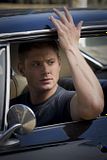
to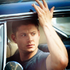
The entire layer list is here
1. First of all, resize your pic (go to Image -> image size) to the size you like the most.
2. Do a curve layer ans set the opacity to 32%
Output : 150
Input : 89
3. Do a selective color layer
Reds : -68%, +26%, +76%, -12%
Yellows : +100%, +17%, -51%, -20%
Whites : +100%, 0%, -23%, -10%
Neutrals : +9%, -10%, -6%, +6%
4. Do another selective color layer
Whites : -70%, 0%, +6%, 0%
5. Do a color balance layer
Shadows : -11, 0, +13
Midtones : +22, -6, -19
Highlights : -1, 0, -22
6. Do a brightness/contrast layer
Brightness : 21
Contrast : -39
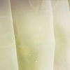
7. Now we'll give a little more light. Open a new layer, with a white brush, paint a bit everywhere which means around Dean's arm, the dark part of his face til the top of the icon. Then, use the gaussian blur to blur the light a bit. My layer looks like this (yours got a transparent background, not a black one) Then set the opacity to 80%. (if you want to know more about this technique, check danceof_flame, all_at_once did tutorials about it (it's where Ive learnt it)
8. Do a color balance layer
Midtones : +26, -5, -9
9. Duplicate your base and set it to soft light.
10. Duplicate your base and set it to soft light, opacity 25%
You're done!!!
If you got questions, don't hesitate!! I know everything is not explained but I like when people just see by themselves what are the effects of the different tools. But don't hesitate to ask questions if you want to know something. Don't ask for a .PSD, you won't have one.
All done on Photoshop CS4.
Tutorial #010
From

to
Textures:
by nodazzle
by fullonswayzeed
The entire layer list is here
1. Resize your picture (mine is 367px width and 275px height)and place it in your base (size 100*100px)til you don't see the camera and the people in front of Bale. (it's a behind the scene picture, which is why you saw them)
2. Do a curve Layer, opacity to 27%
Output: 150
Input: 89
3. Do a selective color layer that you put to soft light, 100% of opacity.
Reds: -23%, 0%, +8%, -11%
Whites: 0%, 0%, +15%, +11%
Neutrals: 0%, +3%, 0%, -4%
4. Do another selective color layer. Opacity at 29%
Reds: -20%, 0%, +2%, -1%
Yellows: 0%, 0%, -3%, +3%
Whites: +11%, 0%, +9%, +24%
Neutrals: 0%, +2%, +8%, 0%
Blakcs: 0%, 0%, 0%, +100%
5. Do again a selective color layer (sorry I know it's boring)Opacity to 41%
Reds: -68%, +26%, +76%, -12%
Yellows: +100%, +17%, -51%, -20%
Whites: +100%, 0%, -23%, -10%
Neutrals: +9%, -10%, -6%, +6%
6. Guess what? Create a selective color layer (it's the last one I swear)
Whites: -70%, 0%, +6%, 0%
7. Create a color balance layer, opacity to 25%
Shadows: -11, 0, +13
Midtones: +22, -6, -19
Highlights: -1, 0, -22
8. Create a brightness/contrast layer
Brightness: +9
Contrast: -39
9. Create a new color balance layer
Midtones: -71, -8, -27
10. Create an Exposure layer (in new adjustment layer)
Gamma: 0,58
11. Use this texture made by fullonswayzeed. Set it to screen, opacity at 20%.
12. Use this texture made by nodazzle. Set it to screen.
13. And now, the final touch. Create a brightness/contrast layer.
Brightness: +19
Contrast: -38
And you're done!
Tutorial #011
From
to
Textures used:
by lemonpunch
by ohfreckle
The entire layer list is here
1. Duplicate your base and set it to screen, opacity at 38%
2. Do a curve layer.
Input: 89
Output: 150
3. Do a selective color layer and set it to soft light.
Reds: -23%, 0%, +8%, -11%
Whites: 0%, 0%, +15%, +11%
Neutrals: 0%, +3%, 0%, - 4%
4. Do another selective color layer
Reds: -68%, +26%, +76%, -12%
Yellows: +100%, +17%, -51%, -20%
Whites: +100%, 0%, -23%, -10%
Neutrals: +9%, -10%, -6%, +6%
5. Another selective color layer
Whites: -70%, 0%, +6%, 0%
6. Do a color balance layer:
Shadows: -11, 0, +13
Midtones: +22, -6, -19
Highlights: -1, 0, -22
7. Do a brightness/contrast layer
Brightness: +9
Contrast: -39
8. Do another brightness/contrast layer.
Brightness: + 65
Contrast: +11
9. Use this texture by lemonpunch. Erase all the part that are above Caprica Six. To do that easily, set the texture to overlay for example or in a way you can see Caprica. Then increase the view of the icon to 400% and use an eraser size 3. When you have finished to erase all the part above Caprica, set the texture to normal.
10. Use this texture by ohfreckle. Set it to soft light, opacity at 19%.
11. Use again this texture by lemonpunch (not the one you have erased, a non altered one). Set it to screen, opacity at 24%
12. Create a new layer. With a white brush size 4, paint a kind of frame around Caprica and do a line from the top of her head following her face and then go to the border of the icon. Then, use the gaussian blur a bit. You'll have something that will look like this (but you have a transparent background, not a black one)
13. Do a color balance layer
Midtones: +5, -12, -13
14. Do a brightness/contrast layer.
Brightness: 4
Contrast: 46
And you're done!!
Tutorial #012
From

to

The entire layer list is here
1. Resize and crop the picture using the image size tool and positioning your picture on a 100px*100px base. We will call Rox.
2. Do a curve layer and set the opacity to 32%
Output : 150
Input : 89
3. Do a selective color layer
Reds: -23%, 0%, +8%, -11%
Whites: 0%, 0%, +15%, +11%
Neutrals: 0%, +3%, 0%, -4%
4. Do a color balance layer
Shadows: -11, 0, +13
Midtones: +22, -6, -19
Highlights: -1, 0, -22
5. Do another color balance layer
Midtones: -30, 0, +7
6. Do a brightness/contrast layer
Brightness: 9
Contrast: -39
7. Do another brightness/contrast layer
Brightness: 19
Contrast: -29
8. Creat a new layer. Using a brush, size 5 in white, paint a line in the middle of his throat, follow the shape of his face. Then use the gaussian blur to obtain a layer like this (though yours has a transparent background)
9. Duplicate your base (layer 4 in the layer list). Put it at the top of the layers and set it to soft light.
10. Create a new 100px*100px base (not a new layer, a new base). We will call it Rouky.
11. Merge all the layers of Rox and past the result in Rouky.
12. Sharpen Rouky a bit (go to edt -> fade sharpen to modify the sharpeness). It will look like this
(more or less)
13. Go back to Rox. Duplicate the layer that you created with the brush and the gaussian blur. Put the copy at the top of the layer list.
14. Take Rouky and put it at the top of Rox's layers. Set Rouky to soft light.
15. Do a color balance layer
Highlights: 0, 0, +15
16. Merge all Rox's layers and you're done!
Tutorial #013
From

to

The entire layer list is here
1. First of all, resize your pic (go to Image -> image size) to the size you like the most.
2. Do a curve layer ans set the opacity to 32%
Output : 150
Input : 89
3. Do a selective color layer
Reds : -68%, +26%, +76%, -12%
Yellows : +100%, +17%, -51%, -20%
Whites : +100%, 0%, -23%, -10%
Neutrals : +9%, -10%, -6%, +6%
4. Do another selective color layer
Whites : -70%, 0%, +6%, 0%
5. Do a color balance layer
Shadows : -11, 0, +13
Midtones : +22, -6, -19
Highlights : -1, 0, -22
6. Do a brightness/contrast layer
Brightness : 21
Contrast : -39
7. Now we'll give a little more light. Open a new layer, with a white brush, paint a bit everywhere which means around Dean's arm, the dark part of his face til the top of the icon. Then, use the gaussian blur to blur the light a bit. My layer looks like this (yours got a transparent background, not a black one) Then set the opacity to 80%. (if you want to know more about this technique, check danceof_flame, all_at_once did tutorials about it (it's where Ive learnt it)
8. Do a color balance layer
Midtones : +26, -5, -9
9. Duplicate your base and set it to soft light.
10. Duplicate your base and set it to soft light, opacity 25%
You're done!!!