Tutorials #006 to #009
Done on Photoshop CS3.
A little warning : it's not because the settings works well with this icon that it will with yours. You can use the icon as long as you credit; If you snag the textures, don't forget to credit their creators!
If you got questions, don't hesitate!! I know everything is not explained but I like when people just see by themselves what are the effects of the different tools. But don't hesitate to ask questions if you want to know something. Don't ask for a .PSD, you won't have it.
Tutorial #006
From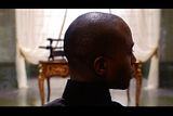
to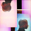
or/and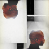
The tutorial will be in 2 parts. First, the coloring. After, the composition
Layer list : Part 1 (coloring) Part 2 (composition)
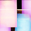
Textures :
by ohfreckle
Part 1 : Coloring
1. Reduce the pic so that the end of the character will be the size you want.
2. With the smudge tool, erase the desk you can see in the background. Use the white part of the pic and extend it around the end to the top of the icon. Then do the same with the green of the wall. Your background must be with a green part, a white one and then a green one again.
It will look like this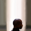
3. Duplicate your rand new icon and set it to screen, 45% of opacity
4. Do a curve layer.
Input : 89
Output : 150
5. Do a selective color layer
Reds : -68%, +26%, +76%, -12%
Yellows : +100%, +17%, -51%, -20%
Whites : +100%, 0%, -23%, -10%
Neutrals : +9%, -10%, -6%, +6%
6. Do another selective color layer
Whites : -70%, 0%, +6%, 0
7. Do a color balance layer
Midtones : +22, -6, -19
Shadows : -11, 0, +13
Highlights : -1, 0, -22
8.Do a brightness/contrast layer
Brightness : 9
Contrast : -39
9. Create a new layer. With a white paint brush (size 3-5) paint a bit from the right bottom corner of the icon til the other side of the icon, following the collar. Then use the gaussian blur to blur the "painting" and put more light to the icon. Your layer will look like this (apart that yours is transparent, not black). Ive learnt this technique thanks to all_at_once.
10. Duplice the light layer you have just done and set the opacity to 84%
11. Duplicate your base and put it at the top of the layer list. Set it to soft light
Now the icon looks like this :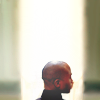
.
Part 2 : Composition
12. Open a new base and paste the icon you've just finished. Rotate it at 180°. Then move it to the left so that you won't see the green part anymore.
13. Duplicate again the icon youve made during the 1st part. Move it til you don't see the right green part. Then, erase the left gree part.
14. Use this texture by ohfreckle and set it to multiply
Now you got this :
If you want this:
just desaturate the texture!
You're done!
Tutorial #007
From
to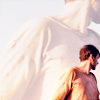
Layer list.
1. Reduce your image so that Justin (the guy on the icon) will look tiny. Then, use the smudge tool so that you'll have blue everywhere and reconstruct slowly his head (use a size like 3 and increase the pic to 400%, it's the best way to do a good job). You may use the blur brush after that to be sure the sky will look like a sky and not like something painted.
2. Do this curve layer. You'll see that it will enlighten the picture. Set the opacity around 30% (it depends on the pic)
3. Do a selective color layer to increase the contrasts and color them a bit.
In Reds : -20%, 0%, +2, -1%
In Yellows : 0%, 0%, -3%, +3%
In Whites : +11%, 0%, +9%, +24%
In Neutrals : 0%, +2%,+8%, 0%
In Blacks : 0%, 0%, 0%, 100%
4. Do another selective color layer to color the white parts.
In Whites : -70%, 0%, +6%, 0%
5.Now a little color balance because colors are not pimping enough.
Midtones : +22, -6, -19
Shadows : -11, 0, +13
Highlights : -1, 0, -22
6. Add a brightness/contrast layer.
Brightness : +9
Contrast : -39
7. Add another brightness/contrast layer.
Brightness : +61
Contrast : -50
8. Duplicate your base and set it to soft light. Put the opacity at 94%
9. Go back to the original pic (the one you used for your base). Resize it a bit but not as tiny as the version you use for the base. You are doing now the picture you see in the background. Once you got the size you want, put it at the top pf your layers and set it to soft light.
10. Duplicate this layer so that we'll see the background a bit more.
11. Add a brightness/contrast layer.
Brightness : +56
Contrast : -50
You're done!!
Tutorial #008
From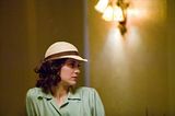
to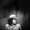
Textures:
by muddi88
by latastic
by reyesphile
The layer list is here
1. Resize the picture til it fits you base properly. Then, use the smudge tool to erase the lights and have a background with 2 greenish-yellowish vertical lines. It will look like this.
2. Do a curve layer. Set the opacity to 32%
Output: 150
Input: 89
3. Do a selective color layer.
Whites: -70%, 0%, +6%, 0%
4. Do a channel mixer
Red: +112%, -12%, -12%
Blue: 0%, -12%, +124%
5. Do a color balance layer.
Shadows: -11, 0, +13
Midtones: +22, -6, -19
Highlights: -1, 0, -22
6. Do a brightness/contrast layer
Brightness: 9
Contrast: -39
7. Do a color balance layer
Midtones: +18, -9, +27
8. Use this texture by latastic. Before put it at the top of the layer, rotate it so that the top will be the bottom. (or the lightest part at the top and the darkest at the bottom). Set it to soft light.
9. Duplicate your base. Put it at the top of your layers and set it to soft light, opacity at 43%.
10. Use this texture made by muddi88. Set it to soft light. Duplicate it twice. All set to soft light.
11. Use this texture by reyesphile. Set it to screen, opacity at 23%.
12. Create an exposure layer.
Gamma: 0,88
13. Open a black and white gradient map and set it to normal.
You're done!
Tutorial #009
From
to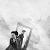
Layer list : Part 1 Part 2
Textures :
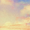
by bea_lost
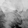
by nodazzle
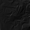
by reyesphile

1. First of all, reduce your pic. When you think Jack & Martha are at the good size open a base at the size of your icon 100*100 and copy your resize pic in your new base.
3. Then, use the smudge tool to erase all the things that ar ein the background except the door and the characters of course. Rebuild with the smudge brush the part of the door that is missing. Increase the view you got from the base to 400% (instead of 100%) it will help you to be more precised. The size of teh brush must be around 3-5 not more.
4. Do a curve layer
Input: 89
Output: 150
It will look like this
5. Do a selective color layer
Reds : -68%, +26%, +76%, -12%
Yellows : +100%, +17%, -51%, -20%
Whites : +100%, 0%, -23%, -10%
Neutrals : +9%, -10%, -6%, +6%
6. Do another selective color layer
Whites : -70%, 0%, +6%, 0
7. Do a color balance layer
Midtones : +22, -6, -19
Shadows : -11, 0, +13
Highlights : -1, 0, -22
8. Do a brightness/contrast layer
Brightness : +9
Contrast -39
9. Use this texture made by bea_lost. Set it to soft light.
10. Do another color balance layer
Midtones : +53, +9, +81
11. Use this texture made by nodazzle. Set it to soft light, opacity at 80%
12. Do a brightness/contrast layer
Brightness : +33
Contrast -50
13. Use this texture by bea_lost and set it to multiply. Set the opacity to 87%
14. Use this texture by reyesphile. Set it to screen with 75% of opacity. Desaturate the texture. Then rotate it till the brighter part will be on the characters.
15. Copy your base and set it to soft light.
16. This part is a little bit harder. Add a new layer. Then use a brush, size 5 for example. Use a white color. Then paint but just a little bit around the characters. Then, use a gaussian blur to blur the paint you've just done. It would give you a layer like this (Here, Ive used a black background so that you'll see the blurry paint but your layer should be transparent, like in the layer list at the beginning of the tutorial). Set the opacity to 25%.
A little word to say this technique is very useful for enlighting a dark part in a picture.You can also paint in another color to gove another effect.
17. Do another brightness/contrast layer
Brightness : +23
18. Do a color balance layer
Midtones : +21, 0, -17
19. Use a black and white gradient map
20. Add an exposure layer
Exposure : +0,10
Offset : 0,0000
Gamma Correction : 0,85
21. And finally, add a brightness/contrast
Brightness : 0
Contrast : +30
The End.
A little warning : it's not because the settings works well with this icon that it will with yours. You can use the icon as long as you credit; If you snag the textures, don't forget to credit their creators!
If you got questions, don't hesitate!! I know everything is not explained but I like when people just see by themselves what are the effects of the different tools. But don't hesitate to ask questions if you want to know something. Don't ask for a .PSD, you won't have it.
Tutorial #006
From

to

or/and

The tutorial will be in 2 parts. First, the coloring. After, the composition
Layer list : Part 1 (coloring) Part 2 (composition)
Textures :
by ohfreckle

Part 1 : Coloring
1. Reduce the pic so that the end of the character will be the size you want.
2. With the smudge tool, erase the desk you can see in the background. Use the white part of the pic and extend it around the end to the top of the icon. Then do the same with the green of the wall. Your background must be with a green part, a white one and then a green one again.
It will look like this

3. Duplicate your rand new icon and set it to screen, 45% of opacity
4. Do a curve layer.
Input : 89
Output : 150
5. Do a selective color layer
Reds : -68%, +26%, +76%, -12%
Yellows : +100%, +17%, -51%, -20%
Whites : +100%, 0%, -23%, -10%
Neutrals : +9%, -10%, -6%, +6%
6. Do another selective color layer
Whites : -70%, 0%, +6%, 0
7. Do a color balance layer
Midtones : +22, -6, -19
Shadows : -11, 0, +13
Highlights : -1, 0, -22
8.Do a brightness/contrast layer
Brightness : 9
Contrast : -39
9. Create a new layer. With a white paint brush (size 3-5) paint a bit from the right bottom corner of the icon til the other side of the icon, following the collar. Then use the gaussian blur to blur the "painting" and put more light to the icon. Your layer will look like this (apart that yours is transparent, not black). Ive learnt this technique thanks to all_at_once.
10. Duplice the light layer you have just done and set the opacity to 84%
11. Duplicate your base and put it at the top of the layer list. Set it to soft light
Now the icon looks like this :

.
Part 2 : Composition
12. Open a new base and paste the icon you've just finished. Rotate it at 180°. Then move it to the left so that you won't see the green part anymore.
13. Duplicate again the icon youve made during the 1st part. Move it til you don't see the right green part. Then, erase the left gree part.
14. Use this texture by ohfreckle and set it to multiply
Now you got this :

If you want this:

just desaturate the texture!
You're done!
Tutorial #007
From
to
Layer list.
1. Reduce your image so that Justin (the guy on the icon) will look tiny. Then, use the smudge tool so that you'll have blue everywhere and reconstruct slowly his head (use a size like 3 and increase the pic to 400%, it's the best way to do a good job). You may use the blur brush after that to be sure the sky will look like a sky and not like something painted.
2. Do this curve layer. You'll see that it will enlighten the picture. Set the opacity around 30% (it depends on the pic)
3. Do a selective color layer to increase the contrasts and color them a bit.
In Reds : -20%, 0%, +2, -1%
In Yellows : 0%, 0%, -3%, +3%
In Whites : +11%, 0%, +9%, +24%
In Neutrals : 0%, +2%,+8%, 0%
In Blacks : 0%, 0%, 0%, 100%
4. Do another selective color layer to color the white parts.
In Whites : -70%, 0%, +6%, 0%
5.Now a little color balance because colors are not pimping enough.
Midtones : +22, -6, -19
Shadows : -11, 0, +13
Highlights : -1, 0, -22
6. Add a brightness/contrast layer.
Brightness : +9
Contrast : -39
7. Add another brightness/contrast layer.
Brightness : +61
Contrast : -50
8. Duplicate your base and set it to soft light. Put the opacity at 94%
9. Go back to the original pic (the one you used for your base). Resize it a bit but not as tiny as the version you use for the base. You are doing now the picture you see in the background. Once you got the size you want, put it at the top pf your layers and set it to soft light.
10. Duplicate this layer so that we'll see the background a bit more.
11. Add a brightness/contrast layer.
Brightness : +56
Contrast : -50
You're done!!
Tutorial #008
From

to

Textures:
by muddi88

by latastic

by reyesphile

The layer list is here
1. Resize the picture til it fits you base properly. Then, use the smudge tool to erase the lights and have a background with 2 greenish-yellowish vertical lines. It will look like this.
2. Do a curve layer. Set the opacity to 32%
Output: 150
Input: 89
3. Do a selective color layer.
Whites: -70%, 0%, +6%, 0%
4. Do a channel mixer
Red: +112%, -12%, -12%
Blue: 0%, -12%, +124%
5. Do a color balance layer.
Shadows: -11, 0, +13
Midtones: +22, -6, -19
Highlights: -1, 0, -22
6. Do a brightness/contrast layer
Brightness: 9
Contrast: -39
7. Do a color balance layer
Midtones: +18, -9, +27
8. Use this texture by latastic. Before put it at the top of the layer, rotate it so that the top will be the bottom. (or the lightest part at the top and the darkest at the bottom). Set it to soft light.
9. Duplicate your base. Put it at the top of your layers and set it to soft light, opacity at 43%.
10. Use this texture made by muddi88. Set it to soft light. Duplicate it twice. All set to soft light.
11. Use this texture by reyesphile. Set it to screen, opacity at 23%.
12. Create an exposure layer.
Gamma: 0,88
13. Open a black and white gradient map and set it to normal.
You're done!
Tutorial #009
From

to

Layer list : Part 1 Part 2
Textures :
by bea_lost


by nodazzle

by reyesphile

1. First of all, reduce your pic. When you think Jack & Martha are at the good size open a base at the size of your icon 100*100 and copy your resize pic in your new base.
3. Then, use the smudge tool to erase all the things that ar ein the background except the door and the characters of course. Rebuild with the smudge brush the part of the door that is missing. Increase the view you got from the base to 400% (instead of 100%) it will help you to be more precised. The size of teh brush must be around 3-5 not more.
4. Do a curve layer
Input: 89
Output: 150
It will look like this
5. Do a selective color layer
Reds : -68%, +26%, +76%, -12%
Yellows : +100%, +17%, -51%, -20%
Whites : +100%, 0%, -23%, -10%
Neutrals : +9%, -10%, -6%, +6%
6. Do another selective color layer
Whites : -70%, 0%, +6%, 0
7. Do a color balance layer
Midtones : +22, -6, -19
Shadows : -11, 0, +13
Highlights : -1, 0, -22
8. Do a brightness/contrast layer
Brightness : +9
Contrast -39
9. Use this texture made by bea_lost. Set it to soft light.
10. Do another color balance layer
Midtones : +53, +9, +81
11. Use this texture made by nodazzle. Set it to soft light, opacity at 80%
12. Do a brightness/contrast layer
Brightness : +33
Contrast -50
13. Use this texture by bea_lost and set it to multiply. Set the opacity to 87%
14. Use this texture by reyesphile. Set it to screen with 75% of opacity. Desaturate the texture. Then rotate it till the brighter part will be on the characters.
15. Copy your base and set it to soft light.
16. This part is a little bit harder. Add a new layer. Then use a brush, size 5 for example. Use a white color. Then paint but just a little bit around the characters. Then, use a gaussian blur to blur the paint you've just done. It would give you a layer like this (Here, Ive used a black background so that you'll see the blurry paint but your layer should be transparent, like in the layer list at the beginning of the tutorial). Set the opacity to 25%.
A little word to say this technique is very useful for enlighting a dark part in a picture.You can also paint in another color to gove another effect.
17. Do another brightness/contrast layer
Brightness : +23
18. Do a color balance layer
Midtones : +21, 0, -17
19. Use a black and white gradient map
20. Add an exposure layer
Exposure : +0,10
Offset : 0,0000
Gamma Correction : 0,85
21. And finally, add a brightness/contrast
Brightness : 0
Contrast : +30
The End.