Book 2, Chapter 7: Results
It's been a busy week, but here are the late results! helium_lost will update the Character Status page soon.
Votes for favorites are on the top, followed by votes for least favorite, and finally general comments. The arrows indicate whether the iconmaker's points total went up or down.
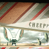
Icon #01
2+ 0- | ▬
[+] #1: Very nice composition, and I love the colors!
[+] 01: The overall style of this icon is amazingly well done and it fits perfectly, the white line gives a very good effect, and the typography is lovely.
[G] 01: I rather like this actually. The use of textures is really good, but I think you could have made Momo a little bigger and easier to see despite the 40% rule.
Icon #02
5+ 0- | ▲
[+] 02: This is a very beautiful icon. The coloring, the cropping, the background: all of them are masterfully done and well-balanced. Good job.
[+] 02: At first glance this icon looks simple, but I like the simplicity and I think it turned out really well.
[+] 02: the subtle coloring adds a nice effect to the icon
[+] 02: The Chinese writing in the background goes well with the style of art in the foreground. It's very artistic.
[+] #2: The use of cropping in this icon is outstanding. I love the simplicity! The characters at the top add a nice effect as well.
[G] #2: ♥ I love that you used this picture!
[G] 02: This .. makes me so peaceful all of a sudden. *__* It's so nice and simple, in a good way. :3
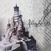
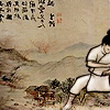
Icon #03
4+ 1- | ▬
[+] 03: It's really interesting that you chose to icon a place, rather than a person. Either way it's beautiful. The coloring compliments the image well and the bar thingy on the right balances out the icon just right.
[+] 03: Clean but eyecatching composition, especially for grayscale. The textures on the right compliment the image well without pulling too much attention from it.
[+] 03: The muted colors bring about a sort of eeriness, a sense of foreboding that represents the abandoned temple well.
[+] #3: The cropping and composition here are lovely. I like the side-bar-effect, and the placement of the text is nice, too.
[-] 03: The icon doesn't stick out very well. The text placement and font aren't the best choice to go with the icon either.
Icon #04
6+ 0- | ▲
[+] #4: This is really cute! I especially love the little hearts.
[+] 04: I think the coloring of the background is very good. I like how this icon is so different from the others, the image below suits it perfectly. Very nicely done.
[+] 04: I love this. The blue brushes at the top really enhance the image really well. However, Sokka and FFCP look a little bit too light to me, but overall, looking at the big picture, I think that adds to the icon rather than detracts from it.
[+] 04: the way the icon was put together came out lovely, the colors aren't too saturated to burn your eyes off.
[+] 04: The shapes of the textures compliment the shape the negative space of the image creates well. The coloring of the background and foreground match well.
[+] 04: The image is and the rest of the icon fits well with it's upbeat hearts and flower.
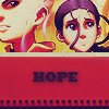
Icon #05
1+ 5- | ▼
[+] 05: I like the general effect of this icon. It's got a good crop and the coloring is really pretty. The texture and text placement are very nice too. :D
[-] #5: The text detracts from this icon, and is way too dark.
[-] 05: Though the coloring and the cropping of image is really well-done, the lower part of the icon doesn't fit it: the notebook detail doesn't quite fit the mood of the icon, and neither does the font you chose.
[-] 05: I actually do like this, but next to the other icons it looks a little bland. I feel like the negative 60% space could have also been better utilized. Some more brushes/textures maybe. Also, the tan-ish bar separating the picture from the magenta is a little jarring to the overall composition. Perhaps a different color would have worked better?
[-] 05: colors are harsh the icon looks grainy and the drop shadow below the text is unnappealing
[-] 05: The coloring seems a bit off, the pink/red highlights are a bit harsh. The darker colors, like in the text feel somewhat smudgy.
Icon #06
1+ 5- | ▼
[+] 06: The type makes good use of the negative space. The lights give a nice balance.
[-] 06: The text is too big and bold and bright for the icon. The light texture doesn't look quite right with it either.
[-] #6: The text is too bright against the black, and it misbalances the whole composition.
[-] 06: Something just looks a bit awkward about this. Iroh doesn't really stand out, and it kind of looks like nothing was really done to the base to enhance the coloring or sharpen the details. The text is appropriate, but it overshadows rather than compliments Iroh. The bright lights are really distracting, and I find myself looking at those and the text more than Iroh, who should REALLY be the focus.
[-] 06: Iroh is weirded extracted and the background looks a bit empty even with all the dirty textures used here. Though the text isn't bad, the light textures stole away the focus of the icon.
[-] 06: the text overpowered the icon and the light texture don't complement the icon at all.
[G] #6: this text selection is PERFECT for Iroh!
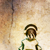
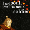
Icon #07
4+ 1- | ▬
[+] 07: I really like this icon. The texture works great with Toph; it isn't too overwhelming. I also like the feeling you get from it. It seems like an overall feeling of despair or something.
[+] 07: This is really simple, but that's part of the charm. :3 It really looks like a drawing on a wall and the crack in it is befitting to Toph's personality. I ADORE the coloring too! It's so subtle, yet perfect for the whole "wall" theme.
[+] 07: Gorgeous icon which gives a very strong impression, I like how Toph is almost in the miggle and the whole work in the background is fantastic.
[+] #7: This icon is growing on me. I love the crack in the rock, paired with Toph's seemingly hopeless expression. Maybe some text would heighten the effect, but the stark nature of it seems to fit the mood of the icon.
[-] 07: The lighting seems too extreme. The simplicity of the composition is fine but the imagery gives a more serene feel, and the bright lighting breaks this mood.
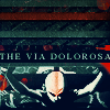
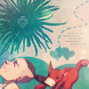
Icon #08
4+ 2- | ▬
[+] 08: The cropping is very nice and the dark coloring works great with the subject matter of the icon. I also like the font and text placement.
[+] #8: The mood in this icon is really clear, and the composition is really nice.
[+] 08: Though the text might be a little confusing, the coloring here is very good. The upper part of the icon goes very well with the lower one.
[+] 08: composition of the icon is well done, the typo fits in.
[-] 08: The coloring and the lighting in this icon swallow Aang up. It's very hard to make out the lines of his body and it's difficult to understand his expression.
[-] #8: The text is set in a prominent place, but it's unclear (at least to me) what it means.
[G] 08: The whole color scheme and image you used is really great, but I find difficult to tell what is Aang doing exactly.
Icon #09
0+ 4- | ▼
[-] 09: The cropping was nice, but unfortunately the box in the middle of the icon ruined it. It doesn't go well with the rest of the icon. The background is too empty, perhaps a texture would've made it better.
[-] 09: In my opinion this style doesn't work very well with this kind of art, but I think it turned out okay. Though my reason for giving a negative critique is the light dots, it looks weird placed and stand out a lot and it could have been better give the overall icon a bit more of contrast.
[-] 09: I don't like how layered everything is. The smaller icon overlaps not only the text but the second image in the background. It's just not appealing.
[-] #9: The way this icon is laid out, everything important (the images, the text) is either cut off or too small to see. If the inlaid box was placed more to the side, that would have helped.
[G] 09: I don't know about this one really since I never actually understood that kind of trend. The repeated box with Zuko in it looks .. awkward. Almost like it's kind of just there interrupting the icon underneath it. The effect is a little jarring actually and makes it look really cluttered. Like .. I almost don't know where to look.
Please don't be discouraged if you got a lot of negative critiques; take them as a learning experience to improve, as that's the whole point of a LIMS :)
Comments to this entry are screened just so I can make sure that you're not accidentally giving away your identity. ^^ Your comment will stay screened if I feel that there is anything in it that may reveal your identity.
Meanwhile, I don't care if you reveal yourself as the author of a particular comment; comments are just kept anonymous so that no one feels like holding themselves back for fear of hurting someone else's feelings.
Votes for favorites are on the top, followed by votes for least favorite, and finally general comments. The arrows indicate whether the iconmaker's points total went up or down.
Icon #01
2+ 0- | ▬
[+] #1: Very nice composition, and I love the colors!
[+] 01: The overall style of this icon is amazingly well done and it fits perfectly, the white line gives a very good effect, and the typography is lovely.
[G] 01: I rather like this actually. The use of textures is really good, but I think you could have made Momo a little bigger and easier to see despite the 40% rule.
Icon #02
5+ 0- | ▲
[+] 02: This is a very beautiful icon. The coloring, the cropping, the background: all of them are masterfully done and well-balanced. Good job.
[+] 02: At first glance this icon looks simple, but I like the simplicity and I think it turned out really well.
[+] 02: the subtle coloring adds a nice effect to the icon
[+] 02: The Chinese writing in the background goes well with the style of art in the foreground. It's very artistic.
[+] #2: The use of cropping in this icon is outstanding. I love the simplicity! The characters at the top add a nice effect as well.
[G] #2: ♥ I love that you used this picture!
[G] 02: This .. makes me so peaceful all of a sudden. *__* It's so nice and simple, in a good way. :3
Icon #03
4+ 1- | ▬
[+] 03: It's really interesting that you chose to icon a place, rather than a person. Either way it's beautiful. The coloring compliments the image well and the bar thingy on the right balances out the icon just right.
[+] 03: Clean but eyecatching composition, especially for grayscale. The textures on the right compliment the image well without pulling too much attention from it.
[+] 03: The muted colors bring about a sort of eeriness, a sense of foreboding that represents the abandoned temple well.
[+] #3: The cropping and composition here are lovely. I like the side-bar-effect, and the placement of the text is nice, too.
[-] 03: The icon doesn't stick out very well. The text placement and font aren't the best choice to go with the icon either.
Icon #04
6+ 0- | ▲
[+] #4: This is really cute! I especially love the little hearts.
[+] 04: I think the coloring of the background is very good. I like how this icon is so different from the others, the image below suits it perfectly. Very nicely done.
[+] 04: I love this. The blue brushes at the top really enhance the image really well. However, Sokka and FFCP look a little bit too light to me, but overall, looking at the big picture, I think that adds to the icon rather than detracts from it.
[+] 04: the way the icon was put together came out lovely, the colors aren't too saturated to burn your eyes off.
[+] 04: The shapes of the textures compliment the shape the negative space of the image creates well. The coloring of the background and foreground match well.
[+] 04: The image is and the rest of the icon fits well with it's upbeat hearts and flower.
Icon #05
1+ 5- | ▼
[+] 05: I like the general effect of this icon. It's got a good crop and the coloring is really pretty. The texture and text placement are very nice too. :D
[-] #5: The text detracts from this icon, and is way too dark.
[-] 05: Though the coloring and the cropping of image is really well-done, the lower part of the icon doesn't fit it: the notebook detail doesn't quite fit the mood of the icon, and neither does the font you chose.
[-] 05: I actually do like this, but next to the other icons it looks a little bland. I feel like the negative 60% space could have also been better utilized. Some more brushes/textures maybe. Also, the tan-ish bar separating the picture from the magenta is a little jarring to the overall composition. Perhaps a different color would have worked better?
[-] 05: colors are harsh the icon looks grainy and the drop shadow below the text is unnappealing
[-] 05: The coloring seems a bit off, the pink/red highlights are a bit harsh. The darker colors, like in the text feel somewhat smudgy.
Icon #06
1+ 5- | ▼
[+] 06: The type makes good use of the negative space. The lights give a nice balance.
[-] 06: The text is too big and bold and bright for the icon. The light texture doesn't look quite right with it either.
[-] #6: The text is too bright against the black, and it misbalances the whole composition.
[-] 06: Something just looks a bit awkward about this. Iroh doesn't really stand out, and it kind of looks like nothing was really done to the base to enhance the coloring or sharpen the details. The text is appropriate, but it overshadows rather than compliments Iroh. The bright lights are really distracting, and I find myself looking at those and the text more than Iroh, who should REALLY be the focus.
[-] 06: Iroh is weirded extracted and the background looks a bit empty even with all the dirty textures used here. Though the text isn't bad, the light textures stole away the focus of the icon.
[-] 06: the text overpowered the icon and the light texture don't complement the icon at all.
[G] #6: this text selection is PERFECT for Iroh!
Icon #07
4+ 1- | ▬
[+] 07: I really like this icon. The texture works great with Toph; it isn't too overwhelming. I also like the feeling you get from it. It seems like an overall feeling of despair or something.
[+] 07: This is really simple, but that's part of the charm. :3 It really looks like a drawing on a wall and the crack in it is befitting to Toph's personality. I ADORE the coloring too! It's so subtle, yet perfect for the whole "wall" theme.
[+] 07: Gorgeous icon which gives a very strong impression, I like how Toph is almost in the miggle and the whole work in the background is fantastic.
[+] #7: This icon is growing on me. I love the crack in the rock, paired with Toph's seemingly hopeless expression. Maybe some text would heighten the effect, but the stark nature of it seems to fit the mood of the icon.
[-] 07: The lighting seems too extreme. The simplicity of the composition is fine but the imagery gives a more serene feel, and the bright lighting breaks this mood.
Icon #08
4+ 2- | ▬
[+] 08: The cropping is very nice and the dark coloring works great with the subject matter of the icon. I also like the font and text placement.
[+] #8: The mood in this icon is really clear, and the composition is really nice.
[+] 08: Though the text might be a little confusing, the coloring here is very good. The upper part of the icon goes very well with the lower one.
[+] 08: composition of the icon is well done, the typo fits in.
[-] 08: The coloring and the lighting in this icon swallow Aang up. It's very hard to make out the lines of his body and it's difficult to understand his expression.
[-] #8: The text is set in a prominent place, but it's unclear (at least to me) what it means.
[G] 08: The whole color scheme and image you used is really great, but I find difficult to tell what is Aang doing exactly.
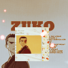
Icon #09
0+ 4- | ▼
[-] 09: The cropping was nice, but unfortunately the box in the middle of the icon ruined it. It doesn't go well with the rest of the icon. The background is too empty, perhaps a texture would've made it better.
[-] 09: In my opinion this style doesn't work very well with this kind of art, but I think it turned out okay. Though my reason for giving a negative critique is the light dots, it looks weird placed and stand out a lot and it could have been better give the overall icon a bit more of contrast.
[-] 09: I don't like how layered everything is. The smaller icon overlaps not only the text but the second image in the background. It's just not appealing.
[-] #9: The way this icon is laid out, everything important (the images, the text) is either cut off or too small to see. If the inlaid box was placed more to the side, that would have helped.
[G] 09: I don't know about this one really since I never actually understood that kind of trend. The repeated box with Zuko in it looks .. awkward. Almost like it's kind of just there interrupting the icon underneath it. The effect is a little jarring actually and makes it look really cluttered. Like .. I almost don't know where to look.
Please don't be discouraged if you got a lot of negative critiques; take them as a learning experience to improve, as that's the whole point of a LIMS :)
Comments to this entry are screened just so I can make sure that you're not accidentally giving away your identity. ^^ Your comment will stay screened if I feel that there is anything in it that may reveal your identity.
Meanwhile, I don't care if you reveal yourself as the author of a particular comment; comments are just kept anonymous so that no one feels like holding themselves back for fear of hurting someone else's feelings.